Superfried Fonts 15 Type families | 36 Fonts
Typography has become a significant factor in my career, but this was a completely unintentional, organic process. As a kid I had no specific interest in type, but I was obsessed with logos. Consequently, It is now unsurprising that I now create brand identities for a living. Over the years I noticed I had accumulated a lot of rejected, unused typographic styles and experiments from branding projects. There was a lot of good work there, but how to make use of it?
Historically, creating typefaces was complicated and required expensive software. This changed with packages such as Glyphs, which was affordable and enabled me to take my designs straight across from Illustrator. With many of the distinct, unused styles I began expanding the character set to complete typefaces, or just the numbers to create personal projects.
This process led to the development of 15+ commercially available typefaces, and personal projects receiving press features and design awards. It has been invaluable to my progress and taught me to never let a good idea go to waste. You never know where it might take you.
As you might expect, Superfried typefaces are generally experimental by nature. Consequently, they are most suited to designers looking for new directions or starting points for brand identities rather than general-purpose use for the masses. With this in mind I decided to collate the complete collection in one designer bundle at a price point accessible for all.
Your new digital playground.
Purchase the Superfried Font bundle now.
—
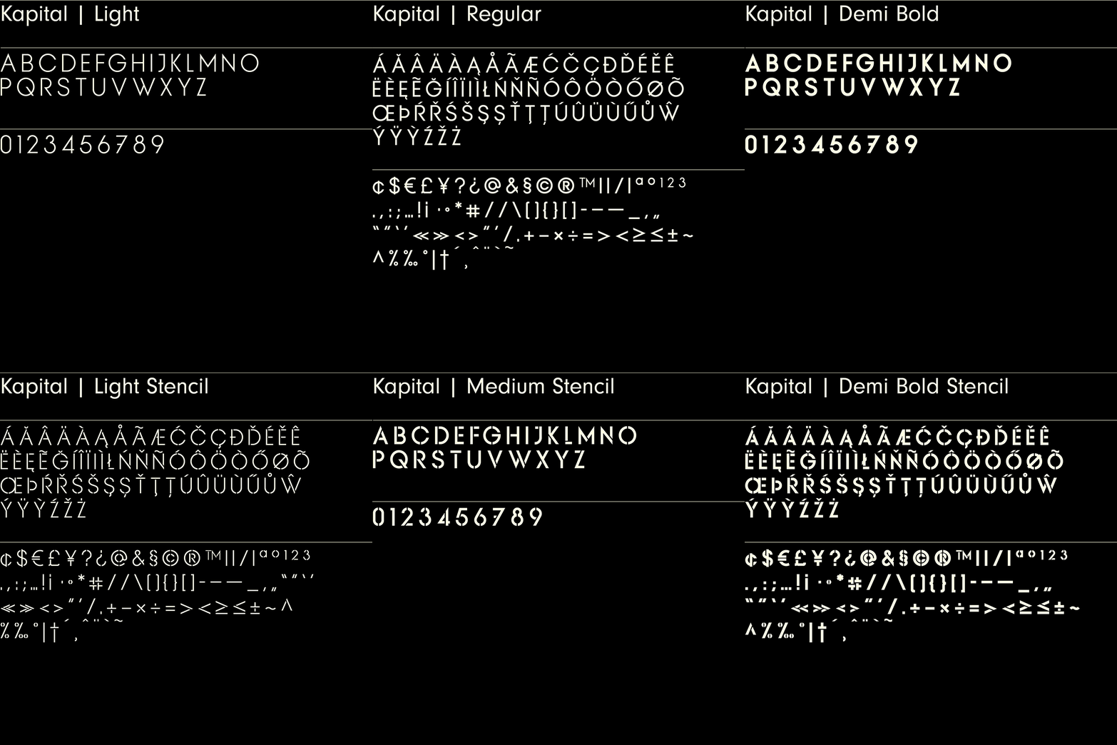
Kapital – 8 Fonts | 2 Styles
When using many sans serif typefaces I found many to be very disappointing when used in caps. The character is often lost in the uppercase glyphs and as the weight increases the consistency in form can be heavily compromised. So I decided to create my own.
Kapital is a minimal, sophisticated uppercase sans. It features four weights – Light, Regular, Medium, and Demi Bold. There is also a stencil version of each weight.
Kapital has been featured for Typography on Behance.
Purchase the Superfried Font bundle now.
—
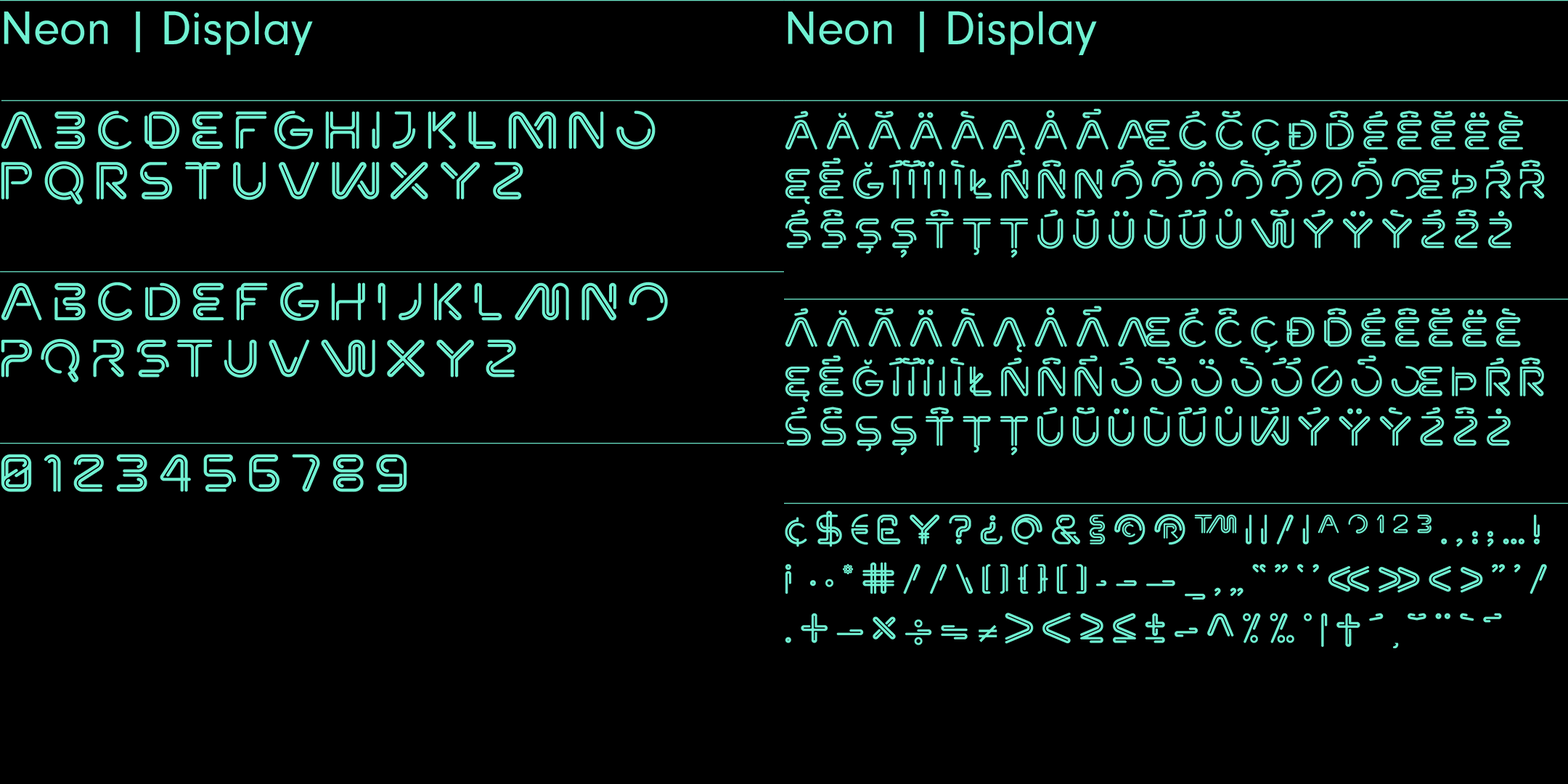
Neon – Sans Serif | 2 Styles | 265 Glyphs
Neon is an experimental, retro display typeface designed by Superfried. Neon features two styles which can be toggled via shift. As the name suggests styling for the typeface started with classic neon signage, but quickly evolved into a very distinct and versatile option to demand attention. Neon has been featured in Computer Arts magazine.
Purchase the Superfried Font bundle now.
—
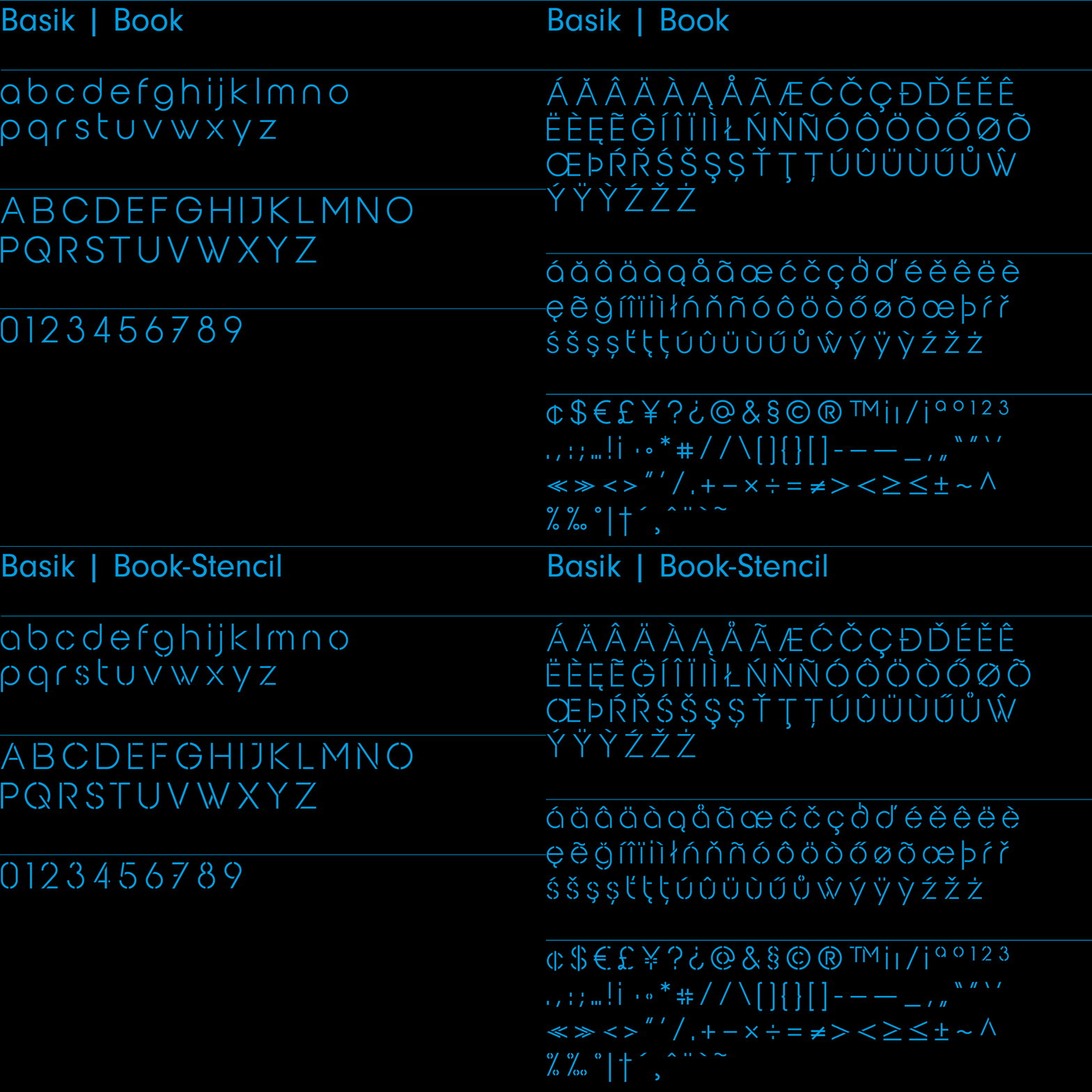
Basik – Sans Serif | 2 Fonts | 265 Glyphs
As the name suggests, Basik is a simple, clean and versatile sans-serif typeface designed by Superfried. It is equally apt in both body and display scenarios.
There are numerous sans fonts available, which is why I tried to create something a little bit different via unconventional styles and cuts throughout the typeface. Basik includes two fonts – book, and stencil.
Basik has been featured for Typography on Behance.
Purchase the Superfried Font bundle now.
—
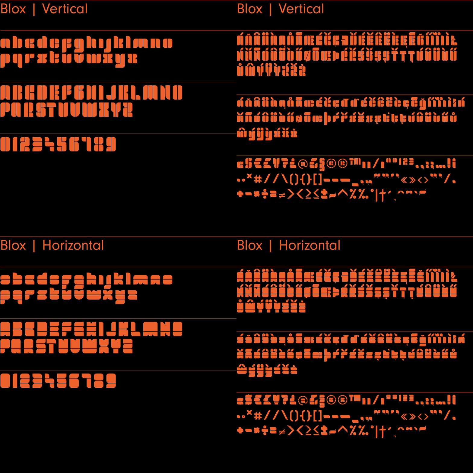
Blox – Sans Serif | 2 Fonts | 265 Glyphs
Blox is a distinct, retro display typeface. With a simple geometric structure, tight spacing, and cuts, Blox is very distinct with high impact.
The family includes two fonts – Blox Vertical and Blox Horizontal – named after the orientation of the distinct incisions within the letterforms.
Blox has been featured for Typography on Behance.
Purchase the Superfried Font bundle now.
—
Sqair – Sans Serif | 2 Fonts | 265 Glyphs
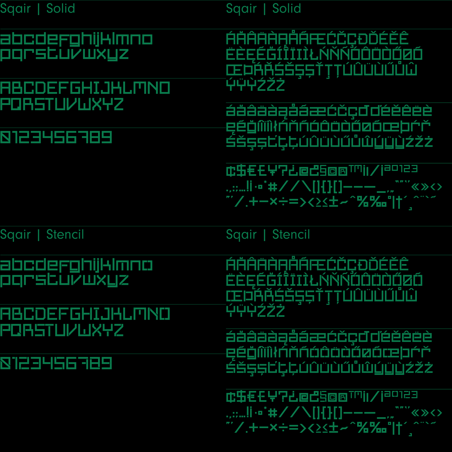
Sqair is an experimental display typeface designed by Superfried. It is available in two formats, stencil and solid. The inspiration for Sqair originated from fond memories of the classic Sinclair Spectrum logo. Consequently, Sqair lends itself to any project with a tech-related theme.
Purchase the Superfried Font bundle now.
—
Slash – Sans-Serif | 3 fonts | 265 glyphs
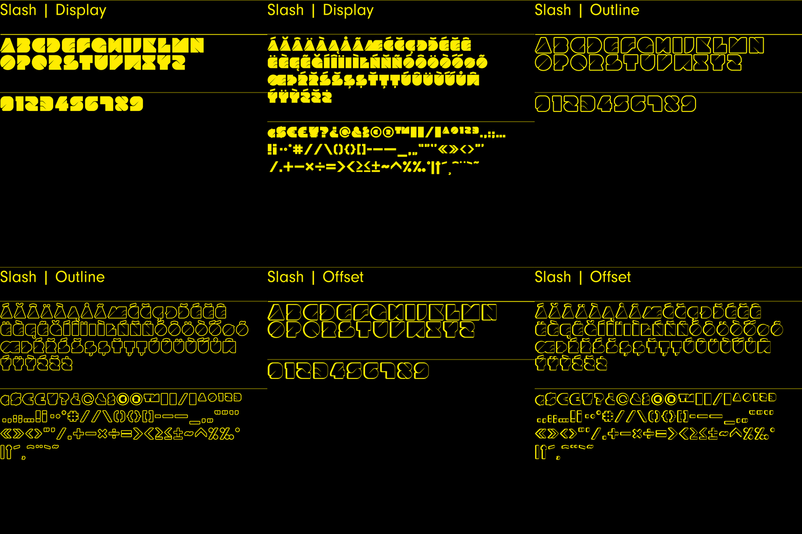
Slash is an experimental, all-caps, no-nonsense display typeface designed by Superfried. Slash is bold and makes no apologies for it. Sculptured from solid blocks, it features distinct incisions and intricate curves to articulate the separate glyphs, resulting in a distinct, high-impact style. The family includes three fonts – Display, Outline, and Offset.
Slash has been featured for Typography on Behance.
Purchase the Superfried Font bundle now.
—
Orb – Sans Serif | 2 Fonts | 265 Glyphs
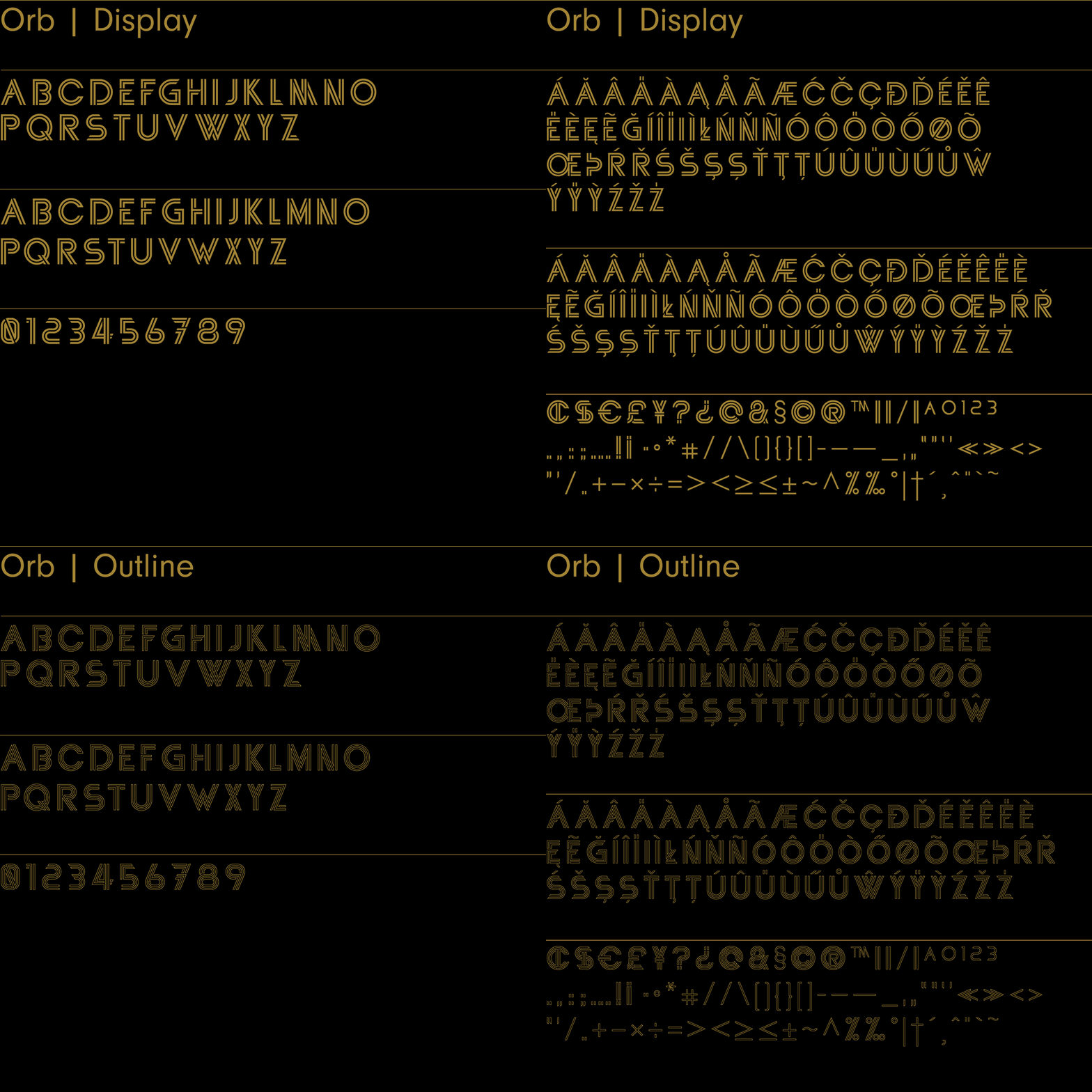
Orb by Superfried has been re-released. Now re-drawn and improved the elegant, uppercase display typeface now also includes a secondary character set activated via the shift key. The glyphs are constructed from two concentric paths featuring intricate interactions and angled incisions, leading to a very distinct look and feel. The Orb family includes two fonts – Display and Outline – each featuring 265 glyphs.
Purchase the Superfried Font bundle now.
—
Plug – Sans Serif | 265 Glyphs
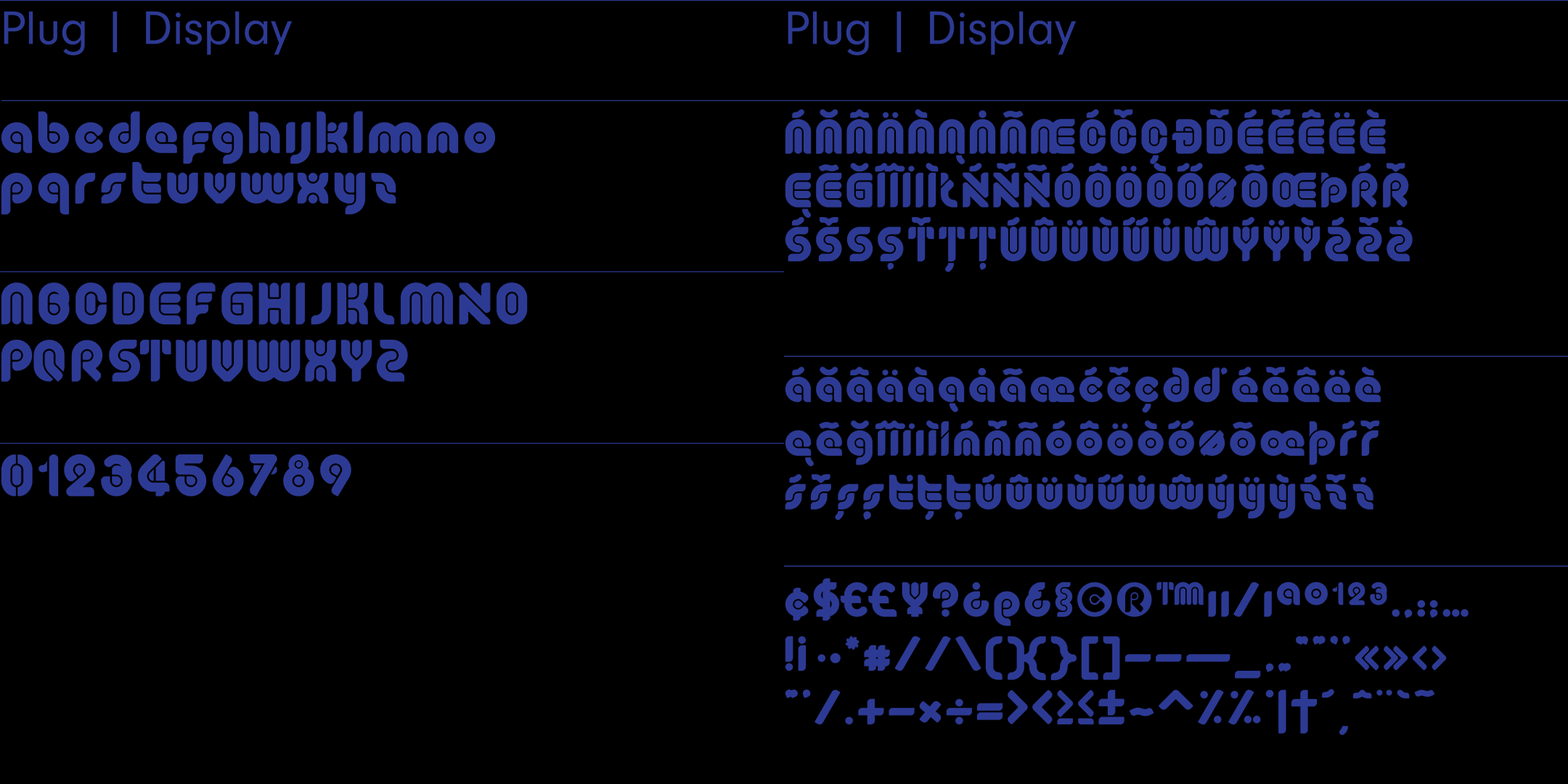
Plug is an experimental, display typeface designed by Superfried. It is named after the ‘plugs’ residing within all of the glyph counters. Plug has a very retro feel and its robust structure leads to a distinct, high-impact presence.
Plug has been featured for Typography on Behance.
Purchase the Superfried Font bundle now.
—
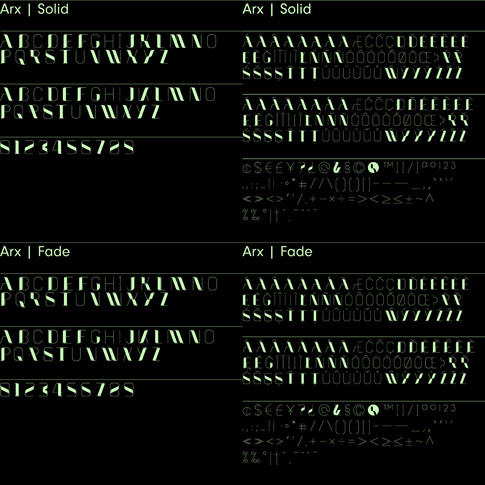
Arx – Serif | 2 Fonts | 2 Styles | 265 Glyphs
Arx by Superfried is an elegant and intricate display typeface designed for use at large scale. Its Latin name – meaning citadel – connects with the classical features, whilst the phonetic pronunciation nods to the arcs which characterise each glyph.
This caps typeface family includes two fonts – Fade and Solid – each featuring two distinct character styles switched via the shift key. Fade features delicate incisions to add depth and the illusion of 3D shading to the arcs. Solid, as its name suggests, is a cleaner, flat alternative.
Arx has been featured for Typography on Behance.
Purchase the Superfried Font bundle now.
—
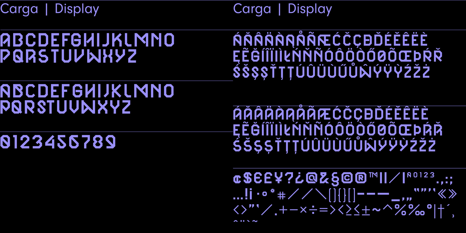
Carga – Sans-Serif | 2 Styles | 265 Glyphs
Carga by Superfried is an angular, brutal, uppercase display typeface. Initially inspired by the use of typography on container ships, this typeface is aptly named Carga – Spanish for Cargo. Carga includes 265 glyphs and features two interchangeable character styles toggled via shift.
Purchase the Superfried Font bundle now.
—
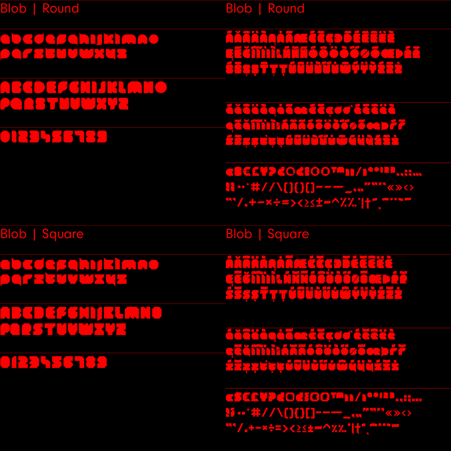
Blob – Sans-Serif | 2 Fonts | 265 Glyphs
Blob typeface designed by Superfried includes two fonts – Round and Square. It is an experimental, sans-serif display face based on simple geometric forms. Although unorthodox, care has been taken to ensure that Blob is completely legible.
Blob has been featured for Typography on Behance.
Purchase the Superfried Font bundle now.
—
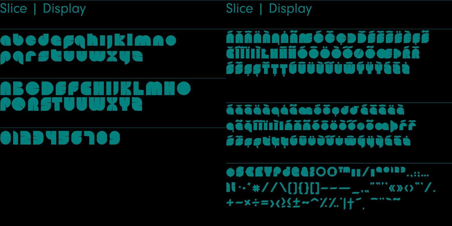
Slice – Sans-Serif | 265 Glyphs
Slice is an experimental, circular, display typeface. Slice, like its big brother Slash, also features key incisions. Unlike Slash, Slice is much simpler in design based on basic geometric forms and features both upper and lowercase. Slice has a very retro feel and its chunky structure leads to a distinct, high-impact presence.
Slice has been featured for Typography on Behance.
Purchase the Superfried Font bundle now.
—
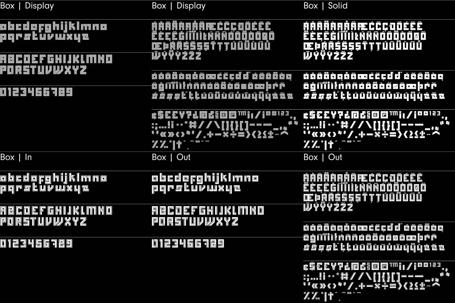
Box – Sans-Serif | 4 Fonts | 265 Glyphs
Box is an experimental, retro display typeface. Initially inspired by the parallel paths of the Superfried logo, Box then took an angular detour leading to its predominantly square forms. The result is a bold, distinct look with high impact.
Box includes 4 fonts – Display, Solid, In, and Out – each featuring 265 glyphs covering lower and uppercase.
Purchase the Superfried Font bundle now.
—
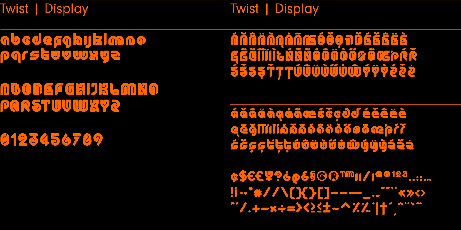
Twist – Sans-Serif | 265 Glyphs
Twist is an experimental, curvy, display typeface designed by Superfried. As its name suggests, it features intricate twists and turns. Twist has a very retro feel and is similar in style to its high-impact cousin, Plug.
Twist has been featured for Typography on Behance.
Purchase the Superfried Font bundle now.
—
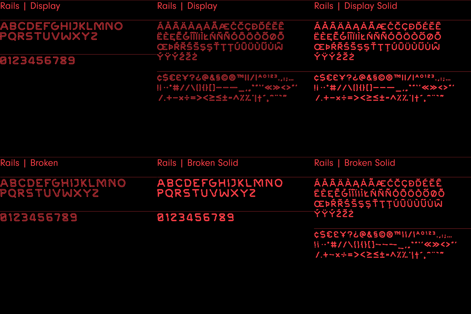
Rails – Sans-Serif | 4 Fonts | 2 Styles | 265 Glyphs
Rails is an experimental, retro, outline display typeface. It features four fonts and two styles – Display and Broken. As the name suggests, the structure of both are based on parallel tracks with the latter version featuring distinct breaks for added impact. Combining the two results in clean, flowing type with sudden and unexpected moments of disruption. In addition, the Rails family also includes a solid version of each style.
Project services
- Bespoke Typography
- Typography
- Typeface design
- Animation
Credits
Purchase the Superfried Font bundle now.
Your new digital playground.