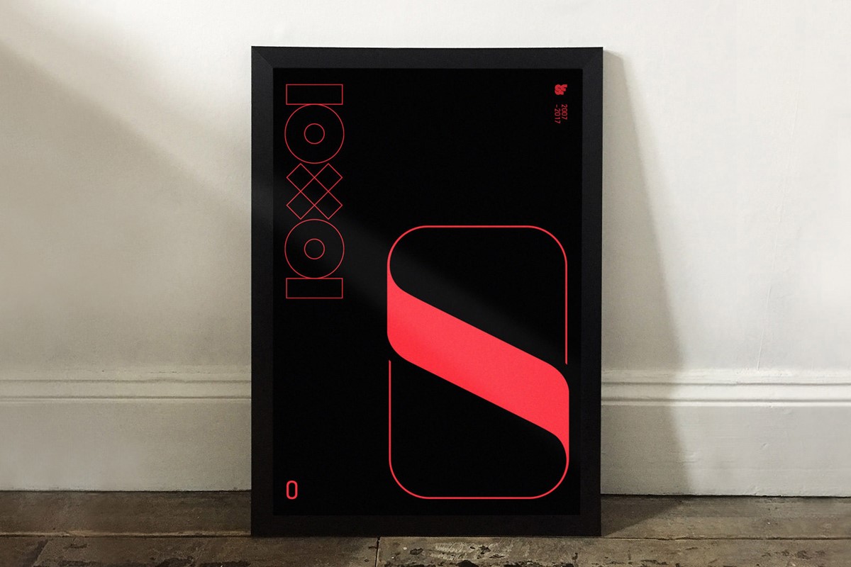


SF10x10 Superfried's 10th birthday!
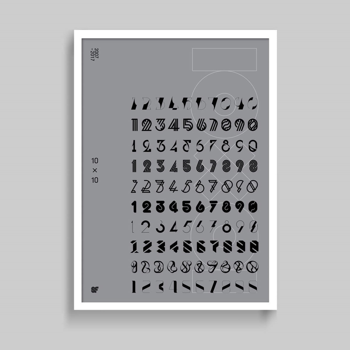
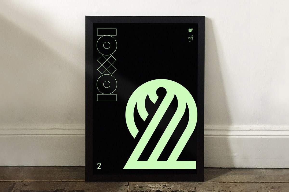
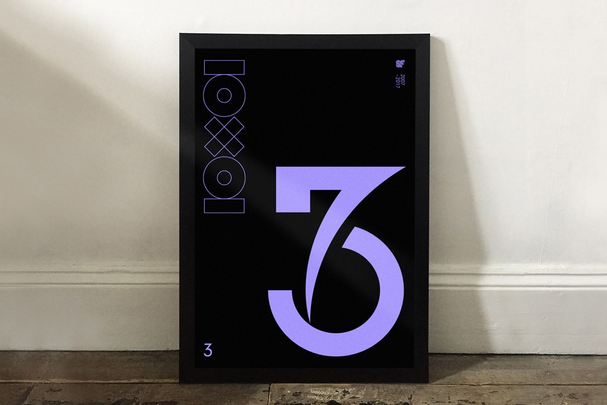
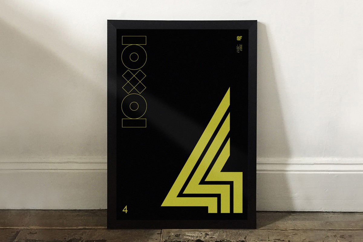
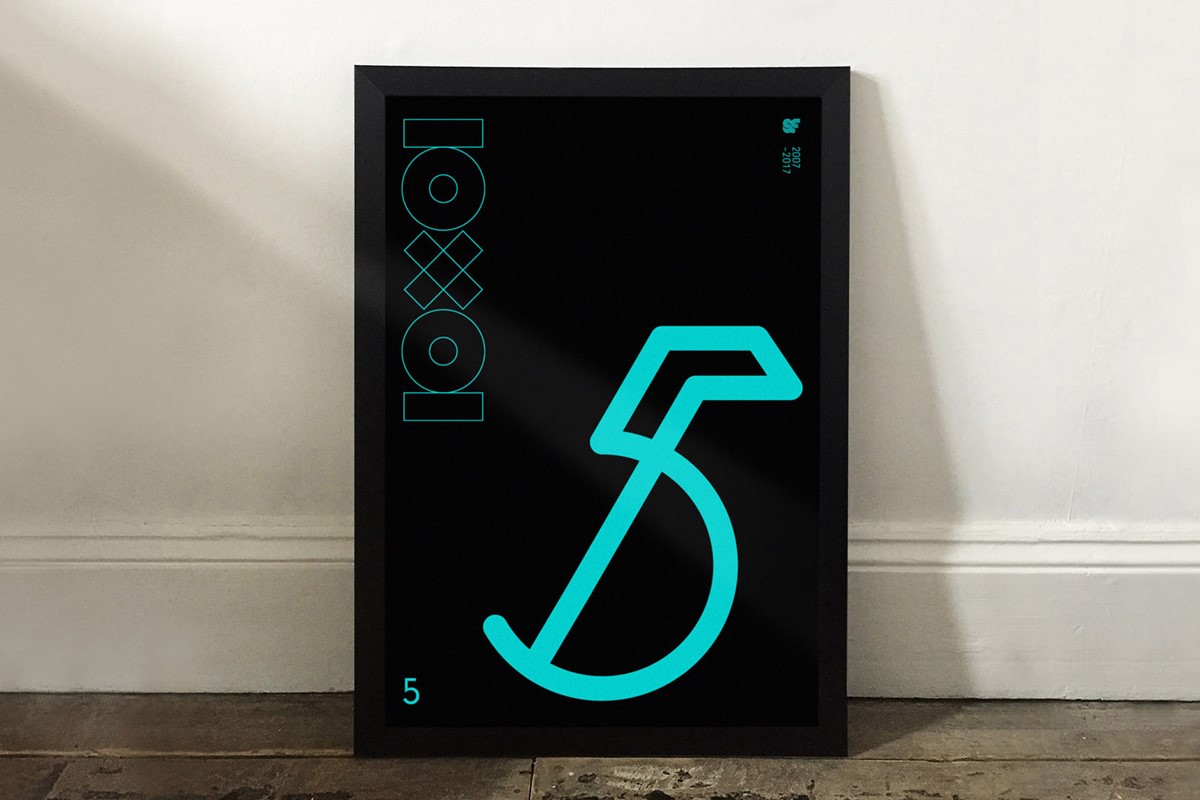
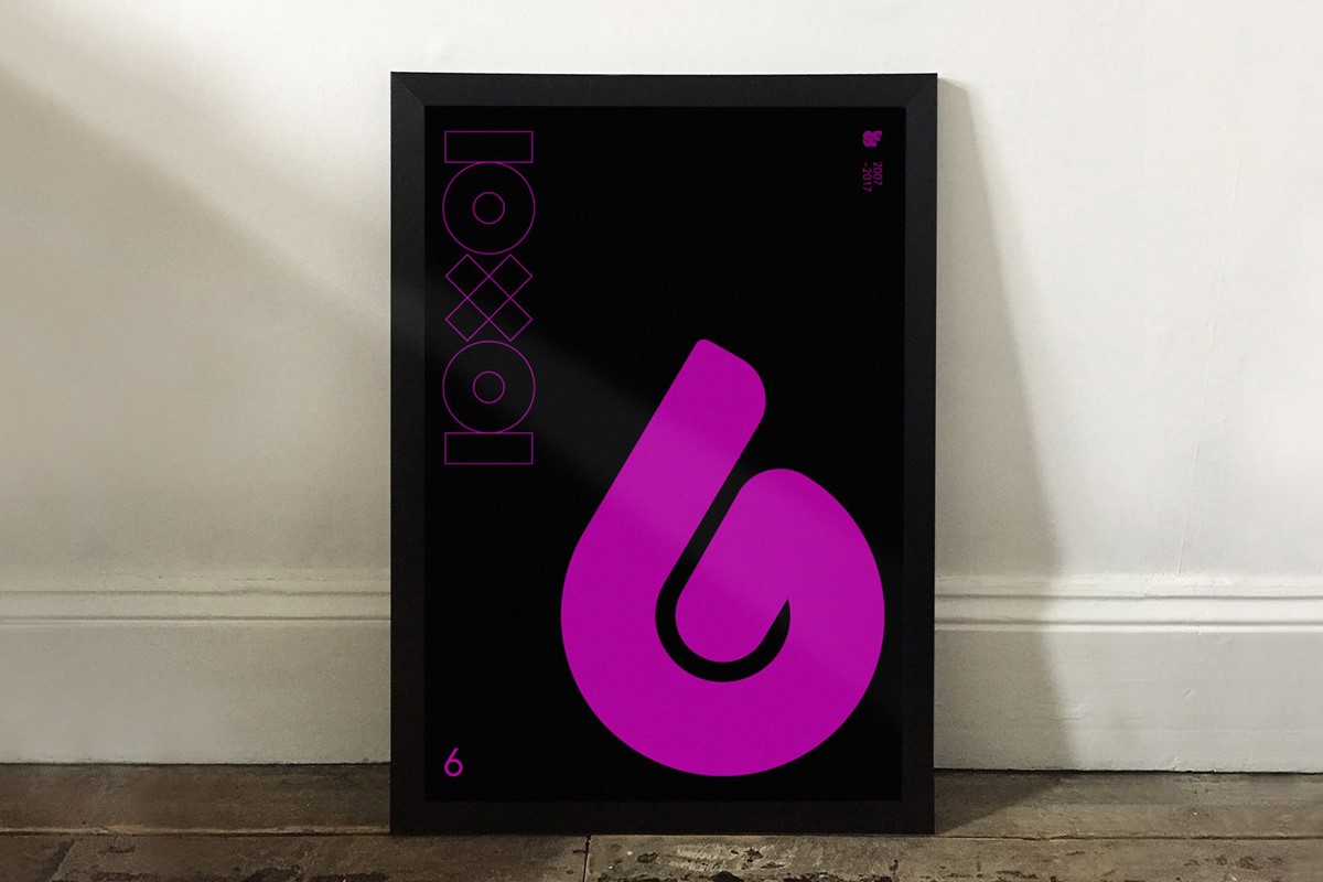
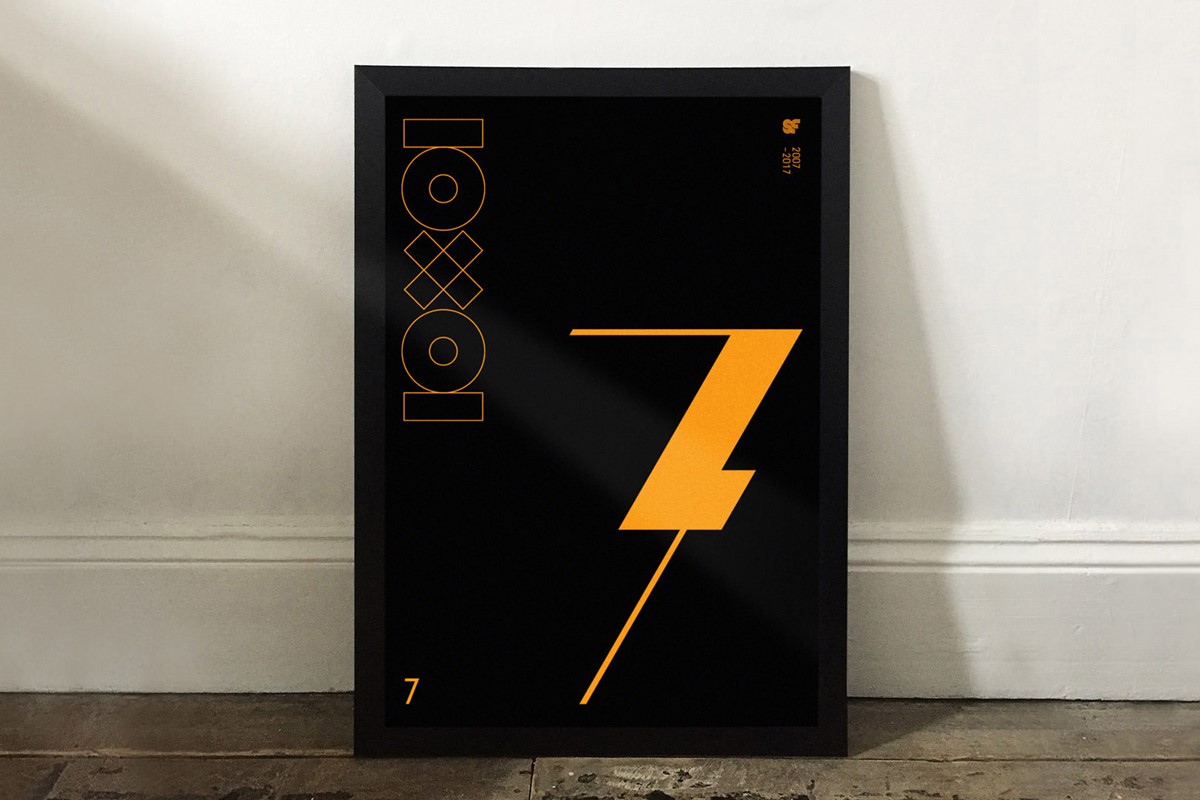
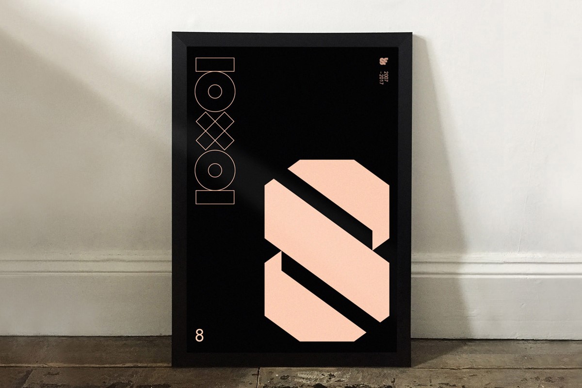
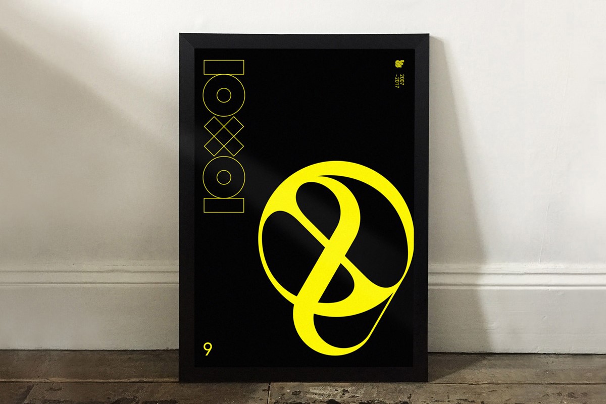
10 years of Superfried design studio was a special milestone for me. So to celebrate, I wanted to develop a personal project that represented the creative output over the past decade. Unintentionally, bespoke typography has become significant within my creative solutions, with a distinct focus on numbers in my recent typographic experiments. With this in mind, I decided to select my favourite 10 digits from my 10 strongest numeral sets – hence 10x10.
This was difficult, particularly with the sevens and eights which were usually the strongest within each collection. Decisions are always so much harder when they are personal rather than simply logical, but eventually, the 10 were selected.
However, with a new birthday, it would be remiss not to create something new. So a completely fresh numeral set was also designed to complete the 10 – which also triggered a subsequent typographic experiment – Flex.
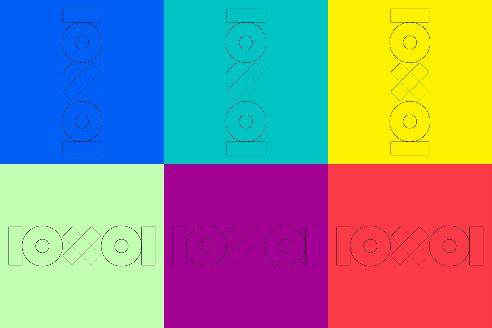
With the numbers selected, a completely geometric, wireframe 10x10 brandmark was developed to feature on the digital posters and teaser anims. The minimal, light style would allow for use at scale without distracting attention away from the featured numerals.
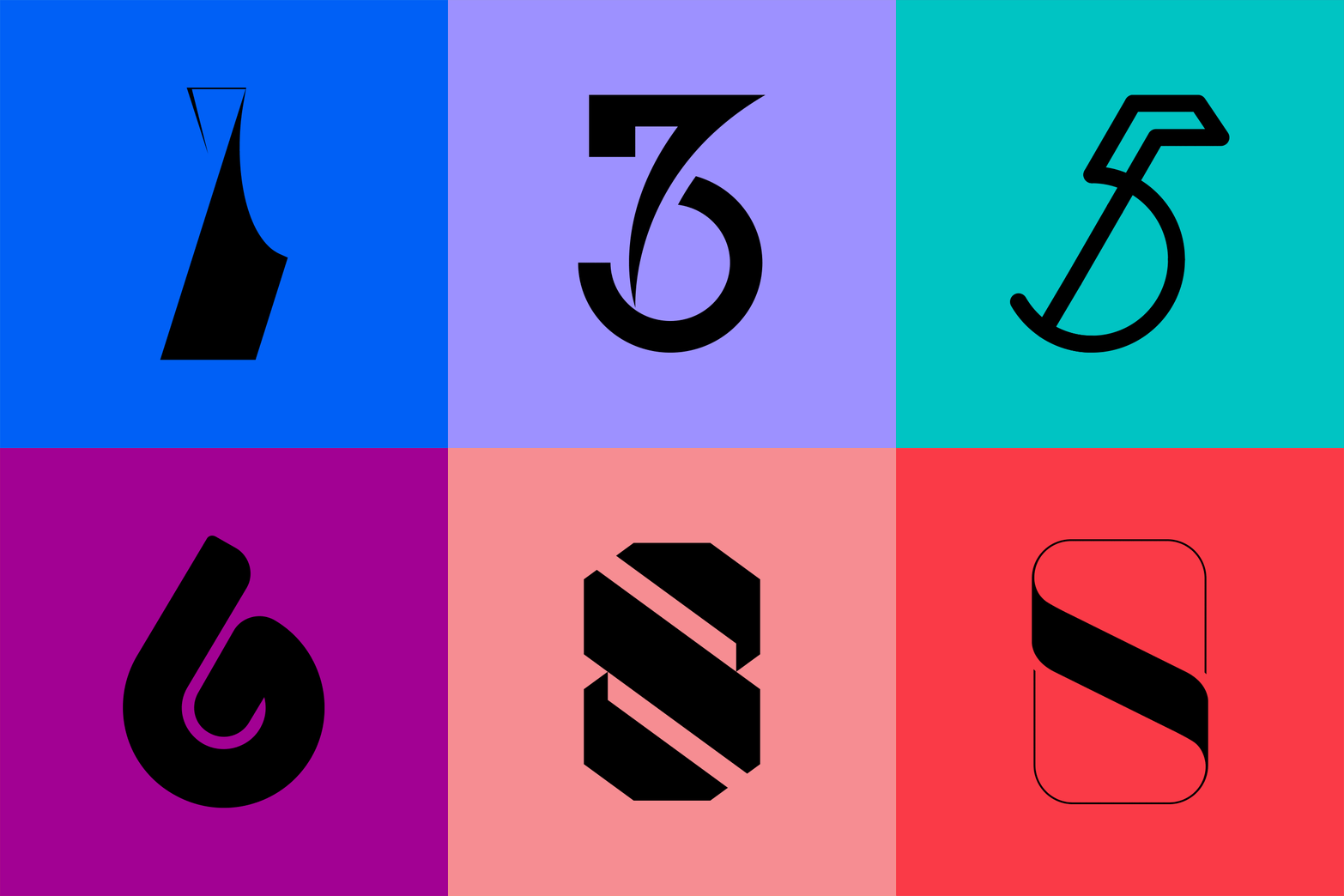
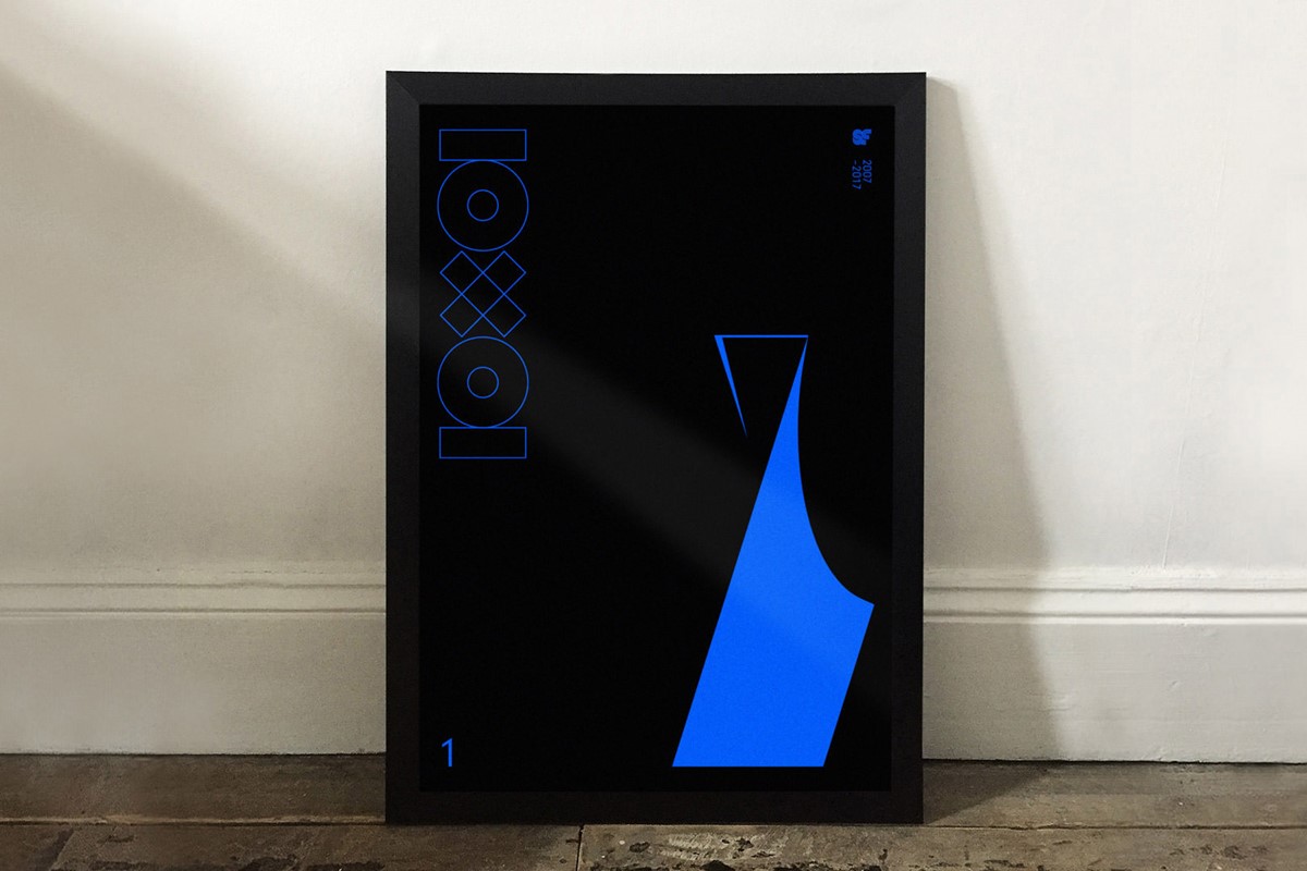
Now decision time again. The best digits, one from each set, would be the star of one of the ten digital posters. To add impact a bold, 10-colour palate was devised for use across all design iterations. Finally the addition of another year of creative work to the existing design showreel.
Project services
- Bespoke Typography
- Illustration
- Art Direction
- Number design
Testimonials . Press . Awards
This typographic design project has been featured on numerous industry leading design sites, such as Creative Boom, FormFiftyFive, Print Mag and was also shortlisted for the Creativepool Awards 2018.