
Oblique Lo-fi 3D type design experiment
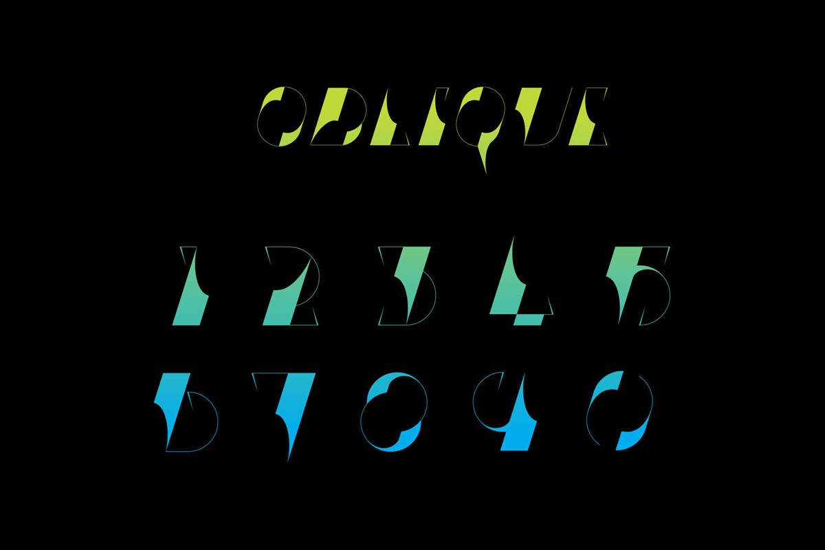
Whilst designing my last numeral set, Klaws, an experimental number two emerged that I was rather fond of. Unfortunately, it did not fit with the Klaws typographic design, but was strong enough to become the basis of a new personal typography project. Ironically the number two did not make the cut for Oblique either!
The extreme contrast between the heavy, solid core and light extenders was powerful. However, as the thick stem was applied to the other numbers the variation in angle of such a dominant feature became jarring.
What if all of the numerals could be based on the same stem and angle?
To do so, would require the use of an italic typographic style, something I had not attempted before. Although challenging, the creative direction worked. The oblique orientation of the bespoke typography led to the project name, so the required letters were also designed for – Oblique – however, this time I was smart enough to avoid creating the complete alphabet!
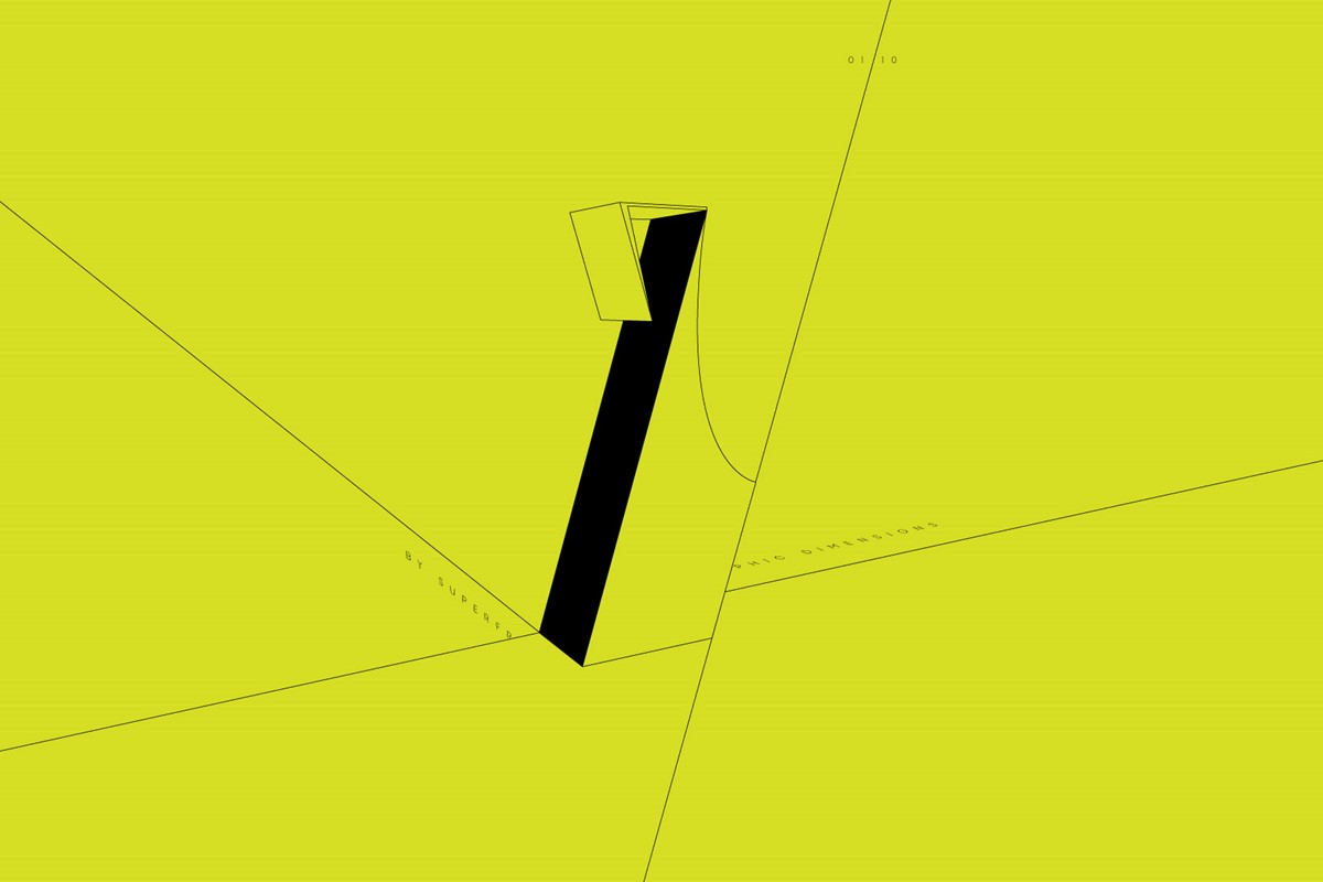
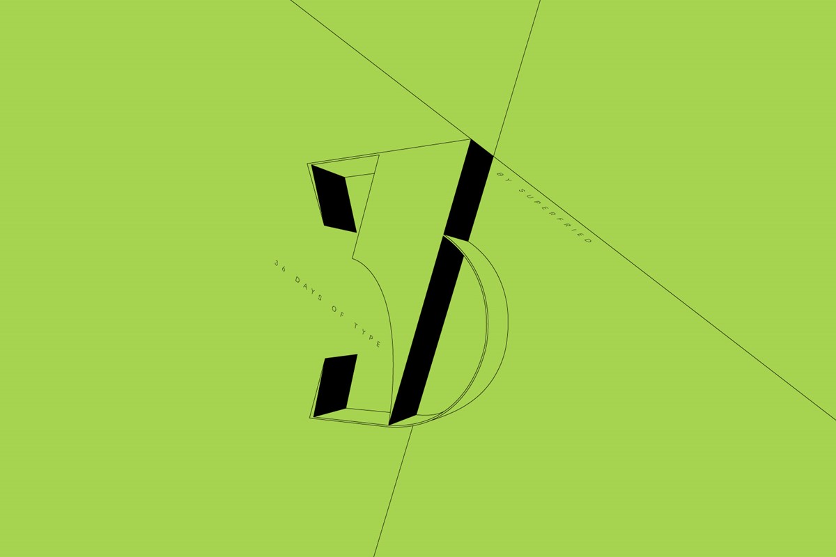
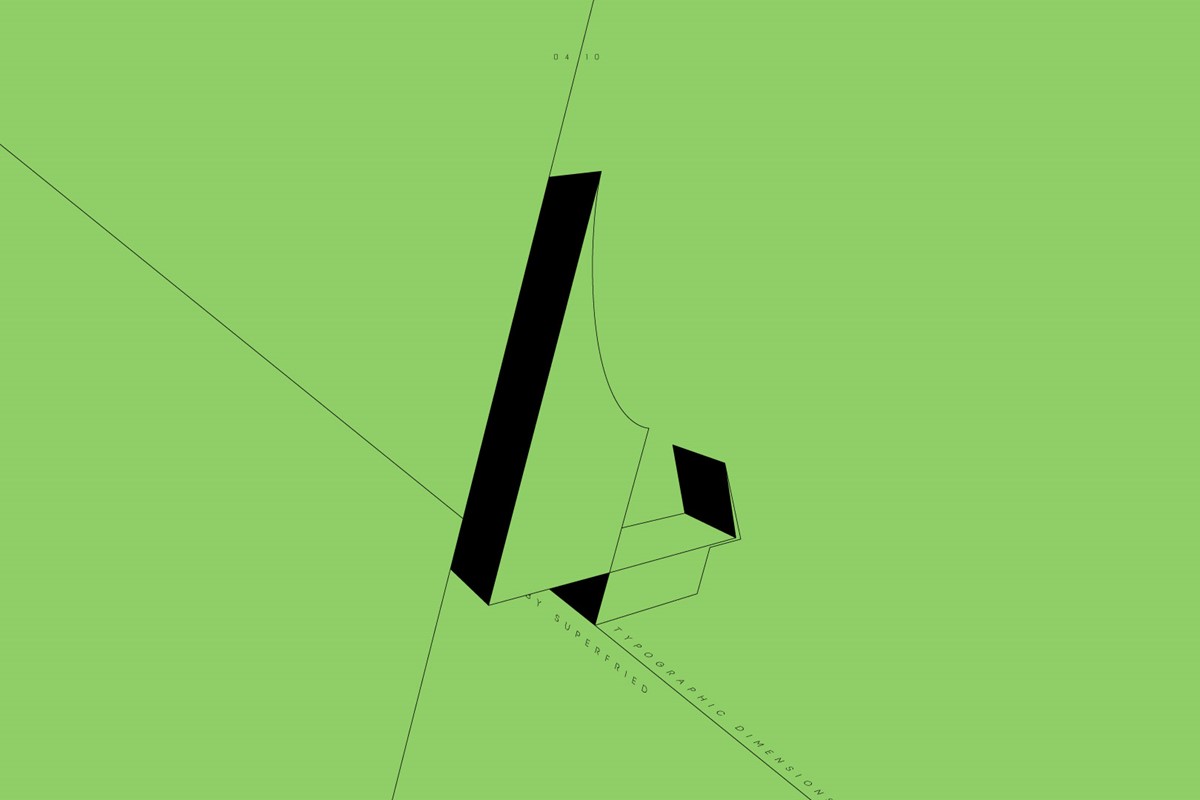
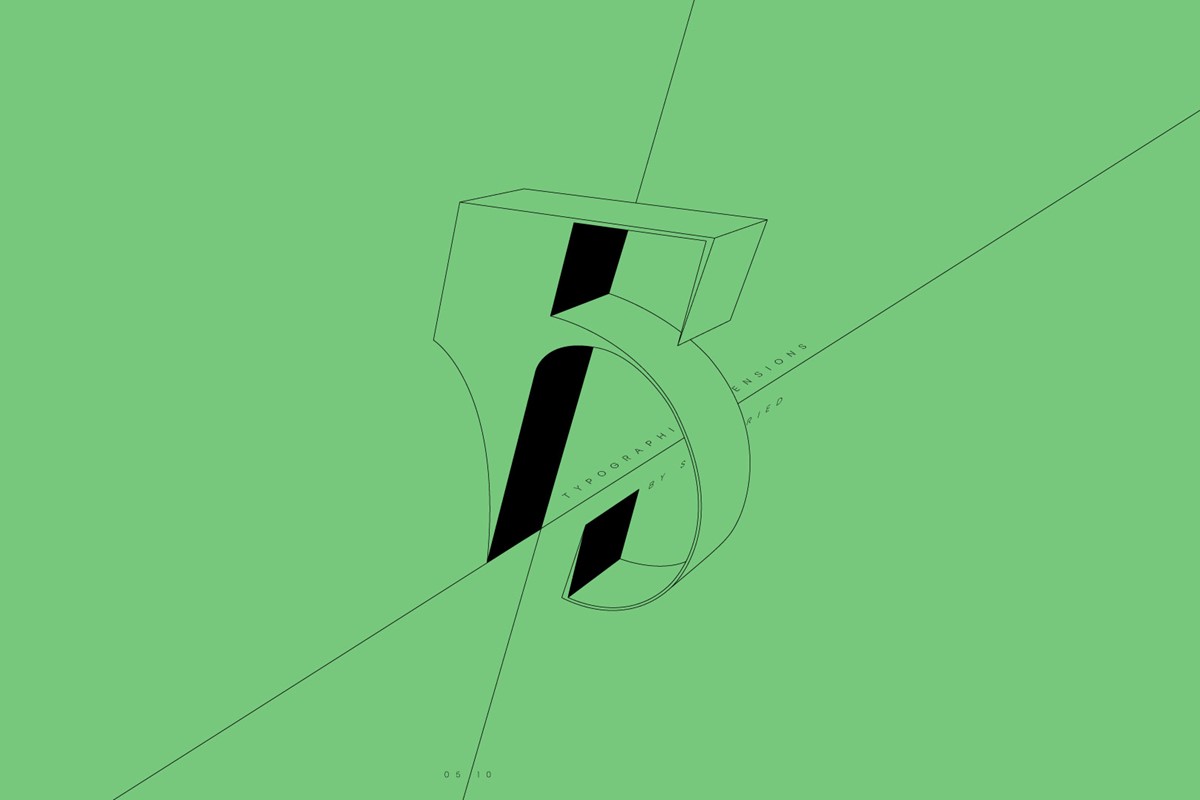
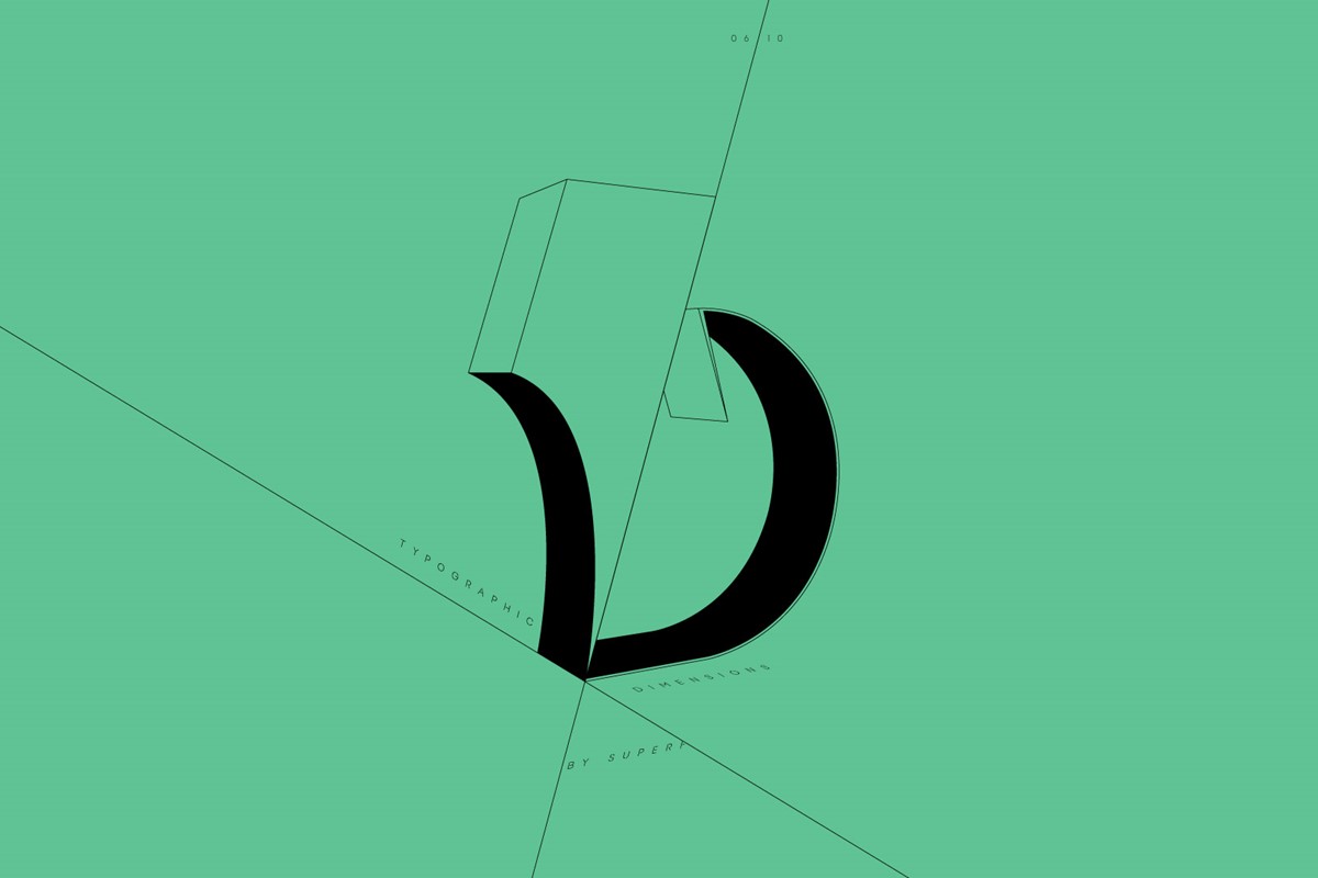
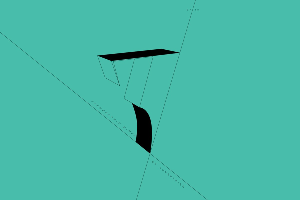
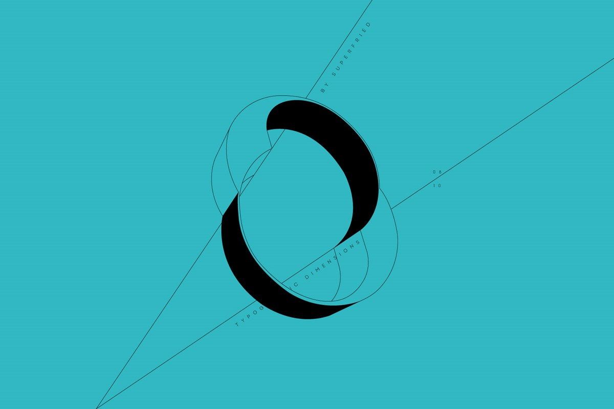
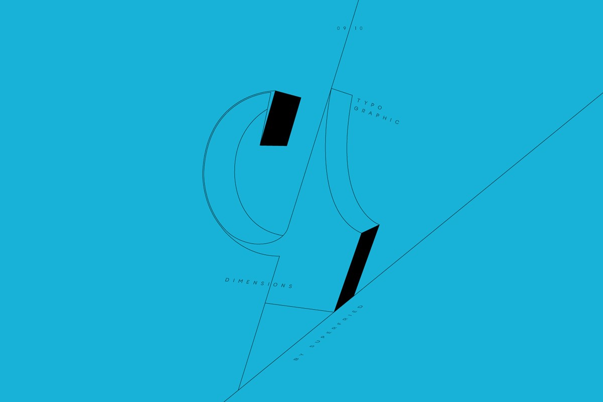
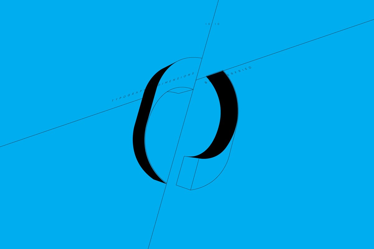
With the 2D typographic designs complete I was intrigued to see how they would work in 3D. However, polished 3D typography was everywhere, so I wanted to go for a completely different, lo-fi aesthetic.
Bringing the illustration styles into C4D, I quickly extruded the numerals by the same value. I then simply screen-grabbed each at their best angle. The screenshots were brought back into illustrator, where the 3D versions could be re-traced in vector form. For each number, its orientation now dictated the design experimentation via the use of simple lines to create confusing 3D planes and ambiguities. This creative freedom was continued with the additional typography used to emphasise the structurally impossible nature of the design solutions.
Project services
- Bespoke Typography
- 3D Typography
- Art Direction
- Graphic Design
- Number design
- Typography
Testimonials . Press . Awards
This typographic design project was featured by industry leading design site Creative Boom.