
Numero Deco – Revisited 2D + 3D Typographic design experiment
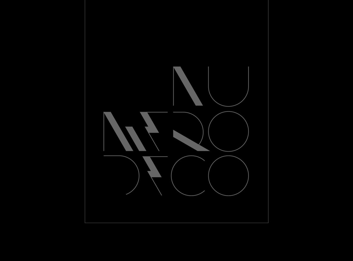
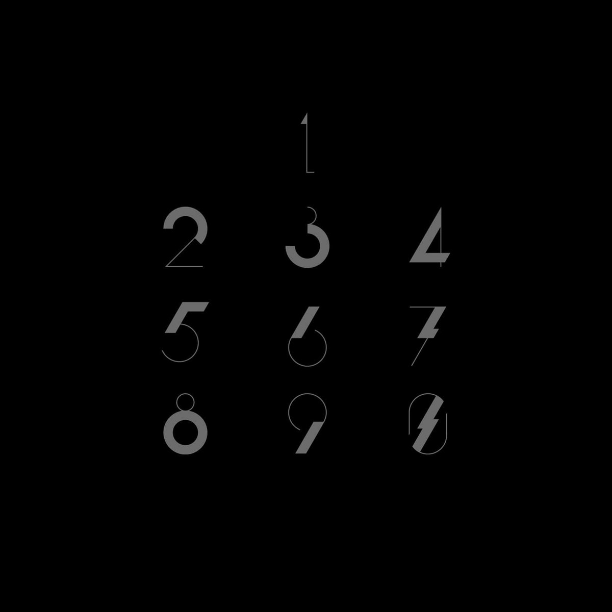
A few years ago, whilst experimenting with typographic designs for an editorial piece a completely inappropriate Art Deco type style emerged. So when time permitted, I proceeded to develop a complete numeral set as a personal project. Since the letterforms were so clean and minimal, in complete contrast, I rendered the bespoke typography as 3D structures combining a mixture of materials.
Upon reviewing the work recently, I felt the original 3D designs were too intricate and the selected palette too garish. Although the idea to take them in completely the opposite direction was bold and made sense, the renders had lost the simple elegance of the original design styles. So it was time for a revisit.
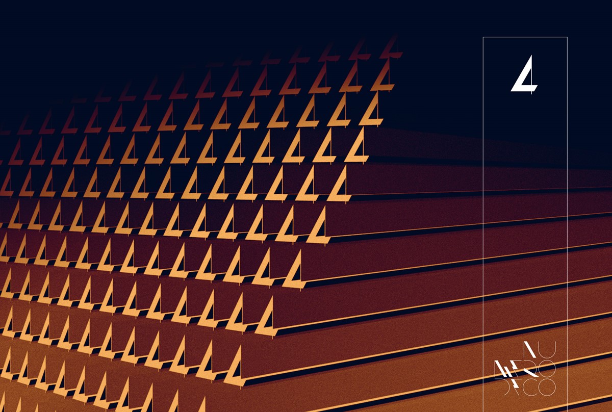
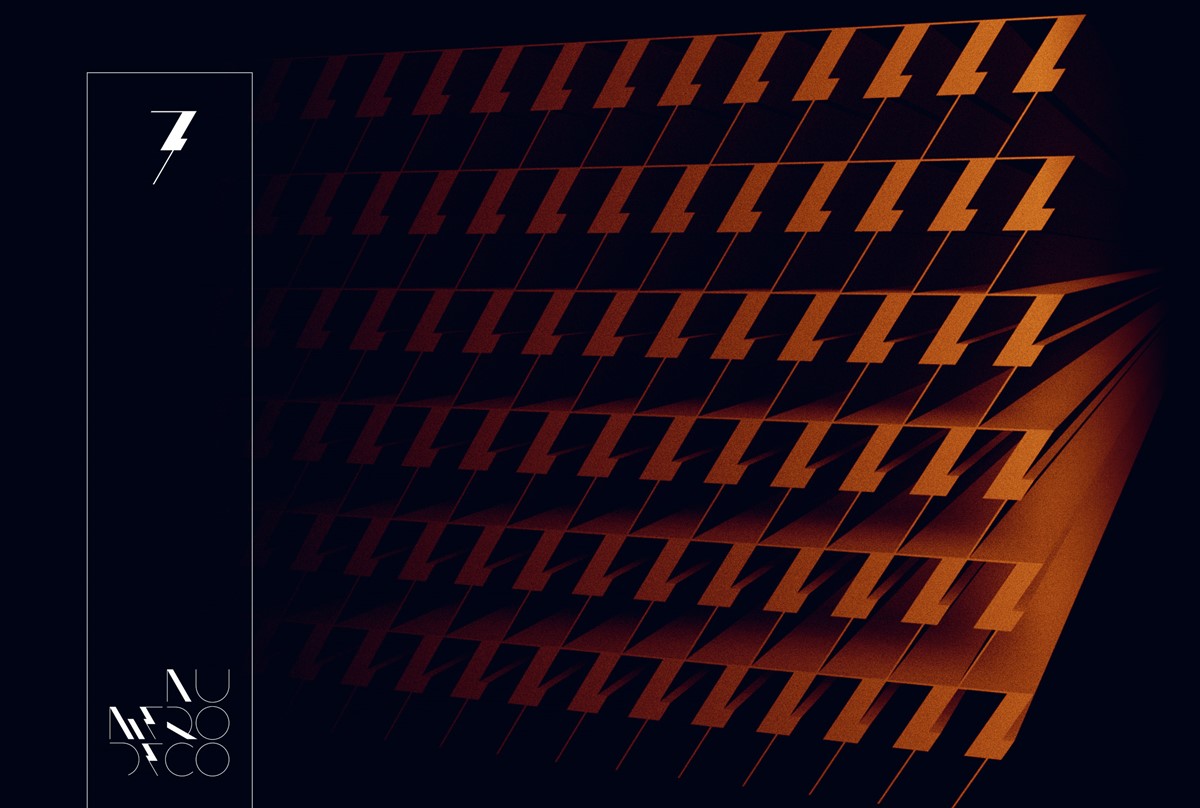
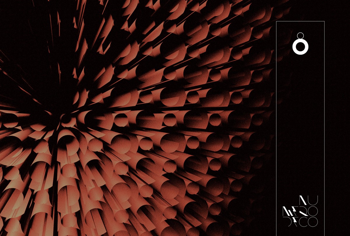
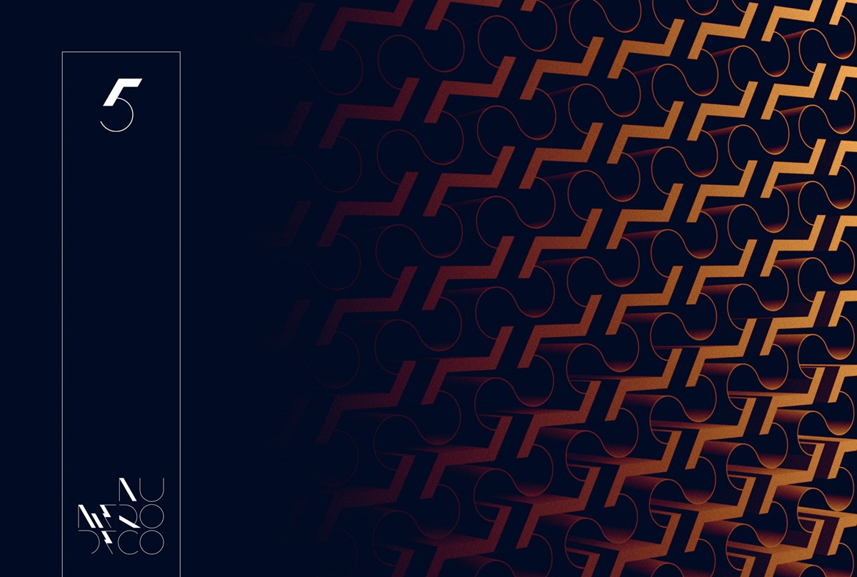
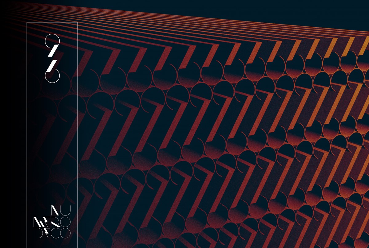
For the first design iterations, the 3D experiments were quite complex. This time I wanted to take the opposite approach. The very simple, geometric forms lend themselves to repetition and pattern. This creative direction moved towards a more structural / architectural route via simple infinite extrusions.
Simplification of the design process led to rapid, ambiguous, and unexpected results which were rewarding due to the sense of impact and scale created. To emphasise the effect, a dramatic lighting style and a more restrained, muted colour palette were applied throughout the renders. The re-visit, although less flamboyant, felt a much more appropriate direction.
Project services
- Bespoke Typography
- Typography
- Number design
- 3D Typography
- Graphic Design
Testimonials . Press . Awards
The original Numero Deco typographic design project was featured in internationally renowned graphic design publication IdN Magazine [IdN v23n3].