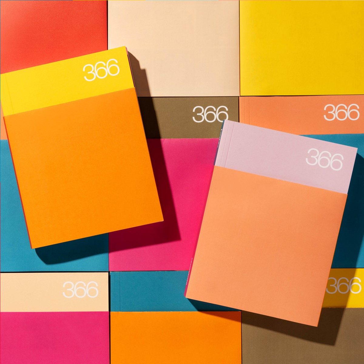
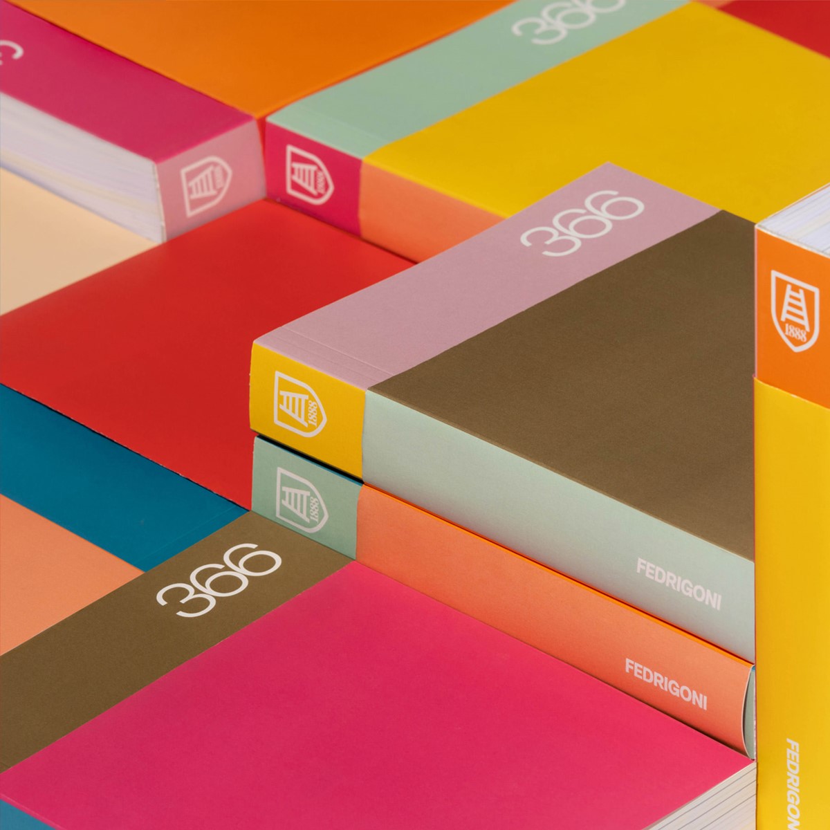
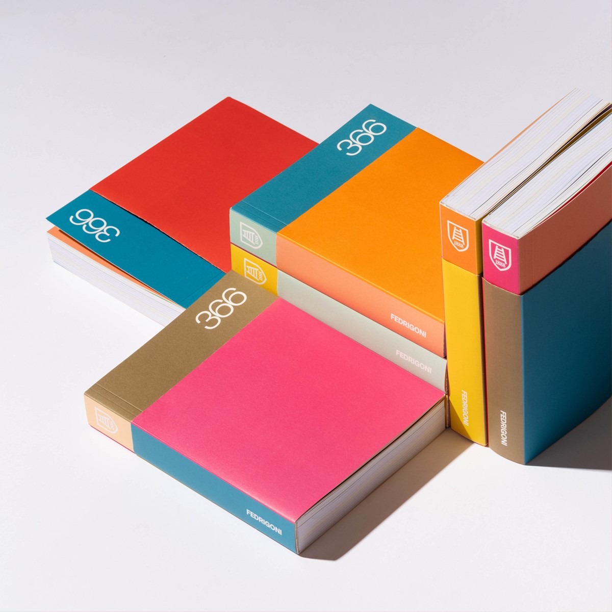
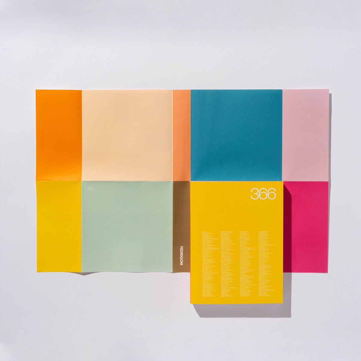
Fedrigoni 366 – 2024 Calendar design submission
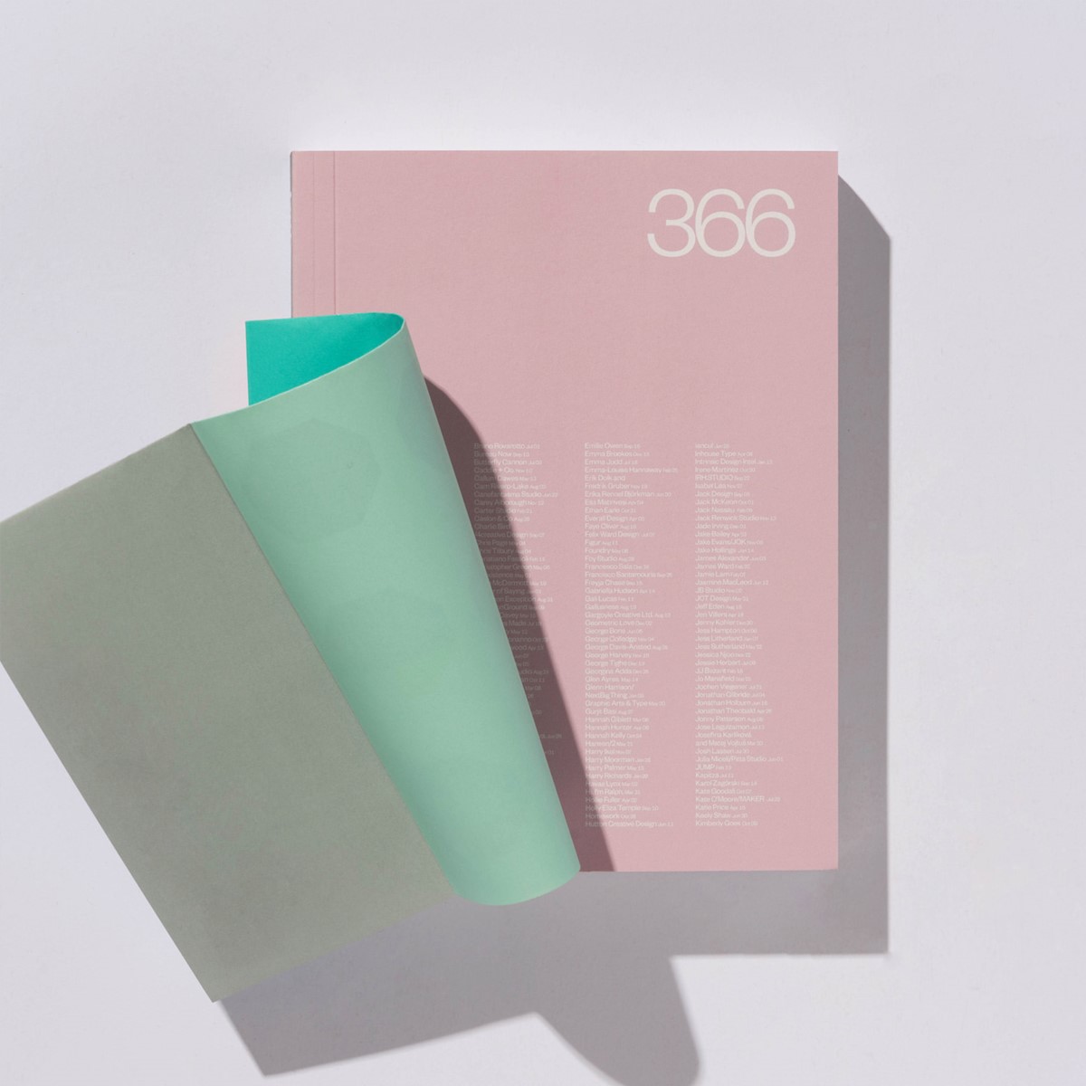
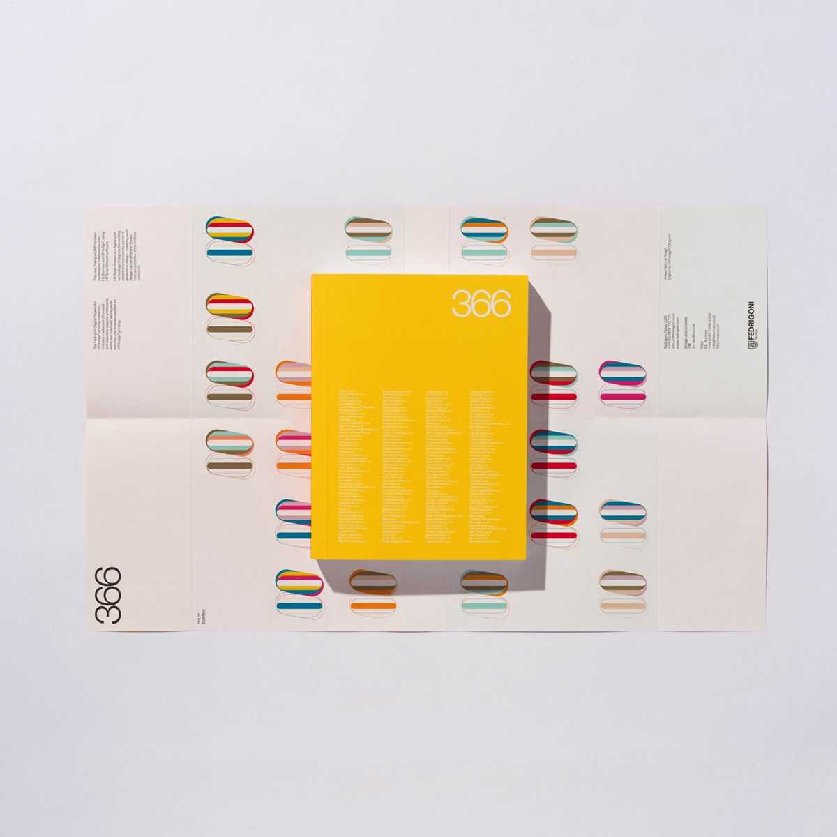
Designed by TM Studio, for Fedrigoni papers UK, Fedrigoni 366 is a calendar where the content is created by UK-based creative studios and individual graphic designers who have been selected to contribute. Each participant is assigned a date to represent within their submitted design solutions. In addition to 2024, design studio Superfried has been privileged to feature in – Fedrigoni 365 2019, Fedrigoni 366 2020, Fedrigoni 365 2021 and Fedrigoni 365 2022.
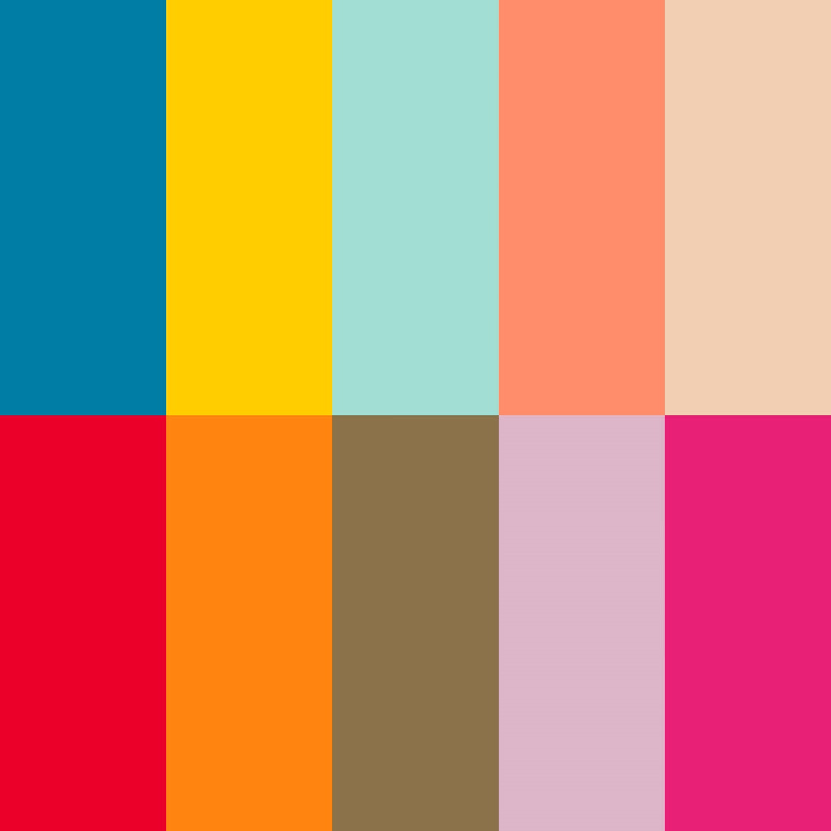
Each year the format and brand guidelines for the entrants change. This year the typographic designs are restricted to a palette of 10 designated colours from one of two palettes (orange or green) from which each design submission must include at least three colours. Subsequently, the colours will be randomly shuffled within the creative solutions to generate different design iterations for each book.
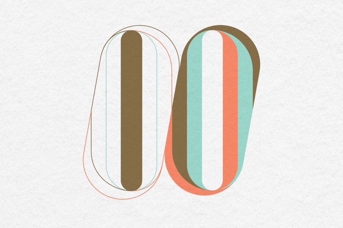
For this edition Superfried design studio was assigned the 10 May. Once again, like the tricky number 12 I was assigned for 2020, I was initially inclined to revisit the use of Roman numerals. However, I always like to try something new and avoid taking the easy option. Therefore, I reverted to my usual design process and looked for commonality between the numbers – 1 and 0, which upon first inspection, appeared unlikely. But, as I explored more condensed lettering, it became apparent that the counter of the zero could also represent a 1. I ran with this theme with each numeral being the inverse of the adjacent. This had some potential but did not satisfy my default preference for balance.
What if the zero was duplicated, but the application of the colour reversed?
There is no doubt that the design solution was now more ambiguous, but I have never let a minor consideration such as legibility get in the way of a typographic experiment! ; )
I had a strong route, but since this is an annual event I like the idea of retaining a subtle connection between each of Superfried's selected design solutions in the Fedrigoni 365 Calendar series. All of the typographic designs to date have featured some optical element or suggestion of depth. With this in mind, some tricky, interlocking planes were introduced. The segmented structure would also allow for the inclusion of multiple colours as requested within the Fedrigoni design brief.
The calendars can be purchased from Counter Print, with all profits from previous editions donated to charity raising over £30,000 to date.
Project services
- Bespoke Typography
- Typography
- Number design
Credits
Purchase the calendar now from Counter Print.
–
Calendar designed by TM Studio.
–
Printed by FE Burman.
–
Paper by Fedrigoni.