
Comic Sans vs Cancer Type experimentation for charity
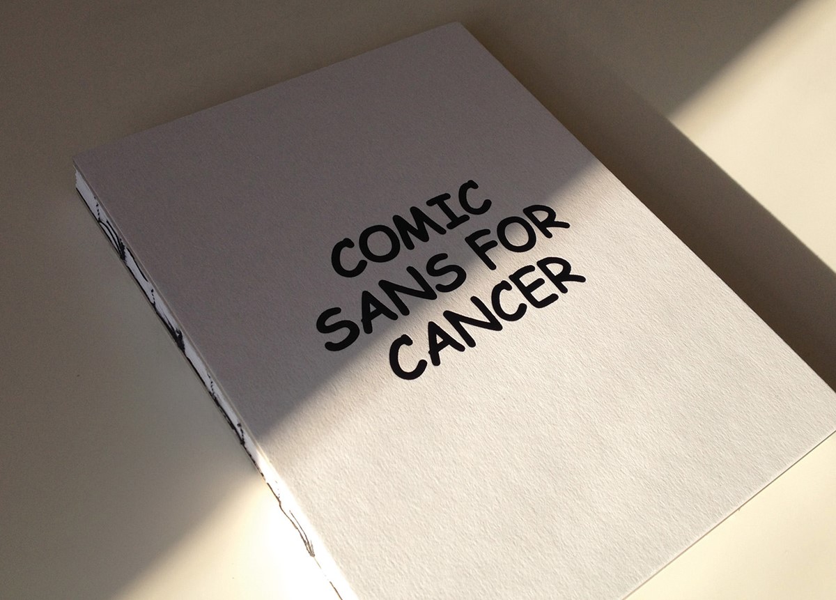
Curated by Chris Flack, Renee Quigley and Jenny Theolin, Comic Sans for Cancer was an initiative to raise money for Cancer Research, whilst also celebrating the 20th birthday of the typeface designers love to hate.
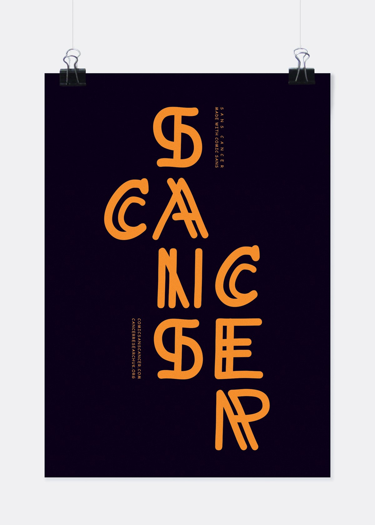
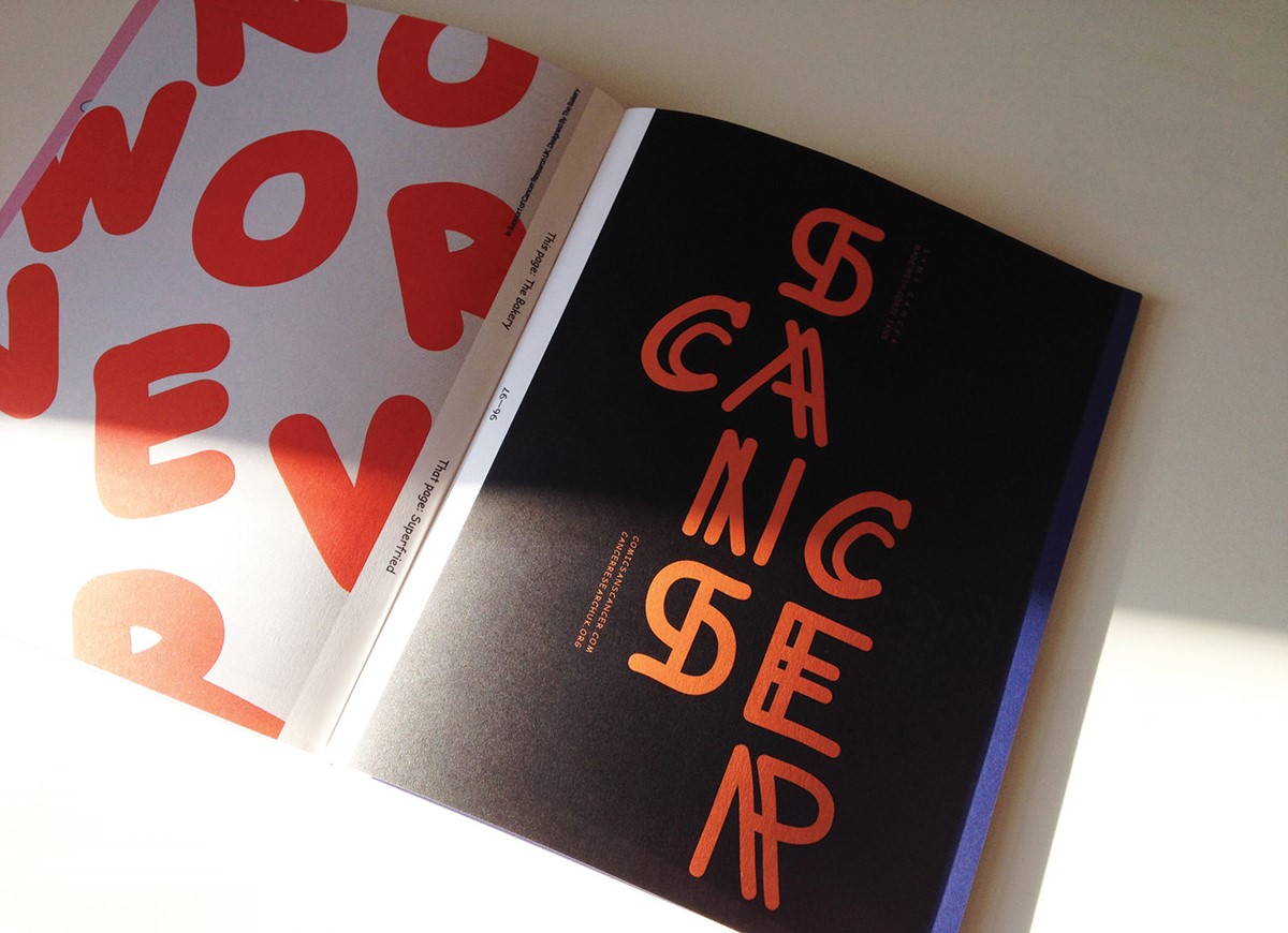
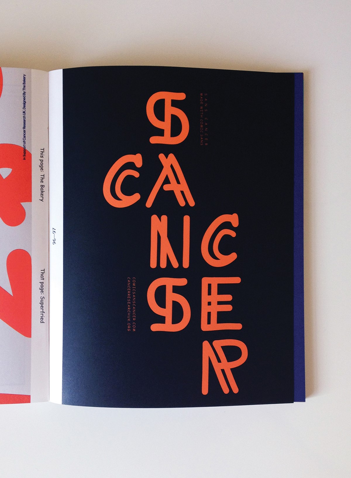
For the Superfried design submission I felt that the idea should be strong both visually and verbally. Playing on the typeface name, the word 'Sans' – French for without – was simply combined with the word 'Cancer' thus clearly stating the ultimate desired objective.
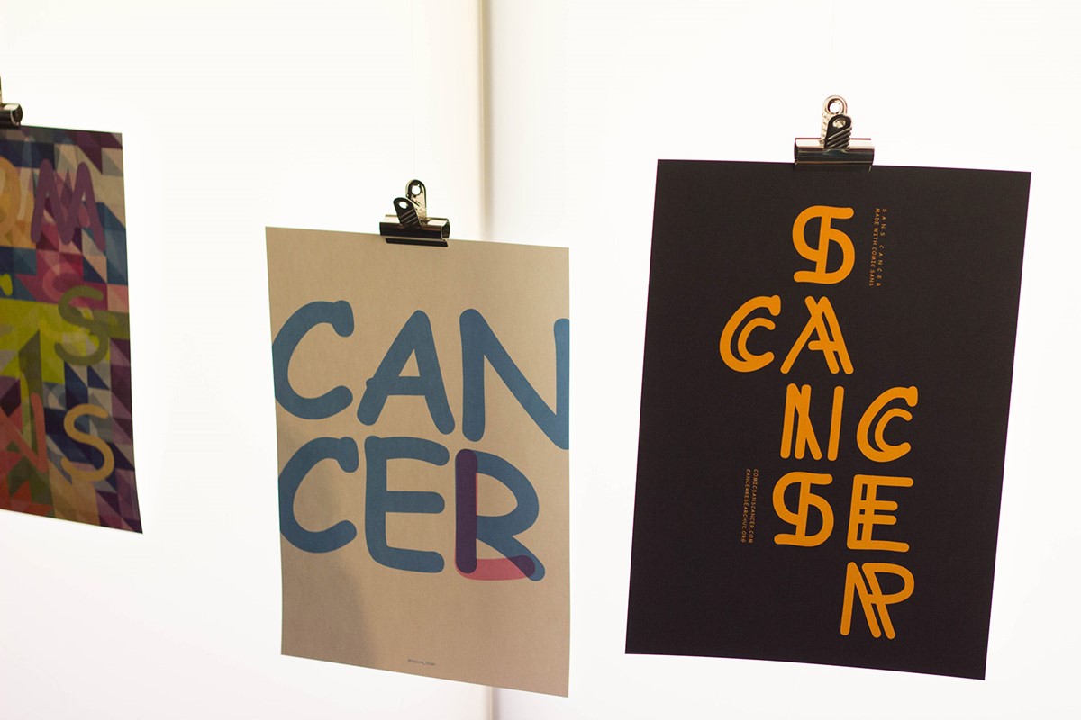
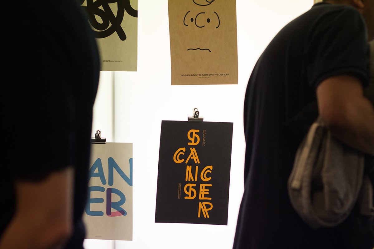
Progressing to the visual aspect, the intention was that the design should be constructed purely from the Comic Sans character set. With so many potential entries, it was important to create something unique using the existing glyphs – a new Comic Sans typographic style was born.
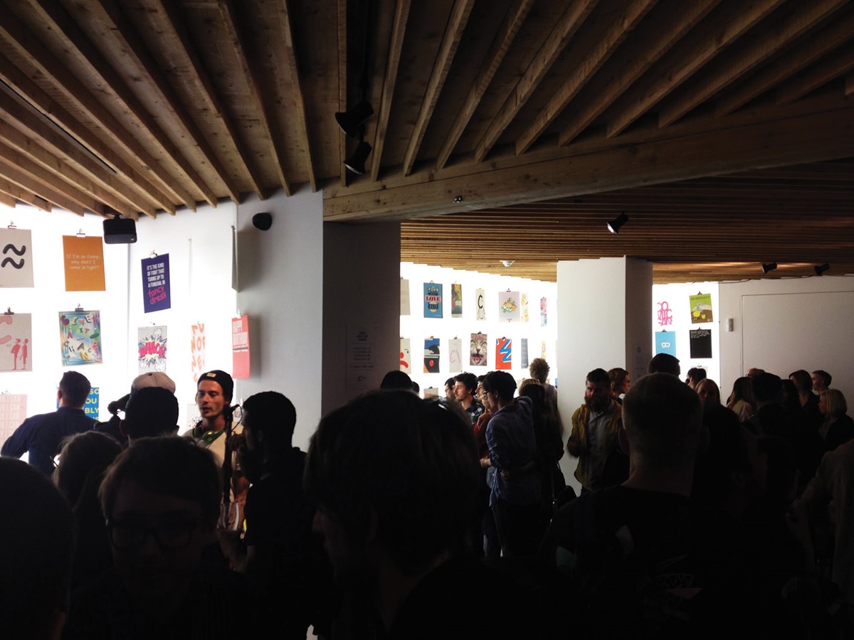
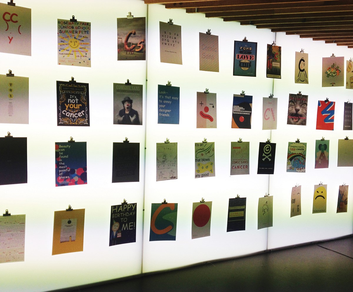
With over 500 submissions Superfried design studio was very fortunate to make the final 200 selected for exhibition at The Proud Archivist and also feature in the rather nice book designed by Dan Bull.
Services
- Bespoke Typography
- Graphic Design
- Art Direction