
Avondale Type Co. ATC Type foundry artist series
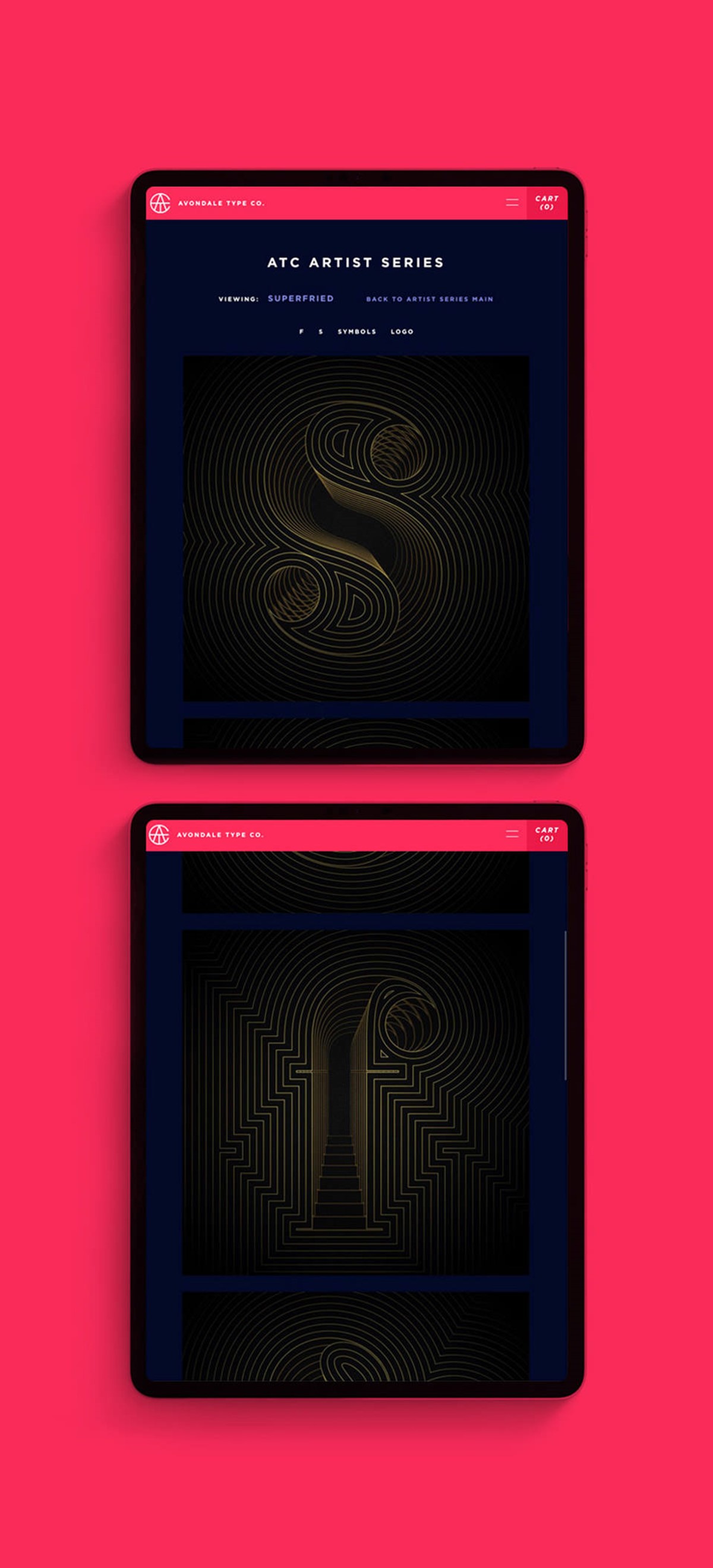
Avondale is a type foundry based in Chicago. As part of their third annual artist series, Manchester-based, creative agency Superfried was invited to create four typographic designs based on one of their typefaces.
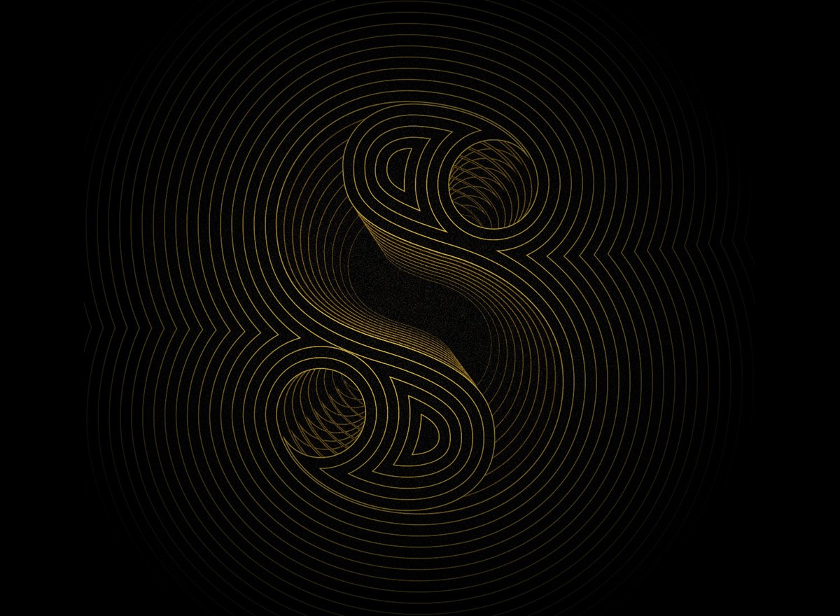
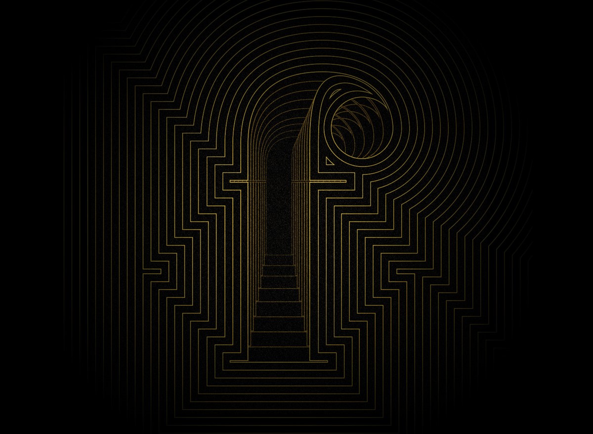
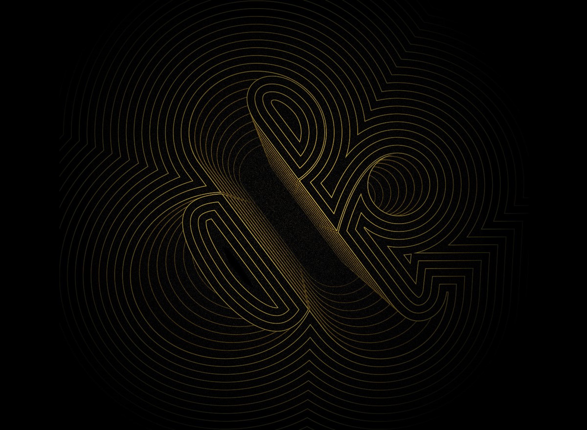
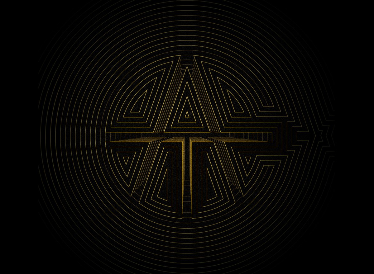
For this typography project, I selected their typeface ATC Rosemary. The brief stipulated that the creative solution must include the participant's initials, their logo design, and one other character. I wanted to experiment further with an idea I had used for the seven in the Klaws experiment, with the character taking the form of a void. My initial design iterations led to a surreal place with multiple, mechanical worms creating the form of the S on their route down into the abyss. The creative solution was striking, but not practical for all the letters. I then moved towards more geometric typographic designs, starting with the F – the most difficult of the characters.
A simple graphic design technique using concentric paths to convey a sense of depth was highly effective. So much so, this graphic design technique was also employed for the Fedrigoni 366 2020 calendar submission. As the paths increased in scale the opacity was progressively reduced to create a smooth fade transition into the background.
Project services
- Bespoke Typography
- Illustration
- Typography