

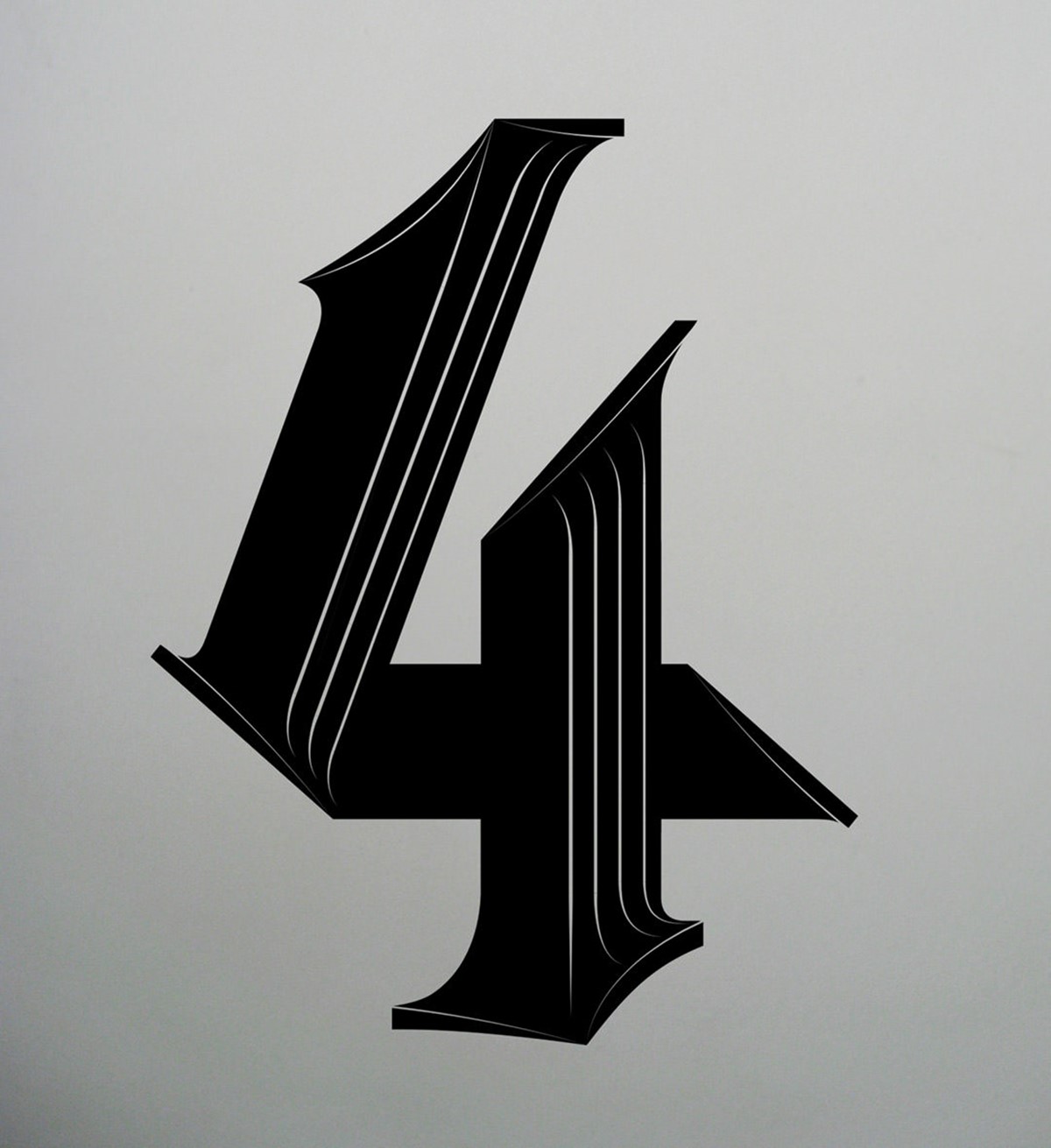


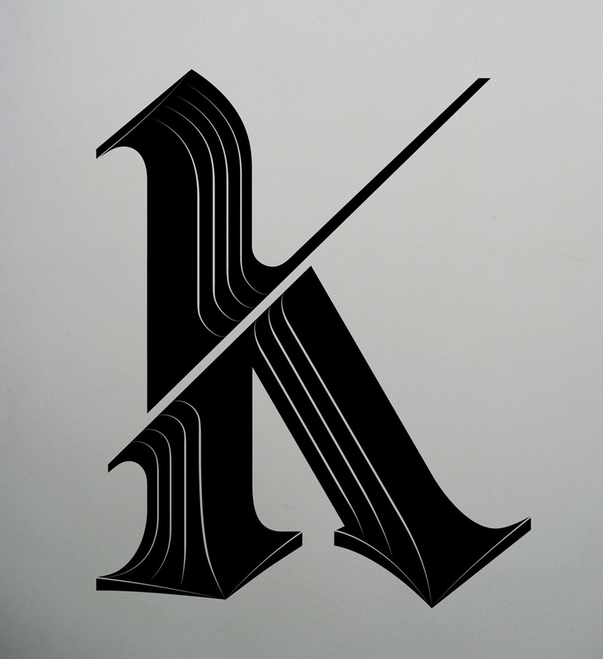
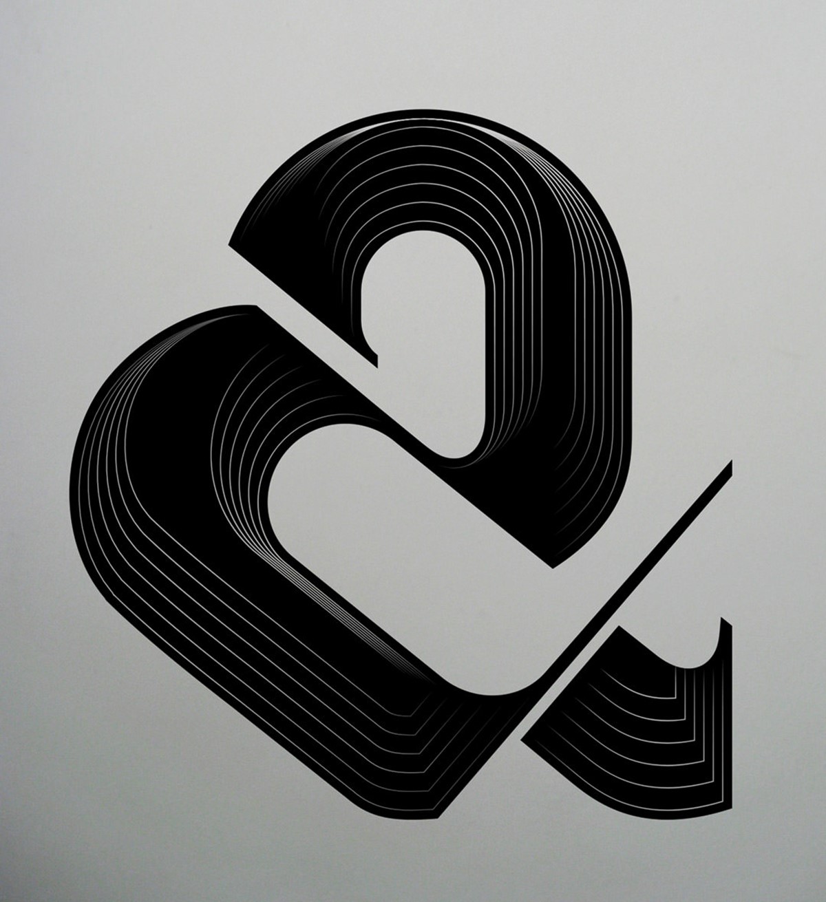
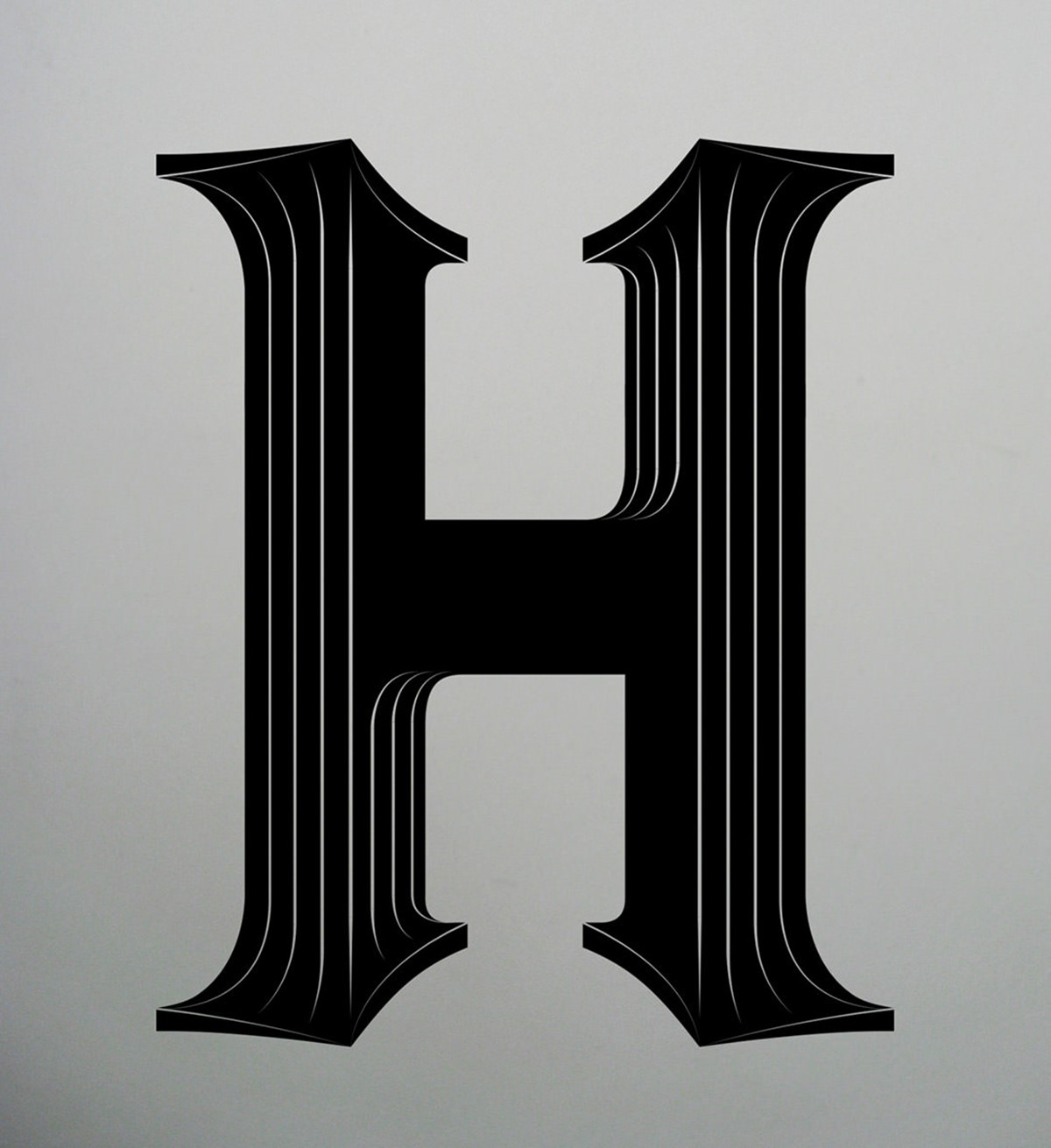


AIGA Type Tuesday BLK LTR Type design experiment
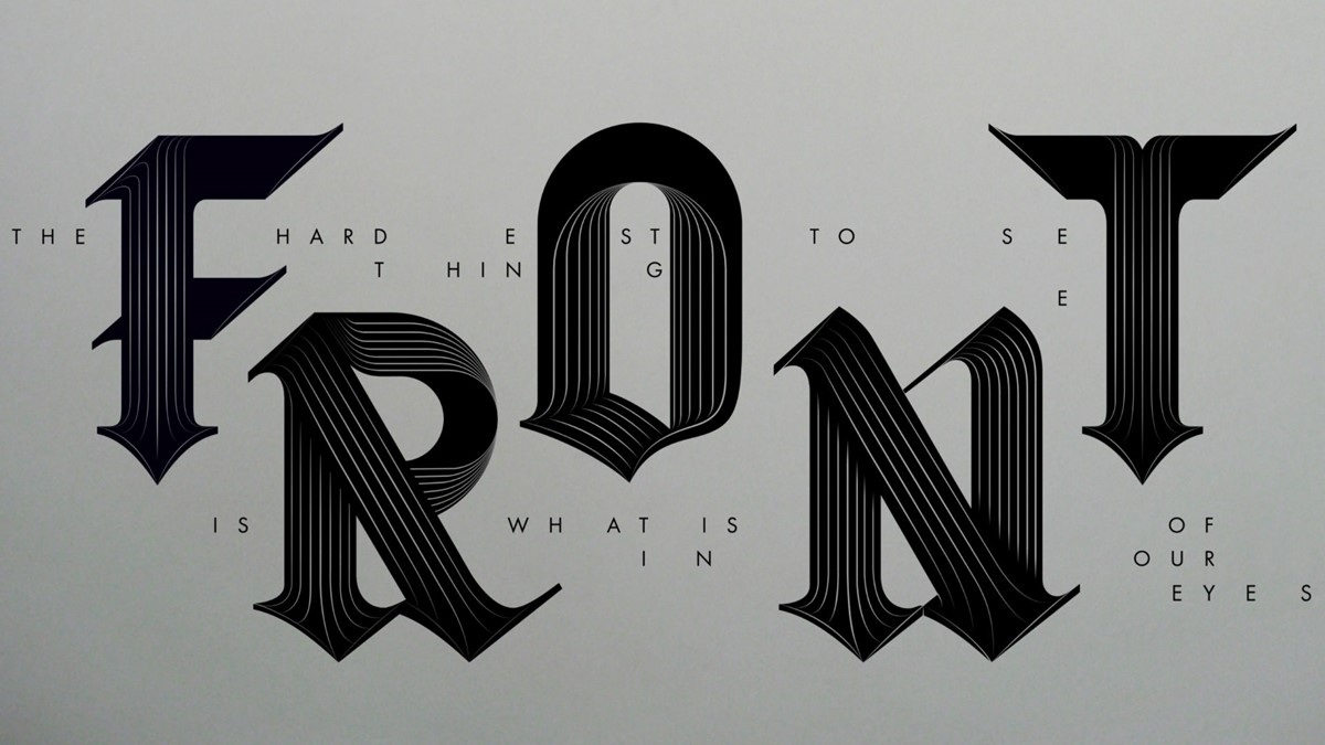
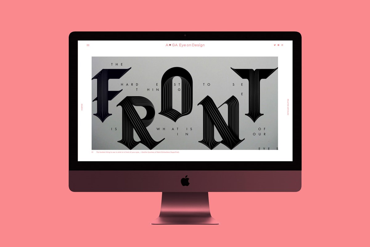
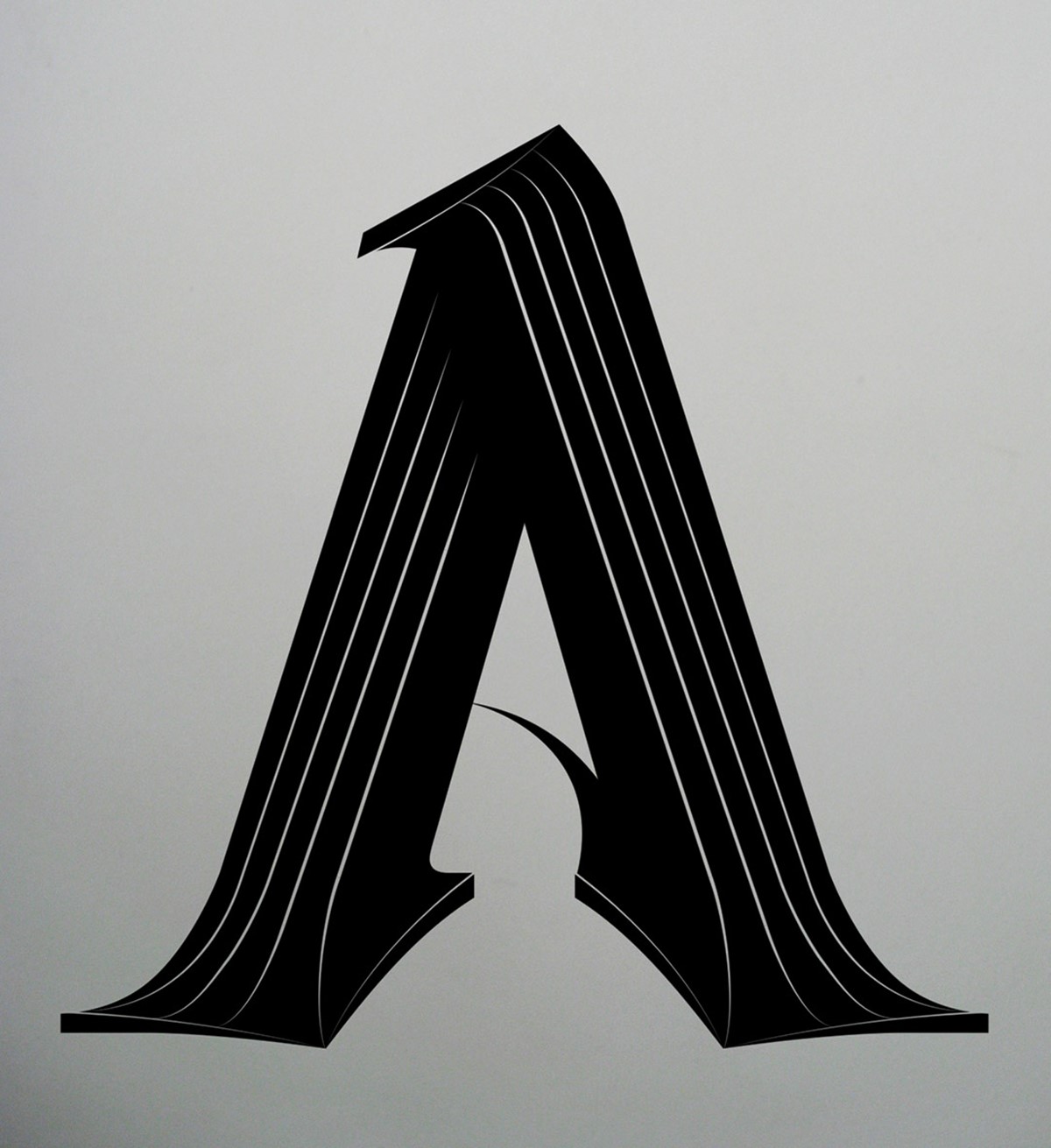
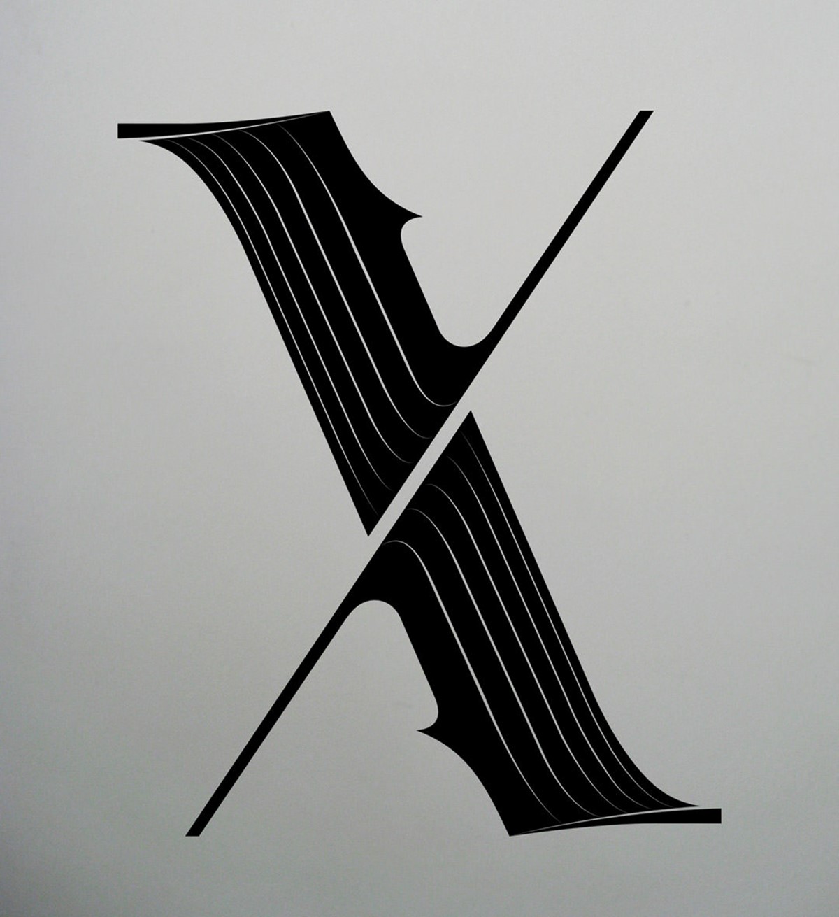
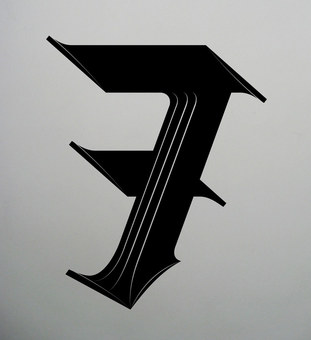
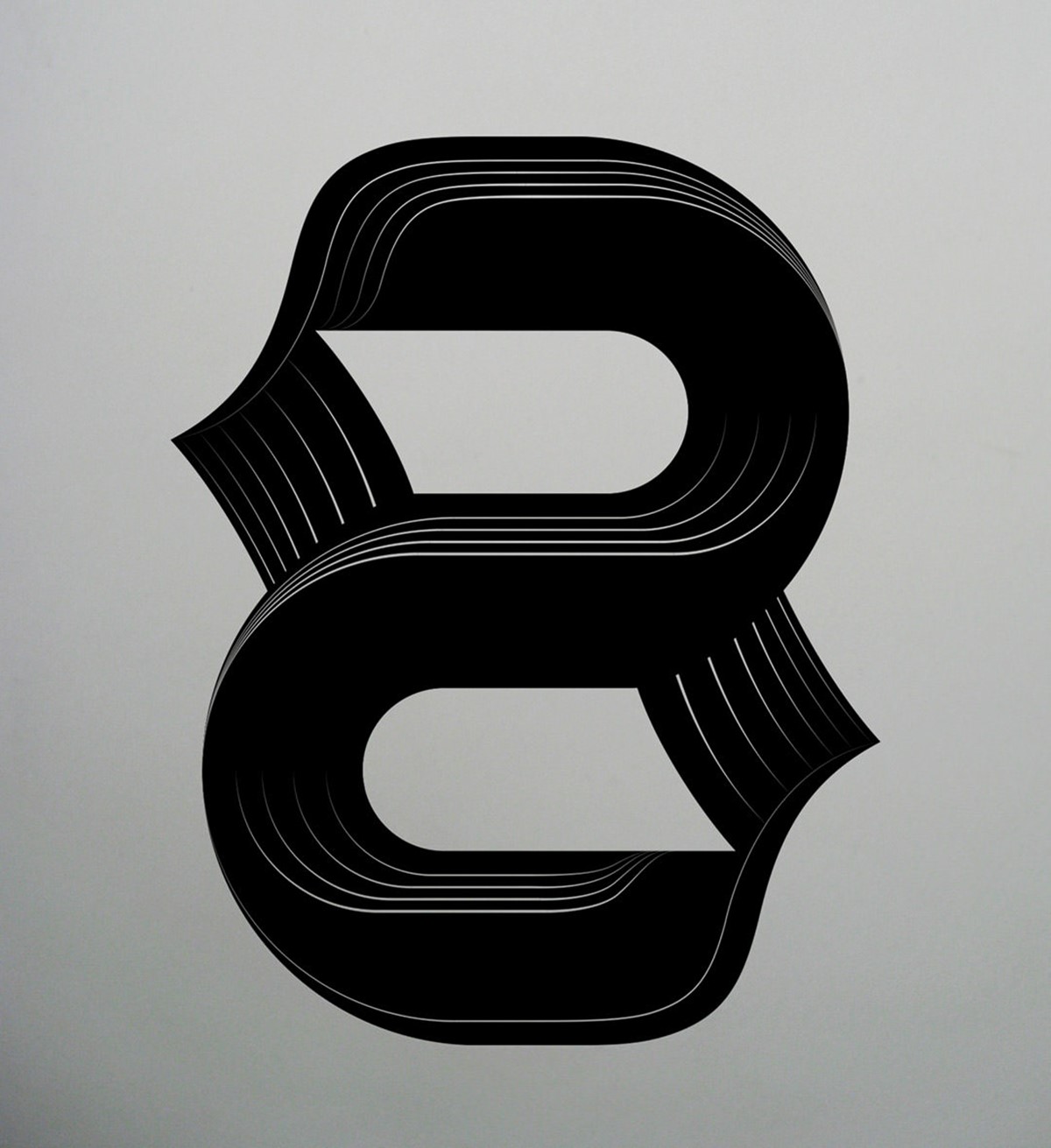
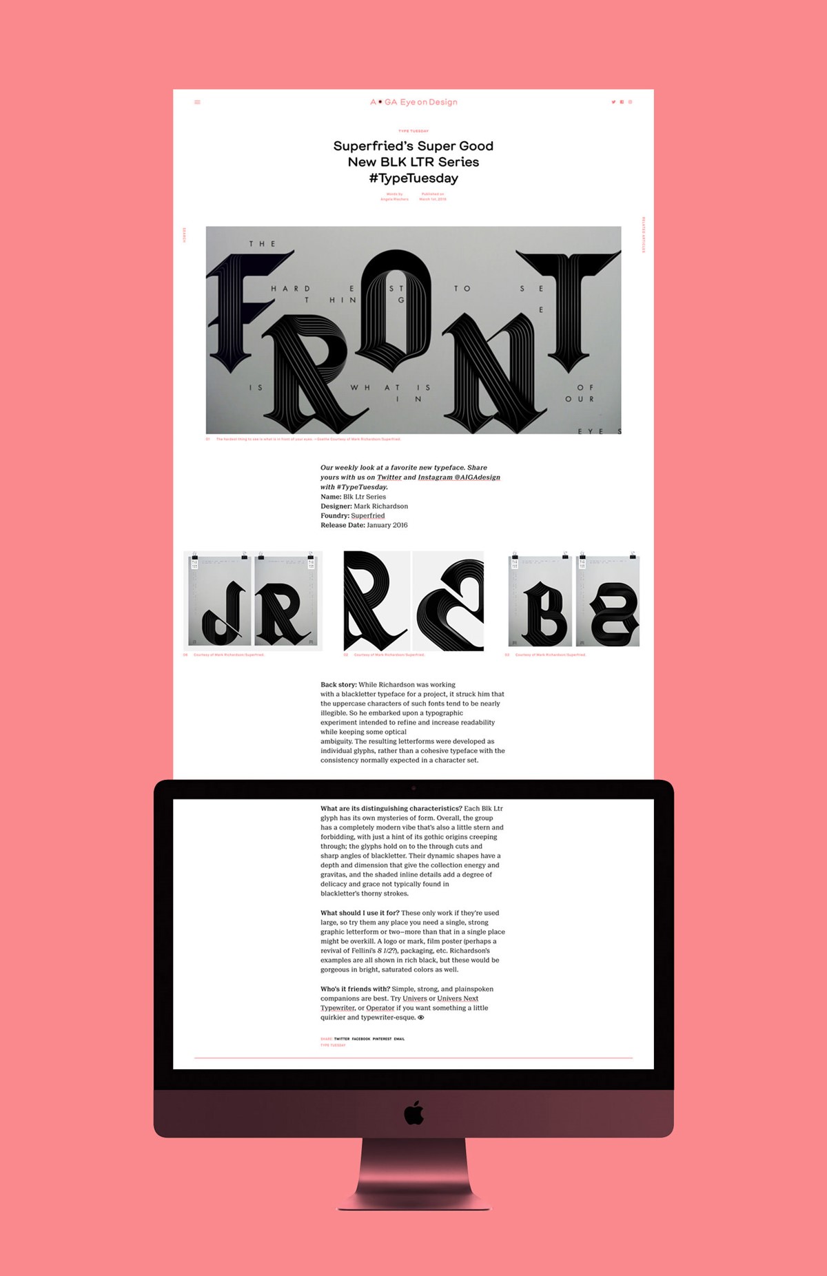
I had recently completed my typographic experiment – BLK LTR Series – and it was discovered by AIGA [American Institute of Graphic Arts] writer Angela Riechers. Angela subsequently invited creative agency Superfried to take part in an interview, and create a typographic design for a quote. The artwork would be used for their regular Type Tuesday feature. I was obviously keen to take part, but nervous about using the type style, as so far I had only created separate bespoke glyphs rather than a complete typeface. The nature of the typographic design also meant that it worked best at large scale, but the quote I had been given was rather long:
The hardest thing to see is what is in front of our eyes.
Fortunately, it contained a key, integral word – FRONT. Consequently, the bespoke typography was applied solely for that word to ensure the lettering style could maintain sufficient scale. Abstract spacing used for the original BLK LTR poster designs directed the layout for the remainder of the quote.
The feature on AIGA's Eye on Design site and the original design experiment were well received. This led to additional press features and became my first award-winning personal project. A subsequent re-visit to this design experiment has been developed, taking the black letter bespoke typography in a completely new creative direction.
Project services
- Bespoke Typography
- Art Direction
- Graphic Design
- Typography
- Typeface design
Testimonials . Press . Awards
In addition to AIGA the BLK LTR Series has been featured on numerous leading design websites including Design Week, Creative Boom, Typostrate, Behance and awarded best of Typography in the 2016 Creativepool Annual awards.