


Zade Film Co Rebranding an award winning videographer
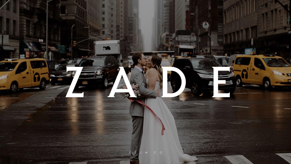
Zade Cross is an award-winning videographer specialising in high-end global weddings. He approached graphic design agency Superfried to develop a branding strategy that would reflect the level of service and expertise he provides.
After conducting the research and discovery phase it was clear that a fine balance must be found for the brand positioning. Weddings are an established, traditional celebration, but the new brand identity needs to be modern and open-minded to reflect its customers. It was also integral that the company should reflect the high-end sophistication of the events he captures.
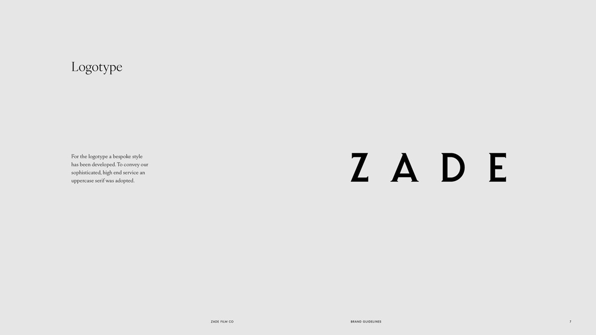
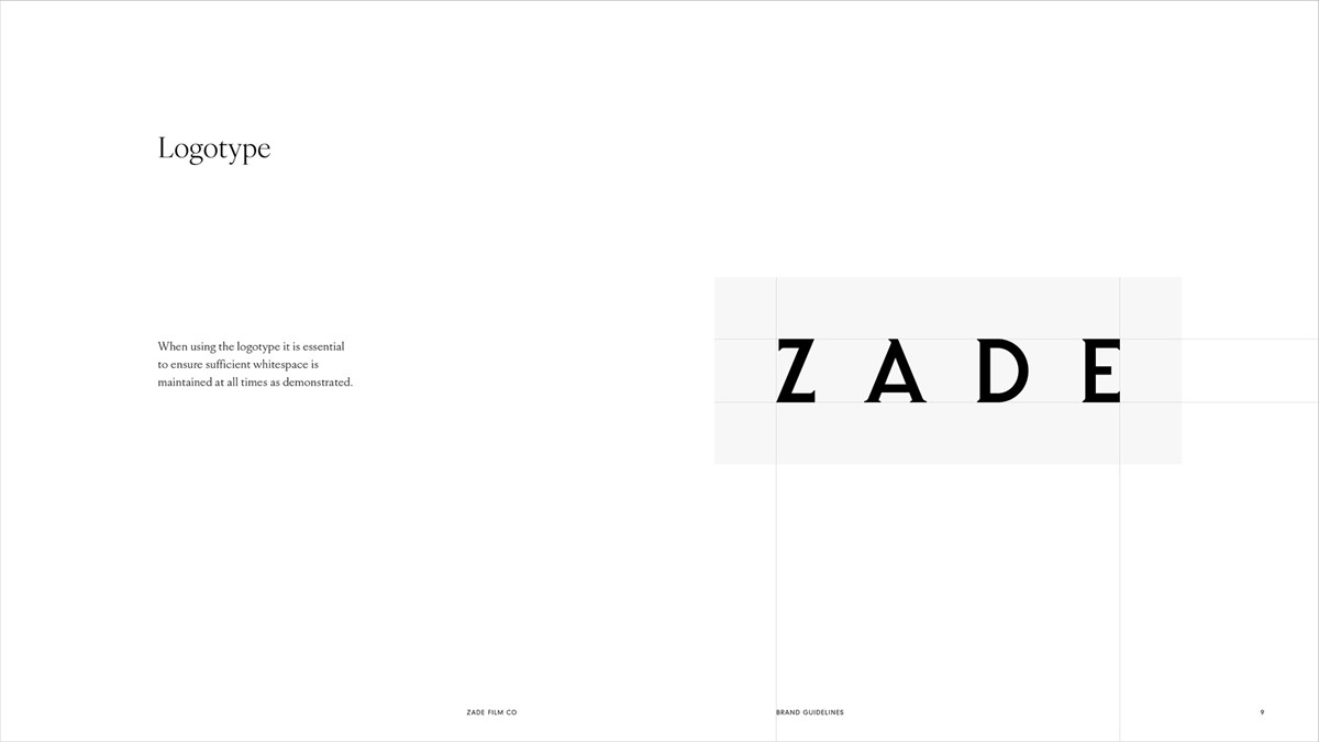
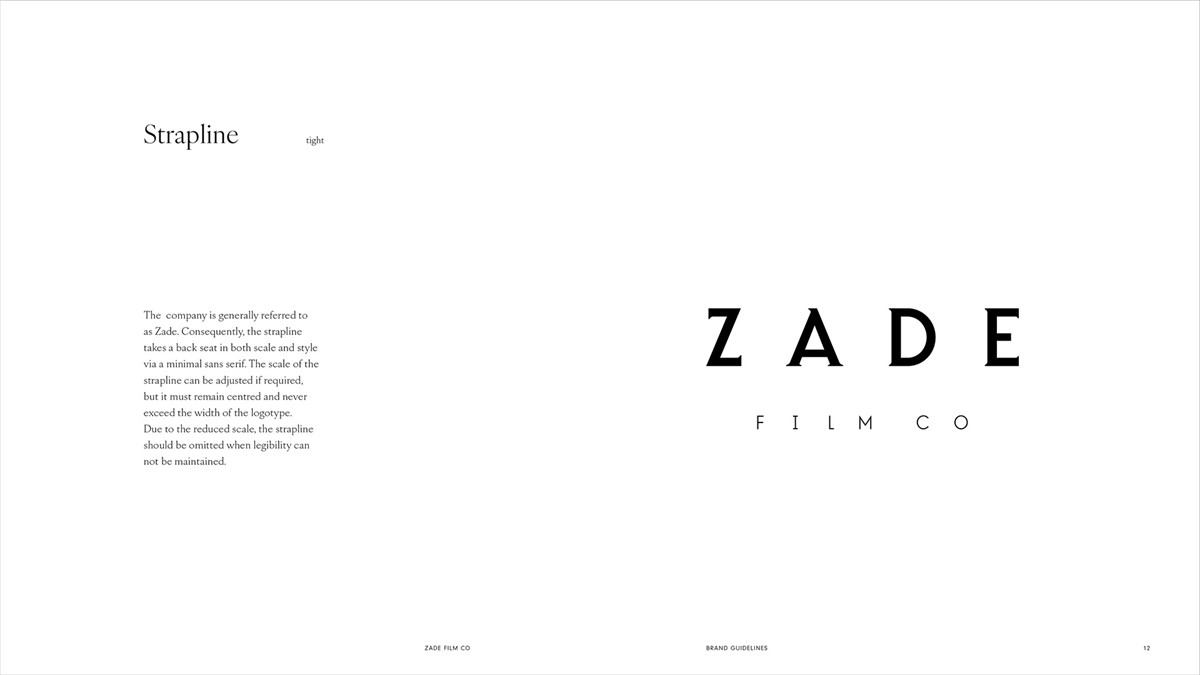
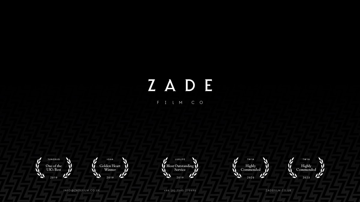
For this particular project, I started with the logotype design since typography would be key in establishing the personality of the brand. Since the company is also named after the owner, it would almost certainly be referred to in its shortened form – Zade – so the remaining descriptor - Film Co – would be set-up as a strapline. To target the sophisticated, luxury market, high-end fashion brands were a target reference.
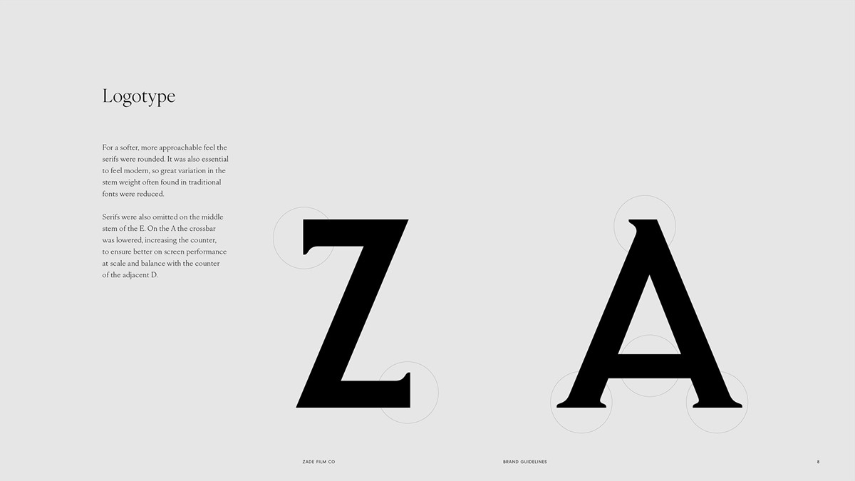
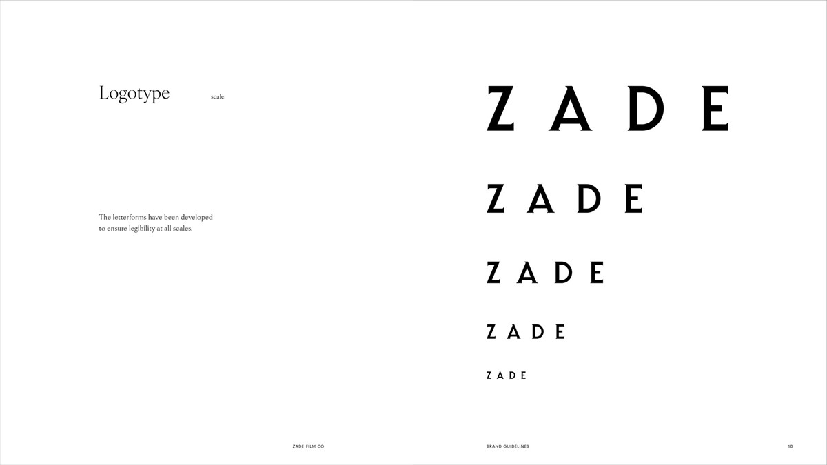
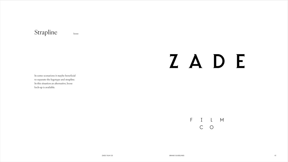
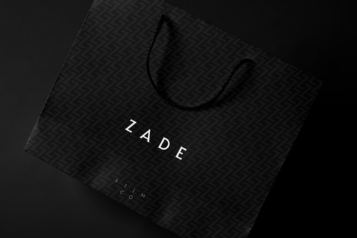
Although typically considered traditional, heavily tracked, uppercase, serifs would be adopted for the lettering. This would establish a strong presence, whilst also creating an aspect ratio to compensate for the short word. To modernise, the characters were heavily crafted. Variation in stem weights was minimised, more in line with the contemporary feel of a sans serif. For a softer, more approachable feel the serifs were rounded. Serifs were also omitted on the middle stem of the E. On the A the crossbar was lowered, increasing the counter, to ensure better on-screen legibility performance at small scale and balance with the counter of the adjacent D. For sharp contrast, a light weight sans serif was modified for the remainder of the name – Film Co. When adopted, the stapline scale would be flexible to ensure legibility in any given scenario.
With the logotype complete, to ensure typographic consistency, a second, lighter version was re-drawn for use on black. This helps to compensate for the irradiation illusion, where white type and graphics appear heavier on dark backgrounds.
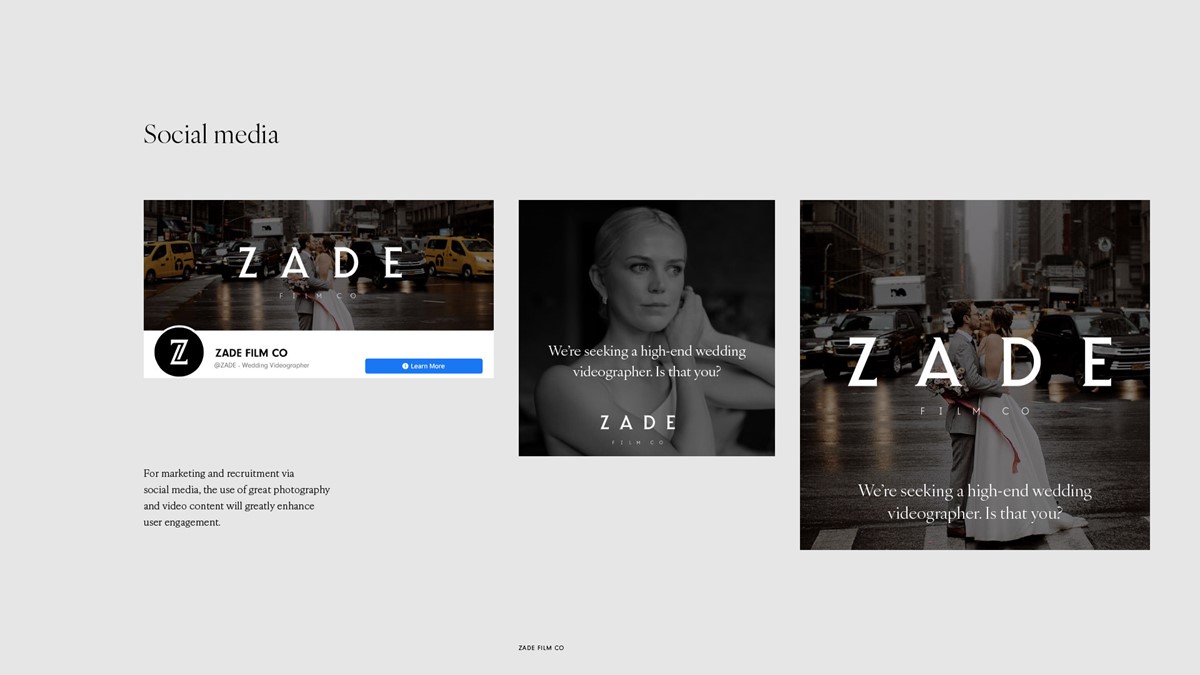
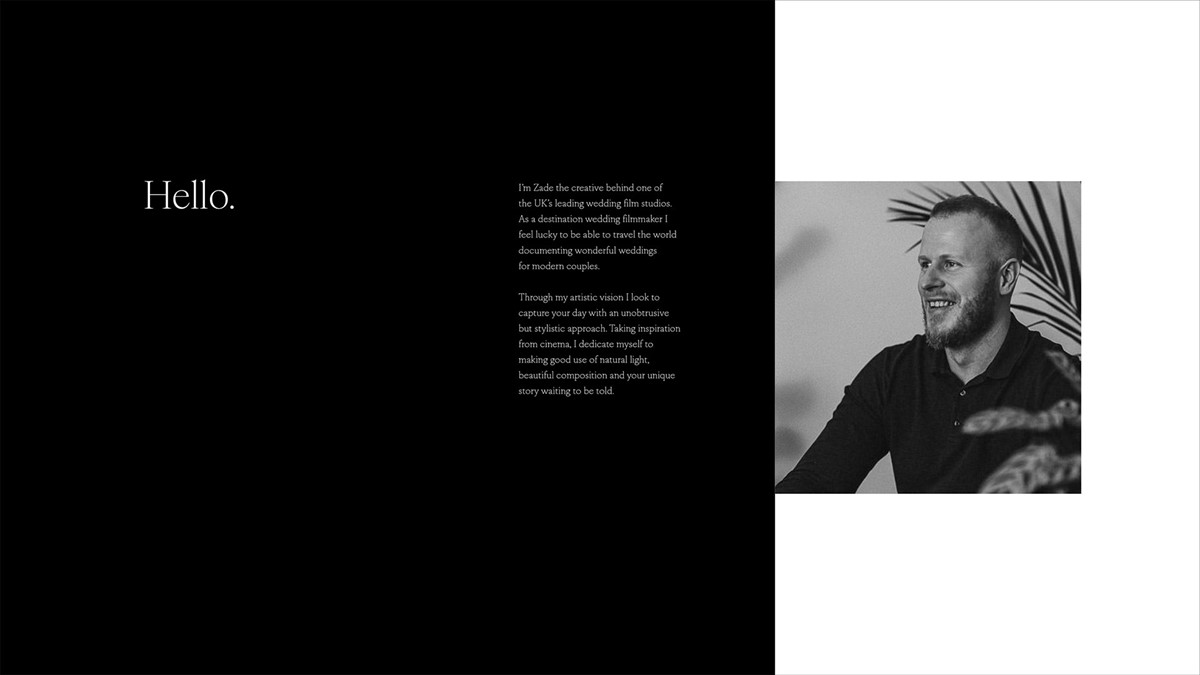
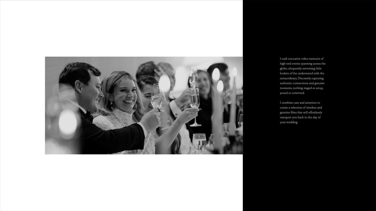
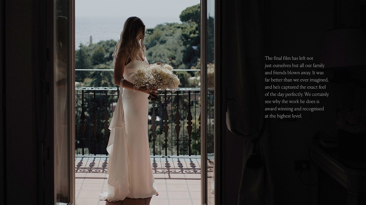
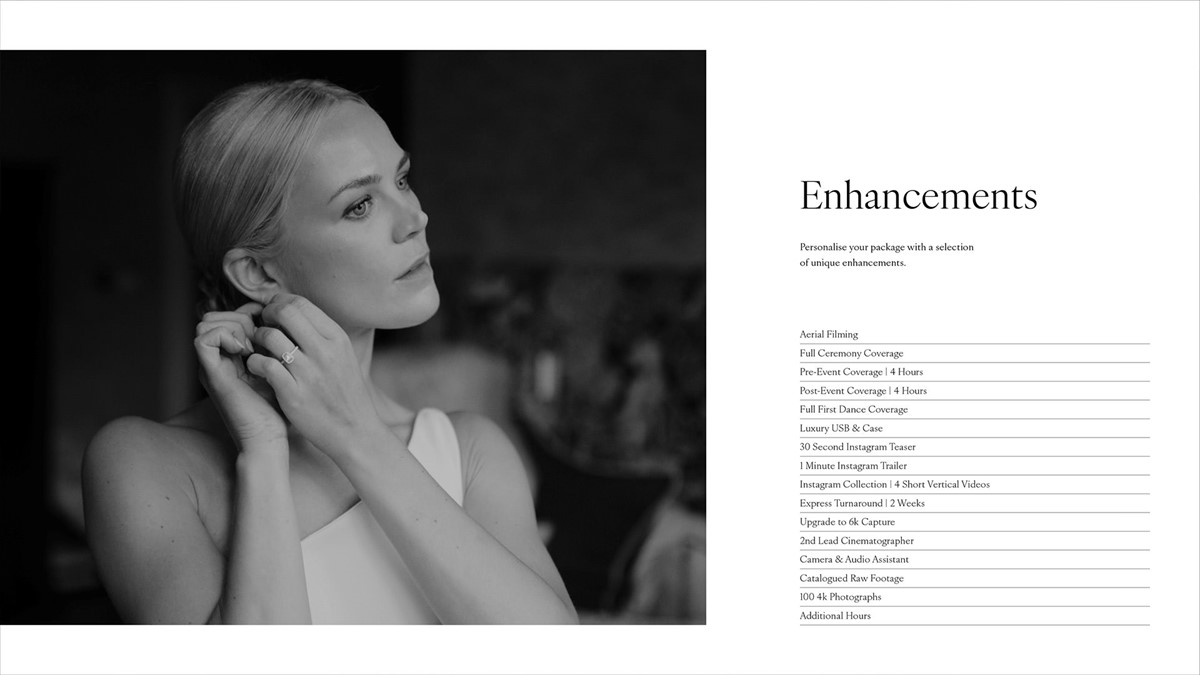
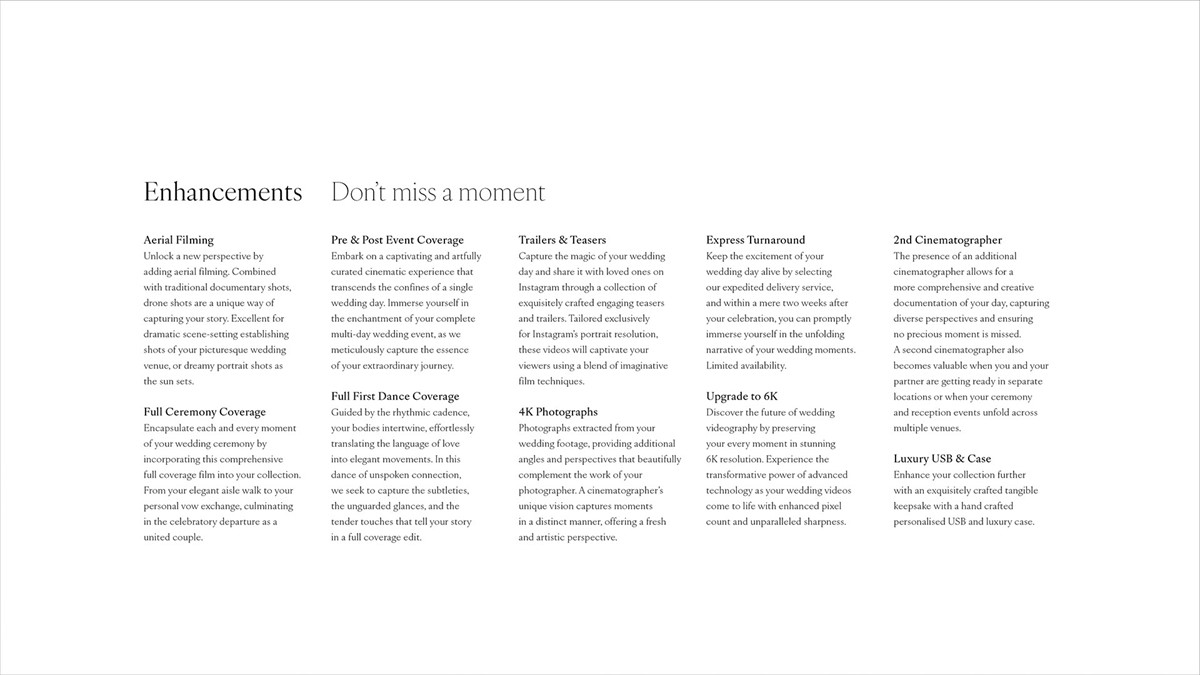
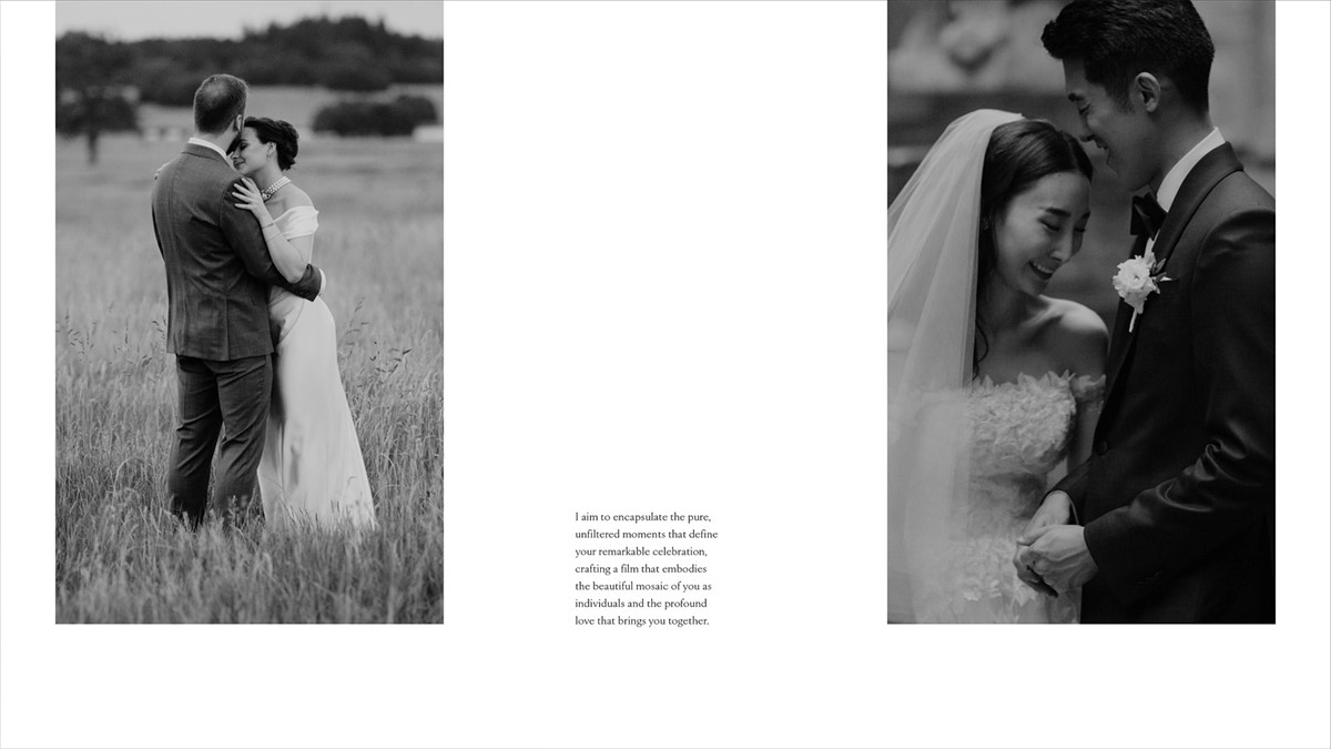
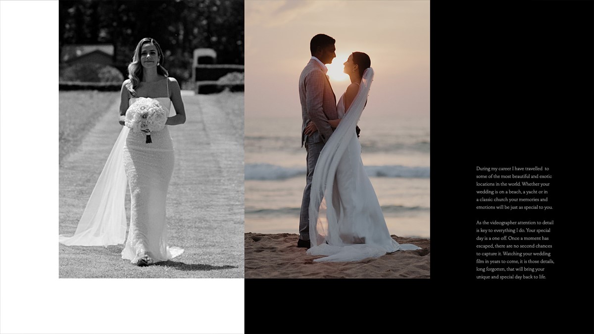
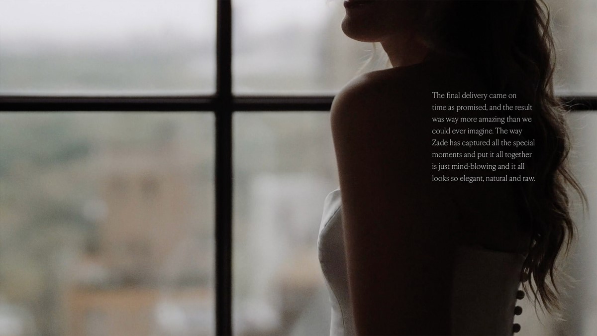
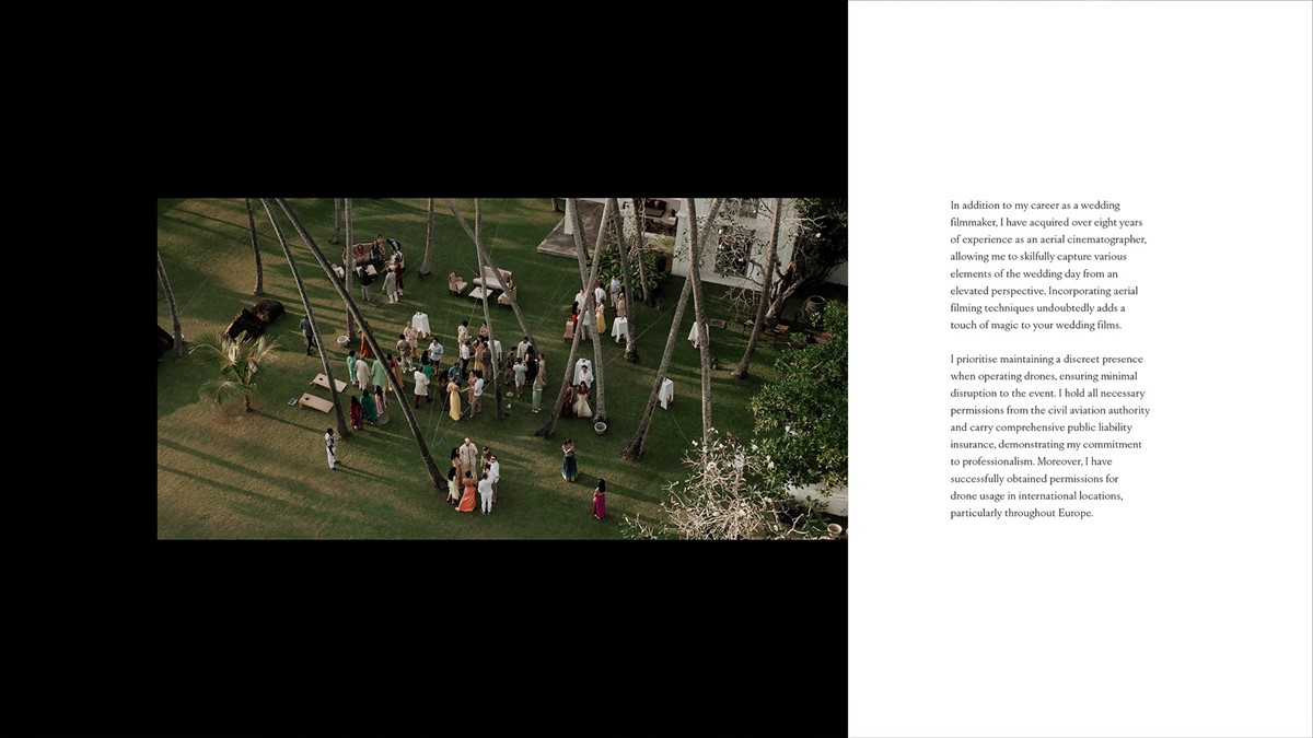
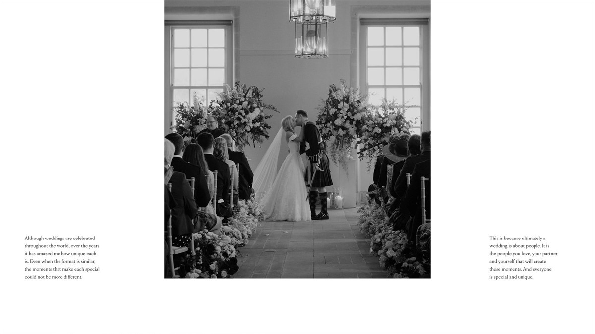
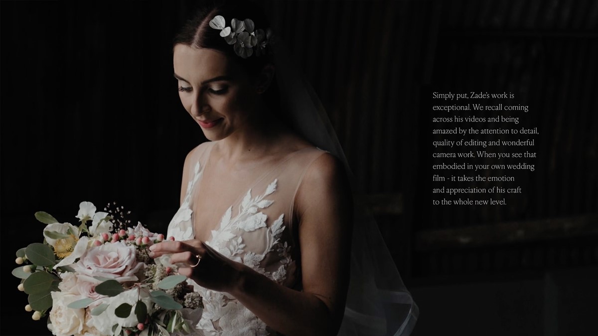
Continuing with the sophisticated approach the palette was restricted to black and white. This would ensure any colour and energy would solely emanate from one source – the events. To enhance the impact and focus further, a rule was employed to ensure the monotone palette worked harder. Black and white photography would be placed on white backgrounds. Conversely, for enhanced contrast full-colour shots would be placed on black backgrounds. This discipline led to bolder, more dynamic creative solutions for the brochure content as the rule required greater thought and attention to detail for the layout designs.
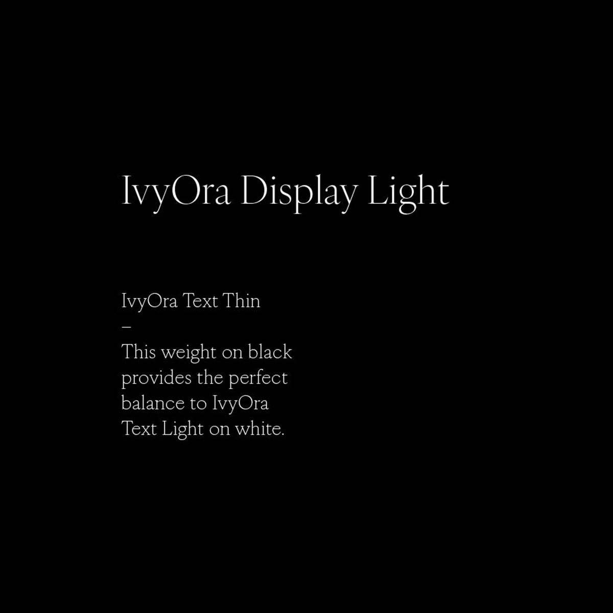
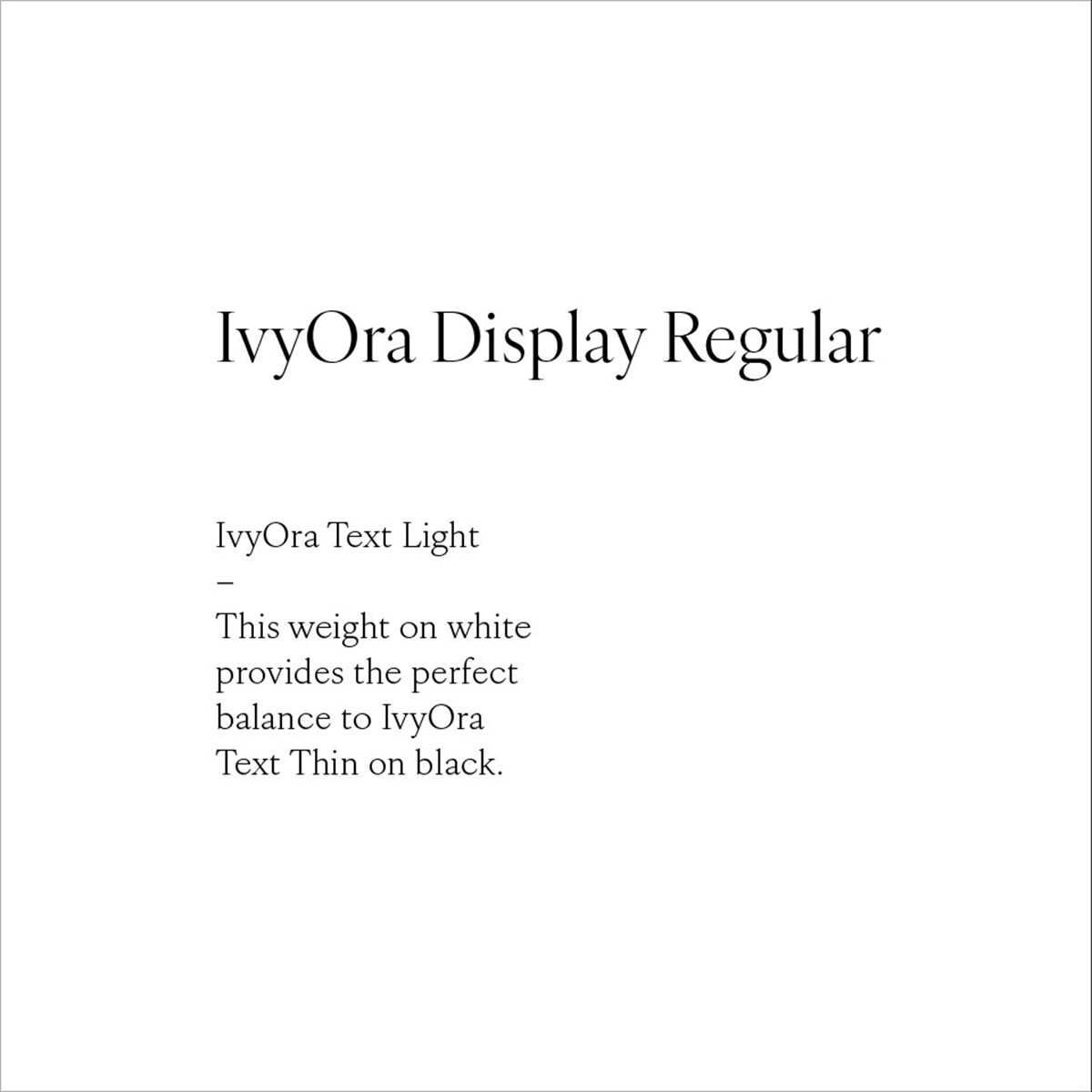
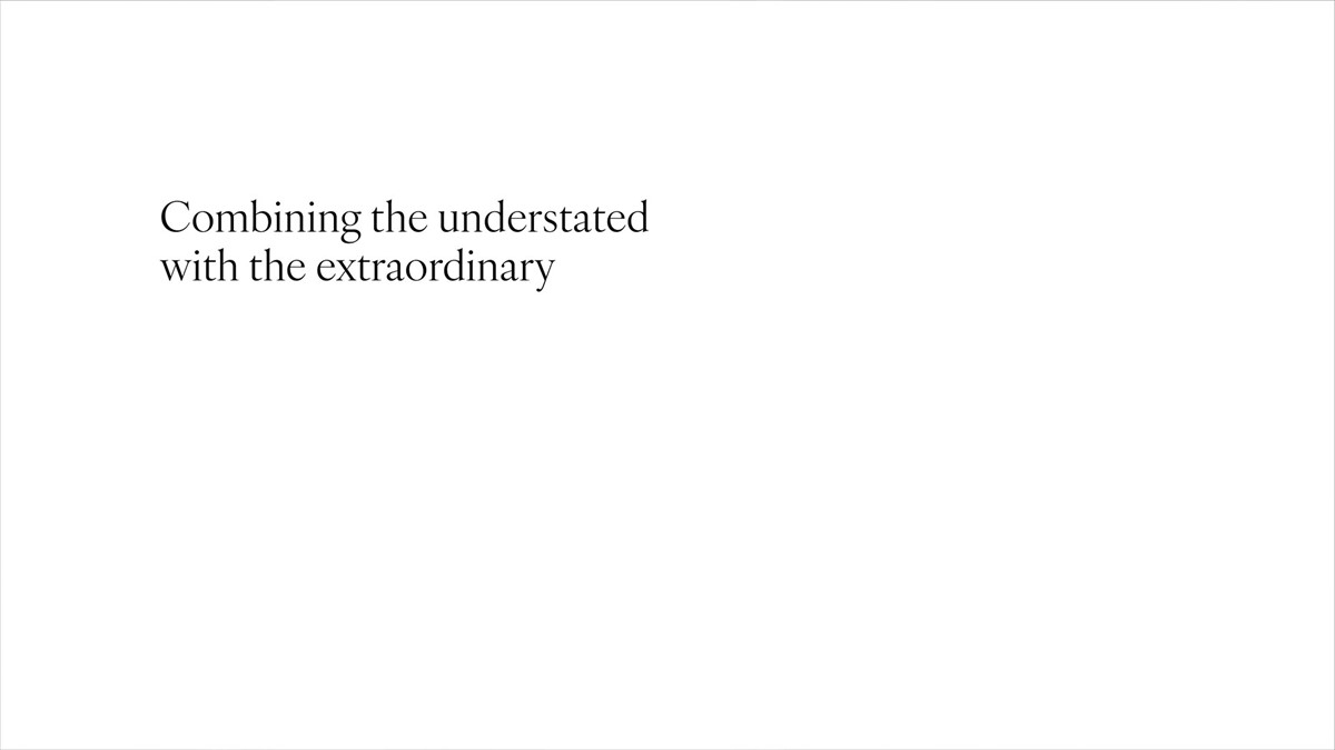
With the palette and logotypes design in place, research began for a suitable serif typeface pairing. Unlike sans, serif fonts can often lack multiple weights. Usually, this is not a problem, but the copy in this instance would be placed on white and black backgrounds – the latter leading to the type looking far heavier as mentioned above. To counteract this a lighter font can be employed for dark backgrounds to ensure greater typographic consistency. This design problem led to the selection of Ivy Ora which is available in two styles – display and text – each containing five weights. This provided considerable creative control – Ivy Ora Light Display / Ivy Ora Thin Text on black vs Ivy Ora Regular Display / Ivy Ora Light Text on white.
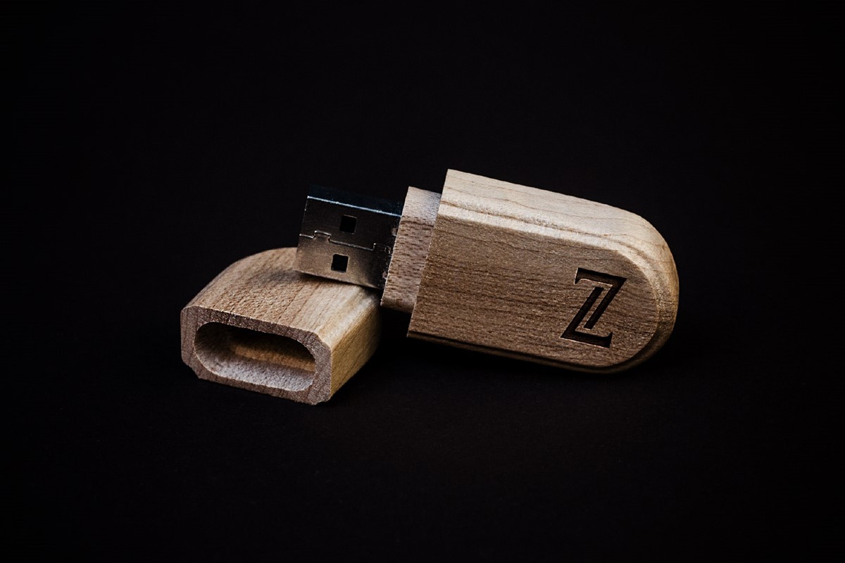
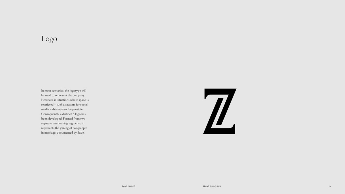
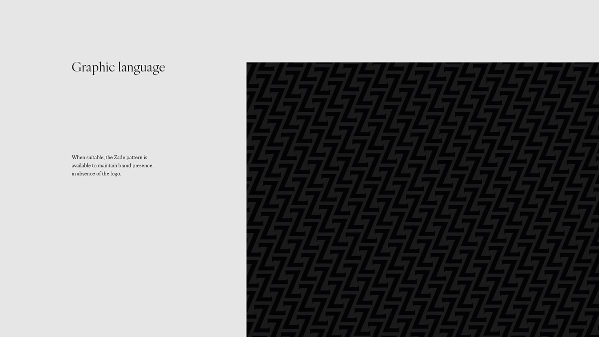
Although the logotype design worked well for general use, it was felt a marque would be beneficial for social media and the development of additional graphic language. Starting with the initial Z numerous design iterations were tested, but they failed to reflect the service he provides. Perseverance led to the idea of splitting the letterform in two, with Zade documenting the joining of both partners. With the final creative solution in place, design experimentation could begin to develop brand-led graphic devices and patterns.
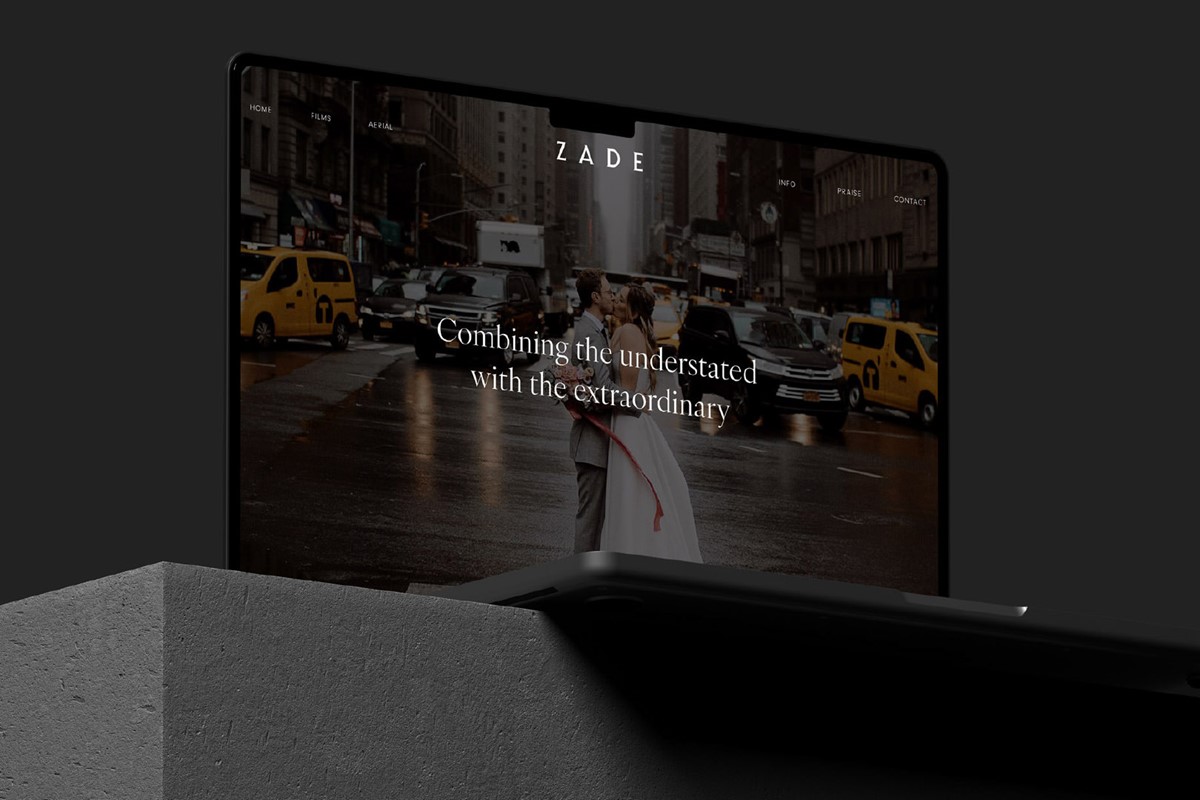
With the brand strategies and brand guidelines complete, it was now time to apply Zade's new brand to his website.
Project services
- Branding
- Brand Strategy
- Bespoke Typography
- Graphic Design
- Marketing
- Web design
Testimonials . Press . Awards
"Mark would often keep working to create new ideas and revisions even when I was happy, just in case there were better options and I think that shows his level of commitment to his craft and creativity. Not long after working with Mark, I could easily see how passionate and talented he and his team were. I'm absolutely over the moon with what Mark has created for my company. He is also a really nice guy to speak to and work with which was a huge selling point for me. I think there is a reason why Superfried is known for being one of the best branding companies in the UK."
—
Zade Cross
Director . Zade Film Co . UK