





Tautenay Agricultural brand strategy
Tautenay are agricultural consultants. They advise government bodies in the Channel Islands and the UK mainland on industry best practices, animal welfare, and the environment. They approached graphic design agency Superfried to develop their brand strategy and brand identity.
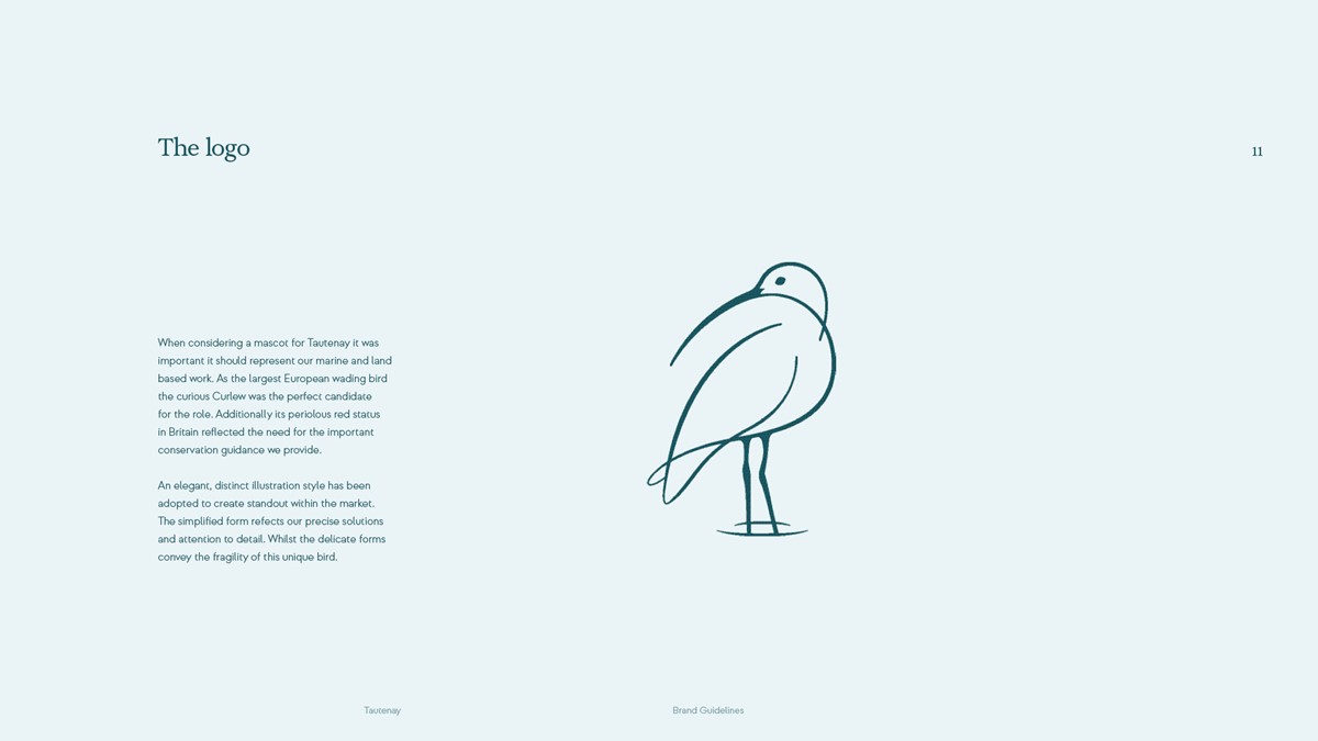
During the discovery stage, the client requested the use of an animal to convey their passion for nature. Their identity should allow for growth and be sufficiently versatile to cover both their marine and land-based work. Selecting a suitable species could be challenging. After some initial exploration, it was the client that proposed the creative solution – the rather distinct Curlew. With a penchant for residence in coastal wetlands and the occasional crab for dinner, our long-beaked friend was the ideal candidate.
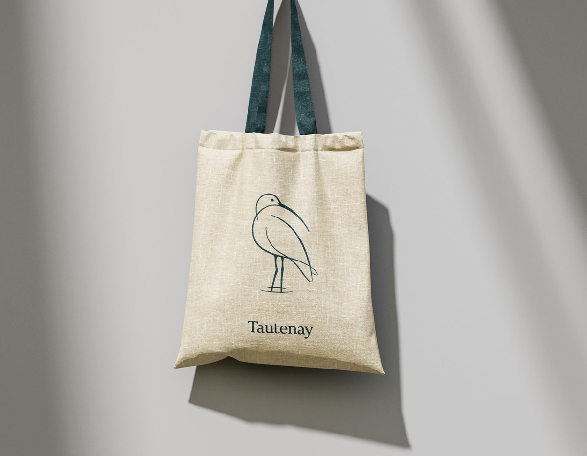
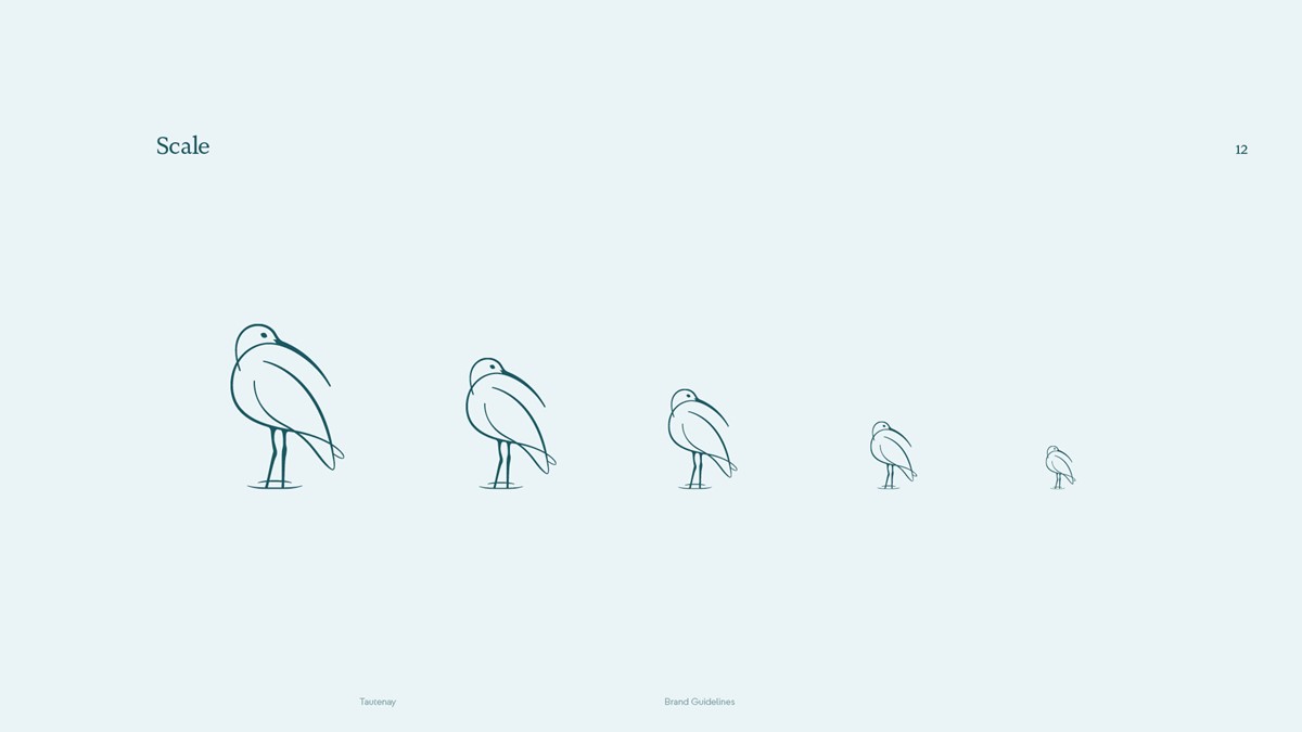
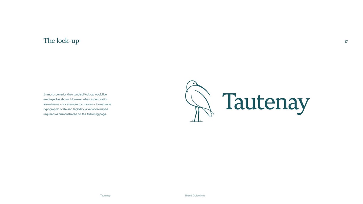
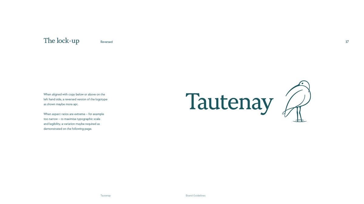
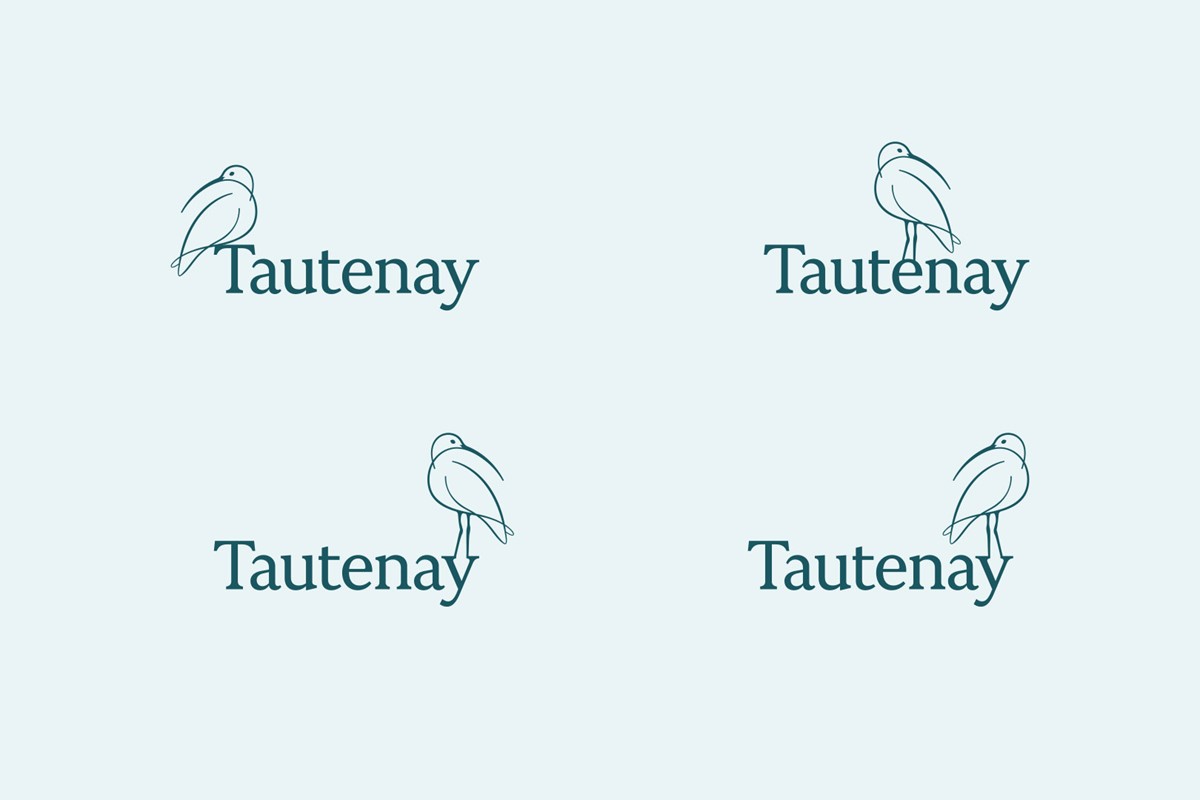
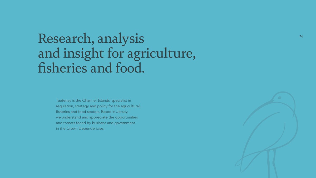
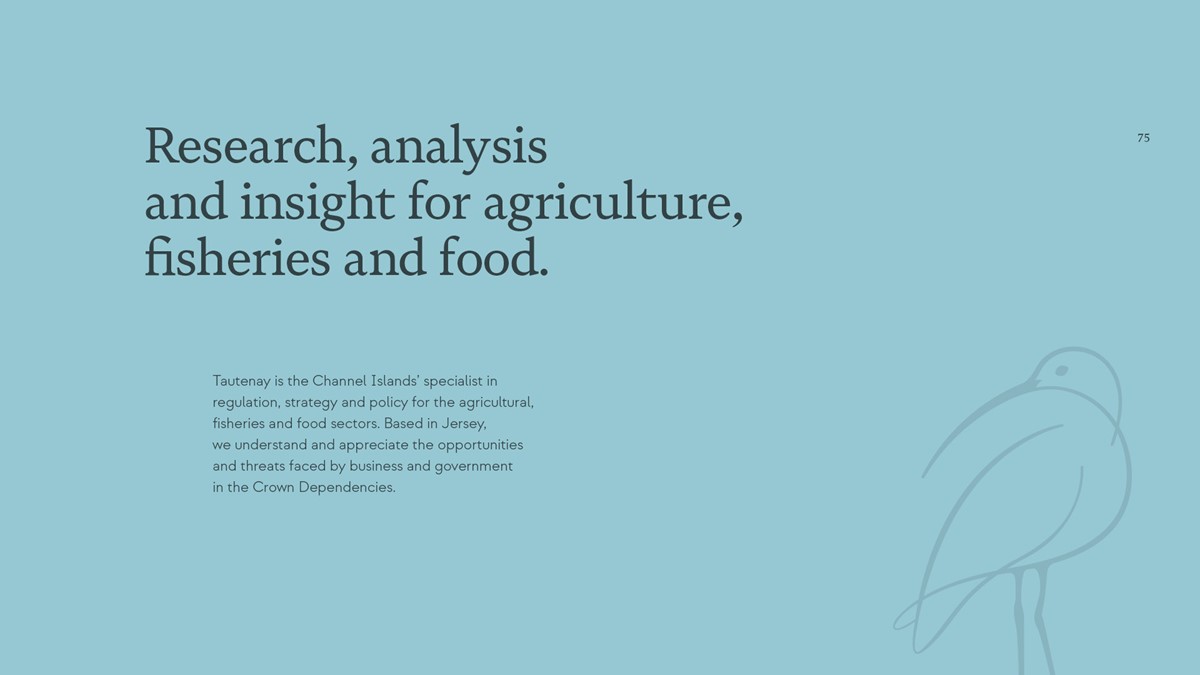
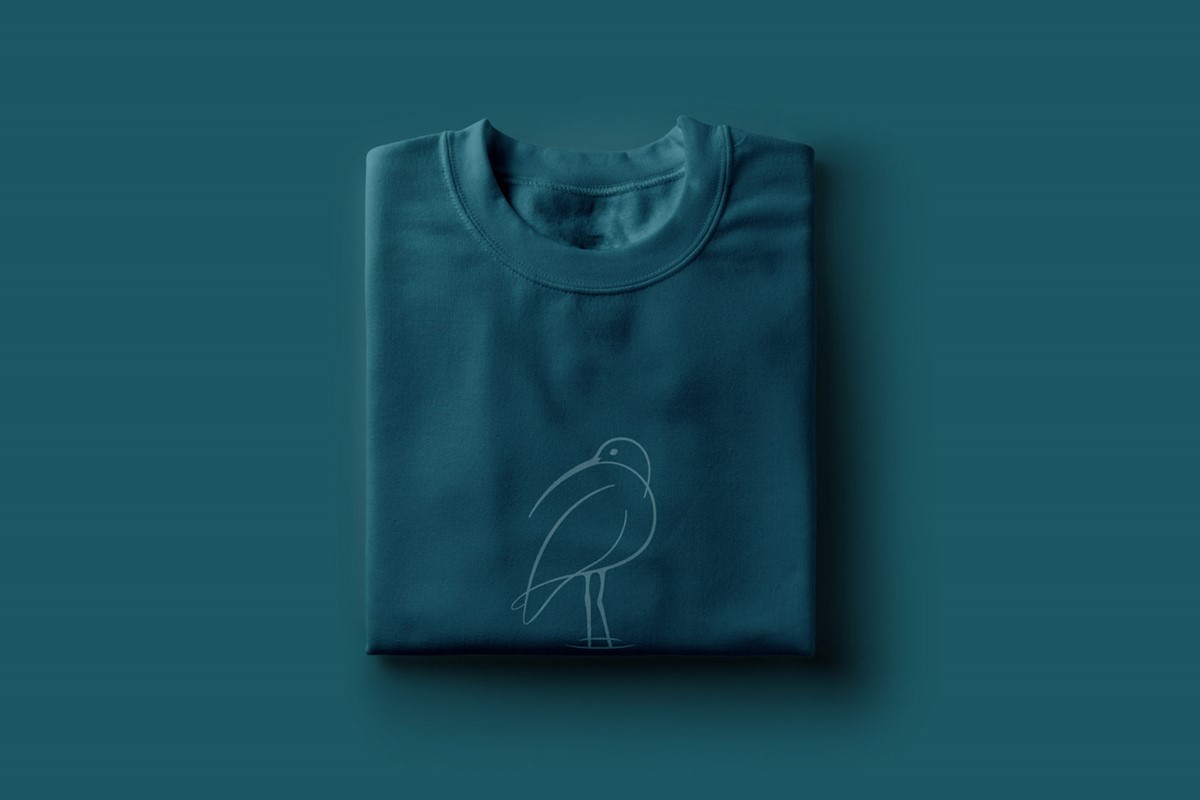
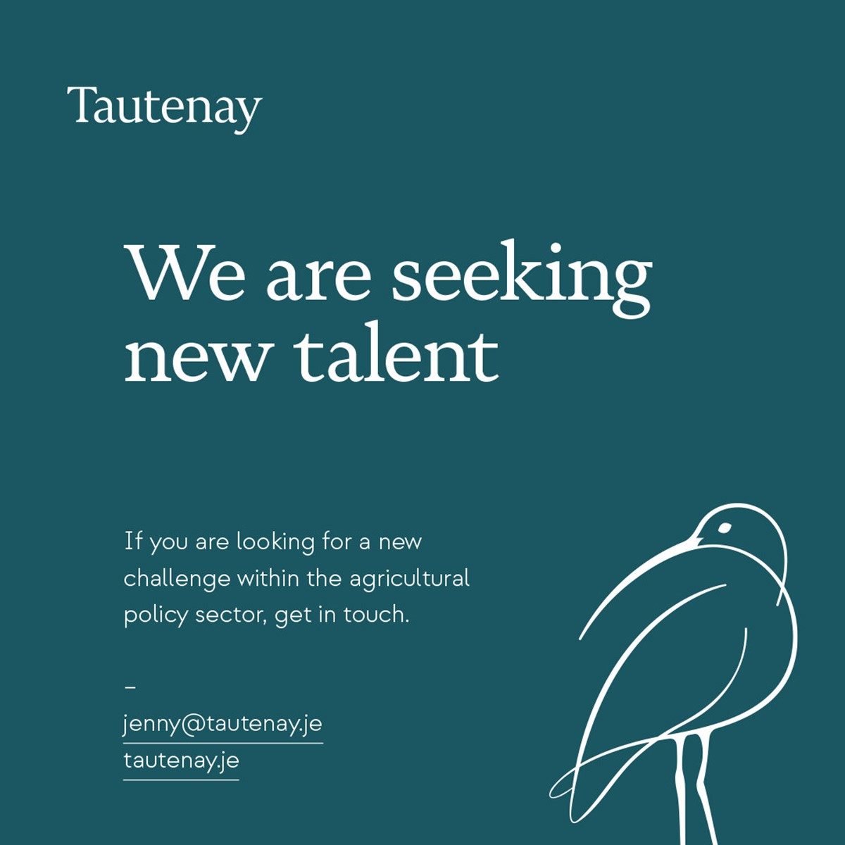
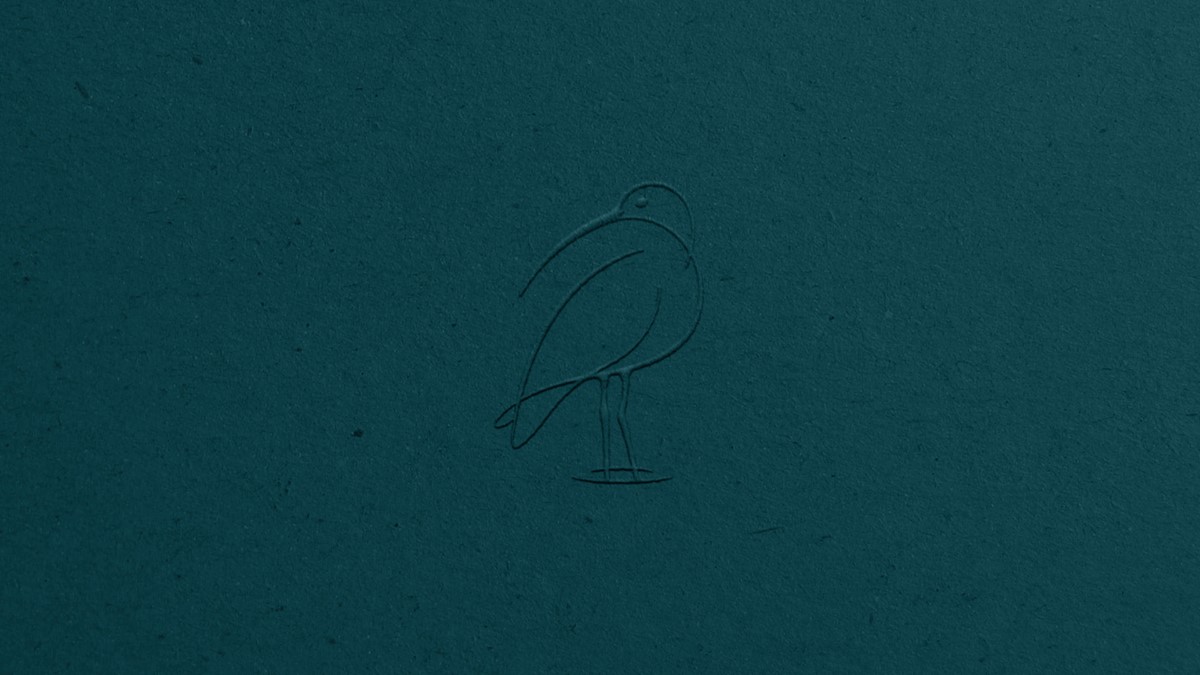
Working on the logo design, the abnormally long beak would provide immediate recognition. This allowed creative freedom to explore more fluid and expressive illustration styles. For elegance the final illustration style was based on a photograph of a Curlew looking backward over its shoulder, leading to a more compact and consistent form. To maintain simplicity, the main body of the bird was developed using just three overlapping paths. The fluid, fluctuating line weight also alluded to their marine-based habitat.
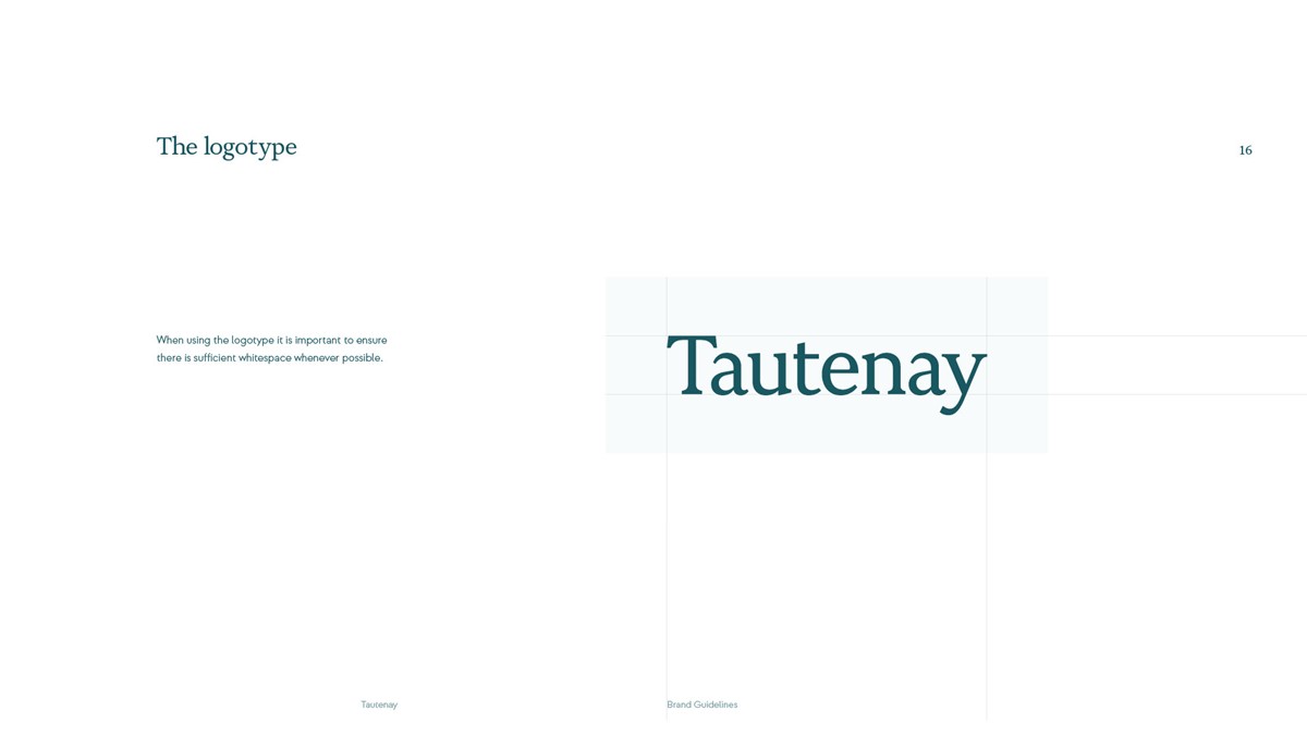
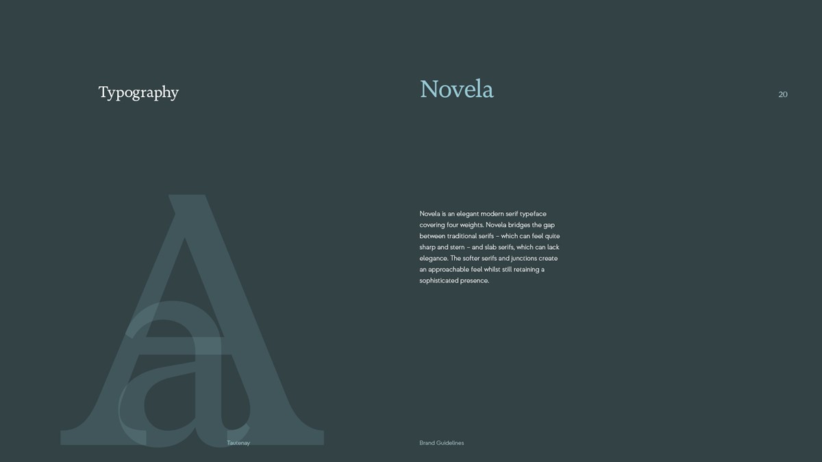
The logotype design required a serif typeface to compliment the delicate style and variable line weight of the logo, whilst also reinforcing the professional perception and positioning required for the brand identity. However, serif typefaces can feel austere. After some research, Novela by type foundry Atipo had the perfect balance. The softer serifs and junctions create an approachable feel whilst still retaining a sophisticated presence.
Using this as a base numerous design iterations and refinements were made to create a bespoke logotype design with a light, clean, and modern tone. This included reducing the scale of the serifs, simplifying the dominant lowercase t, and reducing the width of the uppercase T. This helped to optimise and balance the typography throughout leading to a unique wordmark – sophisticated, confident, and approachable with personality.
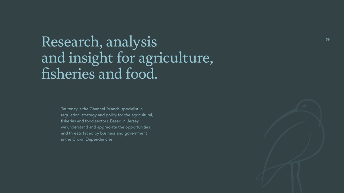
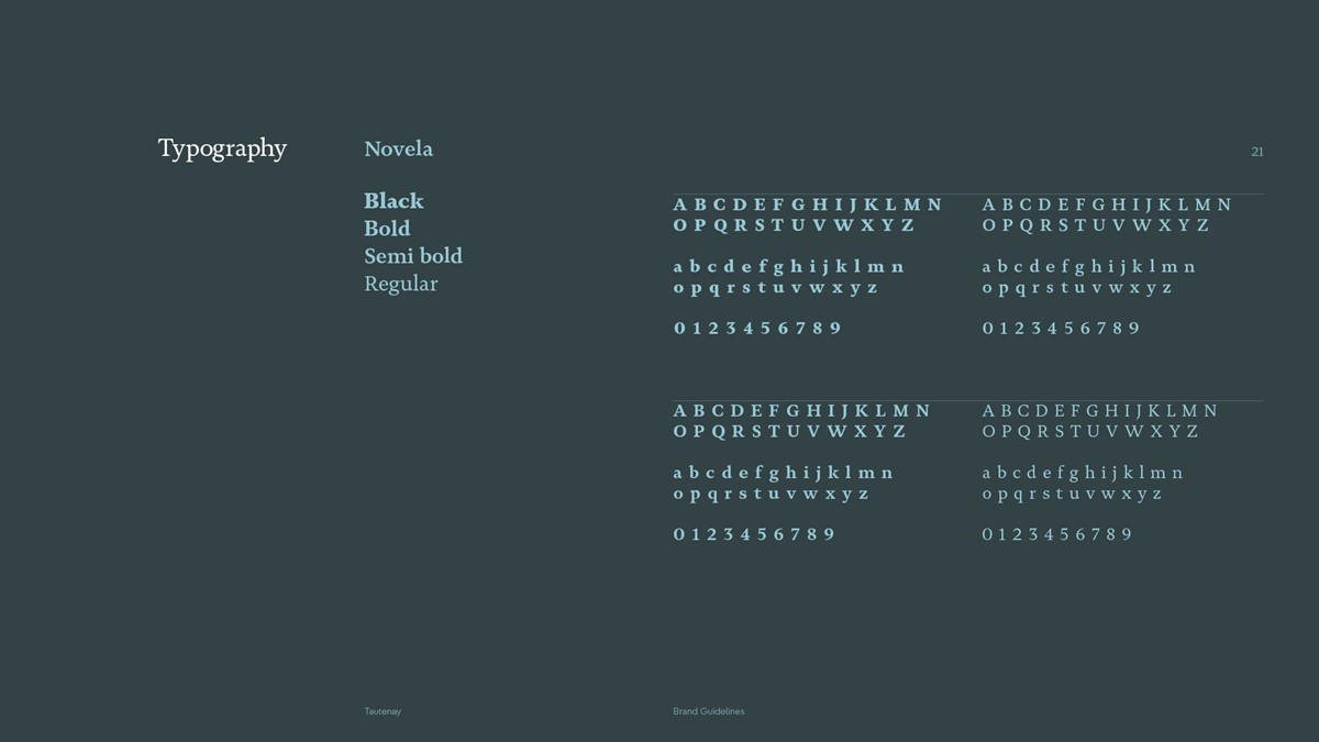
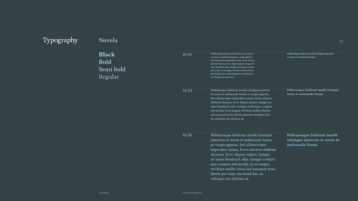
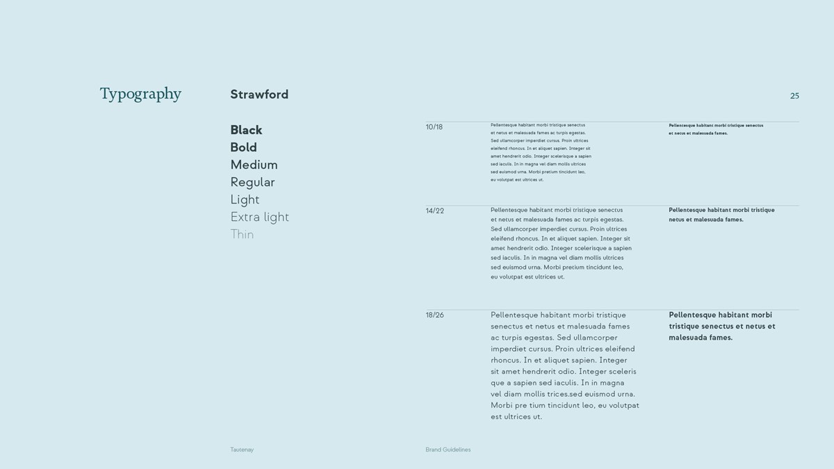
For typography, Novela was retained for headlines + key messages. However, for body copy a sans was sought to continue the softer, modern approach. Sans typefaces can potentially feel bland, so in keeping with Novela the solution required personality. After testing numerous typographic designs the answer arrived from the same type foundry.
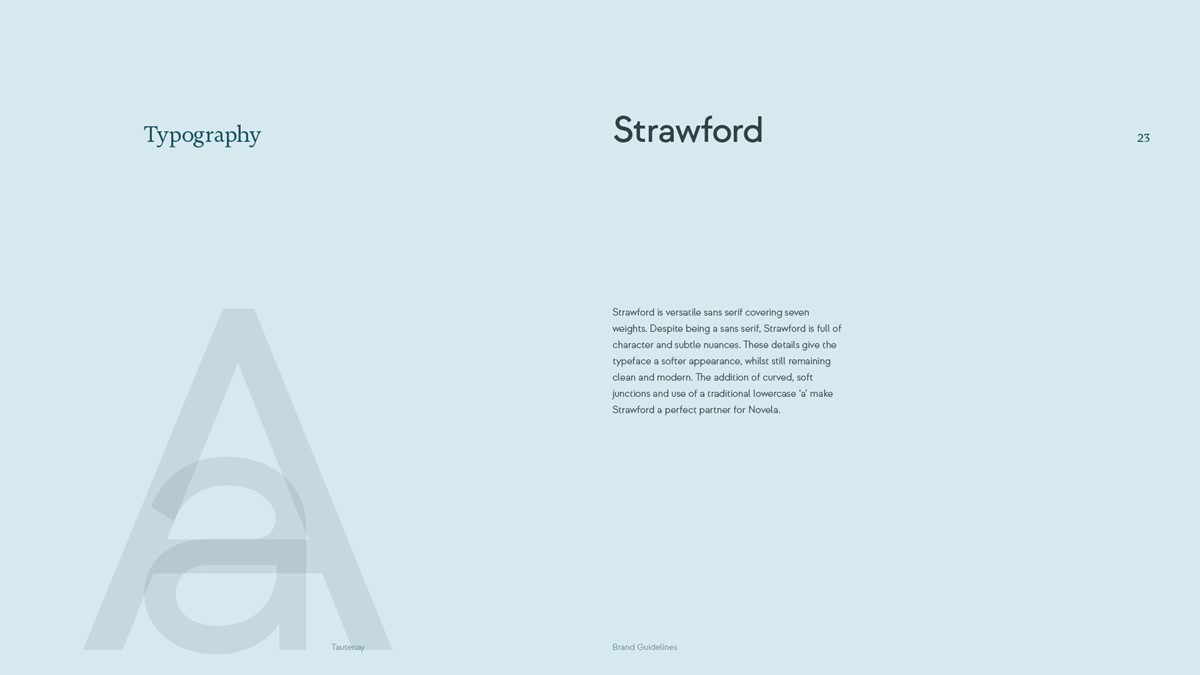
Strawford is a versatile type family, covering seven weights. Despite being a sans serif, Strawford is full of character and subtle nuances. The attention to detail creates a softer appearance, whilst remaining clean and modern. The addition of curved, soft junctions and the use of a traditional lowercase ‘a’ make Strawford a perfect partner for Novela.
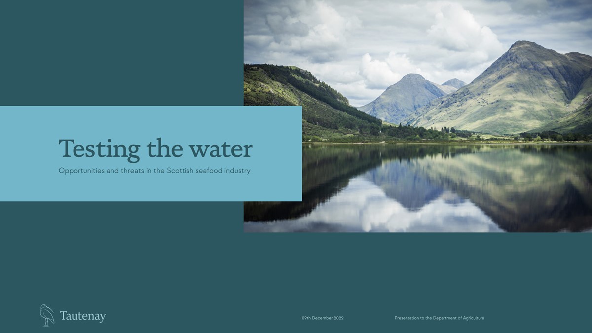
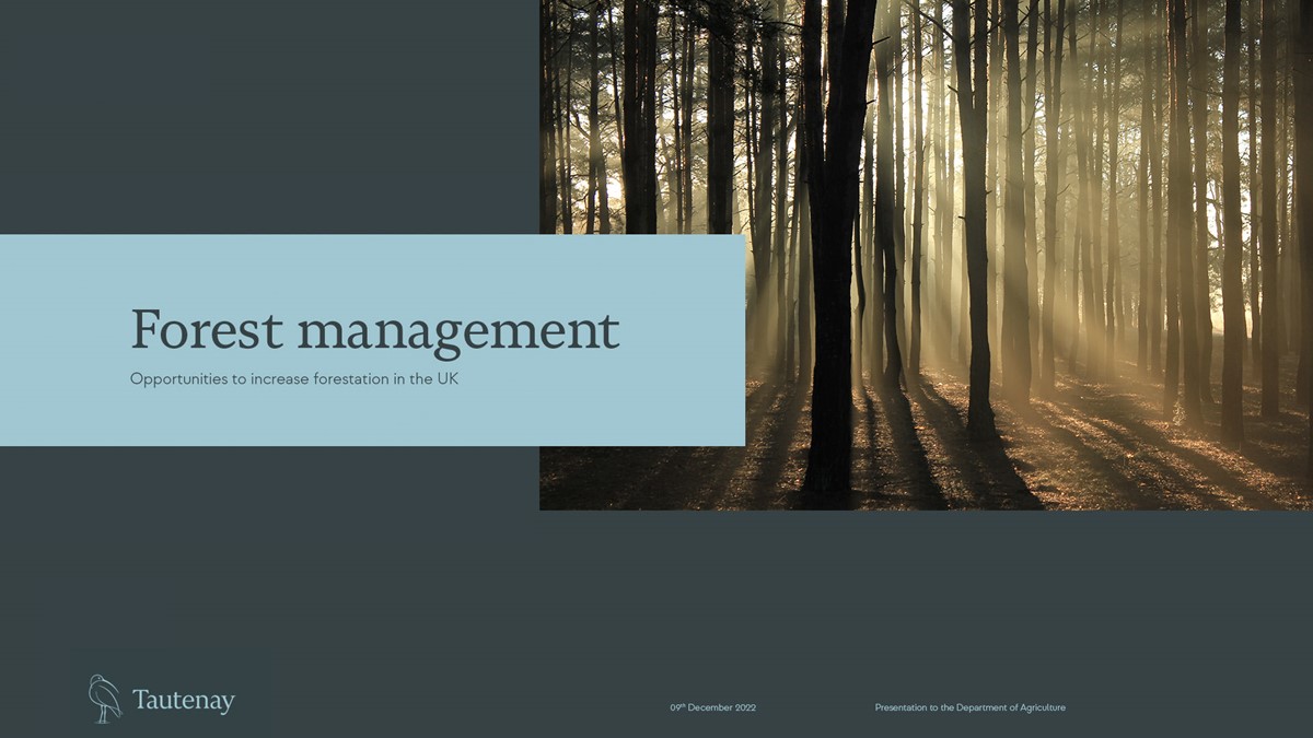
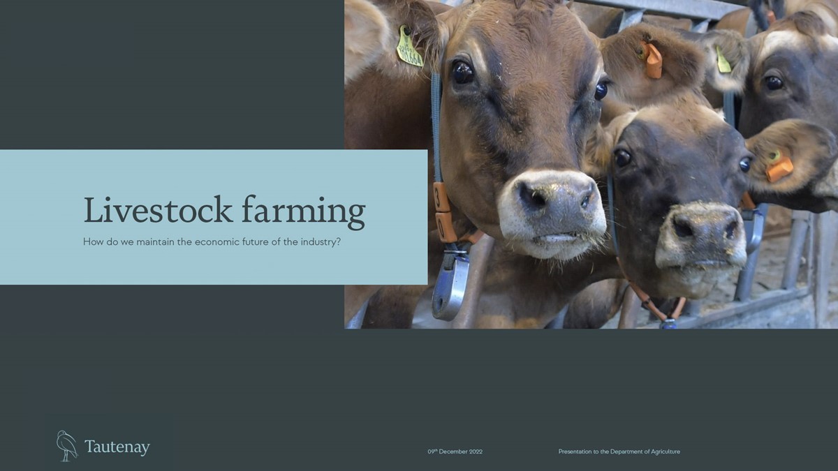
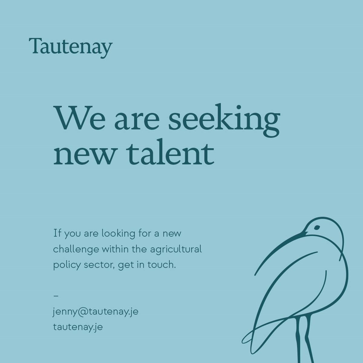
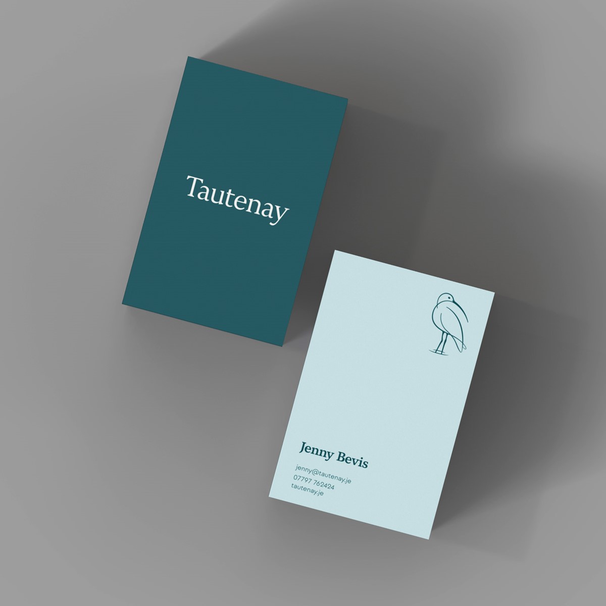
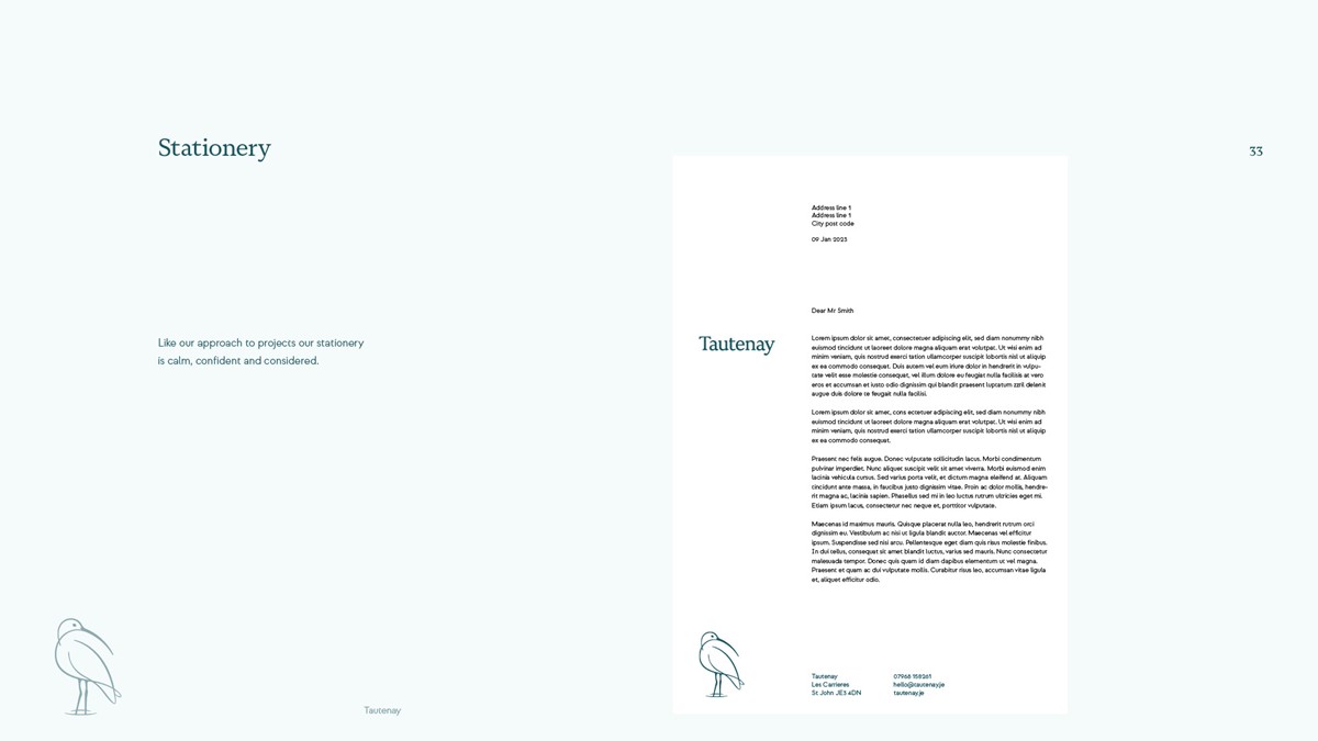
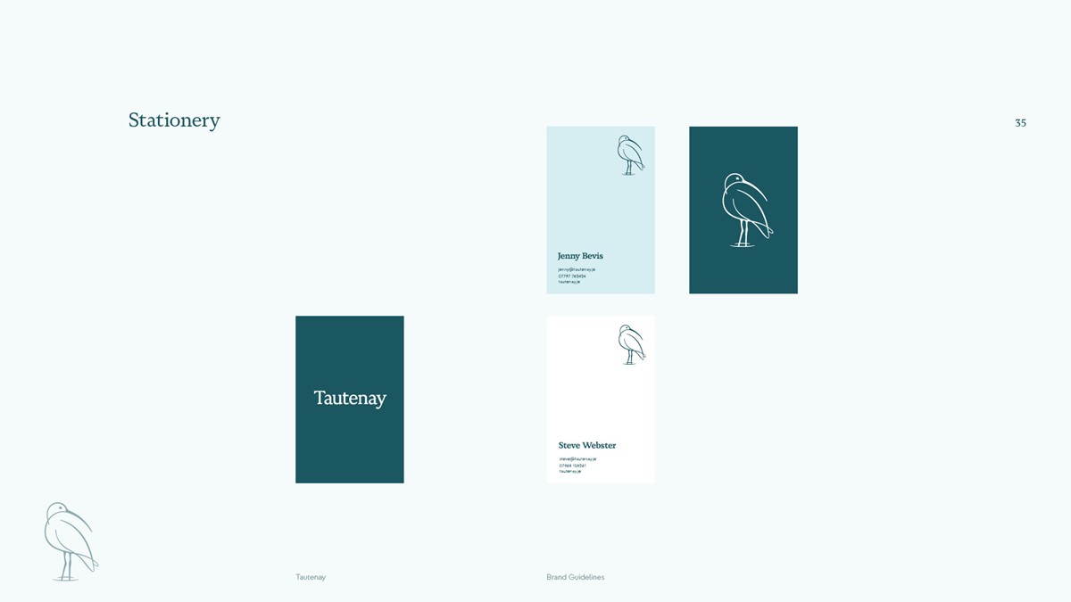
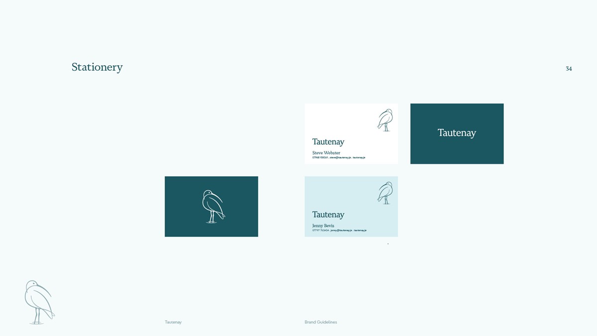
Looking at the palette, to coincide with their work shades of green, brown, and blue were explored. Via testing, it was a stormy, muted set of blues that prevailed – resonating well with our Curlew and the British climate. With the palette in place, marketing collateral and templates could be developed to cover social media, stationery, presentations, and reports.
Project services
- Branding
- Brand Strategy
- Bespoke Typography
- Graphic Design
- Illustration
- Animation
- Web design
Testimonials . Press . Awards
This brand identity design project has been shortlisted for Branding in the Creativepool Annual 2023 awards.