

Sadler's Wells . Northern Light Typographic branding for Nordic dance
Sadler's Wells is the UK's leading dance house, uniquely dedicated to bringing the very best international and UK dance to London audiences.
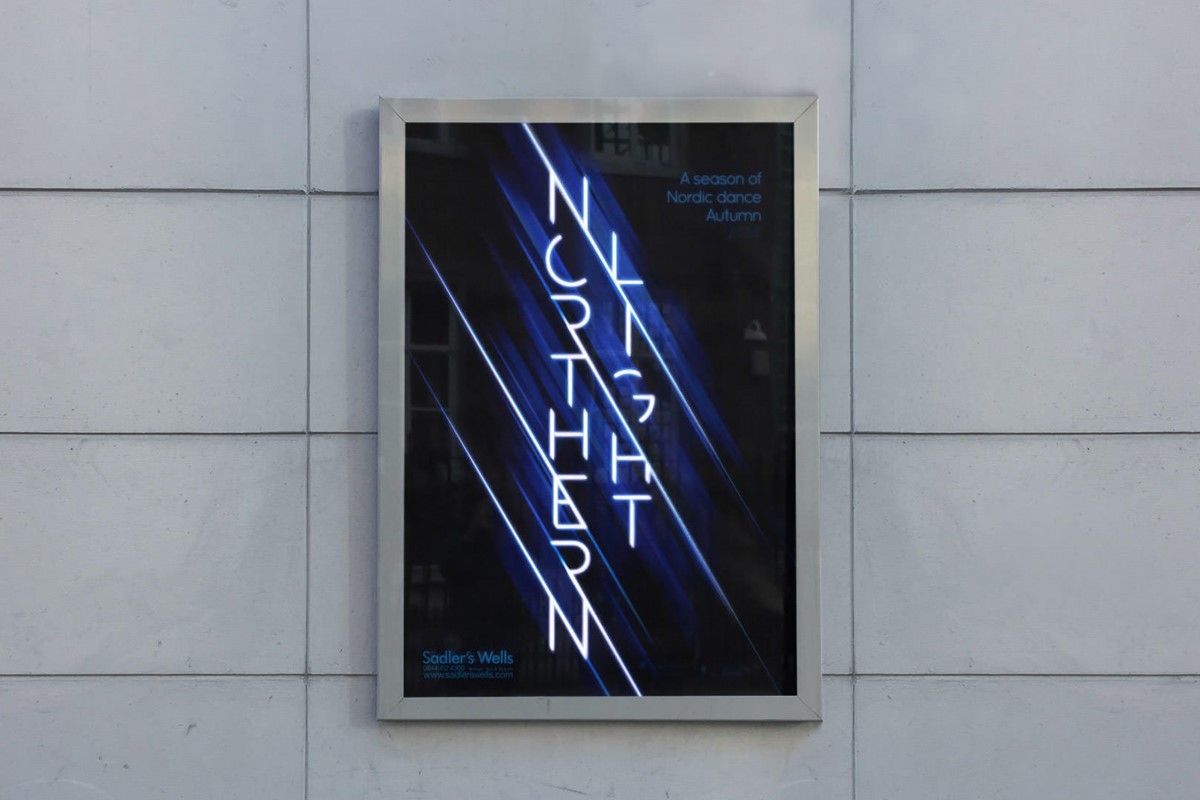
Northern Light is a season of Nordic dance performances covering various styles originating from geographic locations including Sweden, Norway, Finland, and Denmark. After the success of our previous collaboration, Manchester design agency Superfried was briefed once again to develop the branding strategy and graphical communications for a new season.
During the discovery phase, it became immediately apparent that such eclectic content meant a photographic route was not practical. Consequently, it was proposed that we should adopt a typographic design.
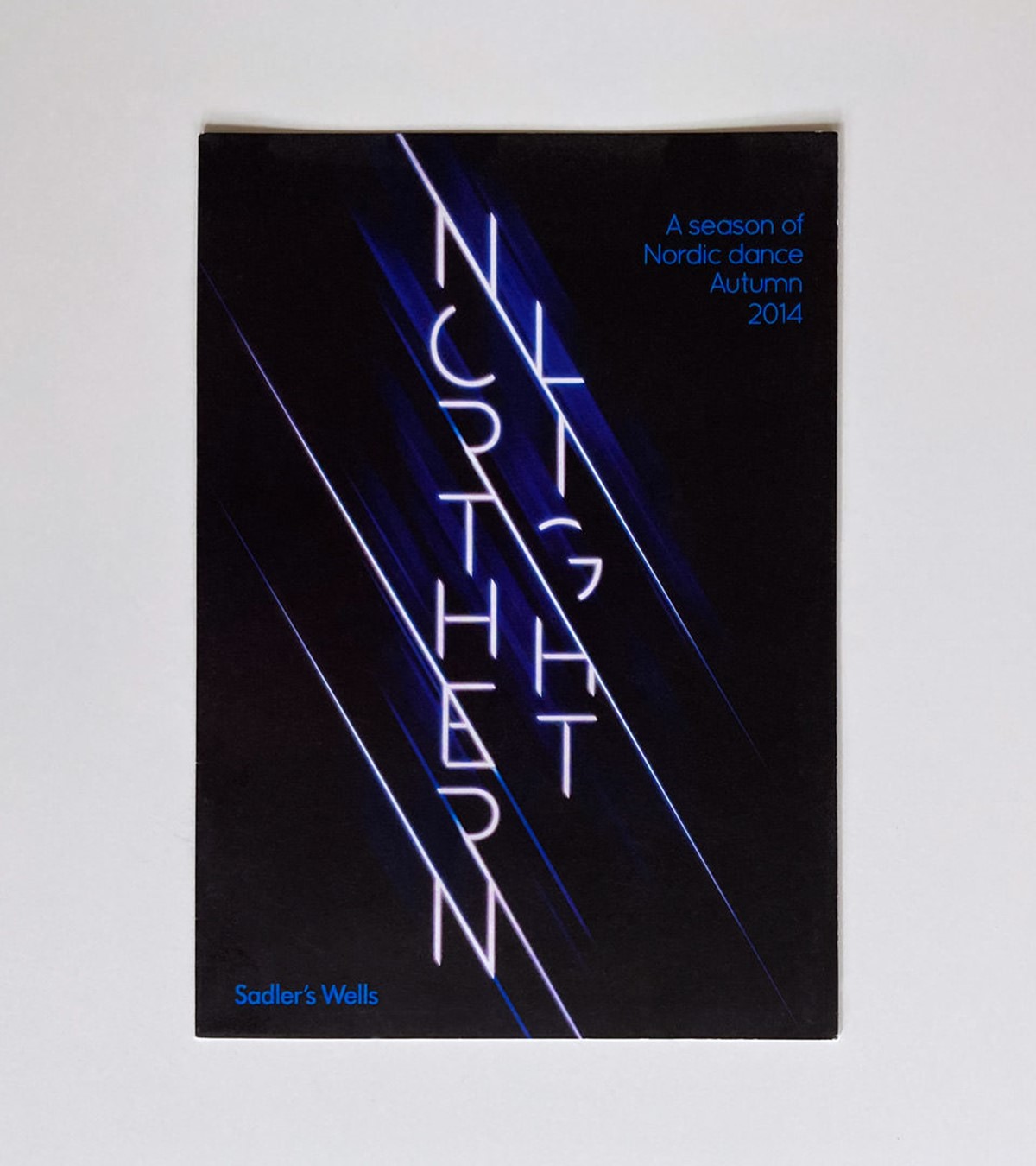
The name led to obvious ideas of light and energy, both appropriate for the subject matter. Since the bespoke typography would need to fulfil a dual role – type as image, graphically leading the marketing material and simultaneously working as a logotype for the brand identity – the typographic design needed to remain completely legible.
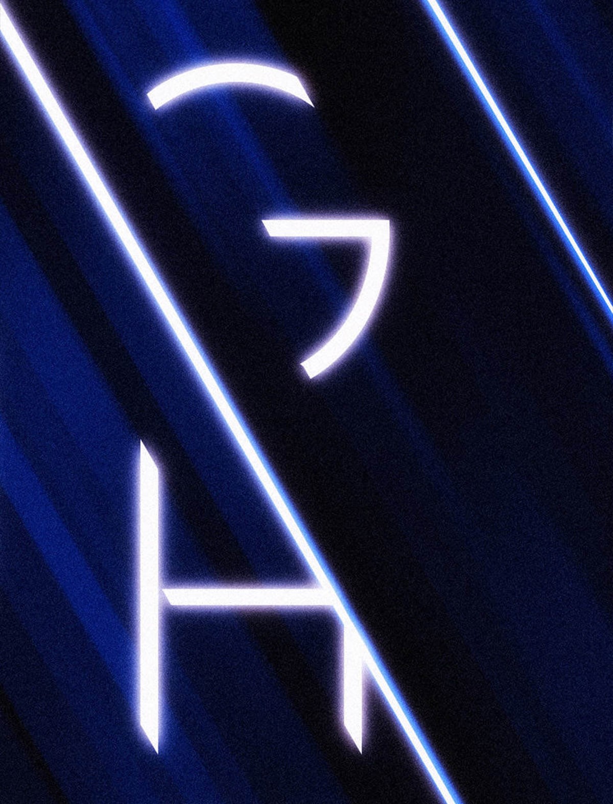
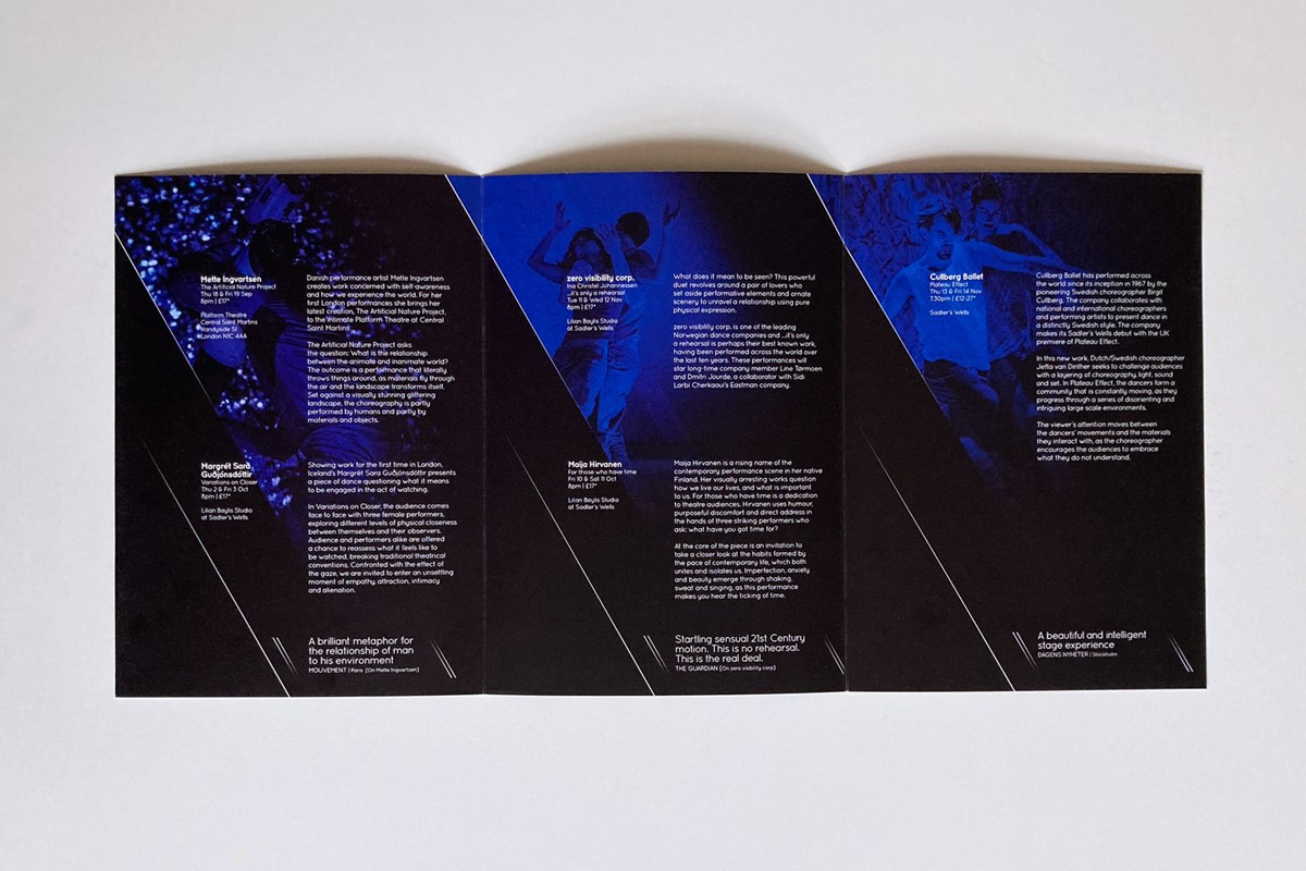
At 13 characters long, the bespoke lettering design was initially arranged in a vertical orientation to work with the portrait aspect ratio of promotional flyers and posters. This composition had the added benefit of eluding to great height and the natural aurora borealis phenomenon. To convey an essence of light and energy an angled shard device was utilised to style the typography, images, and copy throughout the marketing literature.
Use of the light shards created a dramatic effect which enabled design experimentation with the typographic designs – creating bespoke and interlocking letterforms. The angled graphic device was also used for general graphic design to separate and contain content. To ensure versatility the typographic design for the wordmark was fully tested to ensure it would also work in a horizontal logo lock-up. For the remaining typography, the typeface Quicksand was selected for its light, translucent styling, and round, friendly vibe to counteract and balance the sharp angular logotype design.
Project services
- Bespoke Typography
- Art Direction
- Branding
- Advertising
- Strategy
- Illustration
- Graphic Design
- Typography
Testimonials . Press . Awards
"Superfried provided us with an excellent level of service, from conception to product delivery. A passionate, creative and dedicated company, I would recommend them very highly and look forward to working with them again in the future."
—
Maxwell Baker
Sadler’s Wells . London
—
This bespoke typographic branding project has been featured in internationally renowned graphic design publication IdN Magazine [IdN v23n3].
Credits
External shot of Sadler's Wells by Belinda Lawley.