

REVERE Branding, positioning + experimentation
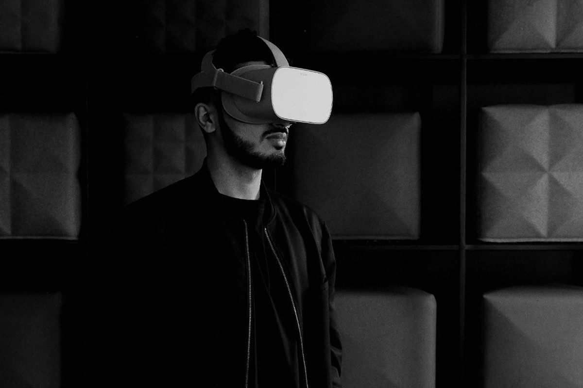
Founded in 2017, Revere is an integrated VR and creative agency, focused on the property industry. They approached Manchester design agency Superfried to develop their brand identity.
A subtle balance would be required for this brand identity. Sophisticated elegance to connect with their target high-end property demographic whilst retaining the design flexibility to evolve and reflect the dynamic nature of their technological expertise.
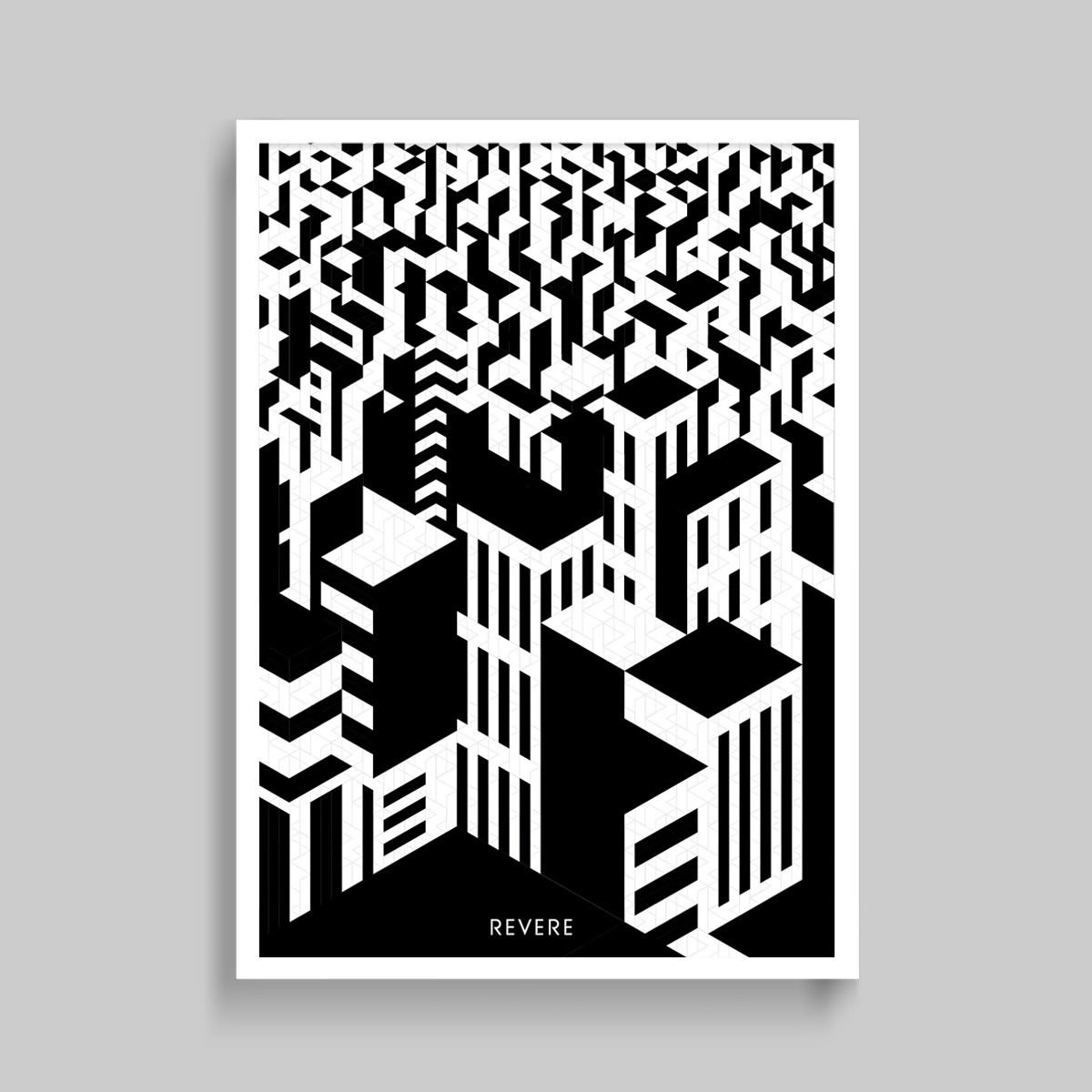
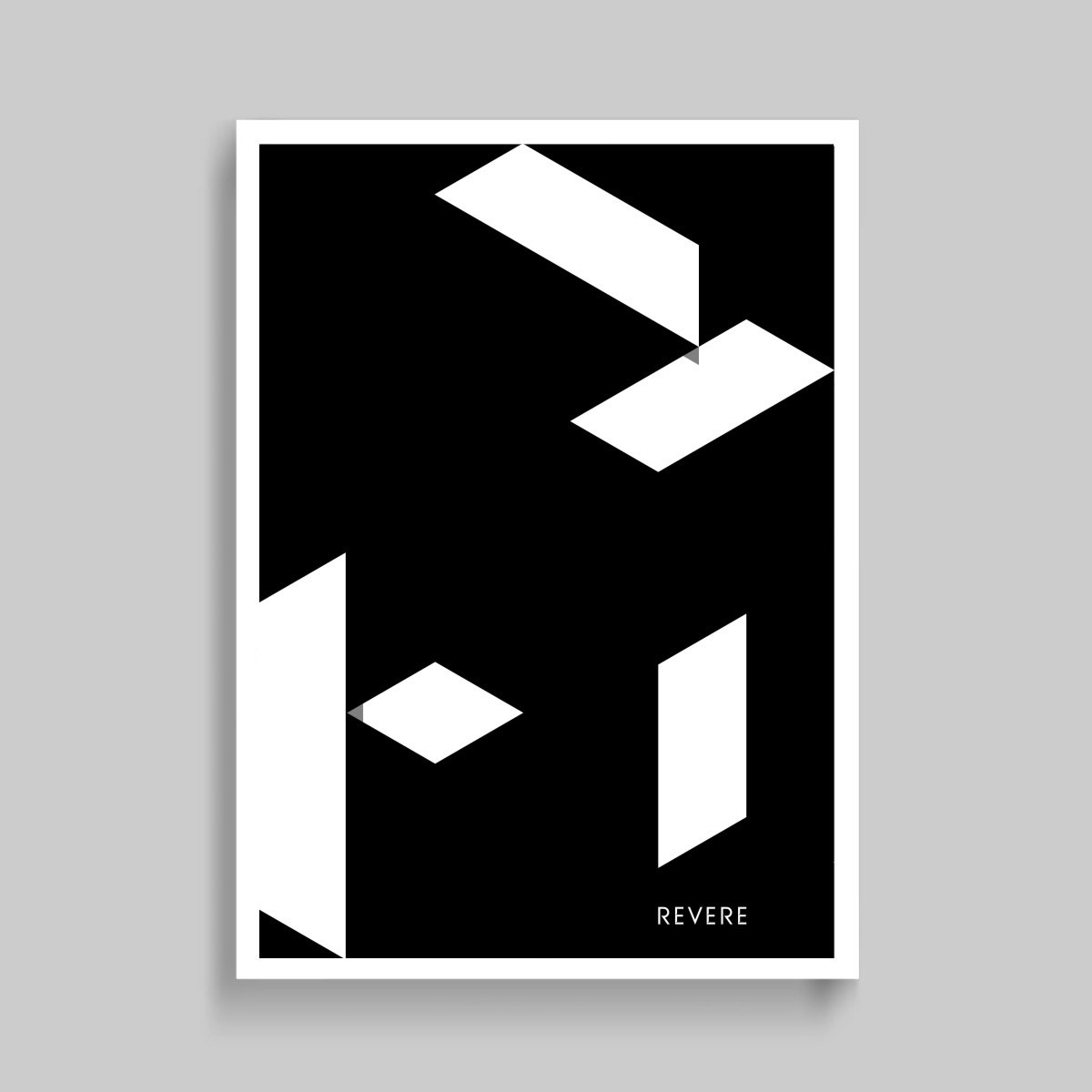
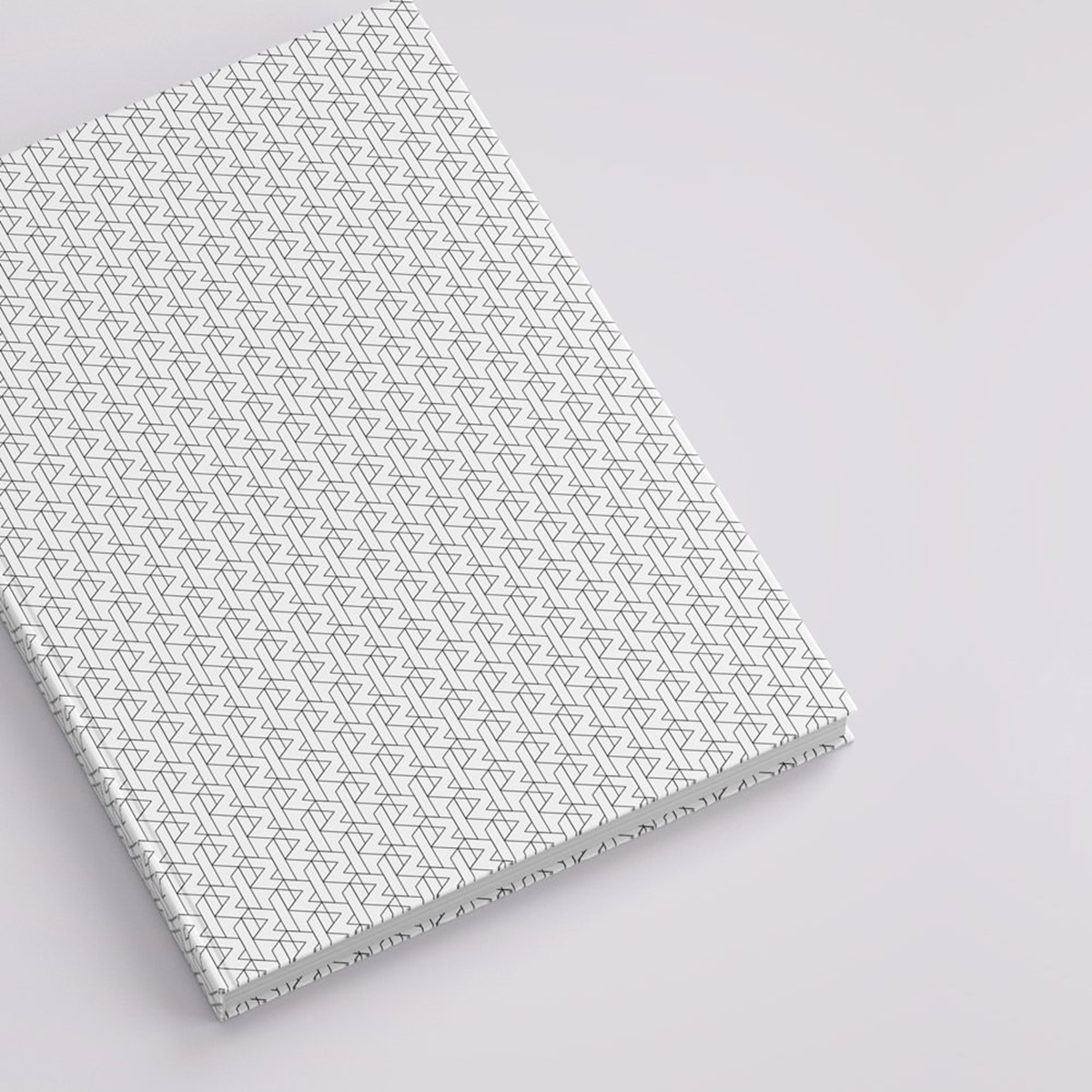
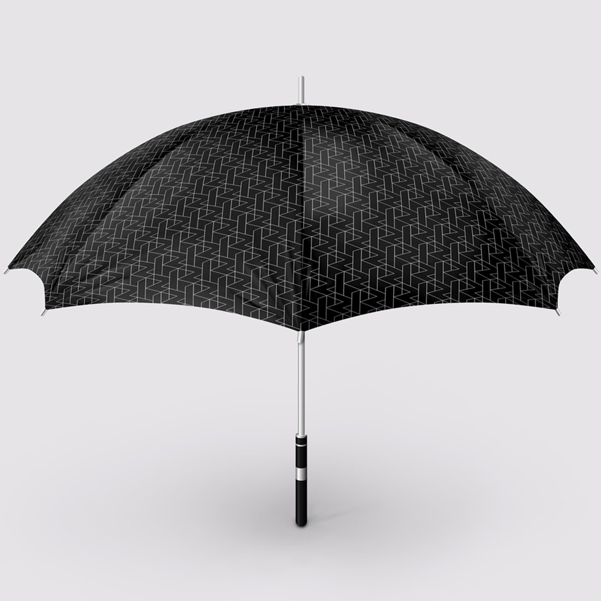
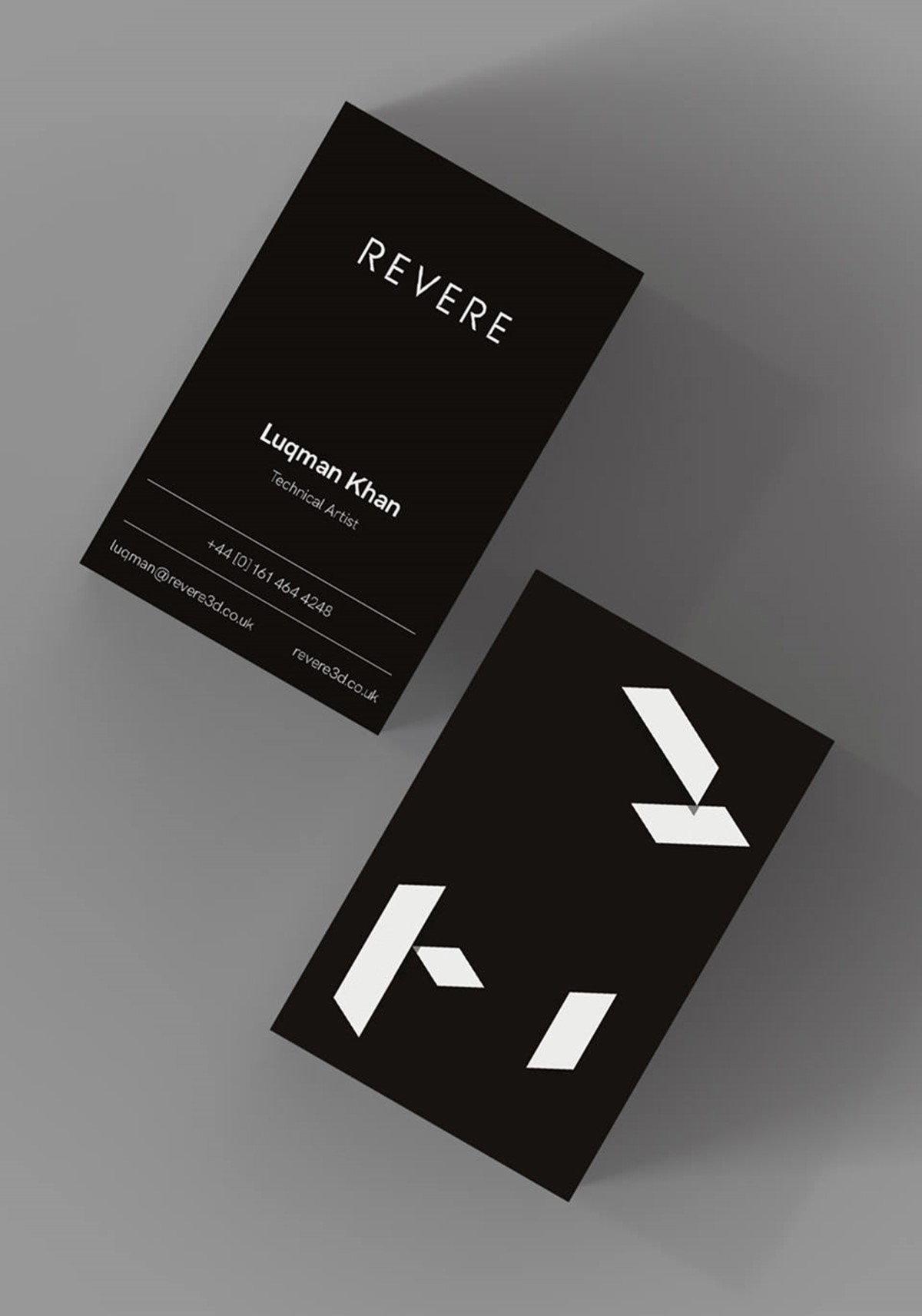
Initial research began with the idea of repeating components that are used to construct both virtual and real-world structures. Use of angles and polygon shapes led to multiple design iterations from abstract use in bold, graphic design to more conservative, repeating patterns. Design experimentation led to subtle illusions of depth and structure.
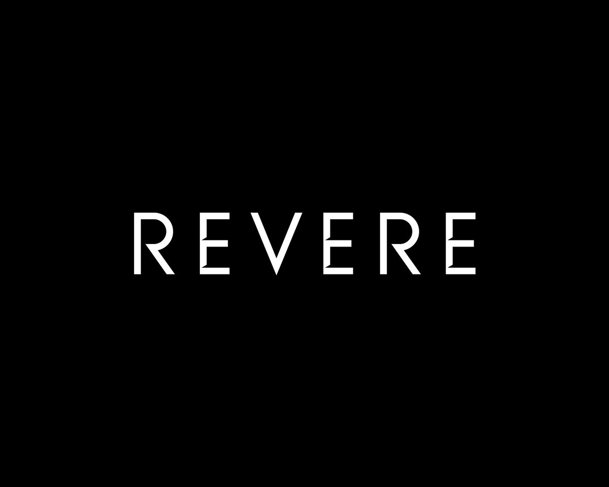
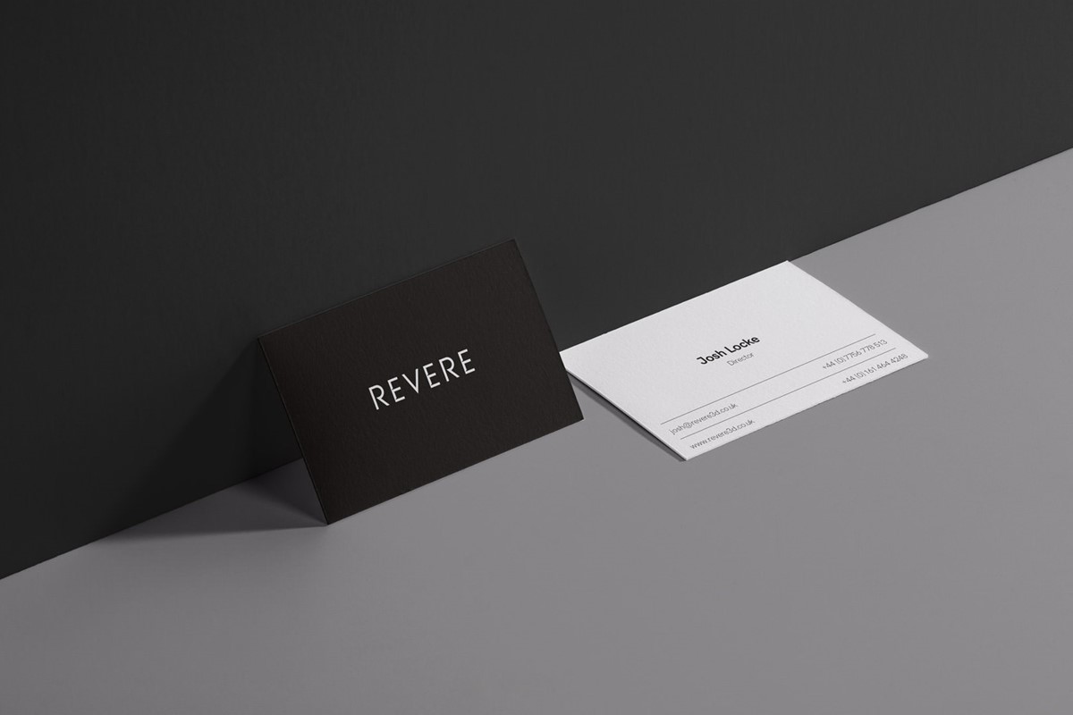
Moving onto the typographic designs for the wordmark, various bespoke options were tested including lower and uppercase sans and sans-serif styles. Ultimately, it was felt the capital sans option was sufficiently elegant, whilst also structurally precise and robust to reflect their target sector. However, further distinction and connection to the angular graphic language was required.
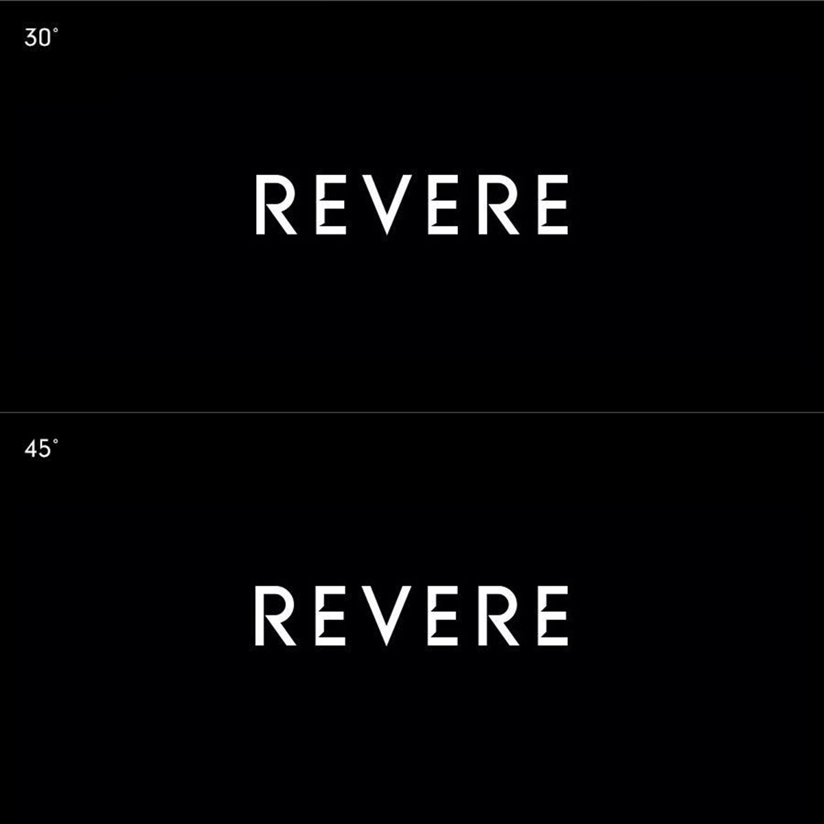
The word Revere is unusual since it features three E's. A simple repeating angled cut at the intersection of the bars of each alluded to the suggestion of depth and floor levels within a building. In addition to a light and heavy version of the logotype design – adjustments were made to the cut angle – increasing from 30 to 45 degrees for use at small scale and on screen.
With the typographic designs for the logotypes complete, design experimentation with the bespoke and versatile patterns ensued. The selected graphic device enabled both simple and complex applications to evolve across all media, whilst allowing room for further development in the future. This took the form of abstract animated logo idents through to the animated formation of complete cityscapes.
To ensure all material would be equally effective regardless of the target audience – tech or property sector – a reduced palette of simply black and white was adopted. To maintain the emphasis on the brand identity or visual content, use of additional typography was also restrained by selecting a versatile, but calm sans serif.
Project services
- Bespoke Typography
- Animation
- Art Direction
- Branding
- Strategy
- Graphic Design
- Typography
- Illustration