
QRFN – Quick Response Fund for Nature Branding for nature
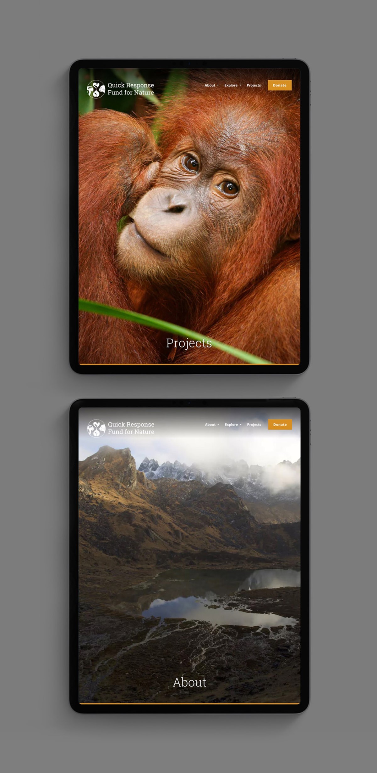
The Quick Response Fund for Nature [QRFN], is a philanthropic collaboration focused on protecting some of the world’s most critical sites for endangered species. Opportunities to purchase key landscapes are often missed if time-consuming fundraising is required. QRFN provides access to immediate investment as opportunities arise. Having worked with Superfried before for various design projects – World Oceans Day . LEAF . Don't Let Them Disappear . Elephants . Sharks – founders, the Leonardo DiCaprio Foundation, commissioned graphic design agency Superfried once again to develop the brand identity.
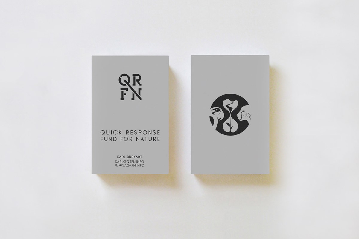
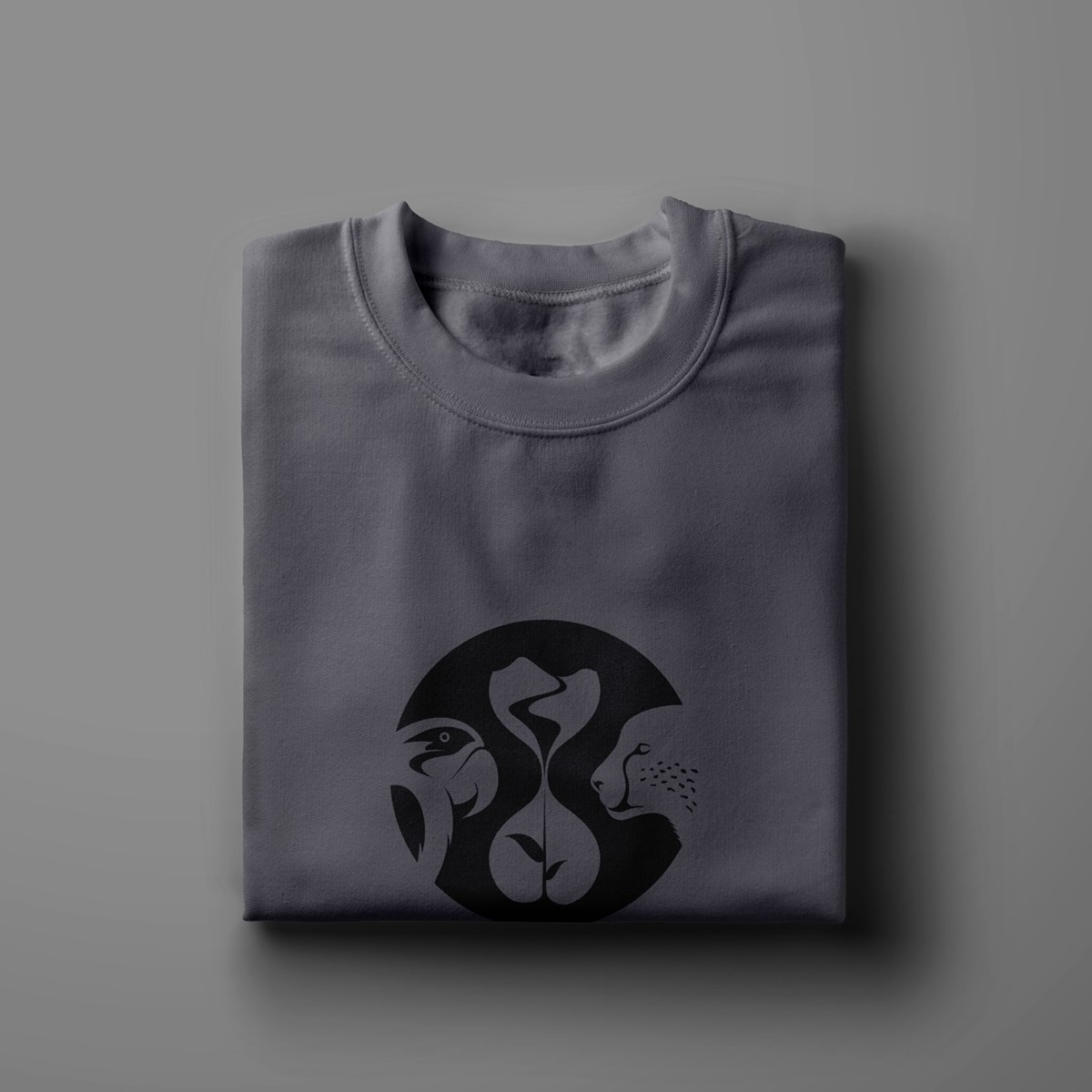
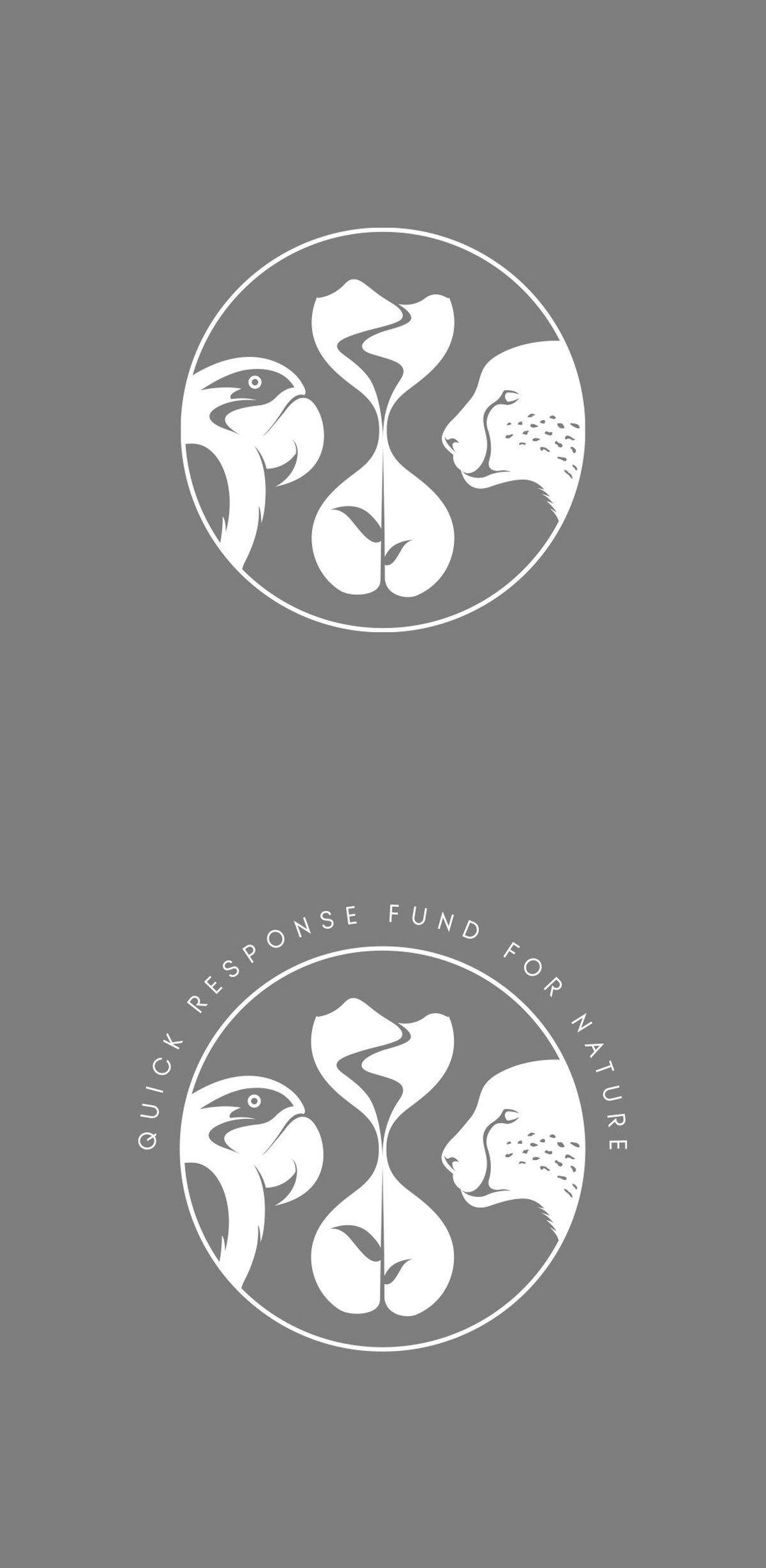
QRFN supplies rapid financial support for all landscapes and species so it was requested that the brandmark should represent a mixture of flora, fauna and, if possible, also convey time. This was a rather challenging proposition. For the inclusion of time, initial research of ideas around clocks proved problematic, so a more abstract design strategy was adopted leading to an hourglass. This allowed for much more creative freedom and expression. The sand could now be manipulated to suggest the presence of mountains and rivers in the upper chamber leading to the formation of a plant in the lower chamber. With time, flora, and land covered, next was the wildlife.
The client requested the fauna to convey both land and air-based species. After design experimentation and numerous design iterations with various animals, it was surprisingly the cheetah and parrot that proved to be the most effective. Thorough testing found the graphical representations of the two species offered the most immediate recognition and closest symmetry at all scales.
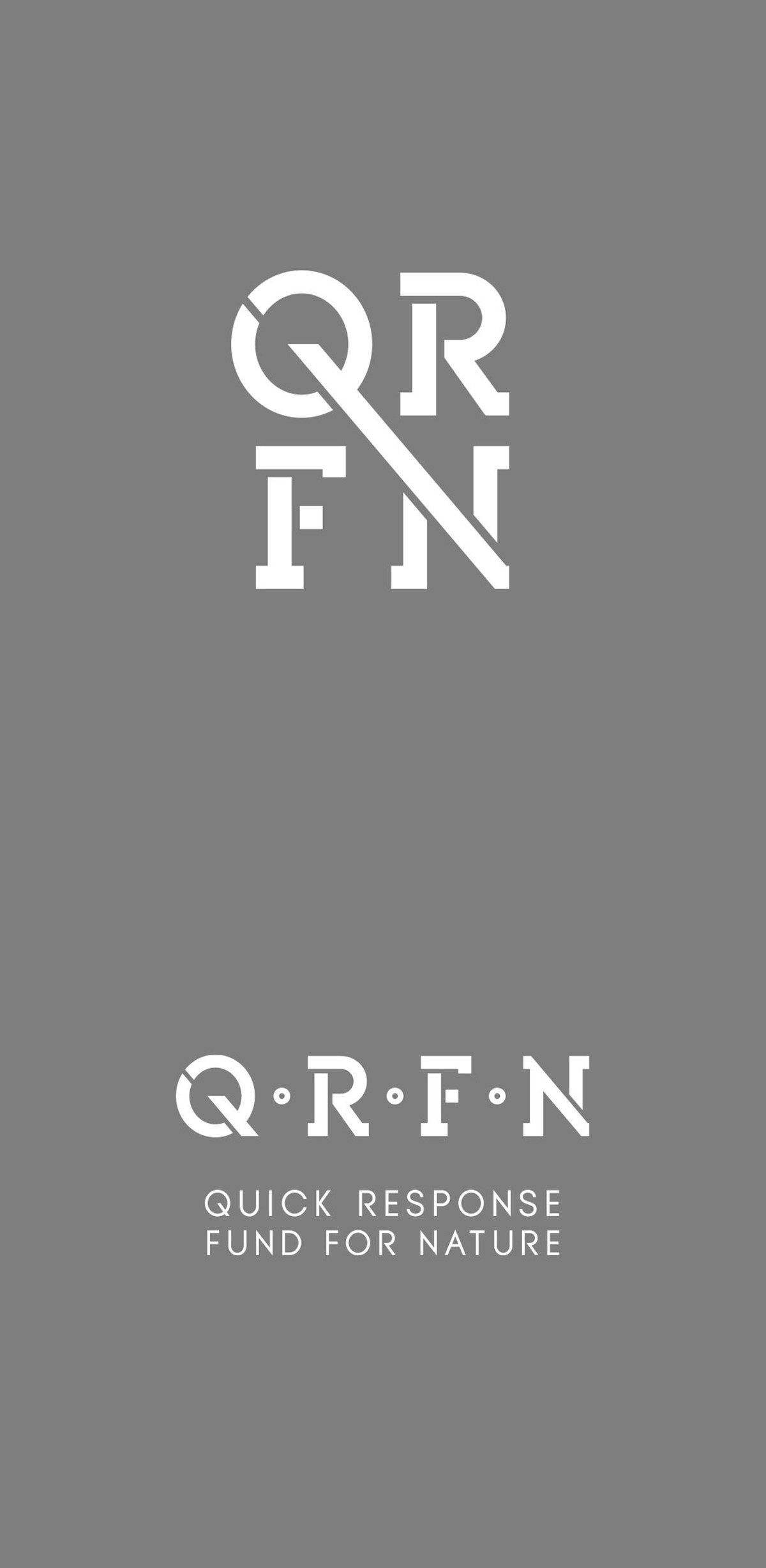
With the creative solution for the marque resolved, I started to look at lettering for the logotype design. The organisation had a rather long name, so it was clear that an initialised version would be required. Bespoke typography was developed for the initialised wordmark using a robust slab serif style reminiscent of branded wooden crates transported throughout the world.
To convey the 'quick' nature of their approach the tail of the Q was extended to connect and simultaneously form the angled stroke of the N, reflecting the rapid progress from availability through to the purchase of critical landscapes. To ensure versatility in all scenarios various logo lock-ups and arrangements were created in addition to testing via mock-up designs for key marketing collateral.
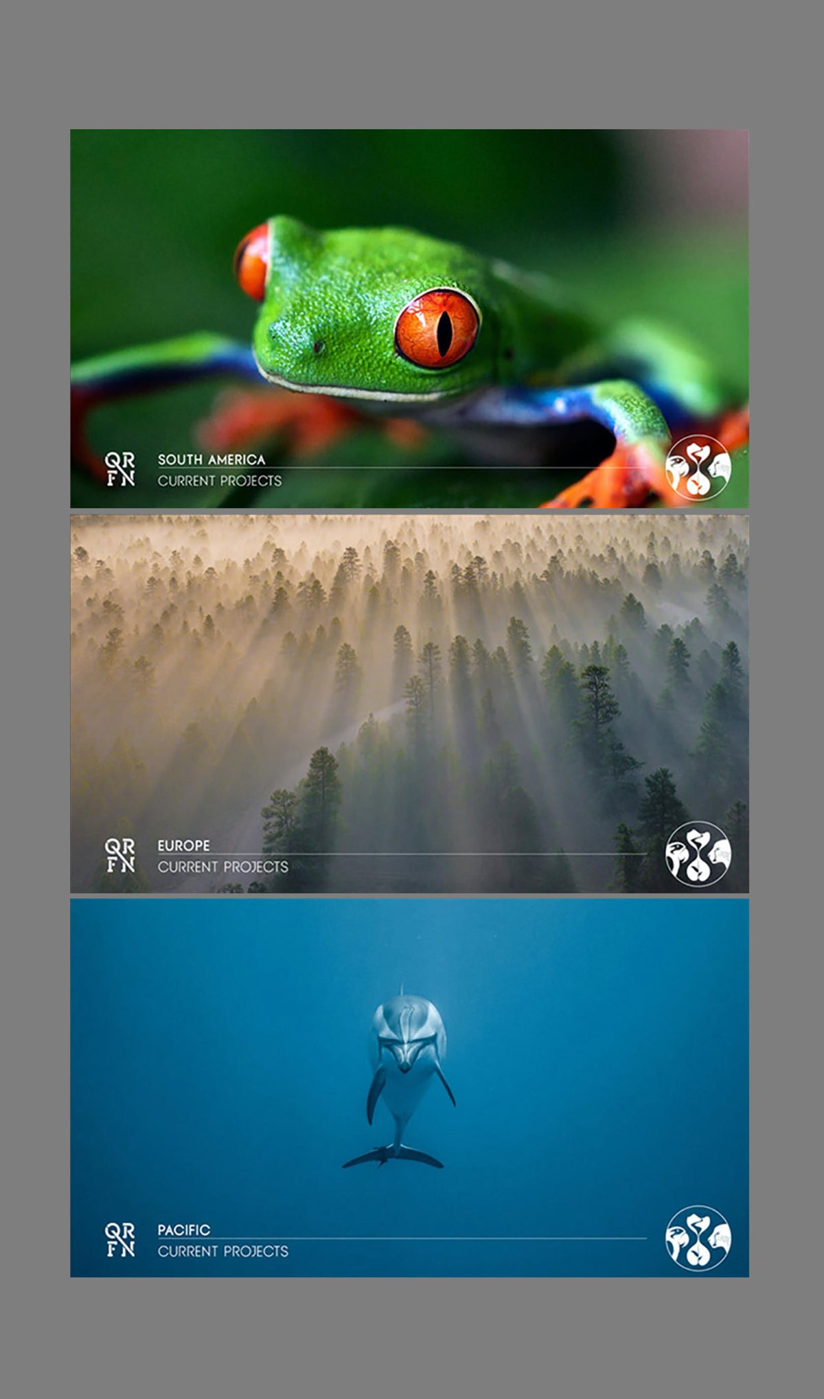
For marketing and fund raising simple promo animations were subsequently designed and developed. To convey the broad scope of QRFN's work an eclectic mix of photographs selected to include all forms of flora, fauna, and landscapes were featured. The shots were then simply run sequentially on a rapid loop to reinforce the pace at which action must be taken.
Project services
- Brand Identity
- Illustration
- Art Direction
- Bespoke Typography
- Animation
- Branding
- Typography
Credits
Animation image credits
–
Casey Horner via Unsplash
David Clode via Unsplash
Chris Lawton via Unsplash
Guu Xuan via Unsplash
Blake Meyer via Unsplash
Guillaume Briard via Unsplash
Ian Parker via Unsplash
Paulius Dragunas via Unsplash
Landon Arnold via Unsplash
Sander Wehkamp via Unsplash
Valeriy Andrushko via Unsplash
Joel Filipe via Unsplash
Jonathan Auh via Unsplash
Иван Сологуб via Unsplash
Yanguang Lan via Unsplash
Sergey Pesterev via Unsplash
Trevor Cole via Unsplash
Yosh Ginsu via Unsplash
Milos Prelevic via Unsplash
Anton Repponen via Unsplash
Boris Smokrovic via Unsplash
Lucas Marcomini via Unsplash
Gaetano Cessati via Unsplash
Curioso Photography via Unsplash
Jeremy Bishop via Unsplash