

Phonik Music events brand identity
Phonik is a bespoke music events company founded by Dj, producer, and long-term client Dan McKie. He asked graphic design agency Superfried to develop the brand name and brand solution for his new venture.
Requesting a musical connection within the name and brand identity, research predictably revealed most associated words were already in use. Deviation from the beaten path and a slight misspelling led to the final creative solution. In addition to being an acoustically based term, Phonik also had a digital feel connecting to the technical expertise they provide.
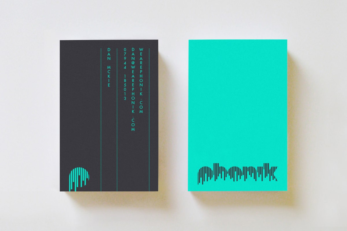
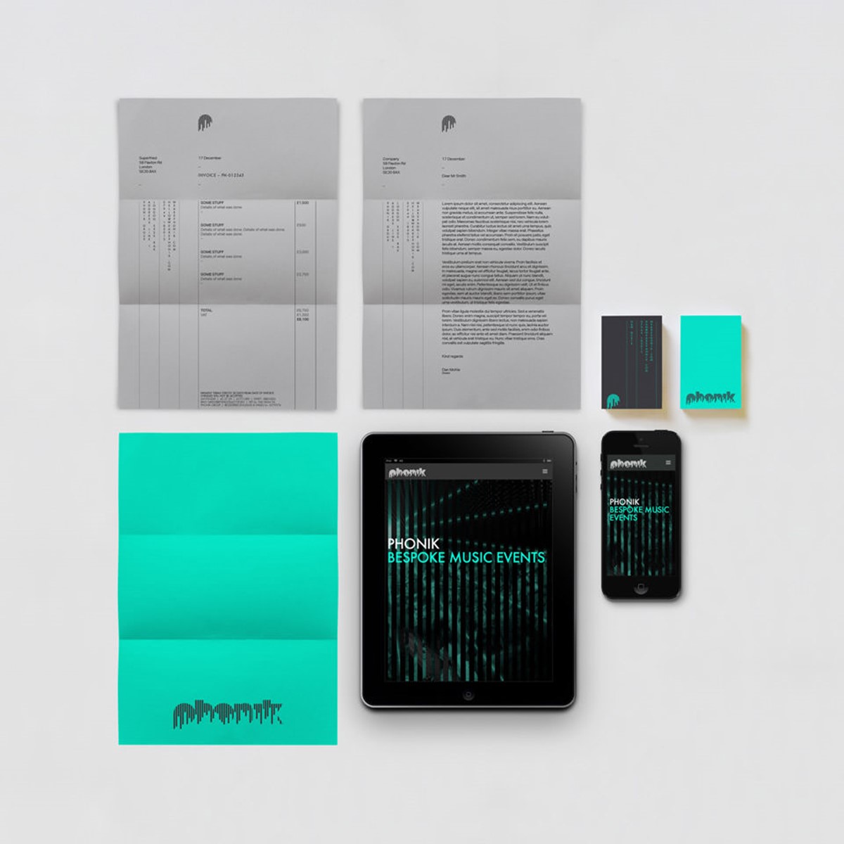
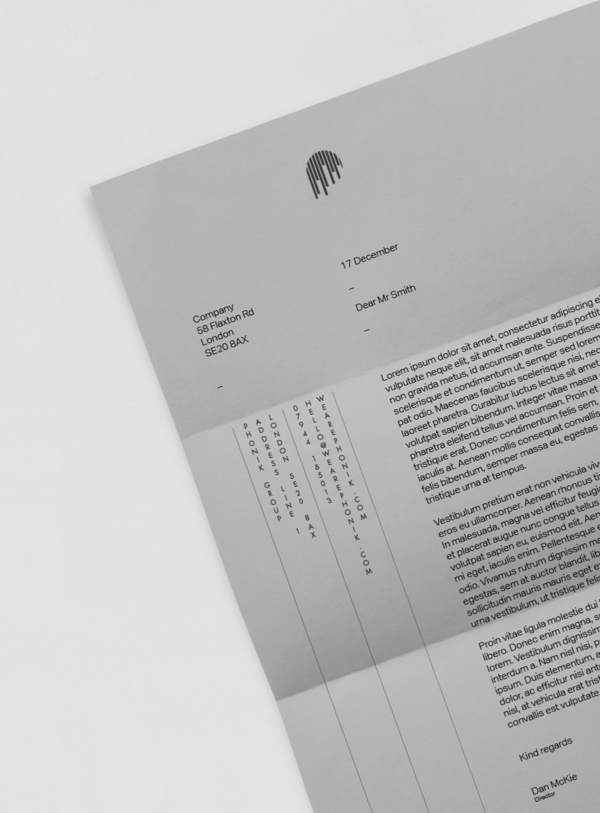
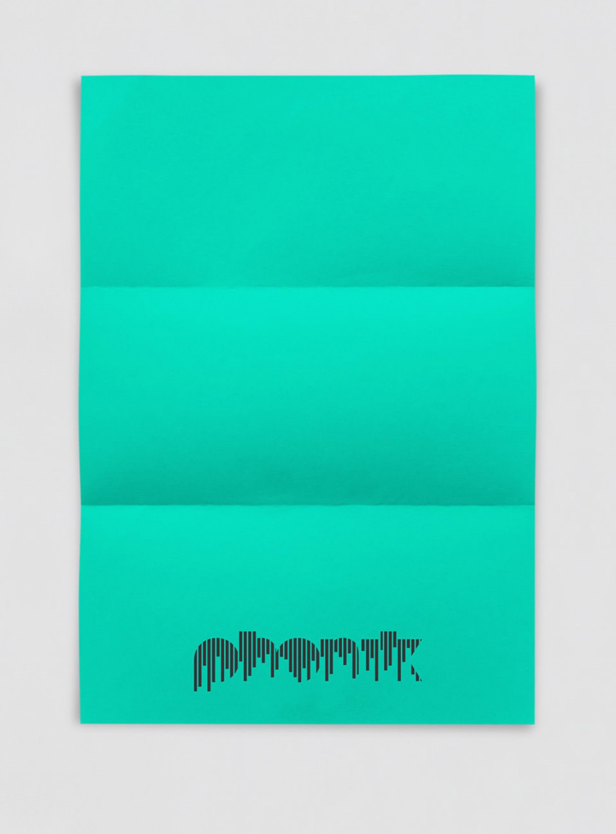
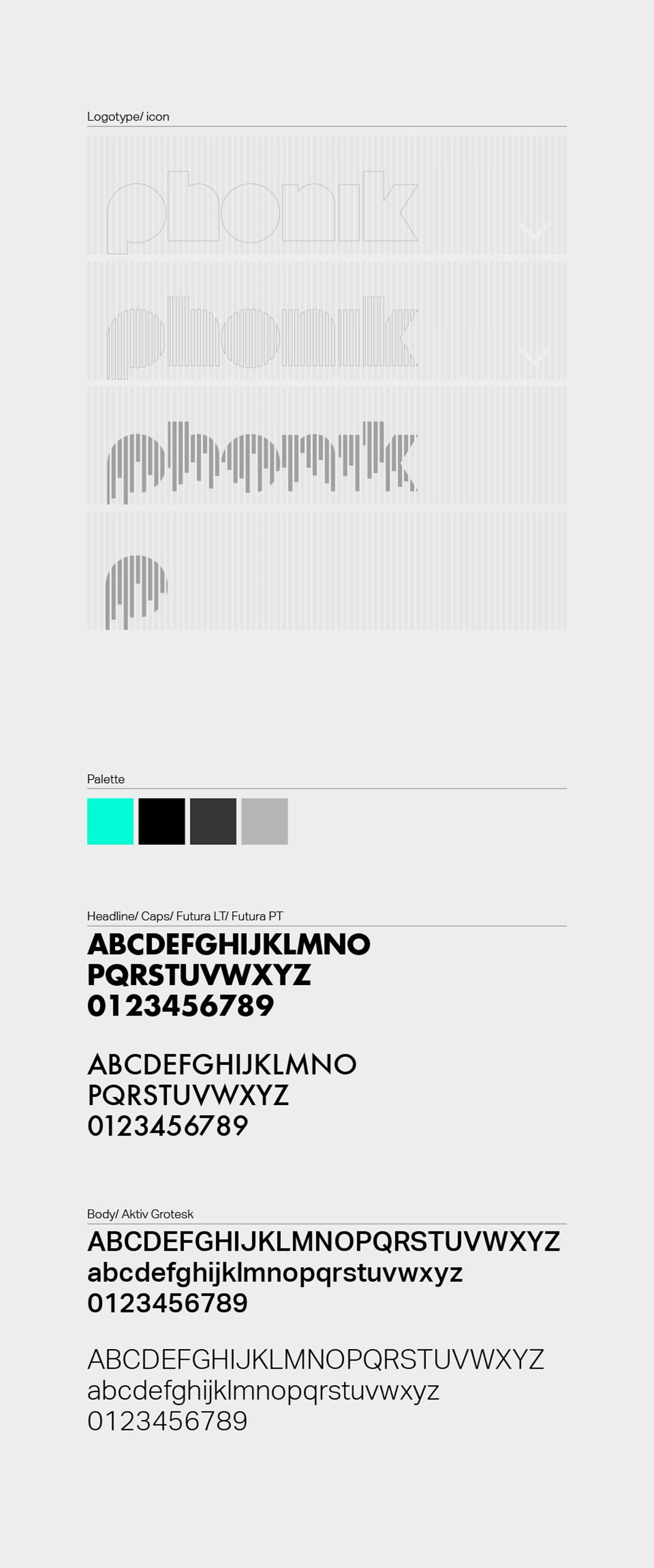
As with the brand name, musical-based graphical representations have been widely used for brandmarks. Looking at Dan's 10+ years in the digital music industry, led to the idea of the classic graphic equaliser. Extensive design iterations and design experimentation were required before the strip effect successfully conveyed this idea whilst also remaining completely legible. To continue this staggered bar chart effect, a distinct vertical typographic composition was employed for the stationery.
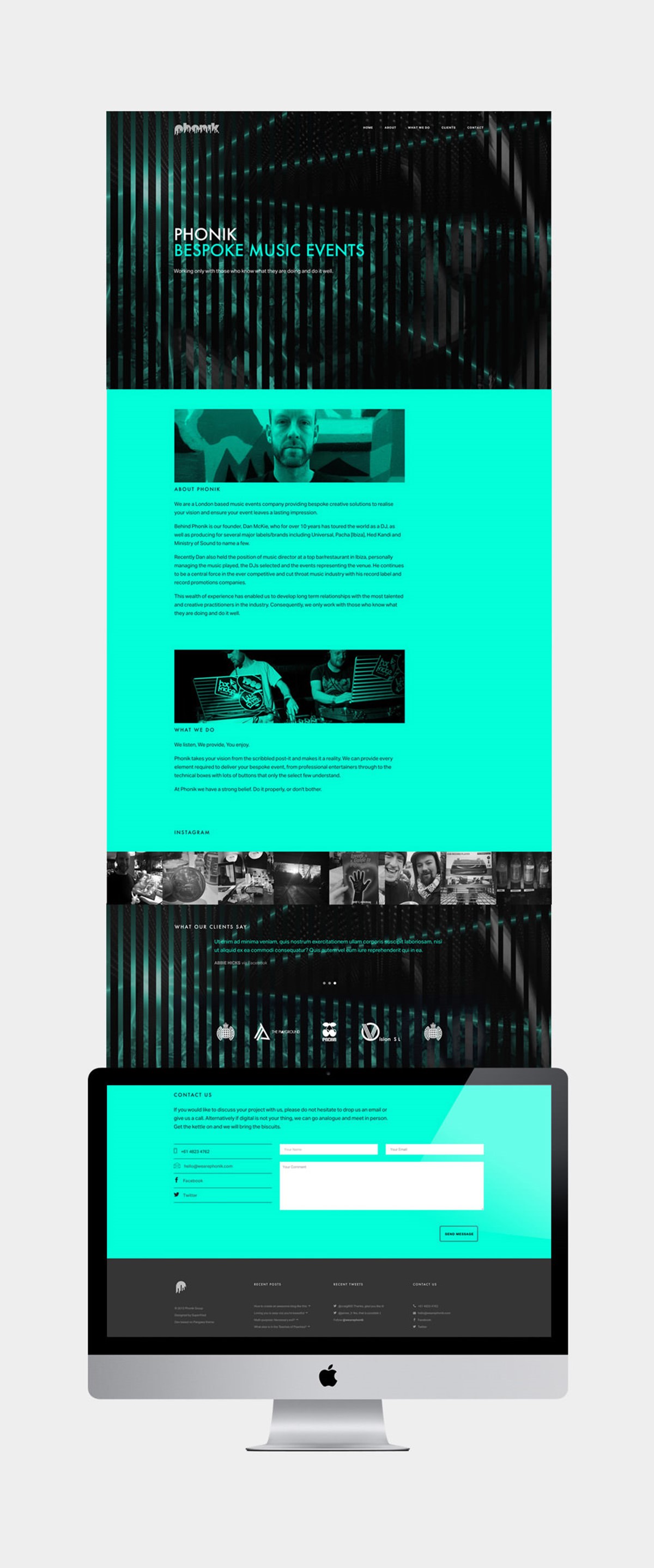
Shredding the associated imagery completed a consistent brand strategy. A combination of two shots on alternate strips created a high-impact look conveying the energy and the motion of the events depicted. This simple illustration style in addition to a bold, brand colour palette was adopted for the single-page website design.
Project services
- Brand Identity
- Bespoke Typography
- Art Direction
- Web design
- Branding
- Typography
Testimonials . Press . Awards
"Superfried has helped me increase my exposure and has set the company up for a very bright future."
—
Dan McKie . Director
Phonik . Barcelona
—
This branding design project was featured in IdN Magazine [IdN v23n3] and awarded design of the day by Design and Design on 13/05/2015.