






One Earth Brand strategy + development
One Earth is a philanthropic non-profit organisation working to accelerate collective action to limit global average temperature rise to 1.5°C. Having collaborated on previous design projects – Shark Conservation . Elephant Crisis . LEAF . QRFN . Pangolin Crisis – design agency Superfried was commissioned to develop its brand strategy and brand identity.
The client was generally happy with the concept for their existing logo design – essentially a diagrammatic representation of planet Earth. So after testing numerous alternative design iterations, the existing marque was retained.
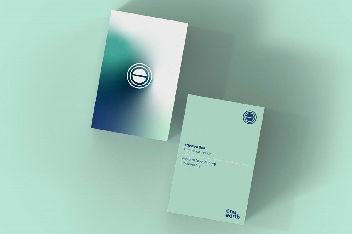
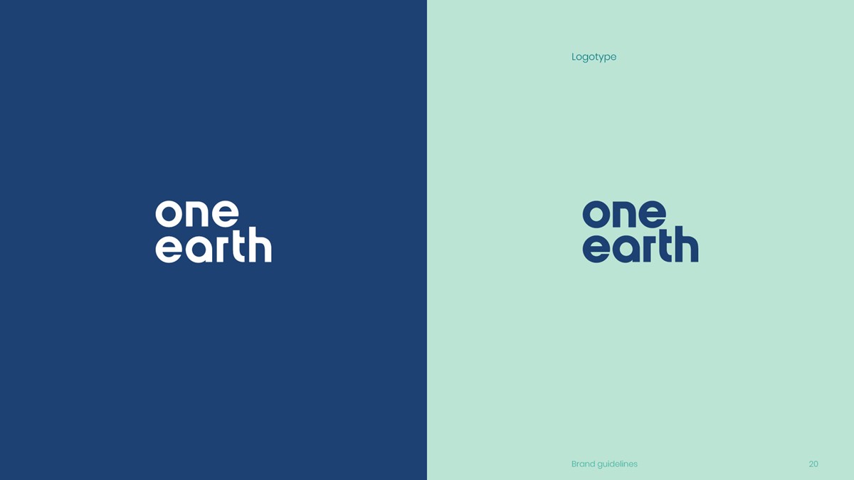
For the logotype design the brand identity required a clean and inclusive feel. A new bespoke geometric typographic design was developed featuring a mixture of round and square forms. The geometric connection to the logo was emphasised further in the case of the 'a' with the removal of the back stem. In stark contrast, for distinction, the 'r' has been adjusted to a square form to match that of the 'n' and create a seamless flow through the 't' to the 'h'. To compensate for the optical weight gain of the logotype design when white on dark backgrounds – The Irradiation Illusion – a second version at a slightly reduced weight was drawn. The new lettering was then adapted to create a bespoke logotype design for the web address sign-off.
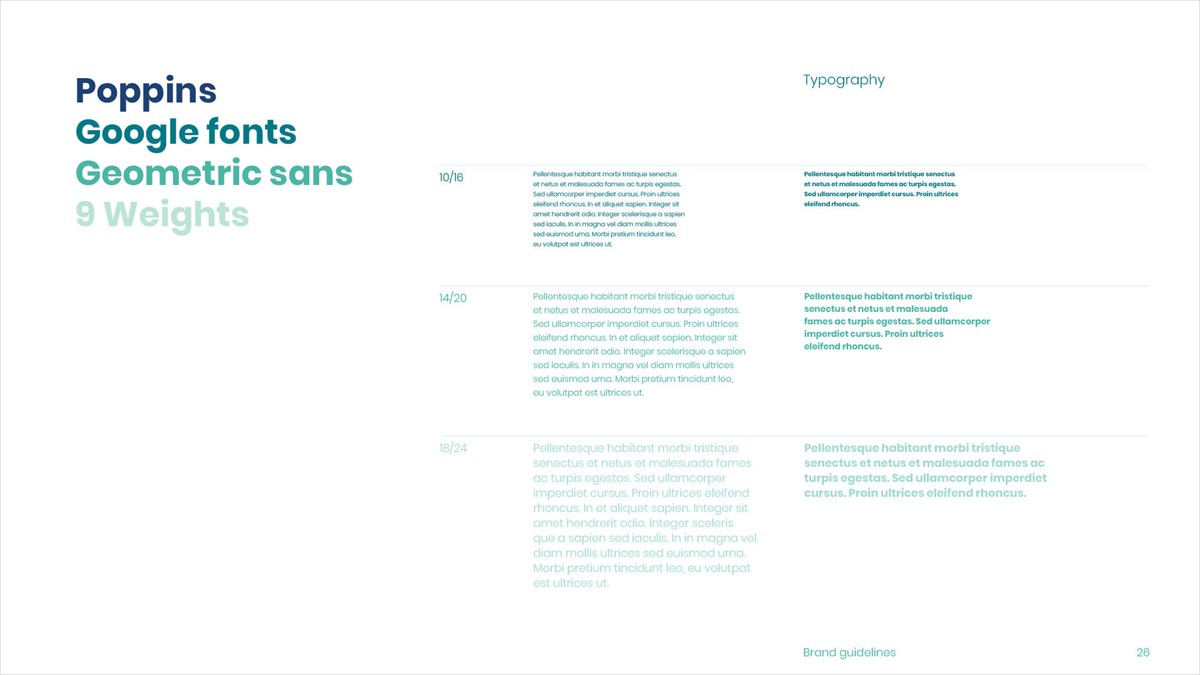
For the typography, as a non-profit, the client was seeking a cost-effective, versatile solution. To work with the style of the logotype a geometric sans serif was selected. With 9 weights and freely available from Google fonts, Poppins ticked all the boxes.
Post COP 26, the environment is high on the agenda. So a dramatic increase in noise and greenwashing was inevitable. Therefore, One Earth's biggest challenge would be communication. They had commissioned 17 leading experts to develop an actionable model to maintain temperature rise to 1.5˚C. The highly respected research provided a strong, sector-leading USP, but conveying this through the noise and scepticism would be challenging.
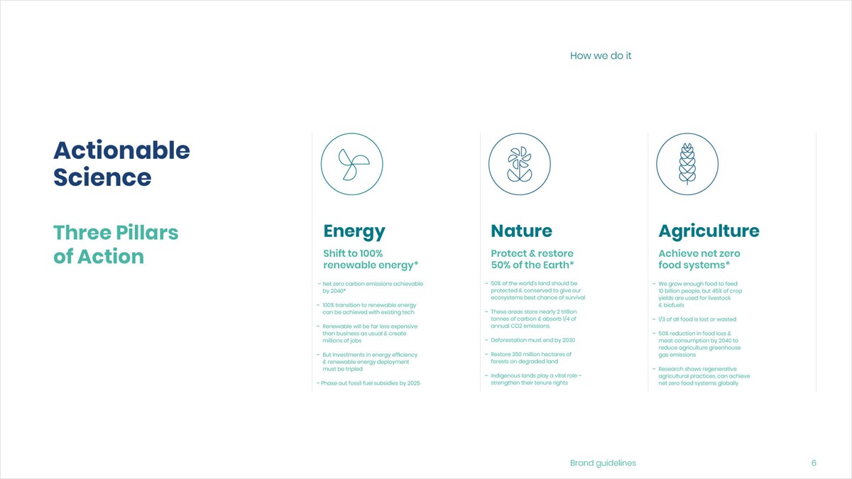
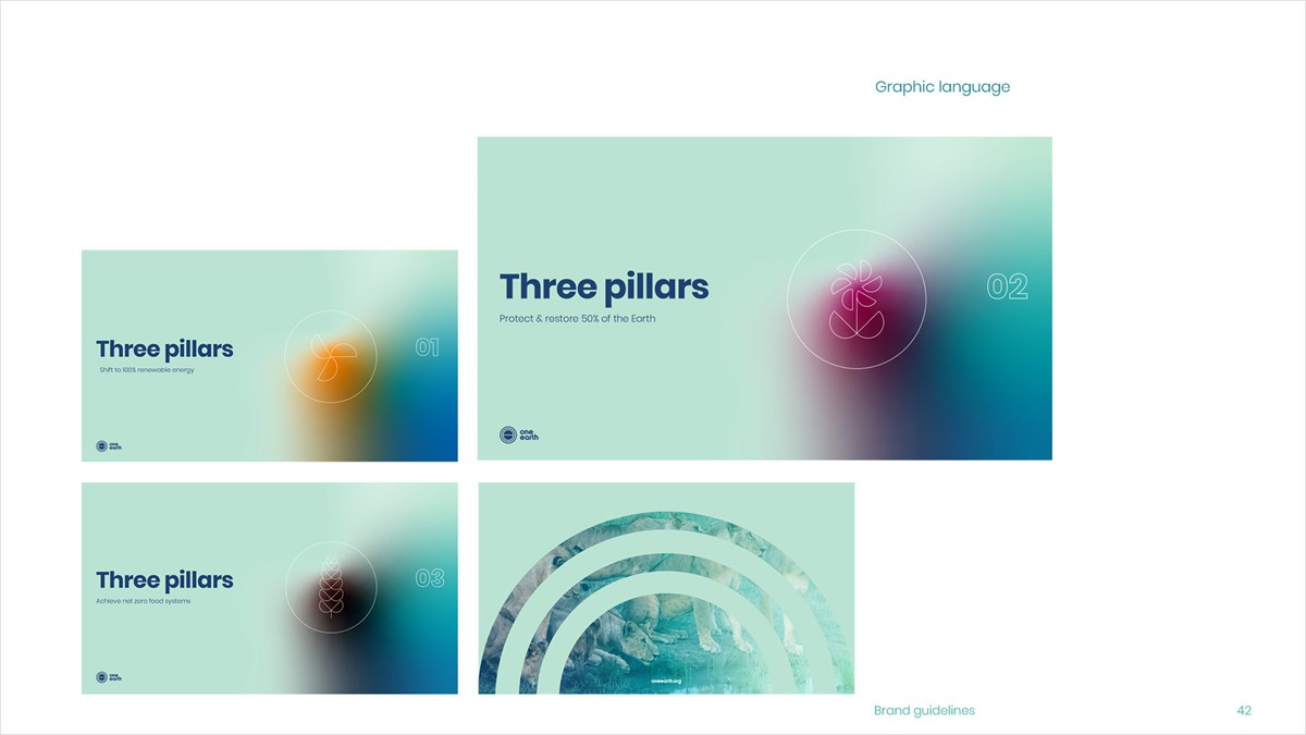
Climate change is a very complex and technical problem so the brand strategy was to simplify messaging wherever possible and focus on their USP – the three-pillar model. This was reduced to three simple headings and an icon for each. The symbols were constructed from multiple semi-circles to create a direct connection to the main logo. Details of each stage were reduced to digestible bullet points. But with heightened levels of misinformation, less detail could encourage further scepticism. To tackle this and instil trust, complete transparency would be maintained by allowing the audience to check their work. The remaining details and research sources would be linked on a separate page reached via a new icon called Stat Check. This would be present in all communications and, in time become a benchmark of reassurance. For printed material, access would be made via a QR code or a direct link for digital.
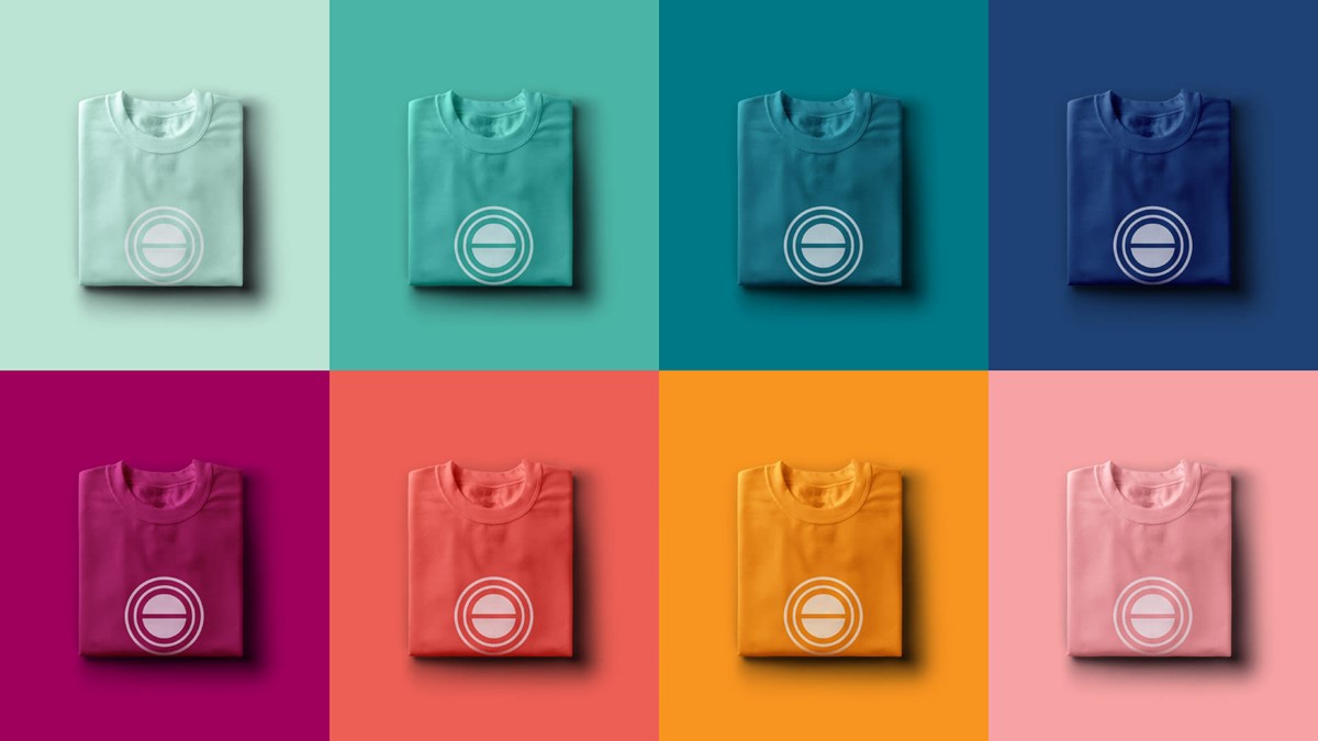
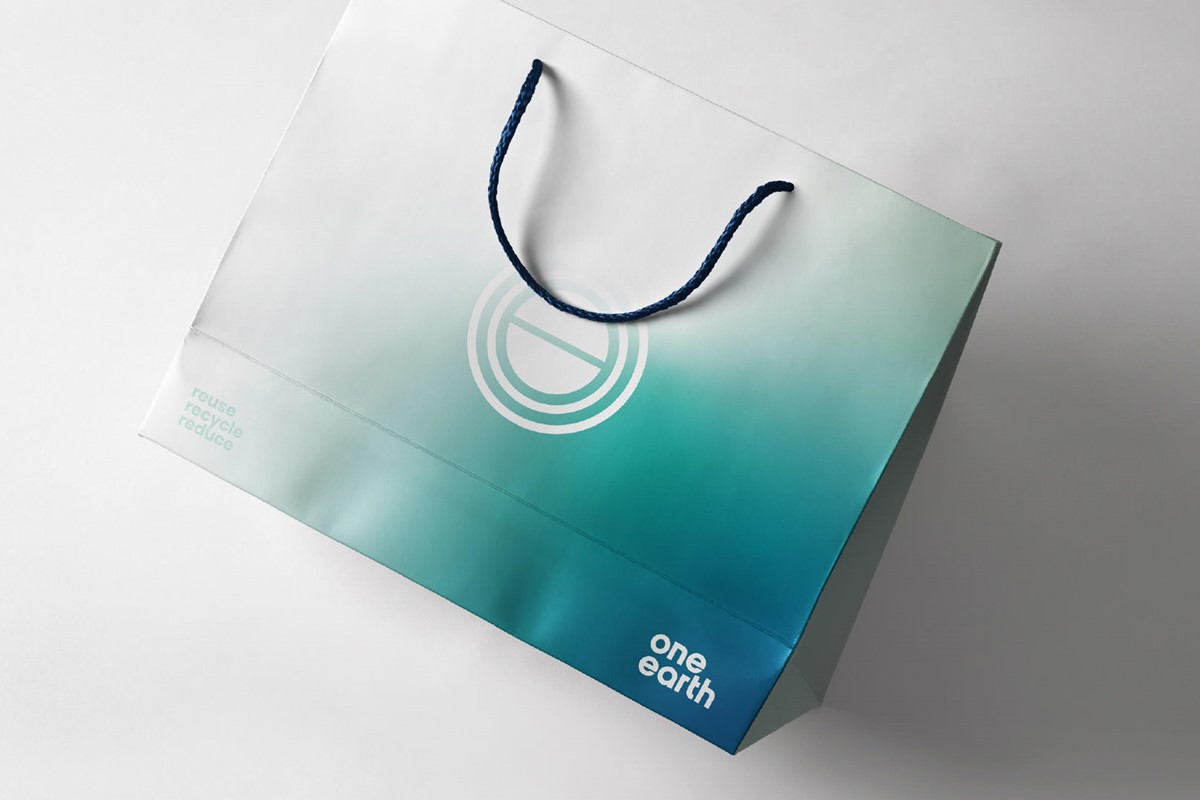
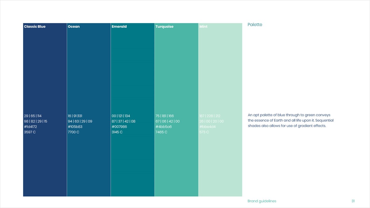
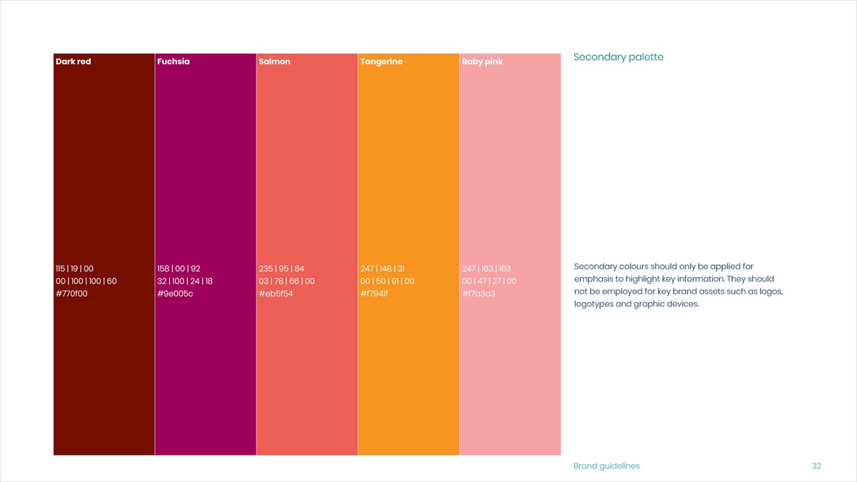
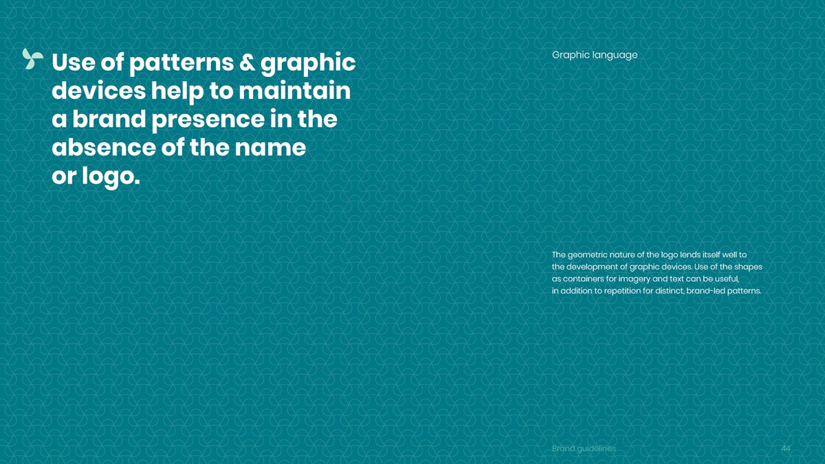
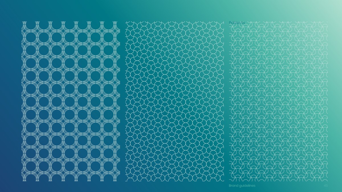
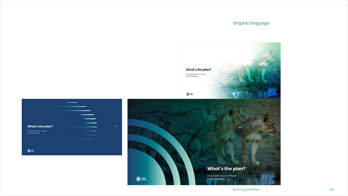
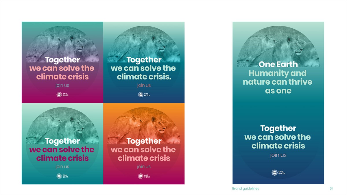
Continuing with the graphic language, previously One Earth made use of a limited palette and gradient device. The gradient was retained but was too static. This was updated via the new tools in Illustrator to create a more dynamic and versatile graphic device that could also be used as an organic image container. This reflected the evolving nature of the problems they are trying to solve. In addition to this, a secondary palette was developed. For marketing brand-led template designs were created, once again making use of the semi-circle as an image container to maintain style consistency. Lastly, pattern devices were created for use as subtle backdrops if required.
Due to budget constraints, the existing website was retained. Superfried provided suggestions for art direction, design strategy, and key messaging.
Project services
- Branding
- Brand Strategy
- Bespoke Typography
- Graphic Design
- Marketing
- Information design
- Animation