
OMD Social Media Week Typographic identity + wayfinding system
Social Media Week is a leading media platform and worldwide event with a local presence across five continents.
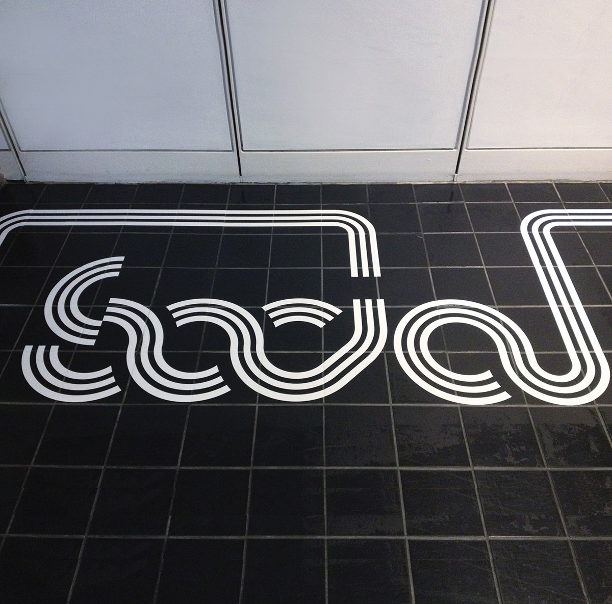
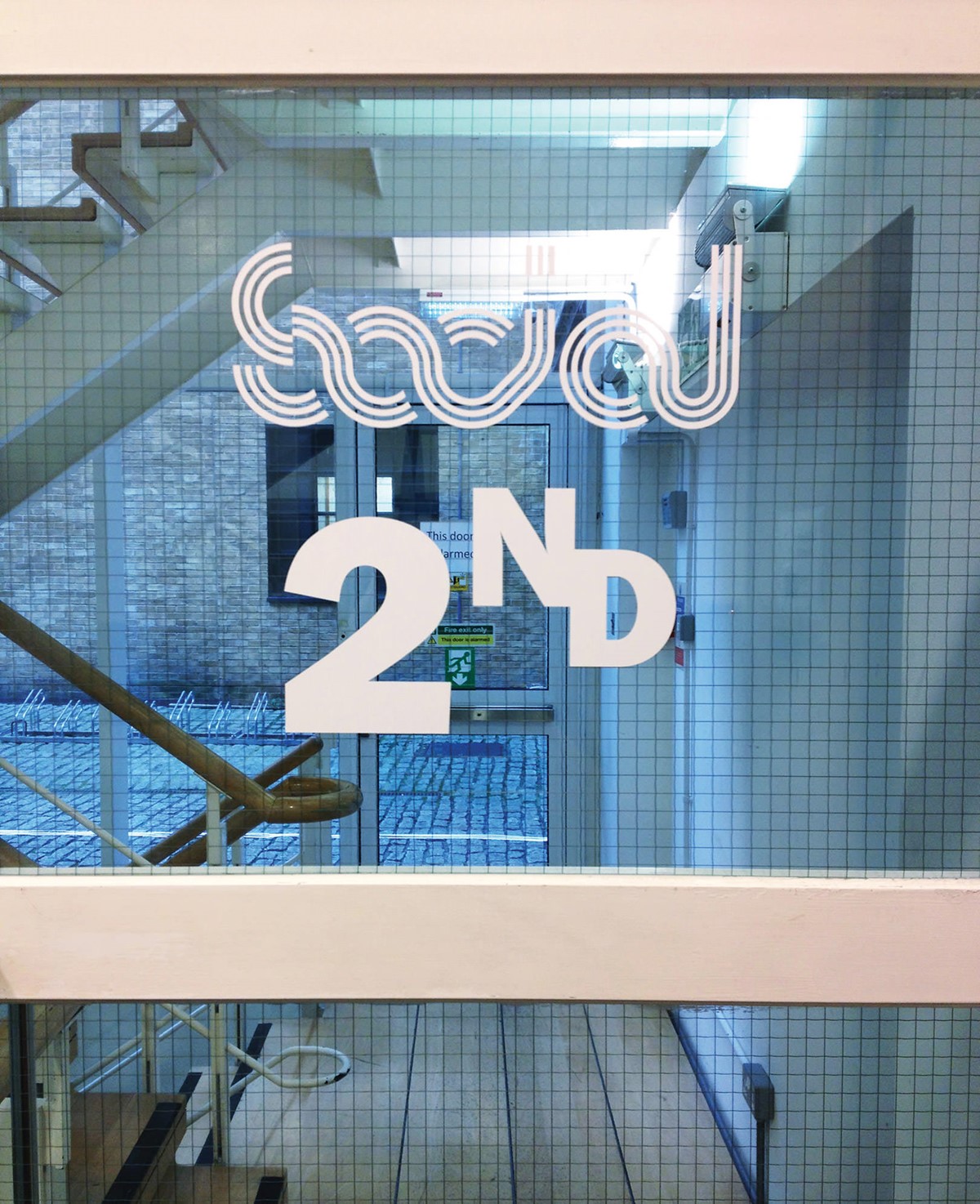
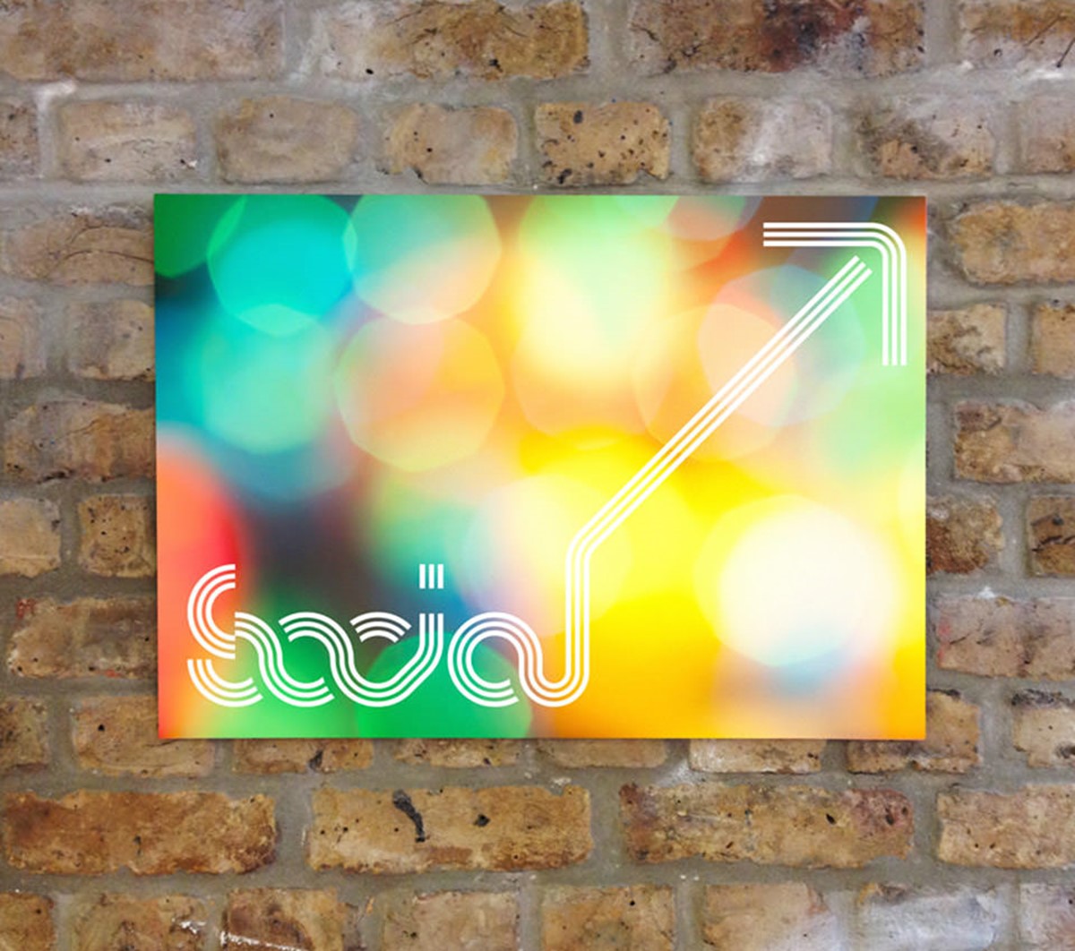
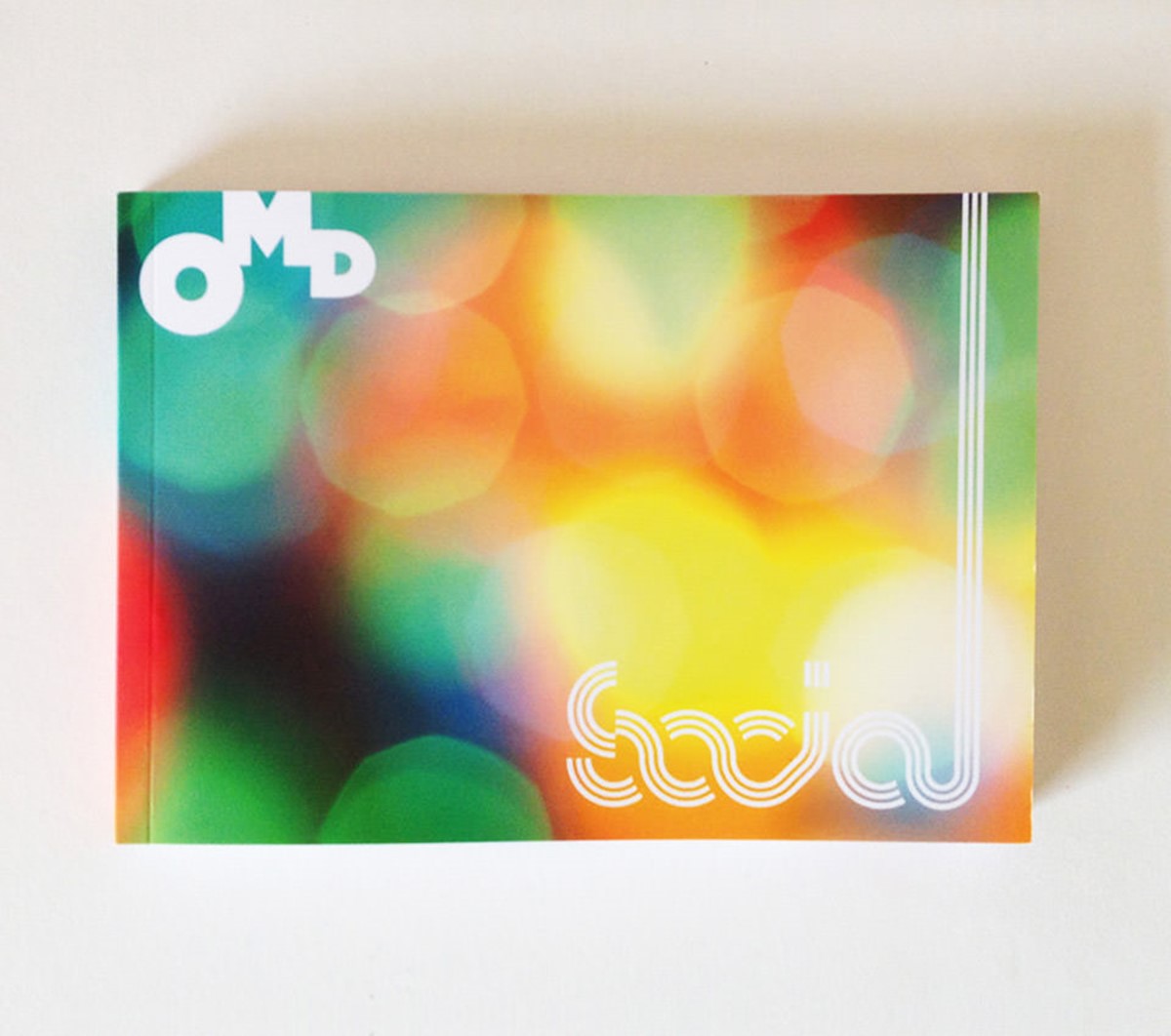
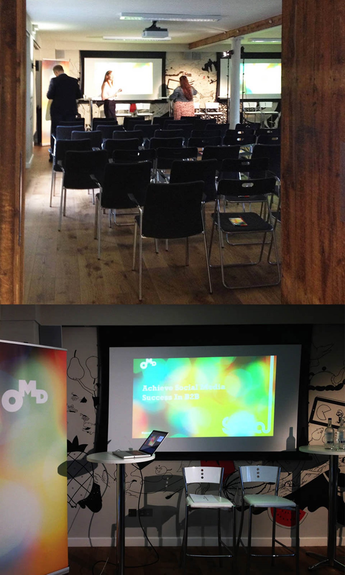
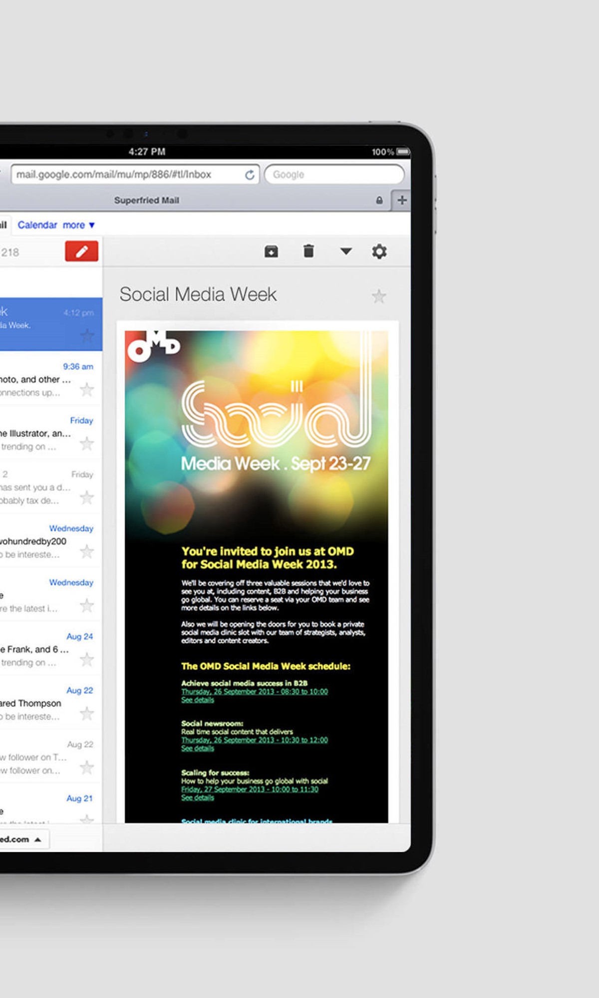
Global Media Agency OMD, was conducting a series of seminars as part of the event and briefed graphic design agency Superfried to develop a new branding strategy. It was important for the client that the new OMD logo for the event had a sense of motion to represent the continually evolving nature of the subject matter.
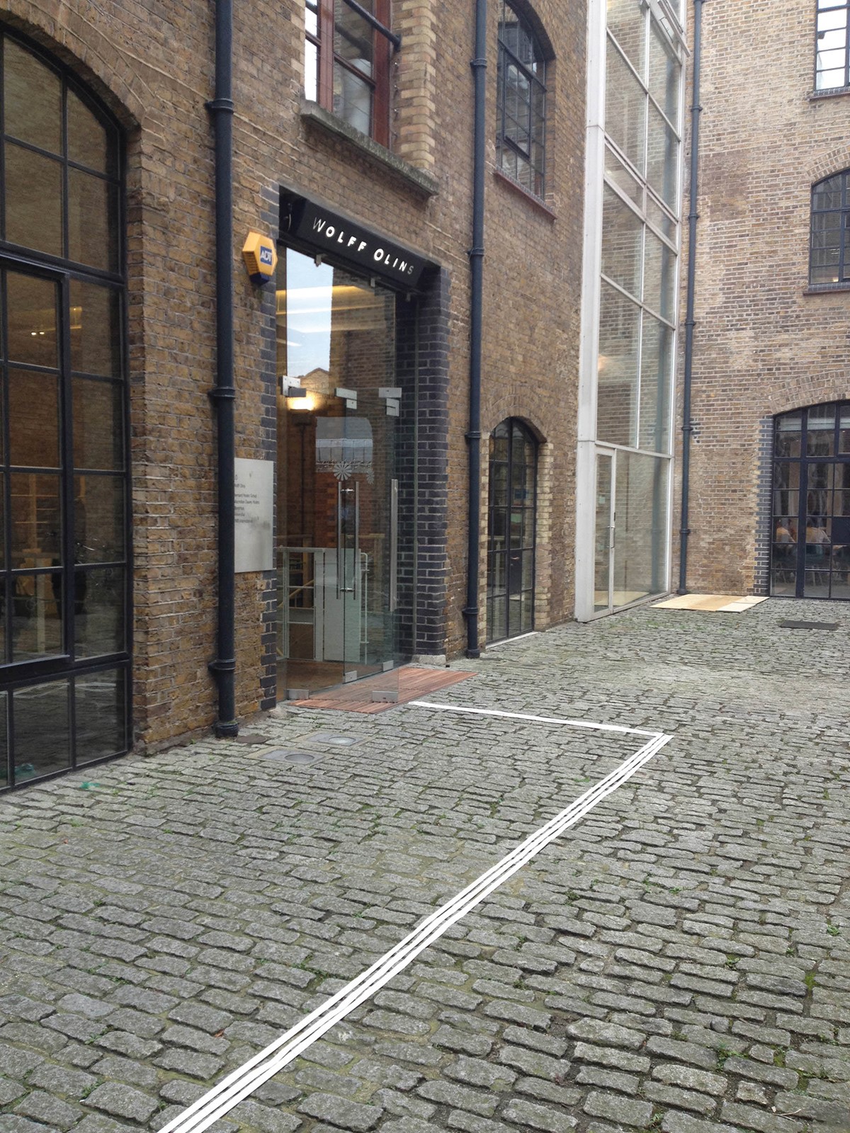
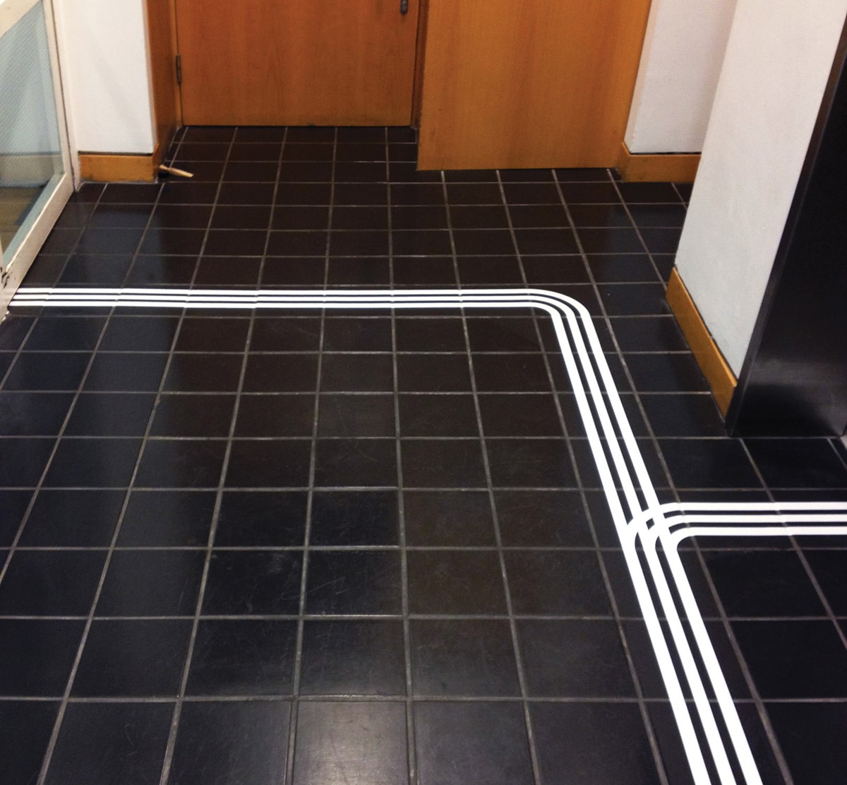
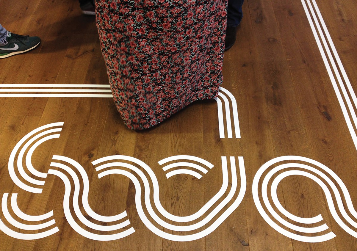
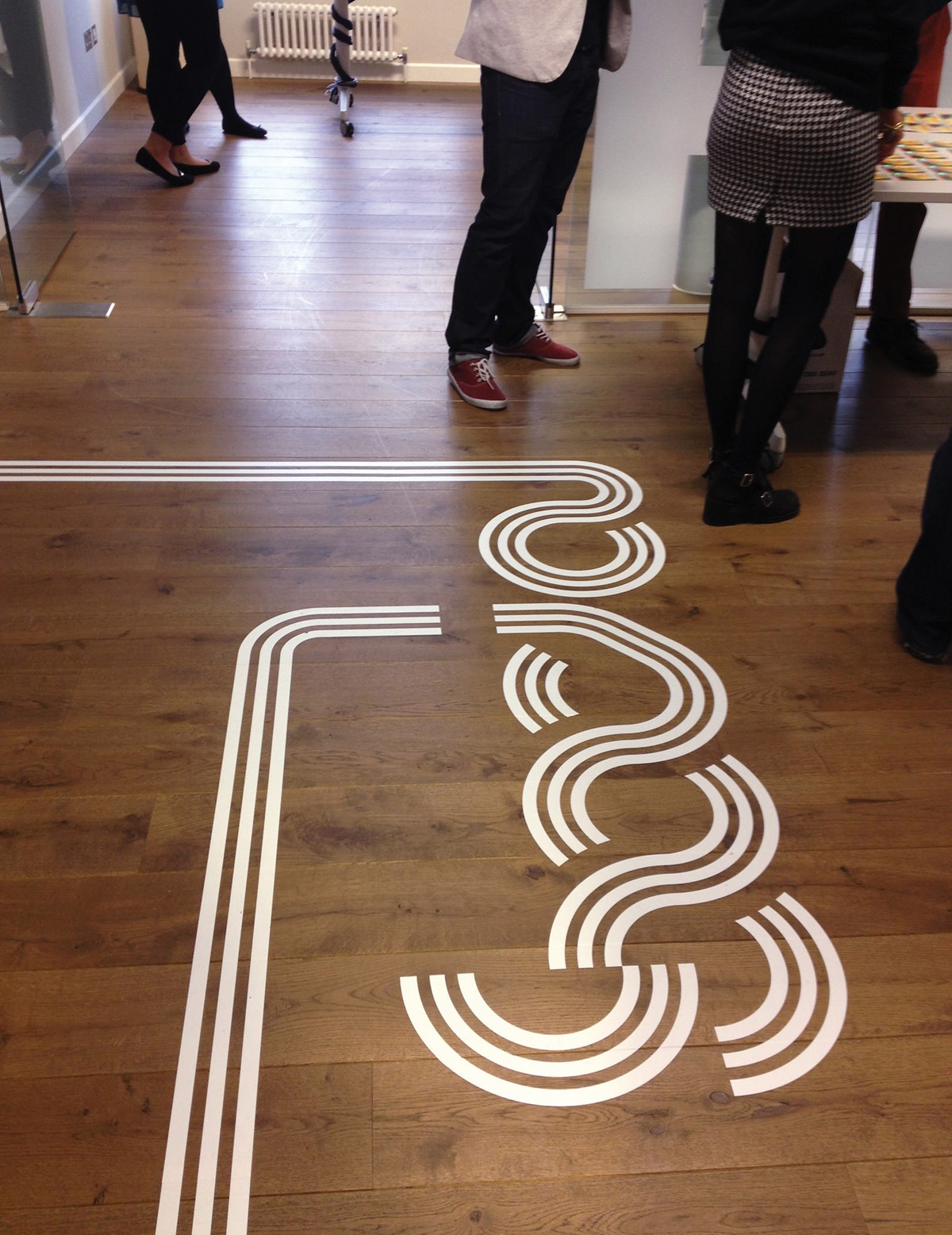
After working through various design iterations to represent motion a new creative direction and design strategy was adopted making use of continuous, flowing parallel paths. This creative solution conveyed the idea of connection which was also appropriate for the event. With the logo design signed off, it was time to look at the signage, but a lack of clear walls meant that we were restricted to the use of floor graphics.
What initially appeared to be a problem quickly led to the design strategy and creative solution for the wayfinding system. A simple adaptation of the new logo design would allow for the parallel lines to flow continuously through it. This was the perfect opportunity to let the new brandmark simultaneously work as a wayfinding system, directing attendees from the entrance straight through to their seats in one fluid, continuous motion.
Project services
- Brand Identity
- Bespoke Typography
- Wayfinding
- Signage
- Typography
- Branding
Testimonials . Press . Awards
This typographic branding project was featured in the wayfinding design publication, Turn Left, Turn Right 2.