
Northern Group Brand development for the property sector
Northern Group are a prominent Manchester-based property developer. They required a local creative agency to develop their brand identity so gave Manchester design agency Superfried a call.
The client felt their existing brand identity was not aligned with where they wanted to take the company. So initially a brand audit was conducted which found that a complete re-positioning was required. After reviewing the findings it was proposed that only the logo marque, primary brand colour and typeface should be retained.
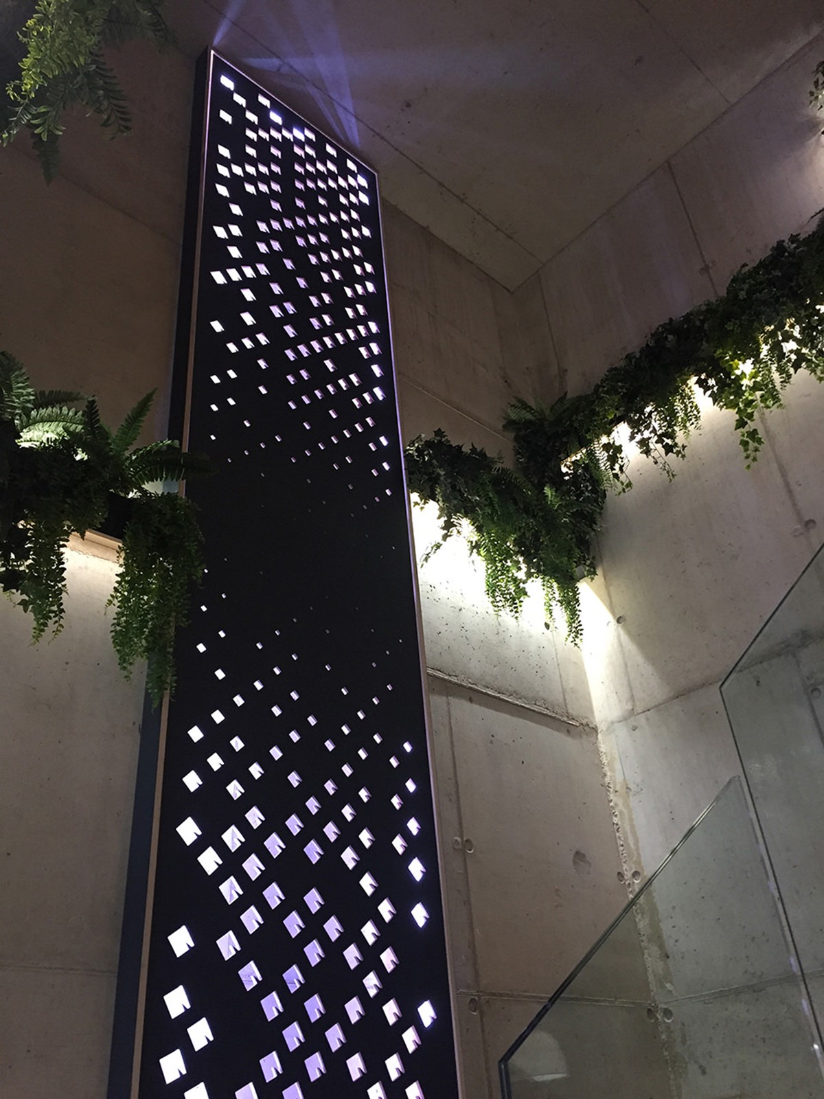
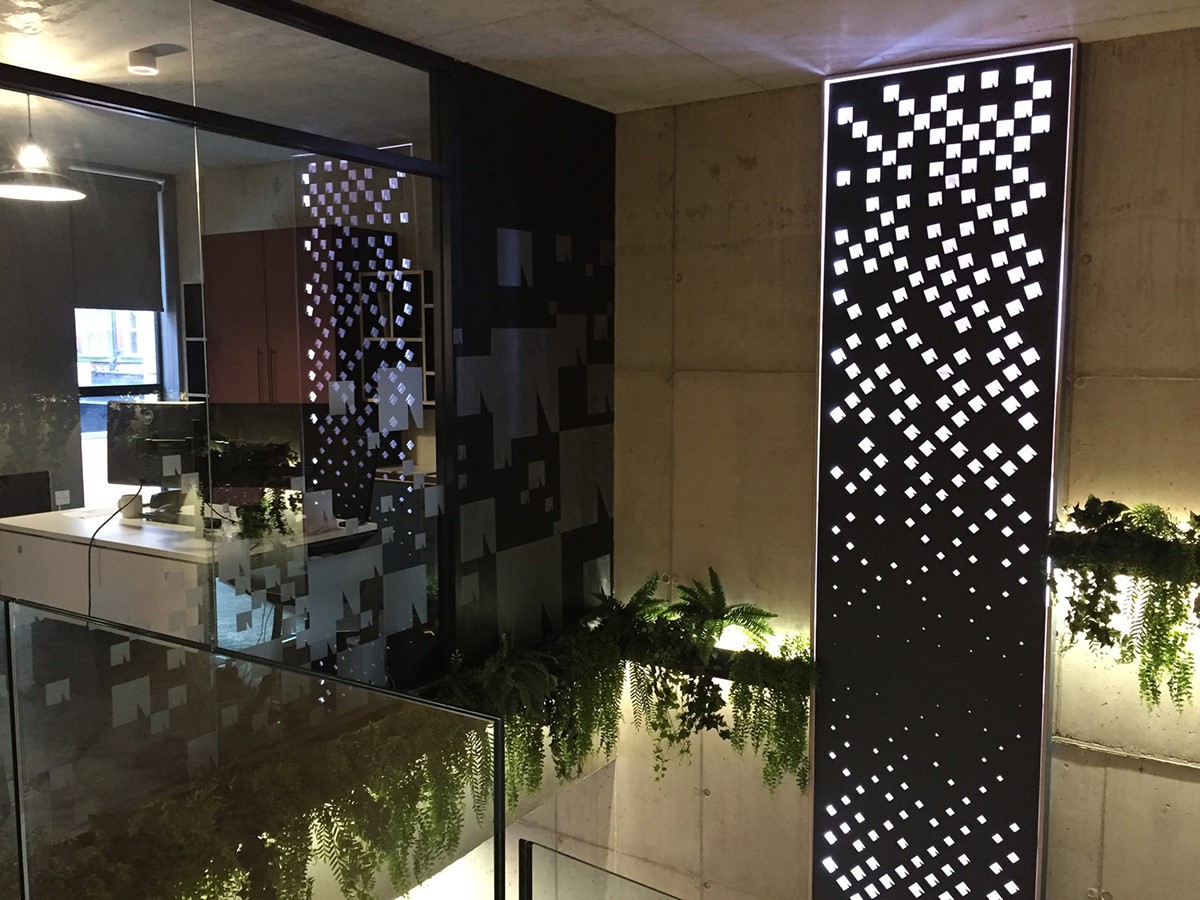
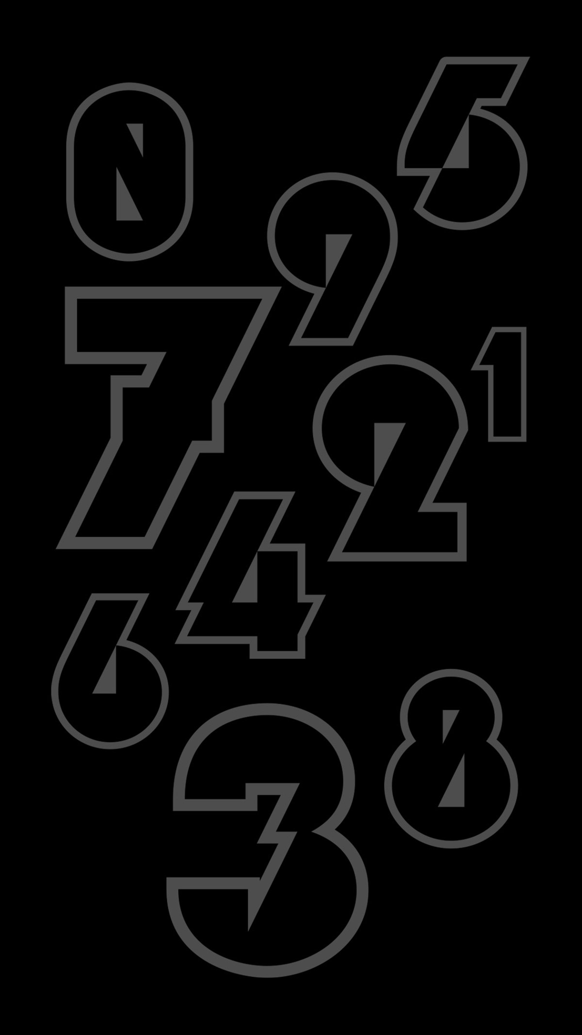
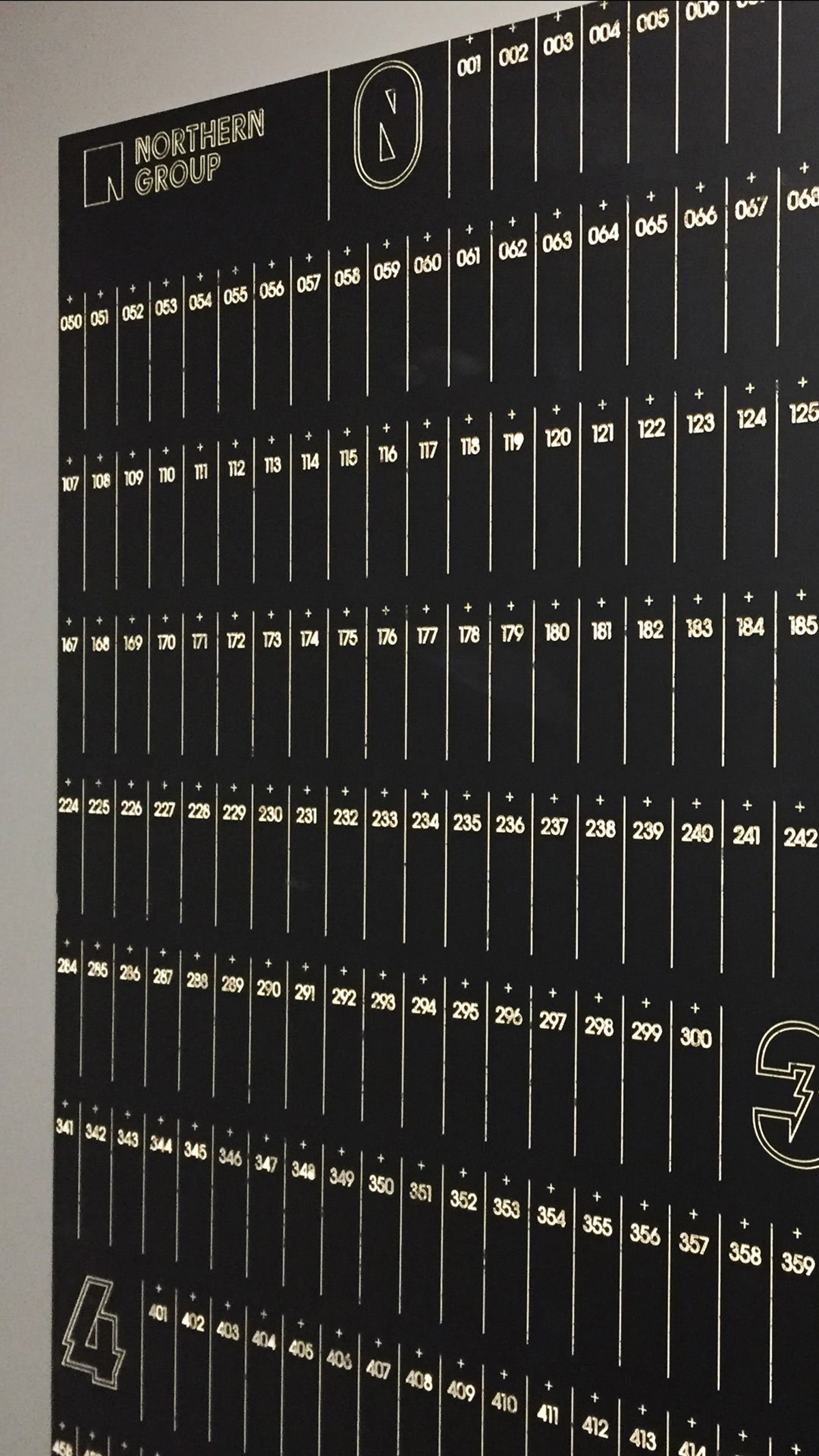
Starting with the typography for the logotype design, new bespoke typography was developed. With the marque retained, design solutions to develop it as a graphic device were explored to suit all potential mediums. This involved abstract patterns, cityscapes, bespoke typography for numerals, and elegant, simple use of the incision angle within the block.
In line with the desired brand positioning, the palette would now be far more restrained and considered – predominantly black and white to focus attention on photography and messaging. The retained typeface worked for headlines, but was not suitable for body copy, so a new, complimentary typeface was introduced. With regards to positioning the existing strapline was no longer appropriate, so a new alternative was written to convey their services:
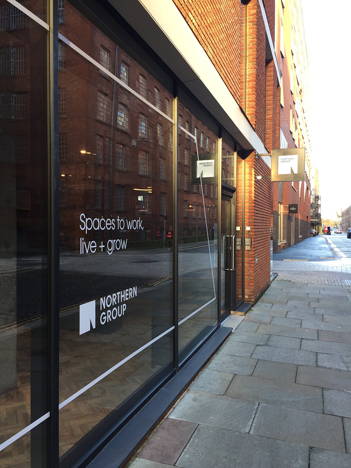
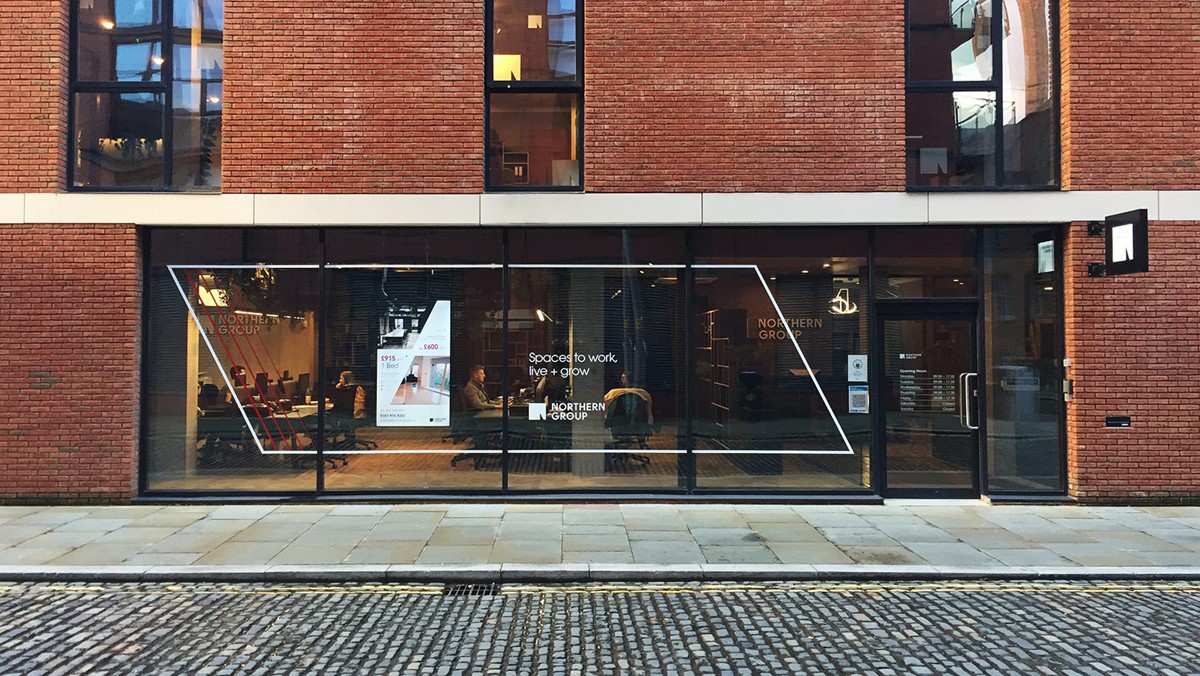
Spaces to work, live + grow
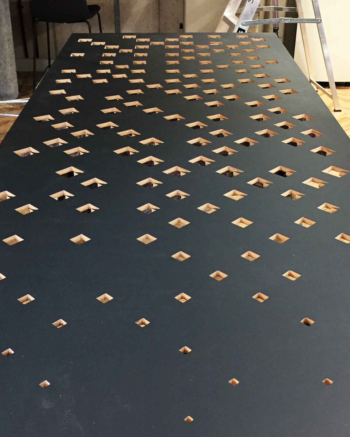
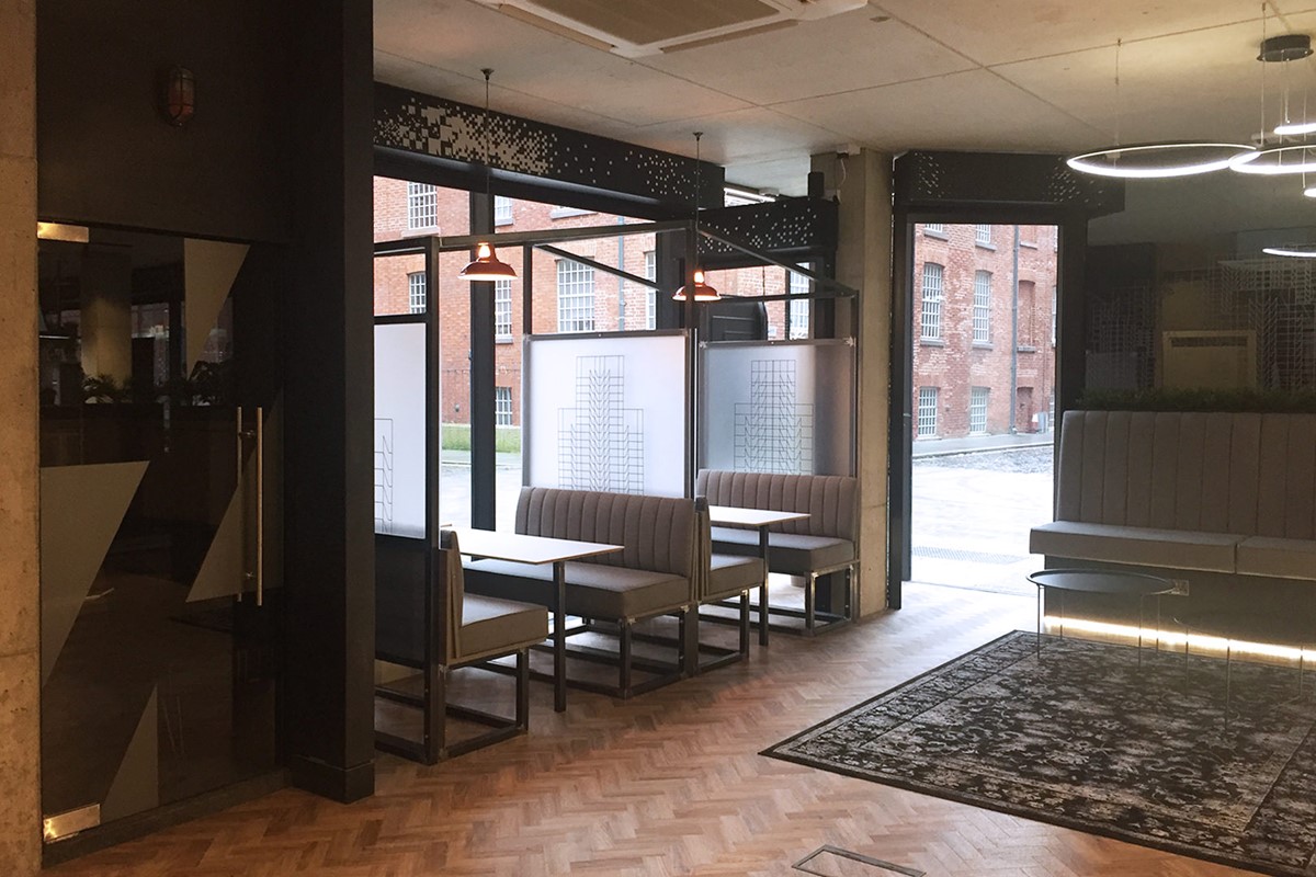
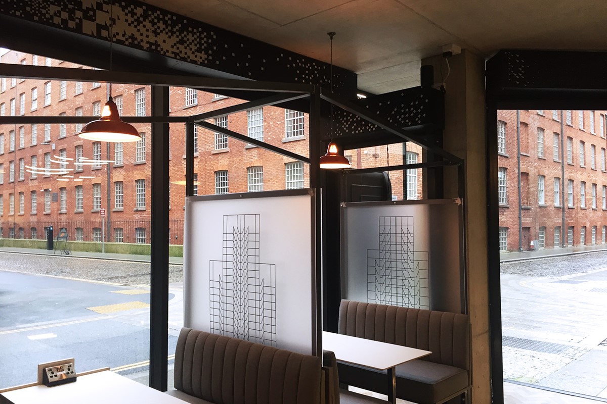
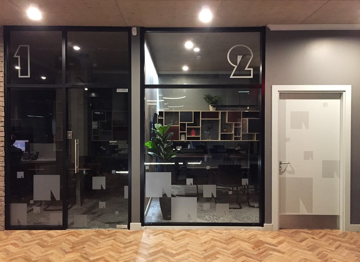
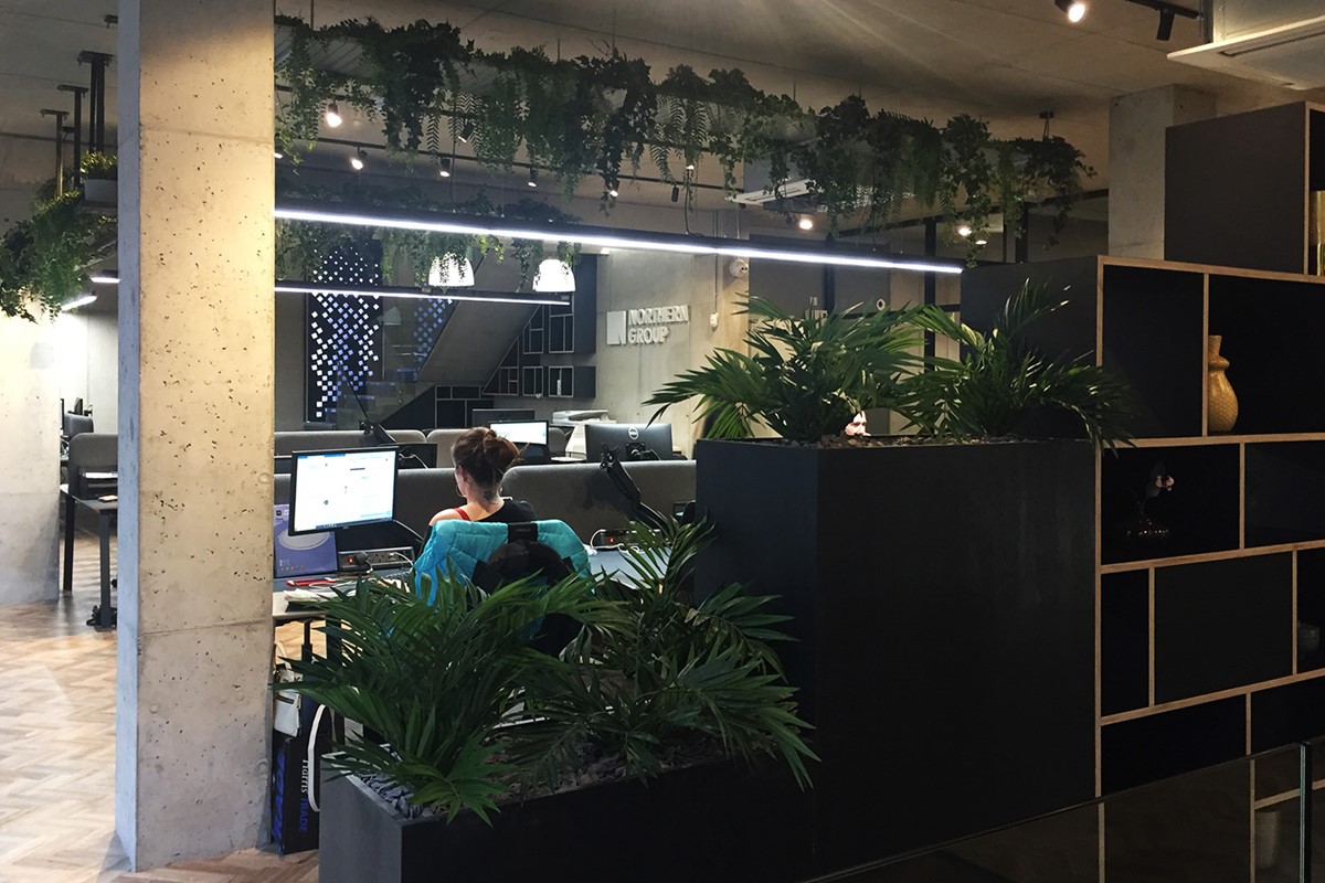
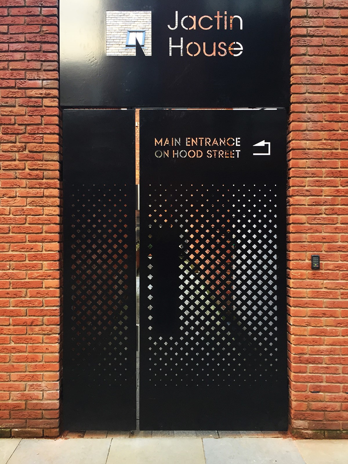
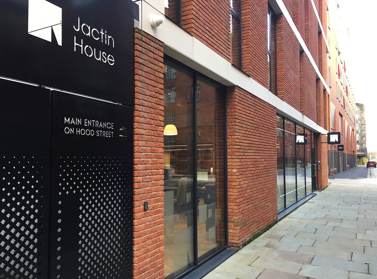
With the building blocks in place, new design solutions were created for their existing legal documents, invoices and internal / external brand communications. Creative solutions were subsequently developed for signage, vinyls and laser cut artwork deployed within the office and exterior of their properties. The design process also covered the graphic design of their marketing collateral, flyers, brochures, merchandise, and stationery.
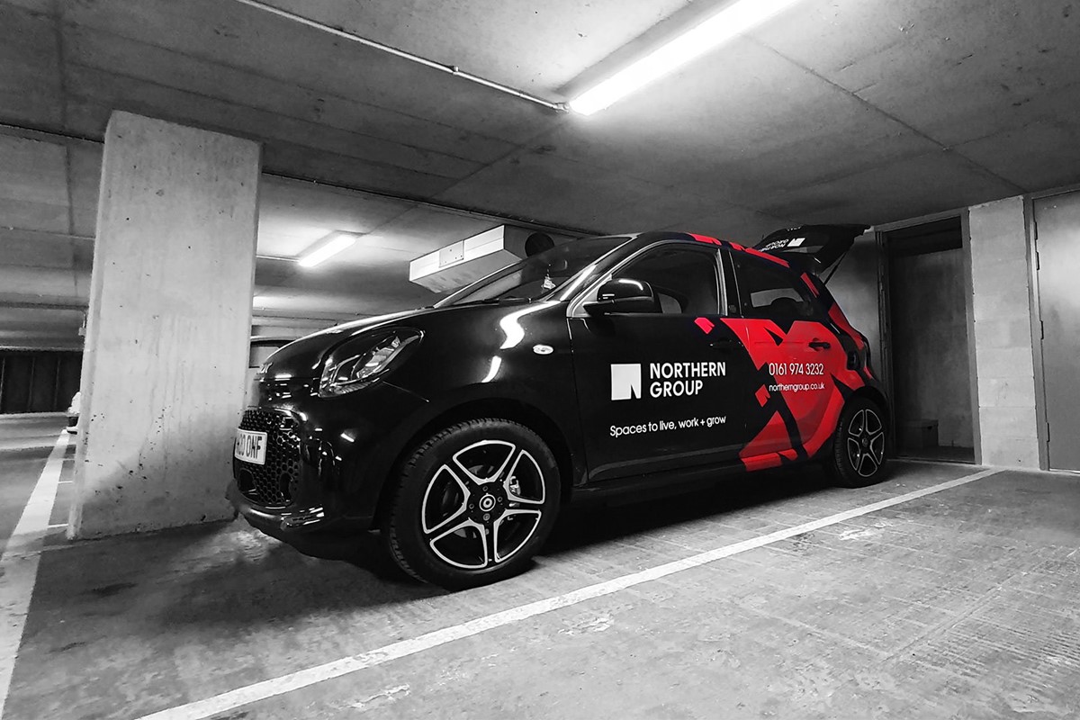
For promotional purposes, in addition to the animated screen adverts, social media template designs and animations were developed. Promotional walkthrough videos were branded via a new, animated logo ident. Lastly, brand consistency was maintained via brand-led vinyl designs for the company vehicles.
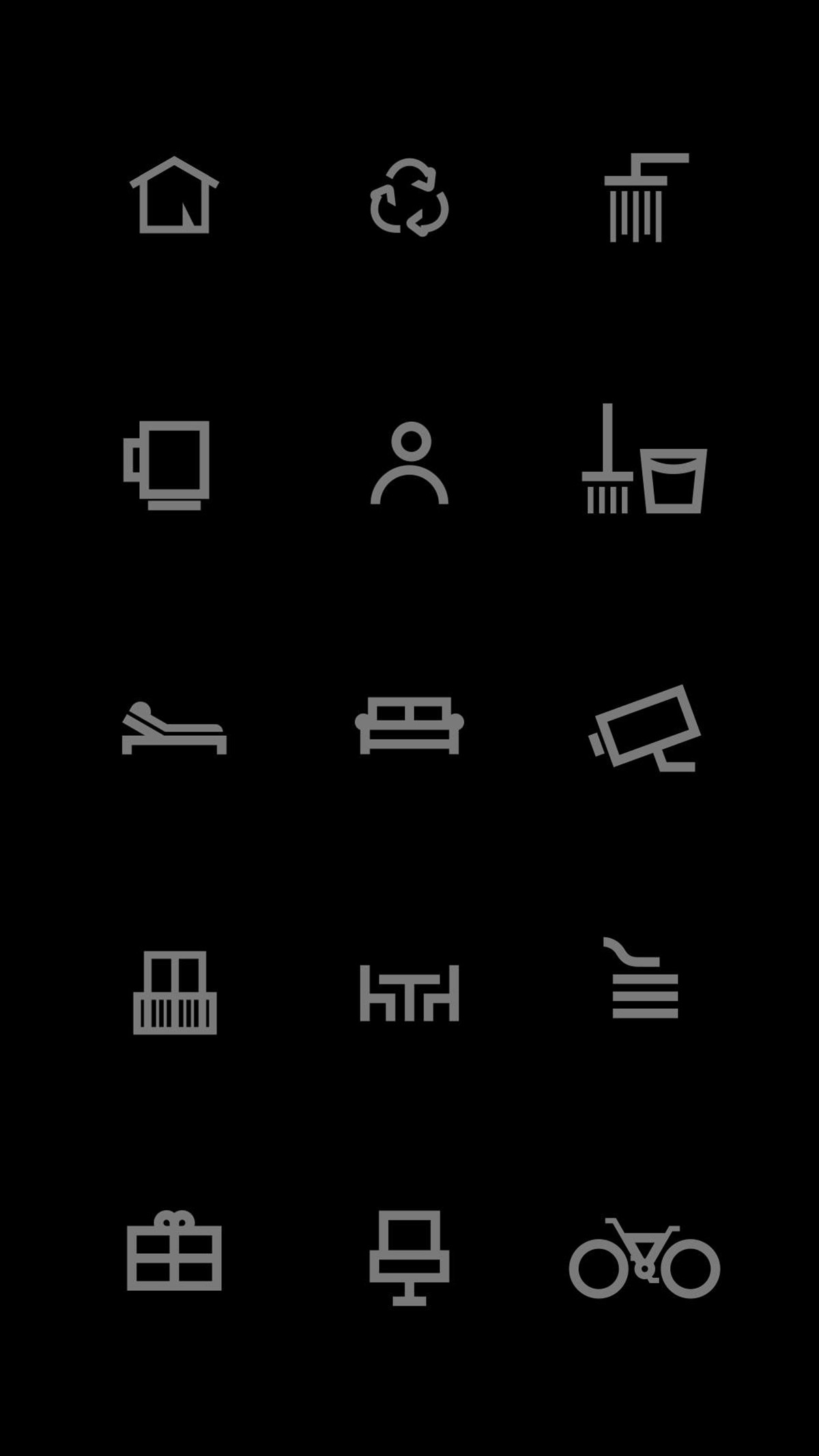
Working with developers HiFi, new internal and external info / promo screens were designed and developed. This required information design, iconography and promotional animations. Work continued with HiFi to develop the new website which was completely integrated with their existing database software and internal / external screens controlled through one CMS. The site was complex with priority focus and consideration given to usability throughout to ensure all search requirements were catered for.
–
Please note, since completion the website design has been altered dramatically and no longer reflects the brand positioning and creative direction originally proposed.
Project services
- Art Direction
- Illustration
- Web design
- Signage
- Animation
- Information design
- Brochure design
- Marketing
- Bespoke Typography
- Branding
- Advertising
- Strategy
- Graphic Design
- Typography
Credits
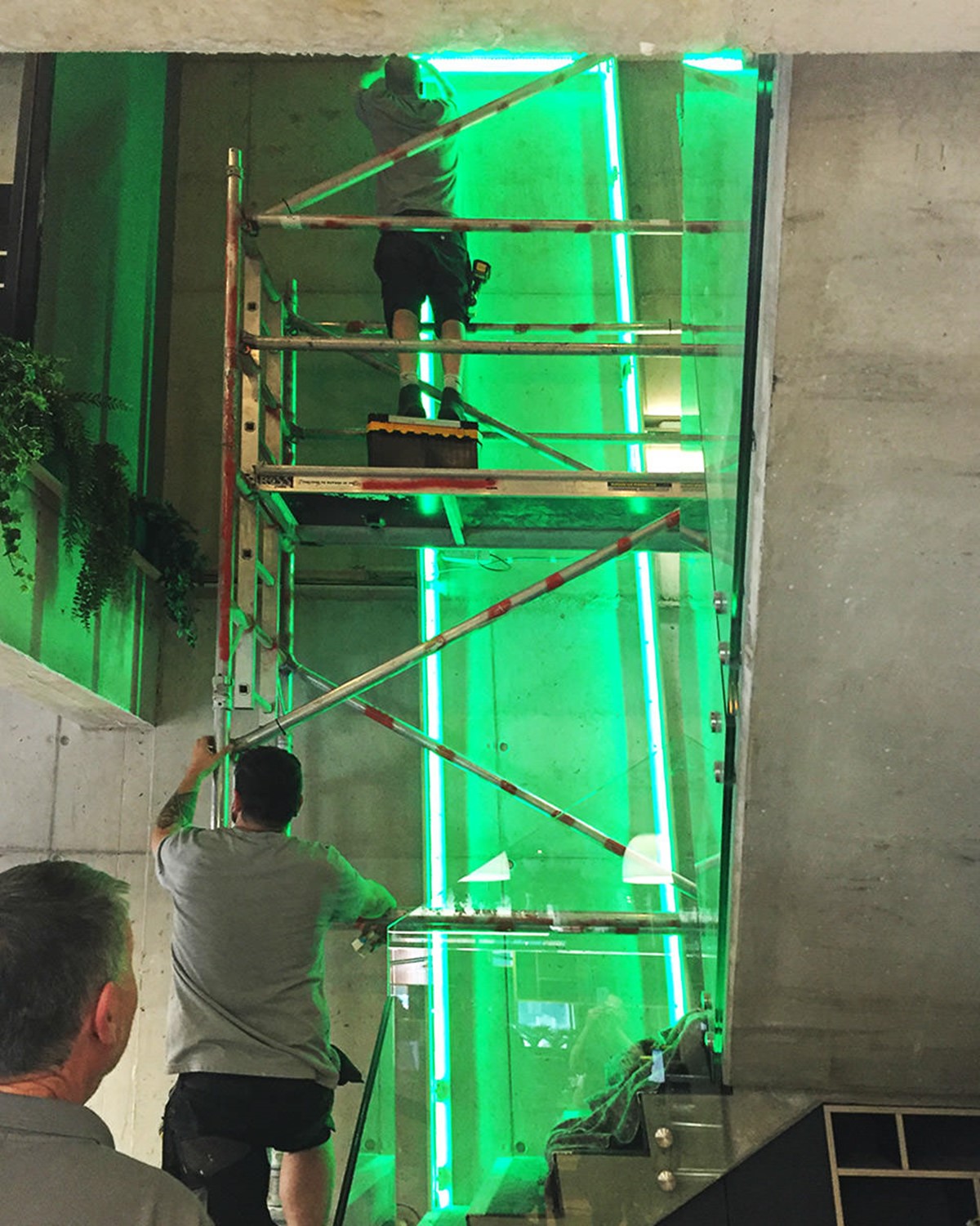
CNC stairwell production + installation – Saw Projects Ltd.
–
Vinyl signage print + installation – Manchester Signage.
–
External signage – Astra Signs.
–
Laser cut + gate installation – Steel Tec Fabrications.
–
Website + internal / external screens development – HiFi.