

leManoosh Bespoke logotype + brand identity
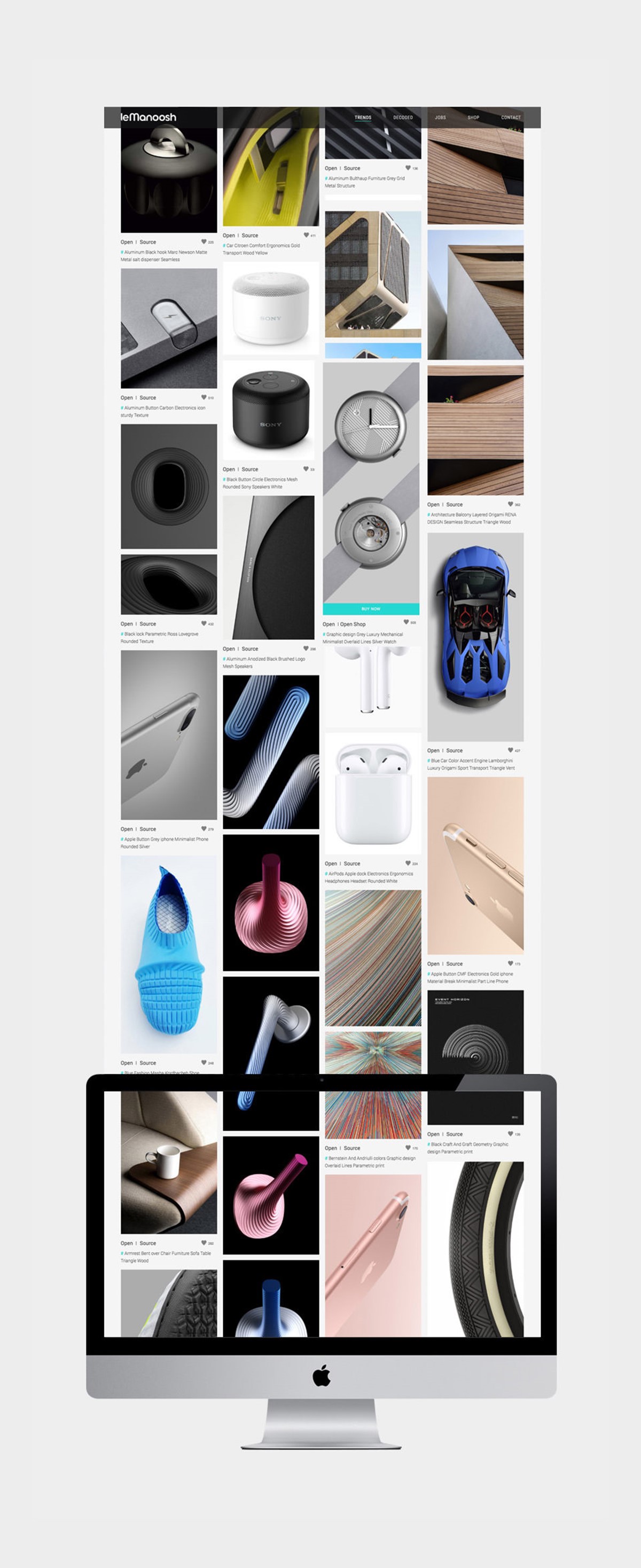
Industrial designer, Alexandre Nys, is the founder of Le Manoosh – a design inspiration blog and online shop. He contacted graphic design studio Superfried requesting help with his rebrand.
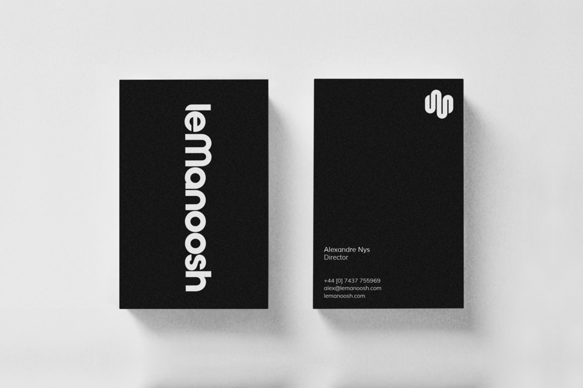
Alex had referenced a Superfried typeface – Basik – for the potential typographic design of the wordmark. He also sent sketches for a potential marque working on the initials. Working closely with Alex a new bespoke lettering was developed using a similar, but much heavier geometric style to Basik.
Usually the 's' is a tricky customer for bespoke typography, but this time it was the initial 'l'. Uppercase felt stern and hard-edged relative to the remainder of the lettering. There would also be an awkward negative space to contend with. A standard lowercase 'l' would also feel too robust and a bit bland being the only character featuring no curves. After many design iterations, a bespoke rounded base to the letter created a softer start to the name, replicating the curve of the adjacent 'e'.
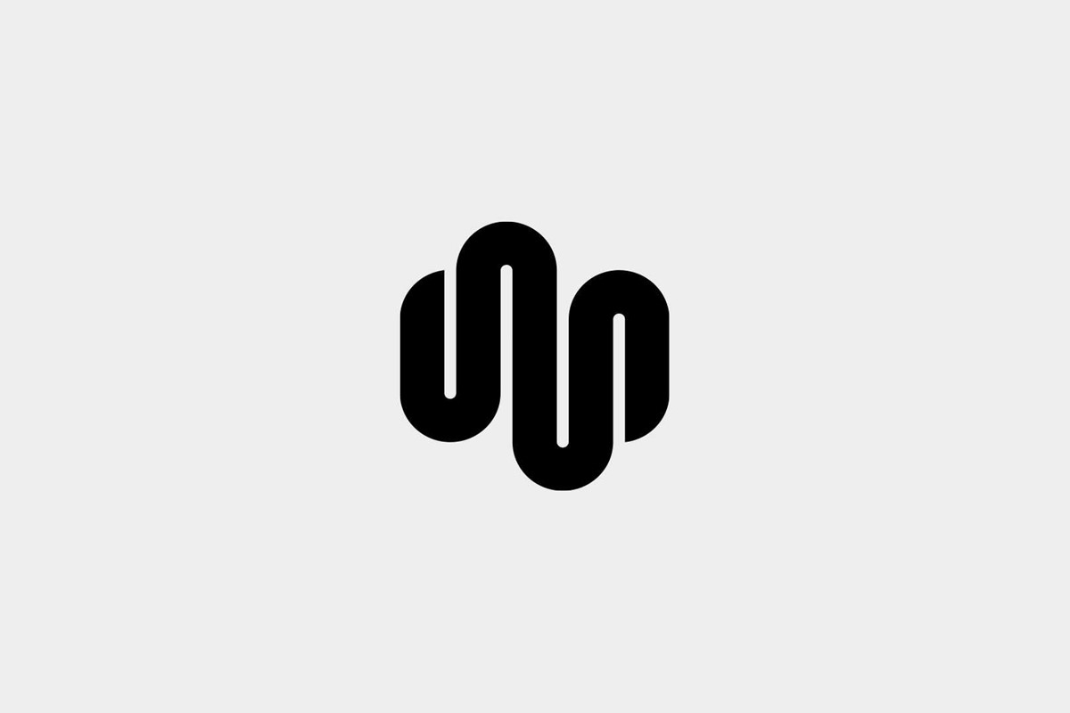
Following the geometric curves of the bespoke typography, a brandmark was crafted. What began as a more literal representation of the letters 'lm' evolved to become a more abstract, perfectly symmetrical fluid form. The creative solution for the marque was sufficiently abstract, yet distinct with a subtle connection to the initials.
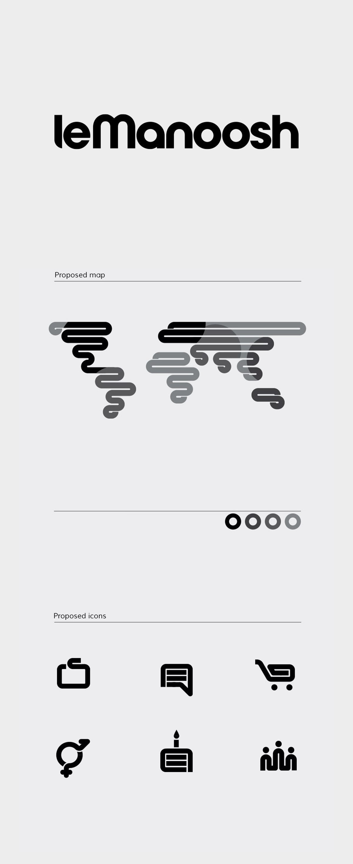
With the wordmark and logo design complete, both were fully tested for robust versatility. For the website, a collection of stylised, brand-led icons were designed. The iconography was highly stylised using a fluid illustration style previously developed for the marque to ensure brand consistency.
Project services
- Brand Identity
- Bespoke Typography
- Branding
- Typography
- Art Direction
- Graphic Design