Interio Brand identity for interior design
Interio is a Russian-based company that supplies contemporary furniture and fittings to the interior design industry. They approached graphic design agency Superfried to develop their branding strategy.
Interio would be supplying products to a wide range of sectors, property types, and locations. Consequently, a flexible and practical brand solution was required, whilst retaining a simple, contemporary style.
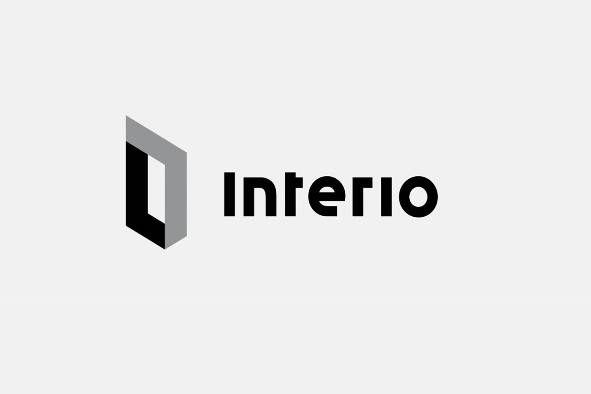
Starting with the wordmark, interior design regularly combines different styles and textures, so I liked the idea of trying to reflect this within the bespoke typography. For simplicity, geometric letterforms were developed. To then represent the mixing of styles, conventional characteristics were altered to create a balanced combination of square and round forms.
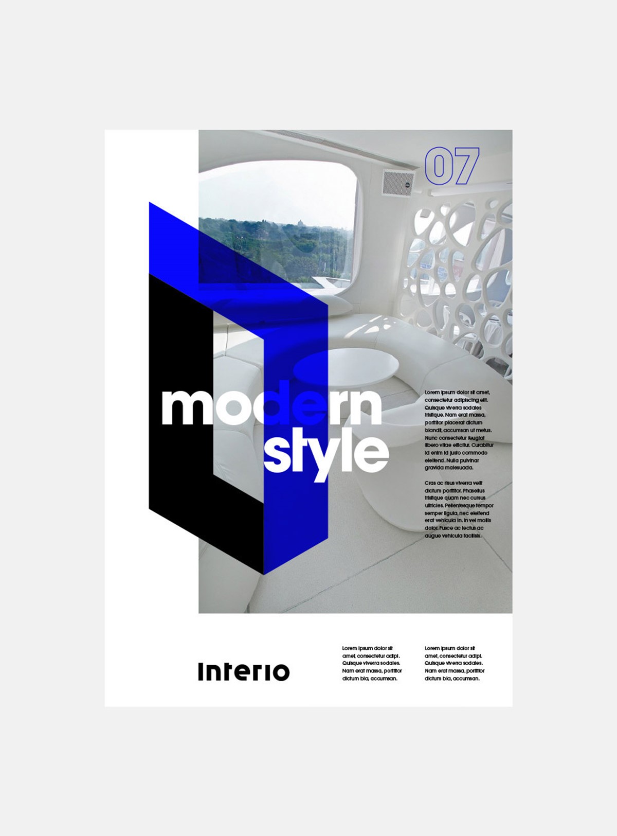
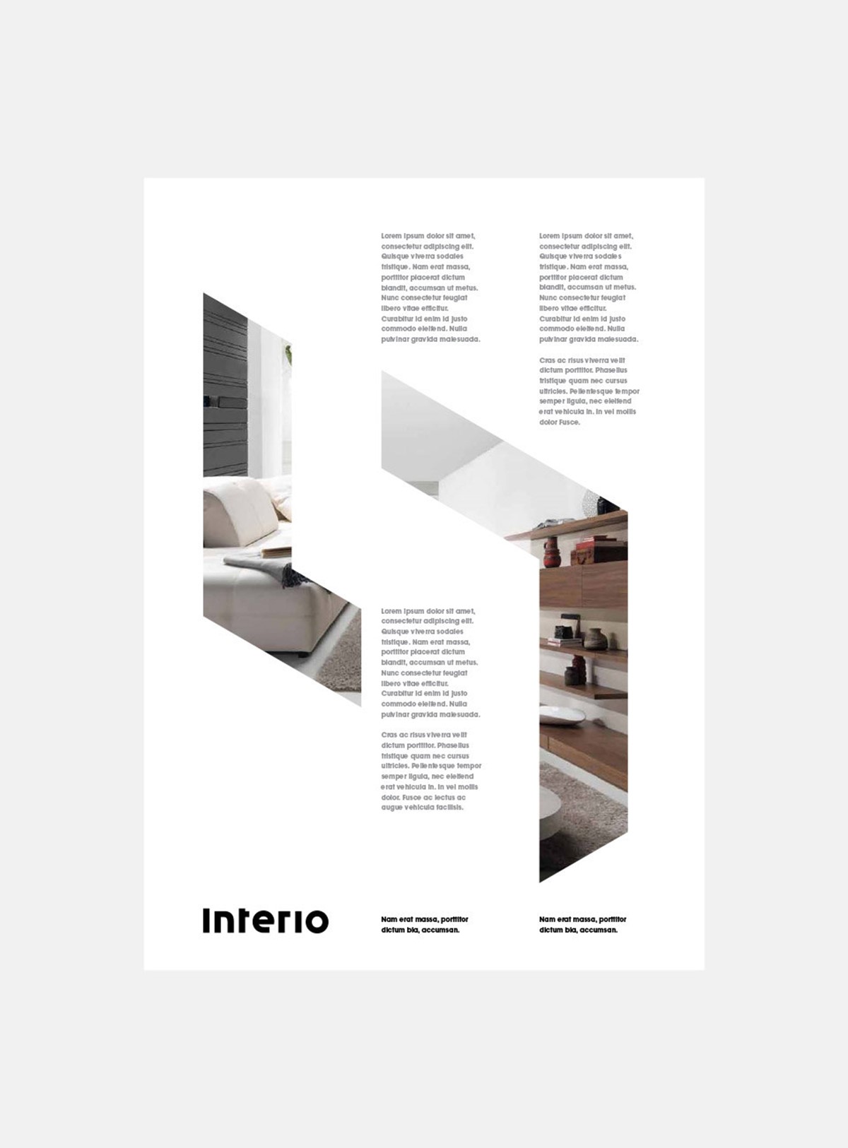
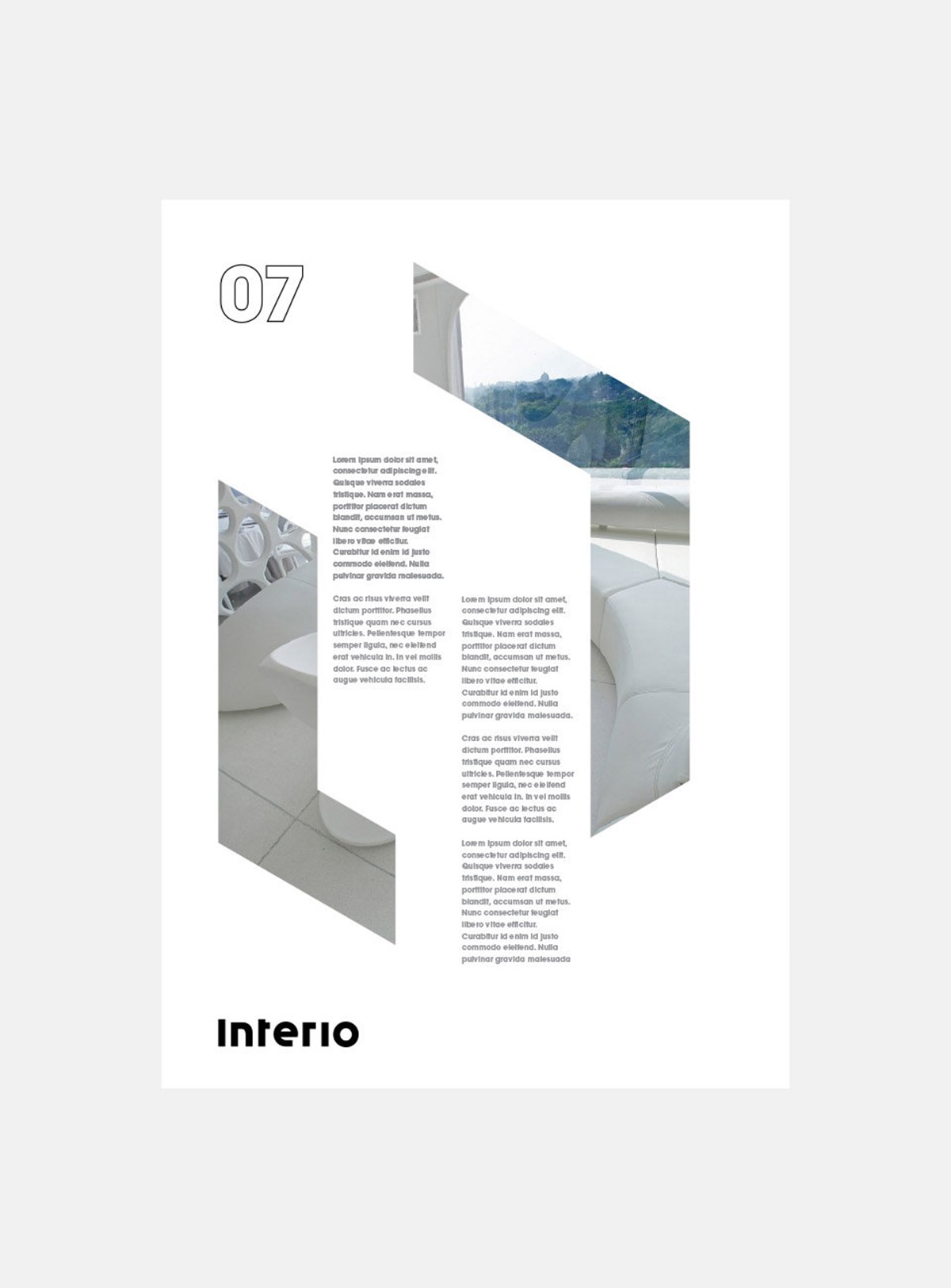
With the wordmark resolved, the client also requested a logo. They were keen to use it for masking and containing photography. To resolve this I required a geometric form that was distinct, and practical, but also had a connection to the nature of their business.
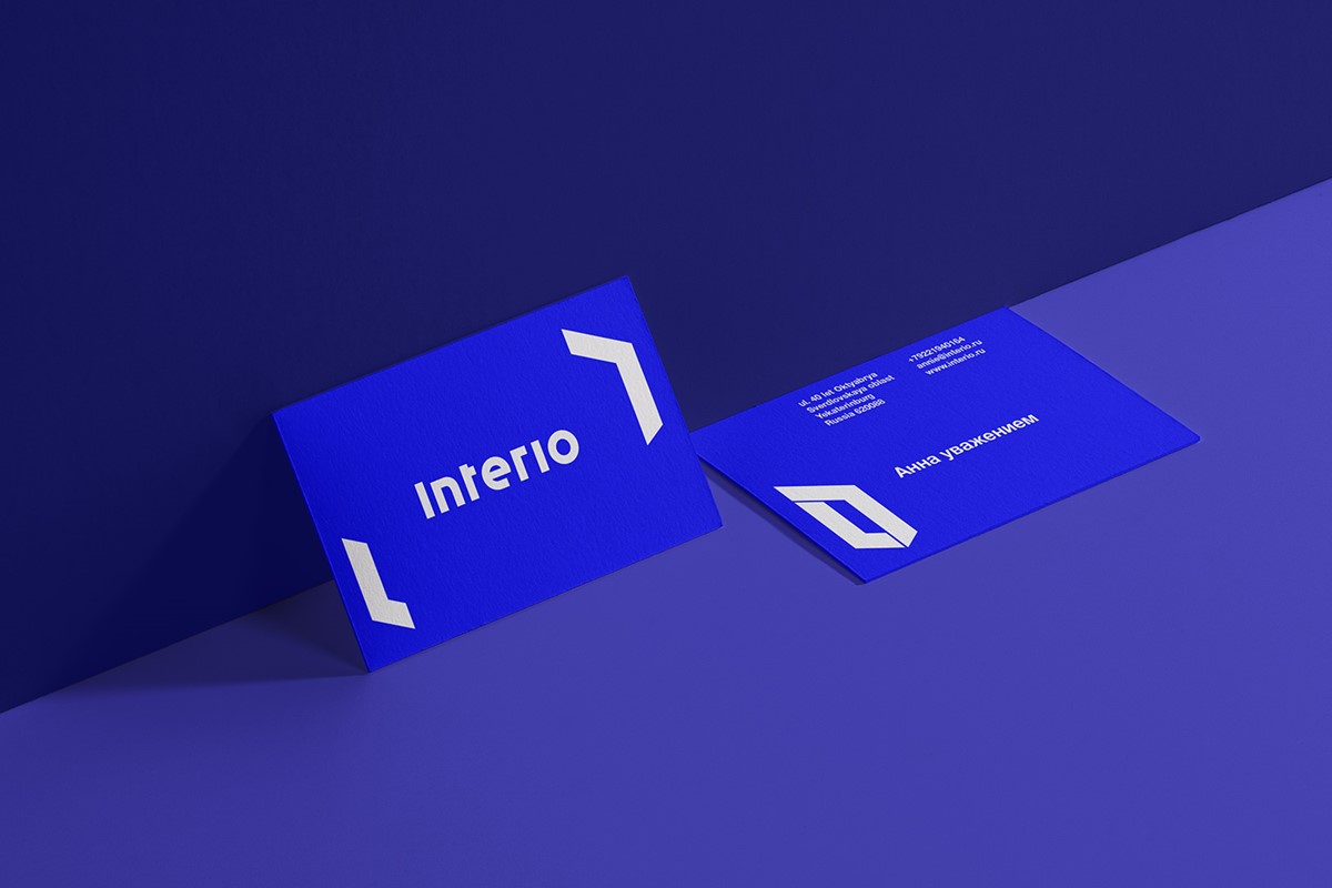
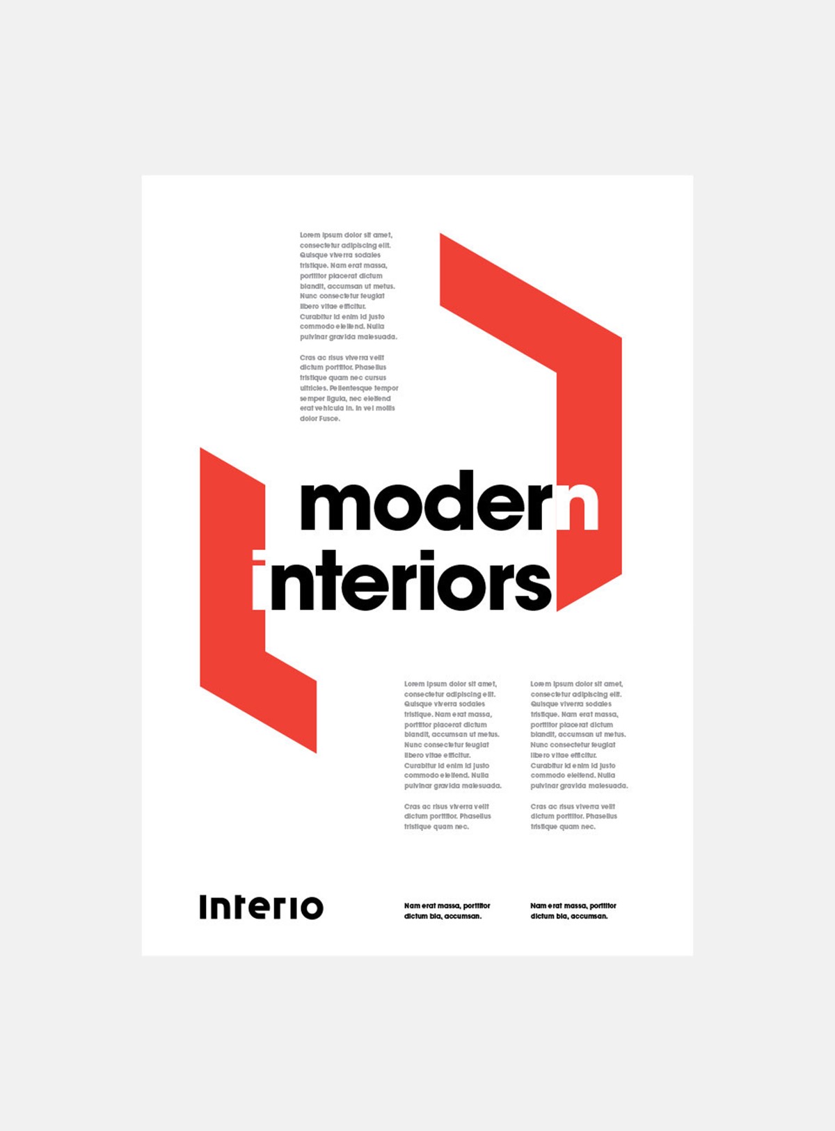
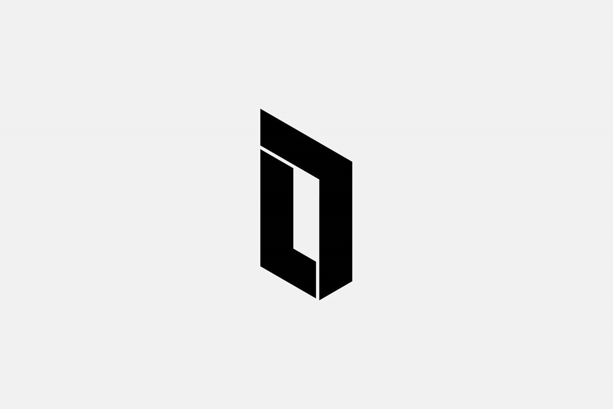
Design experimentation and numerous design iterations led to a structural, op-art, 3D form representing a doorway – relevant to any property. This was very versatile, since its robust form enabled sufficient proportions of images to be revealed, whilst the angles were both distinct and elegant. The ability to split the marque allowed the client to also frame content, and simultaneously reveal two separate sections of the same shot or even two separate images if required.
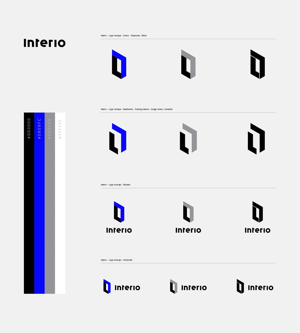
The wordmark and logo design were subsequently refined, tested, and combined for suitable logo lock-ups. Further testing ensured that the new branding solutions would be effective across all branded collateral.
Project services
- Brand Identity
- Bespoke Typography
- Art Direction
- Typography
- Branding
- Graphic Design