

Fast Company WCI Branding a global award for ideas
Fast Company is a leading business publication based in NYC. They had previously worked with graphic design agency Superfried on the Fast Company logo for – FCLA . MCP. Grill – so commissioned us once again to develop the brandmark for their World Changing Ideas Awards.
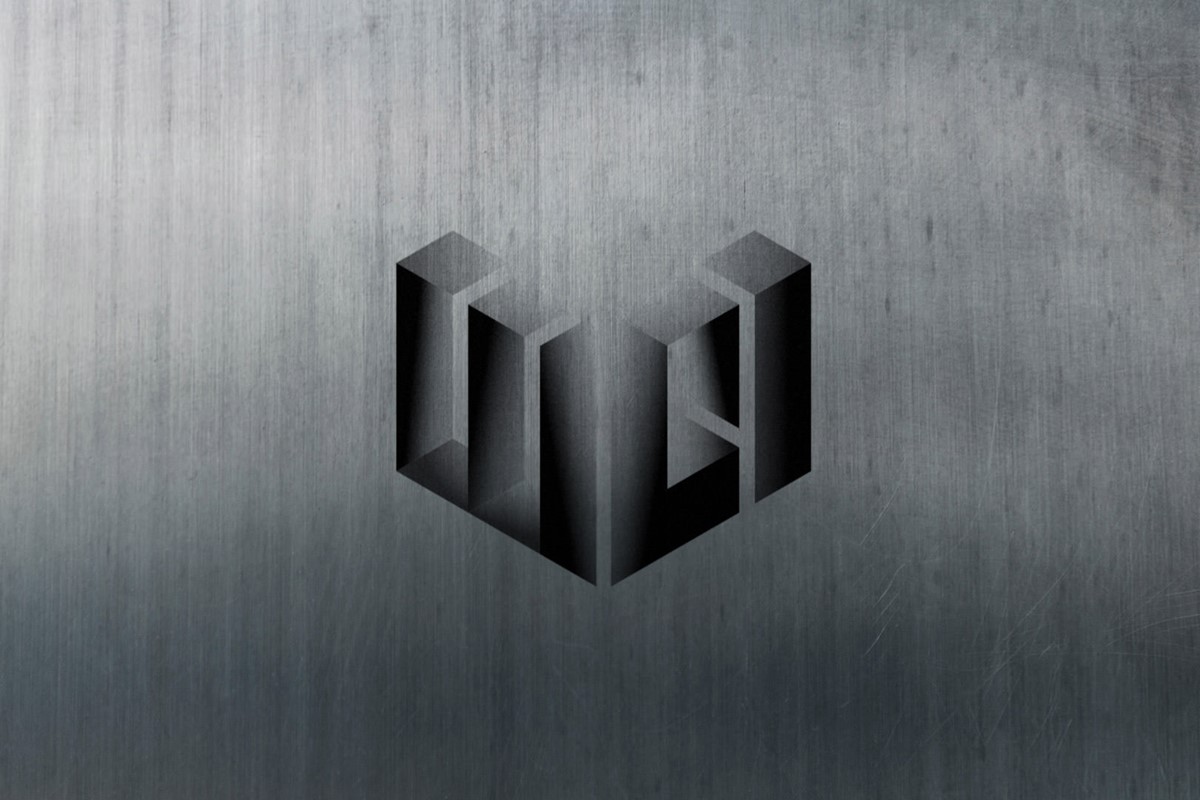
They required a 3D style to coincide with their other award and conference brandmarks. As usual, my strategy was to start in 2D and look for common characteristics in the lettering and for potential symmetry. After some extensive design experimentation and simplification, it became apparent that the letters WCI could all be constructed via six vertical columns, which in turn could be split to convey two planes of a cube.
Since the name mentioned 'changing' it seemed apt that the wordmark should also convey this message. Inspired once again by my favourite artist Escher – op-art effects were employed within the design to suggest that the structure at the top, was very different from that observed at the bottom.
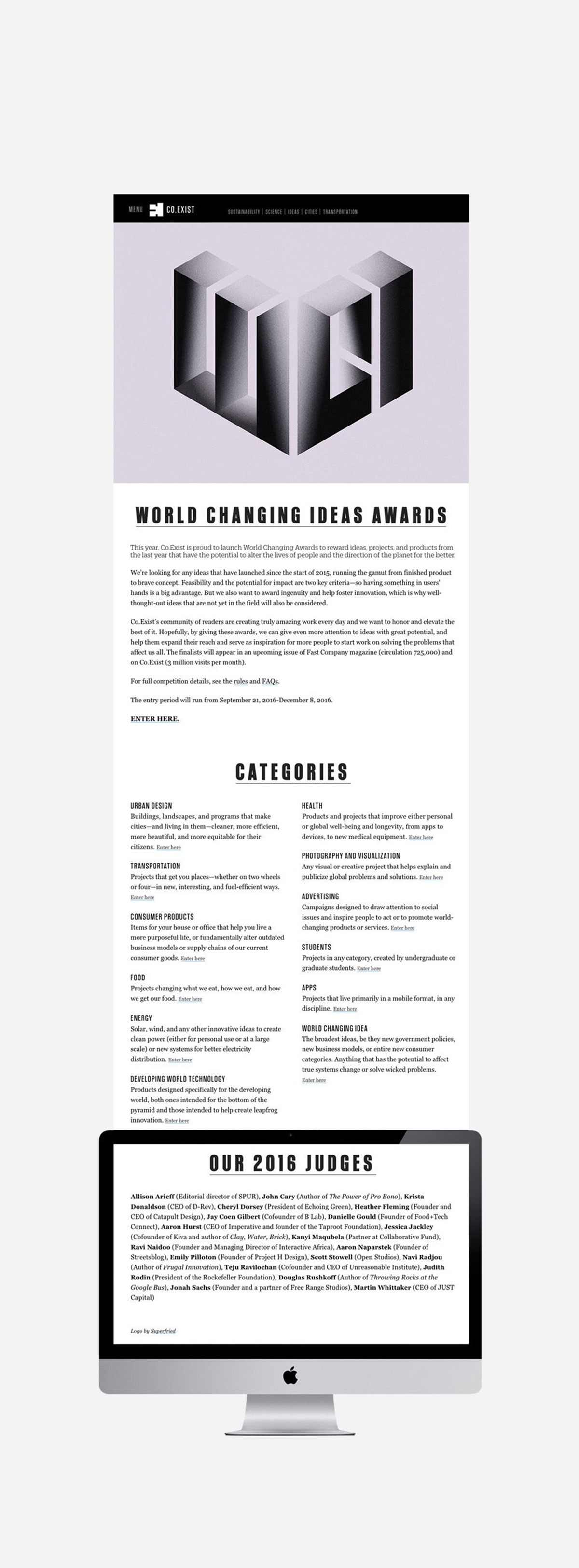
After much testing to obtain the perfect balance between optical ambiguity and intrigue vs letter integrity and legibility the design solutions were resolved. Backlit shading and texture were introduced to enhance the ambiguous forms within the structure.
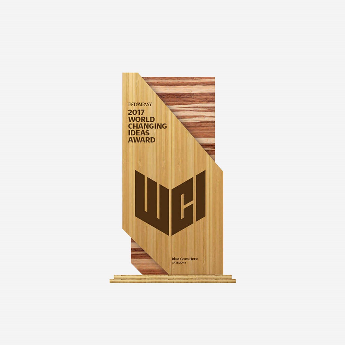
With the 3D version of the logo design complete, a simplified 2D design iterations were developed to work at small scale and laser etched upon the physical award.
Project services
- Brand Identity
- Bespoke Typography
- Illustration
- Art Direction
- 3D Typography
- Typography
- Branding
- Graphic Design