
Crucial FX Branding an experiential agency
Crucial FX is an award-winning studio specialising in the creation of digital, interactive, brand-led experiences. They approached Manchester design agency Superfried to redevelop their brand strategy.
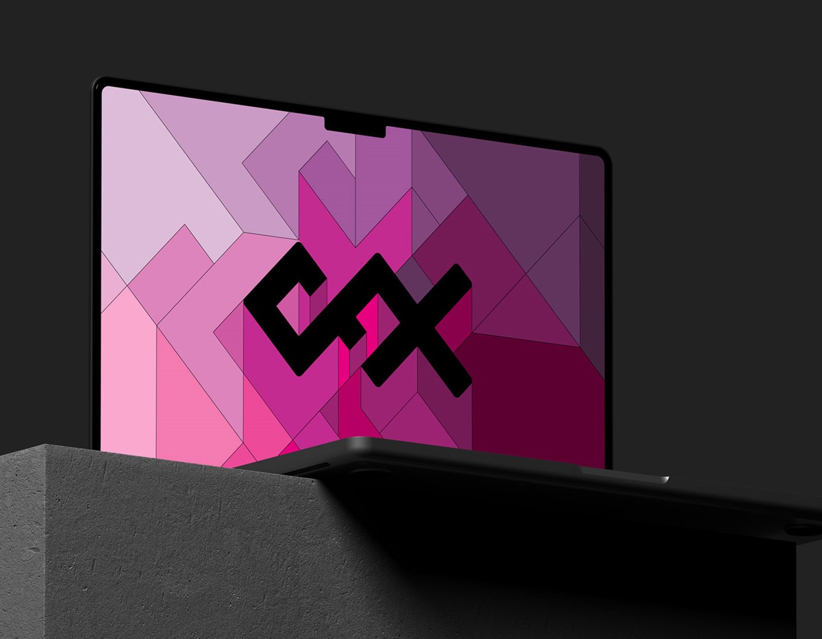
They create bold, exciting interactive experiences so it was important that their new branding should reflect this. Since their output is so eclectic, during the discovery phase it was decided that the marque would require a typographic design. Extensive explorations and design iterations were conducted with the initial letter C, however inclusion of the F + X opened the door to the final creative solution.
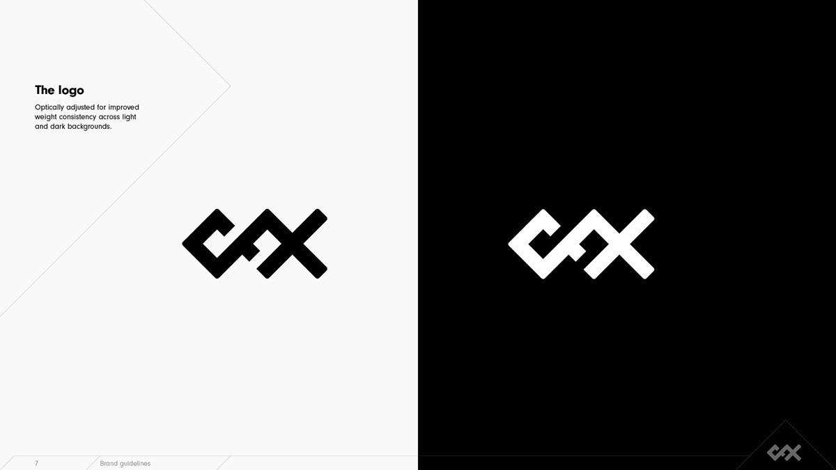
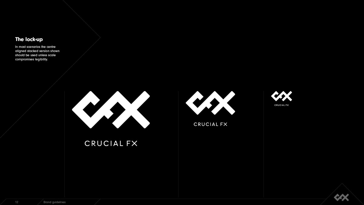
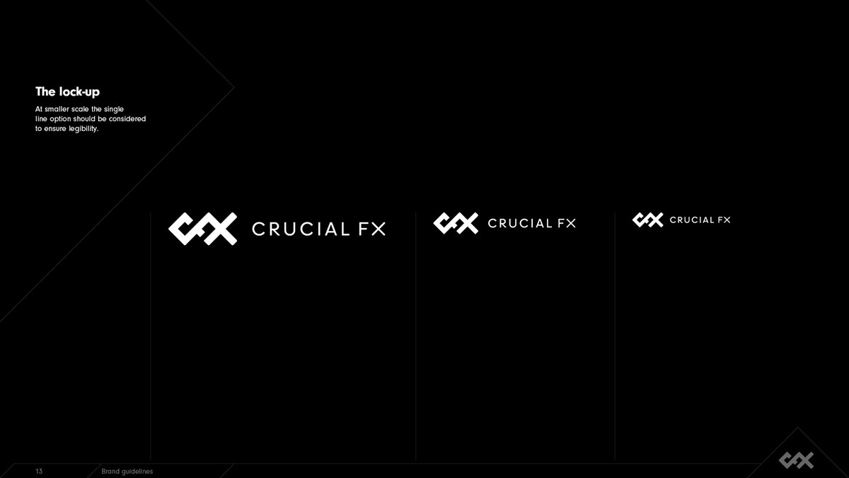
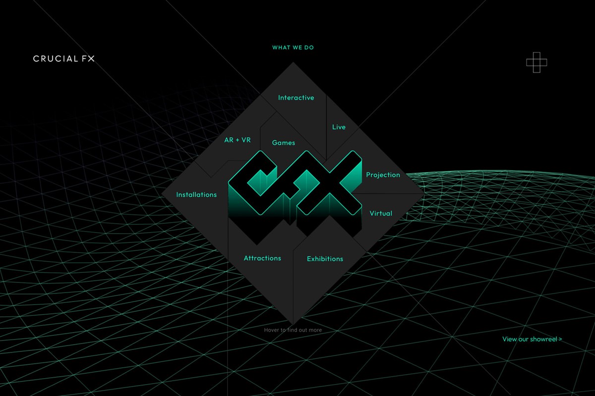
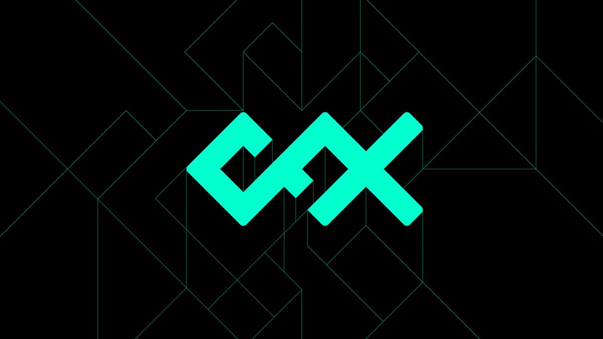
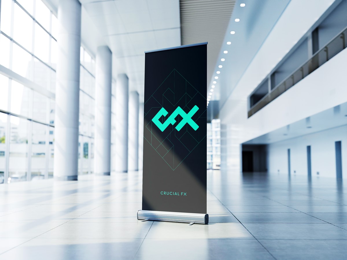
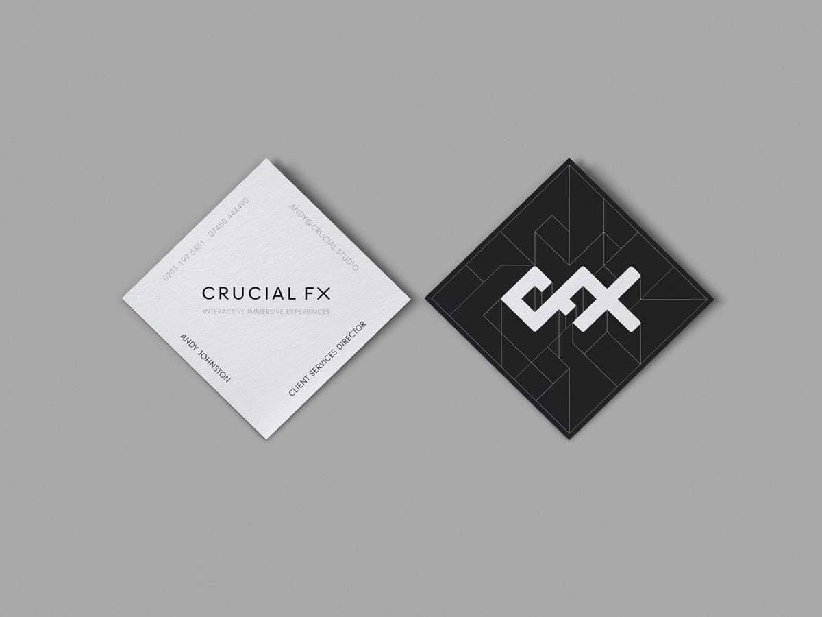
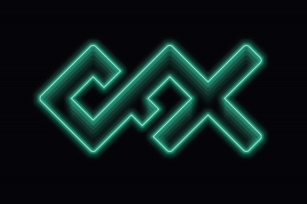
Commonality across the initials was found via the use of square forms and rotation through 45 degrees. This led to the suggestion of three connected squares. The sharp corners and angles were exciting and dynamic, but potentially too clinical. However, after rounding throughout, the logo started to lose its edge. The design solution was found by solely softening the external corners.
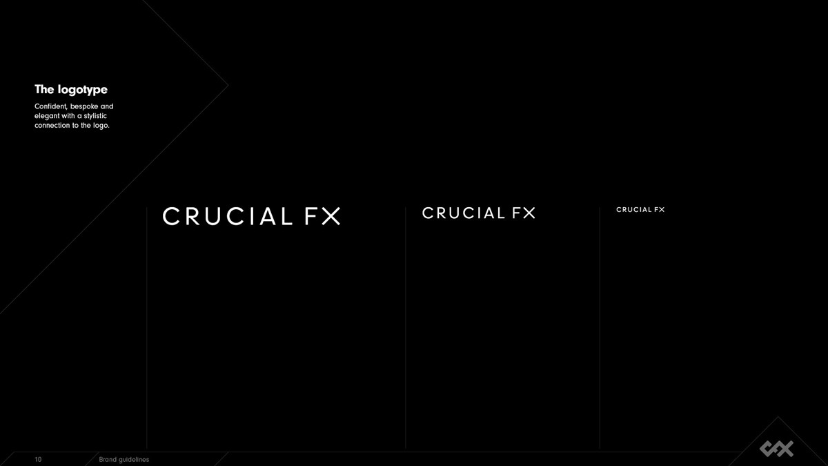
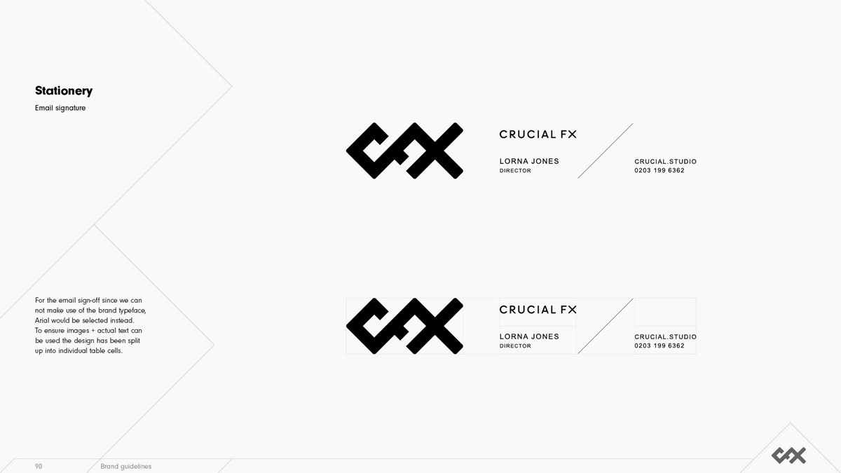
The logo design was simple, bold and distinct. Now it was time to approach the logotype design. Since the marque was so simple, initial thoughts were to seek design solutions that provided a stark contrast – more nuanced and detailed, such as a serif. But the stylised initials were so robust that any subtleties within the lettering went unnoticed. Experimental design options were also explored, but they quickly clashed. So taking the lead from the logo, simple geometric, sans letterforms were employed. To establish a connection to the marque, the stems of the X were adjusted to 45 degrees with end caps to match. Additionally, to reflect the logo all external corners were rounded.
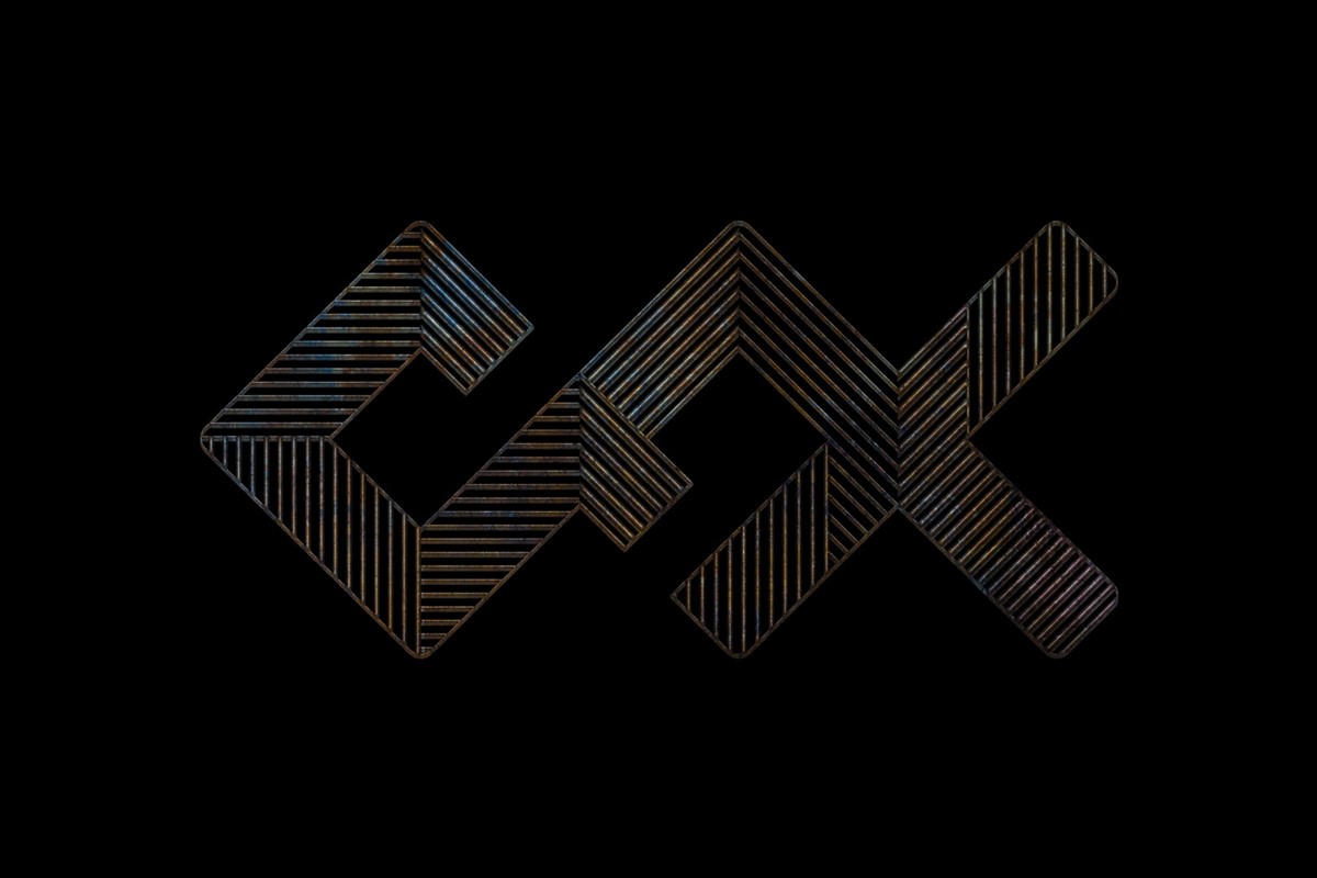
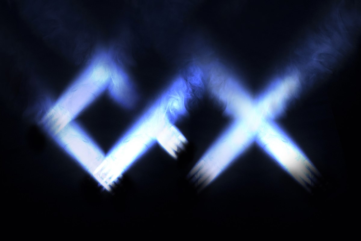
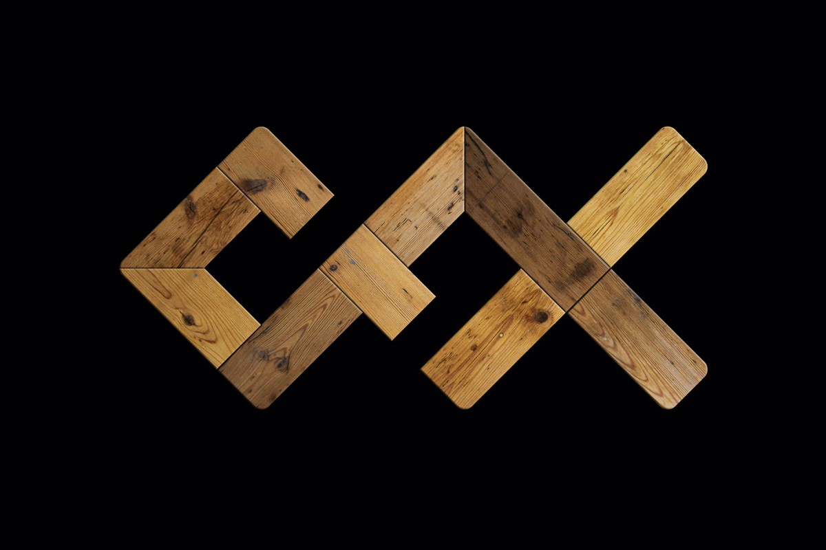
Despite the technical nature of their work, the end results are anything but. Essentially the interactive experiences they create are designed to ignite our senses. To make us truly feel something – an organic response. With this in mind, I wanted the brand identity to convey this in some way. The individual senses are very difficult to convey in simple visual forms. So reverting back to the logo, what if it could be rendered in materials that evoke a specific sense? If fluffy would that lead to feelings of warmth and a desire to touch it? If rendered via plants, would this evoke memories of being outside, feeling the sun on your skin? Created out of lights, could this take the viewer back to a festival – the energy, atmosphere and sound of that moment? This creative solution had unlimited potential, so numerous design iterations were explored.
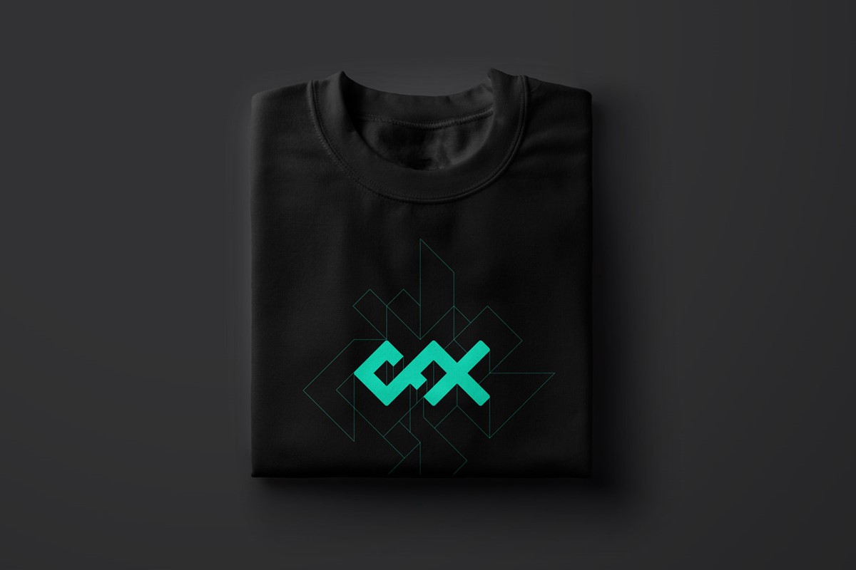
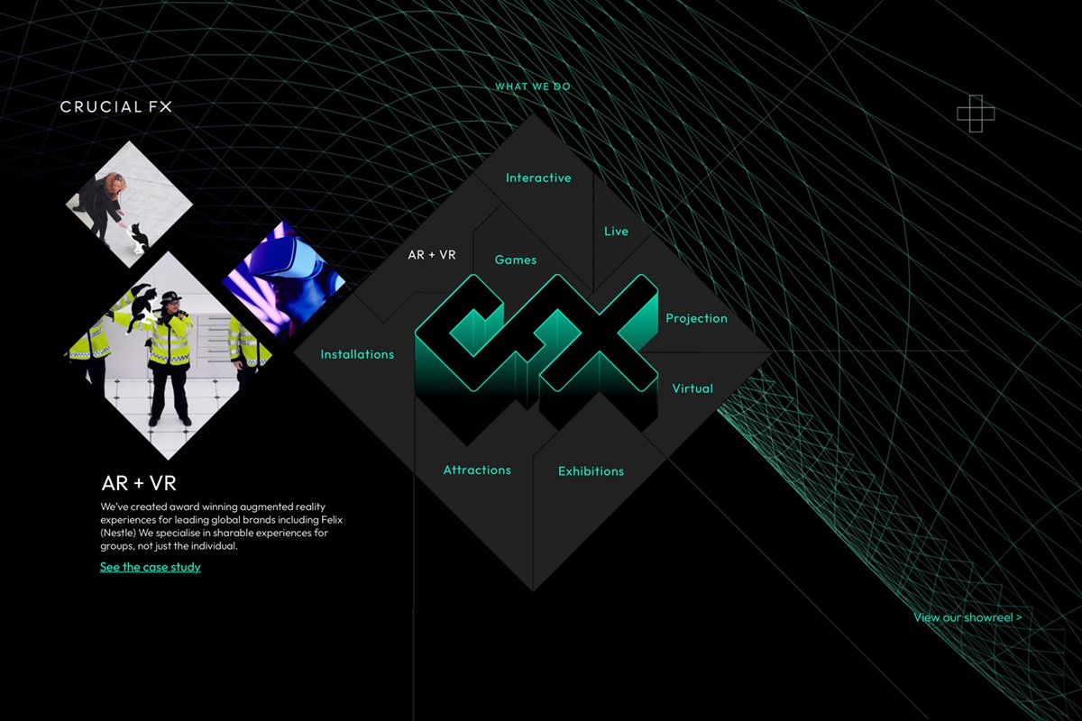
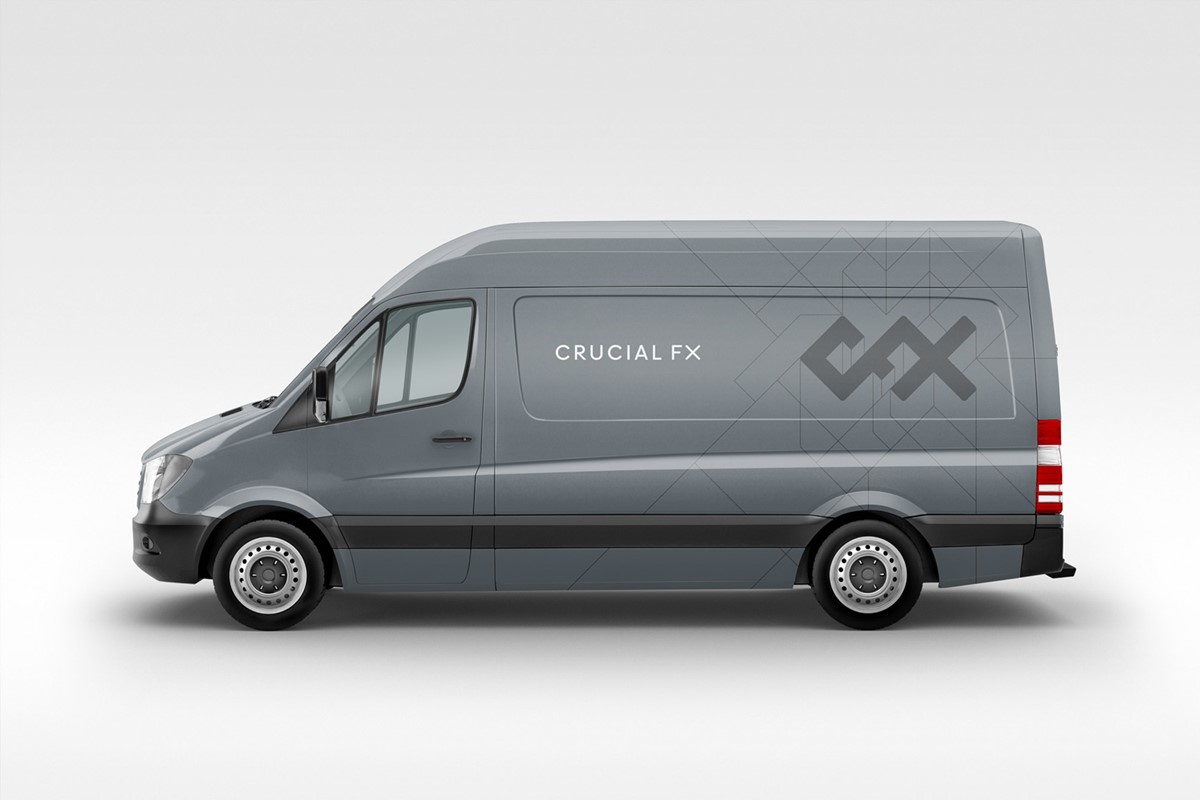
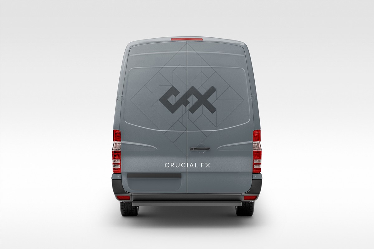
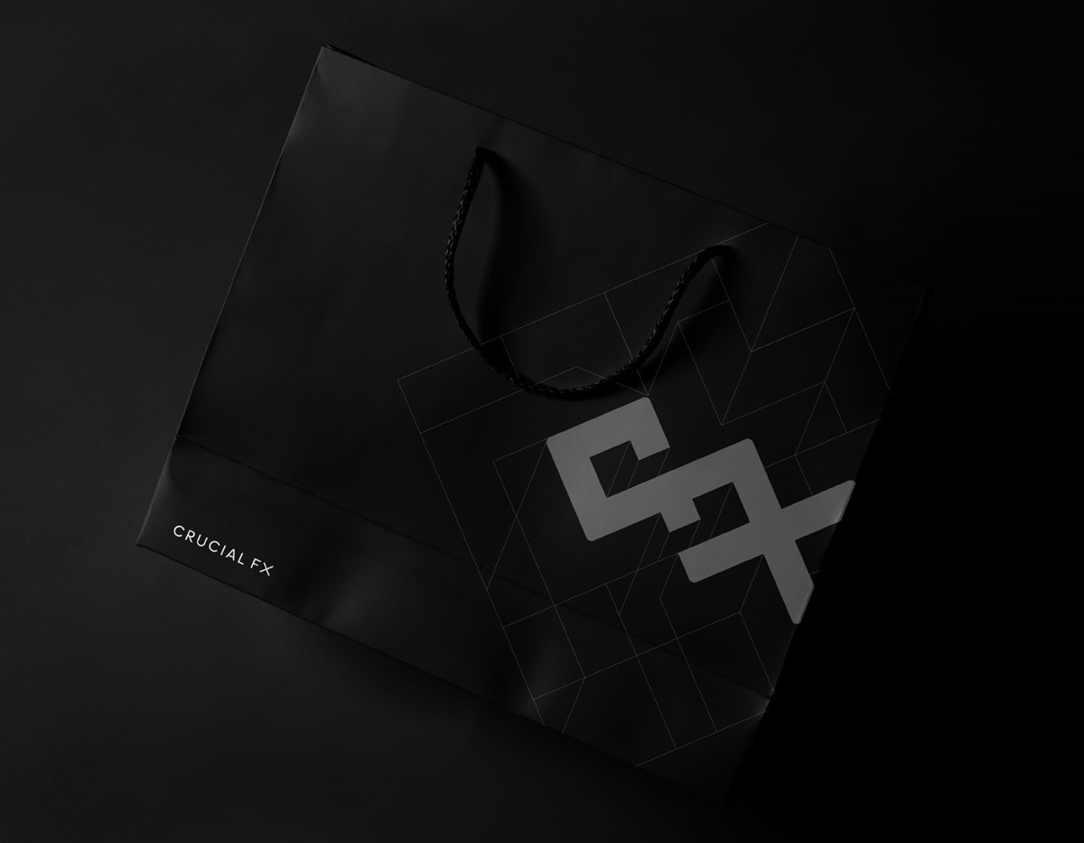
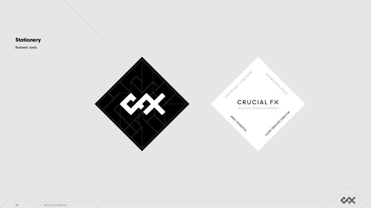
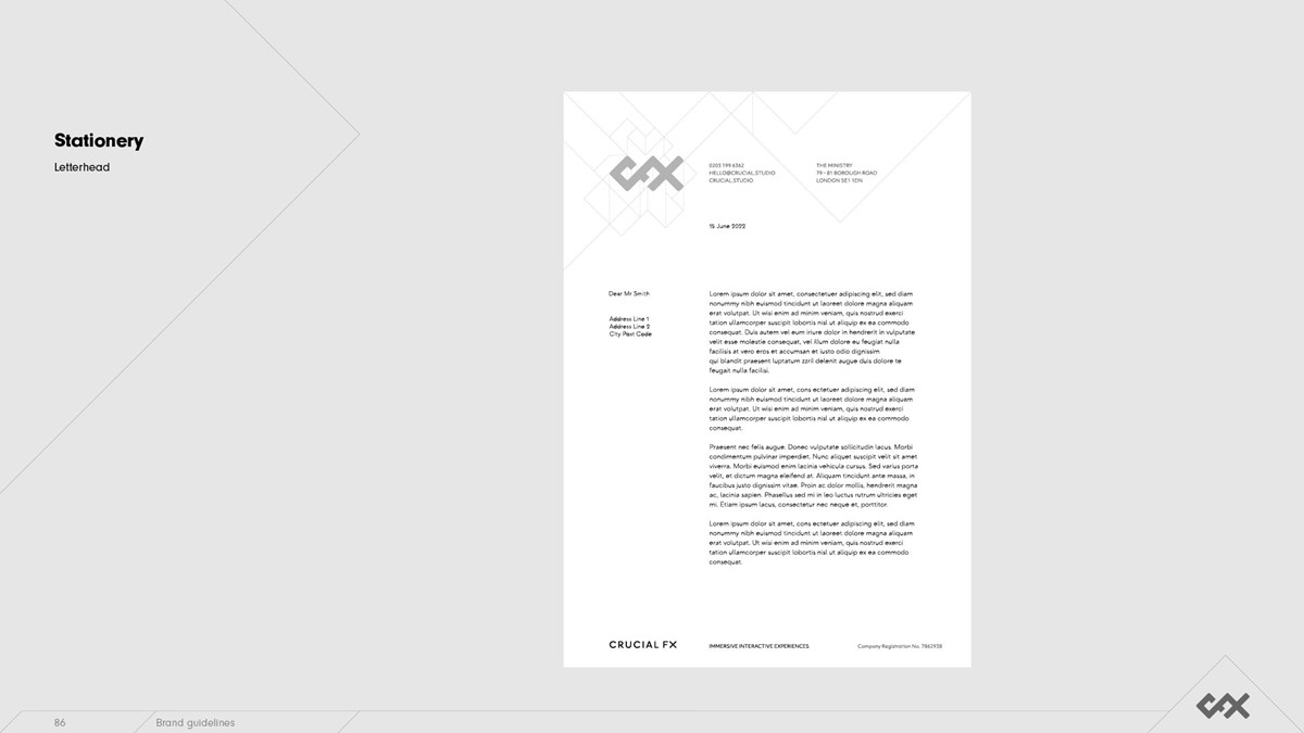
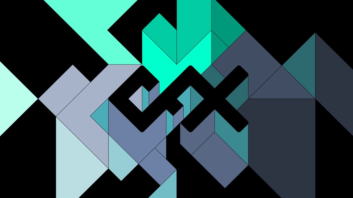
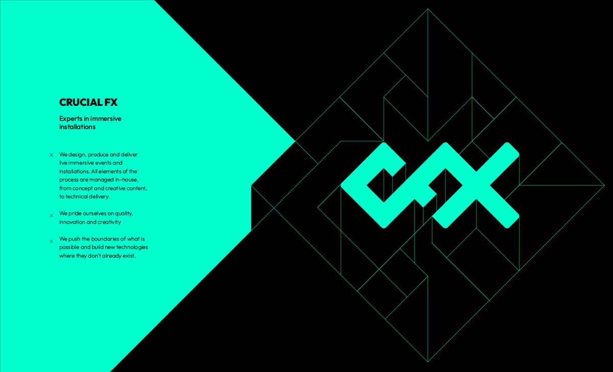
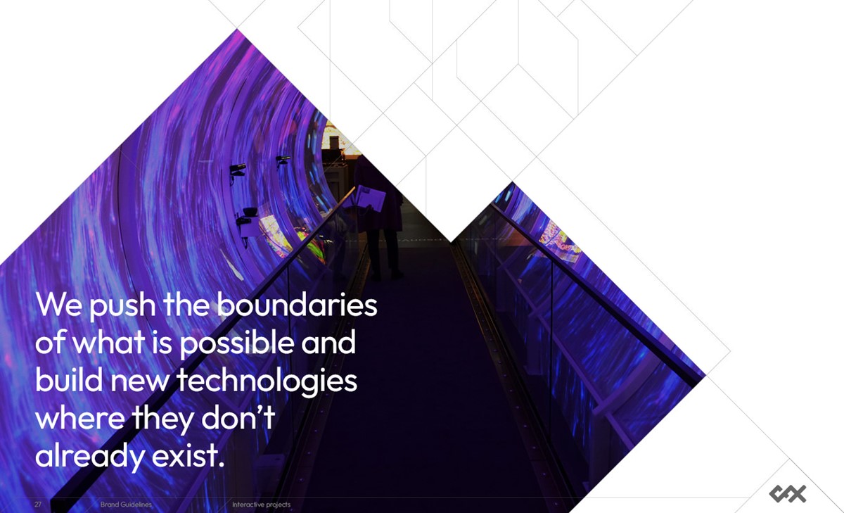
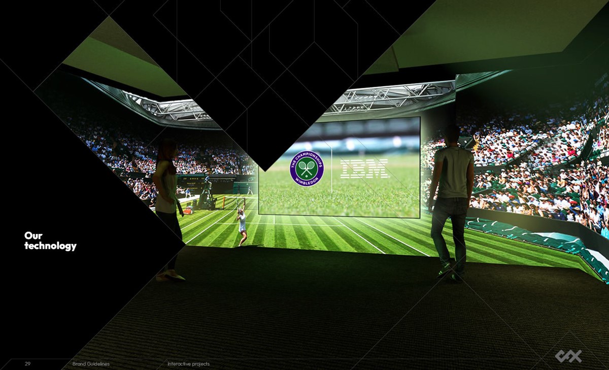
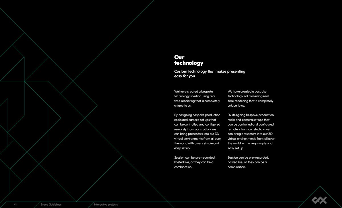
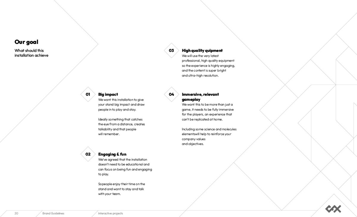
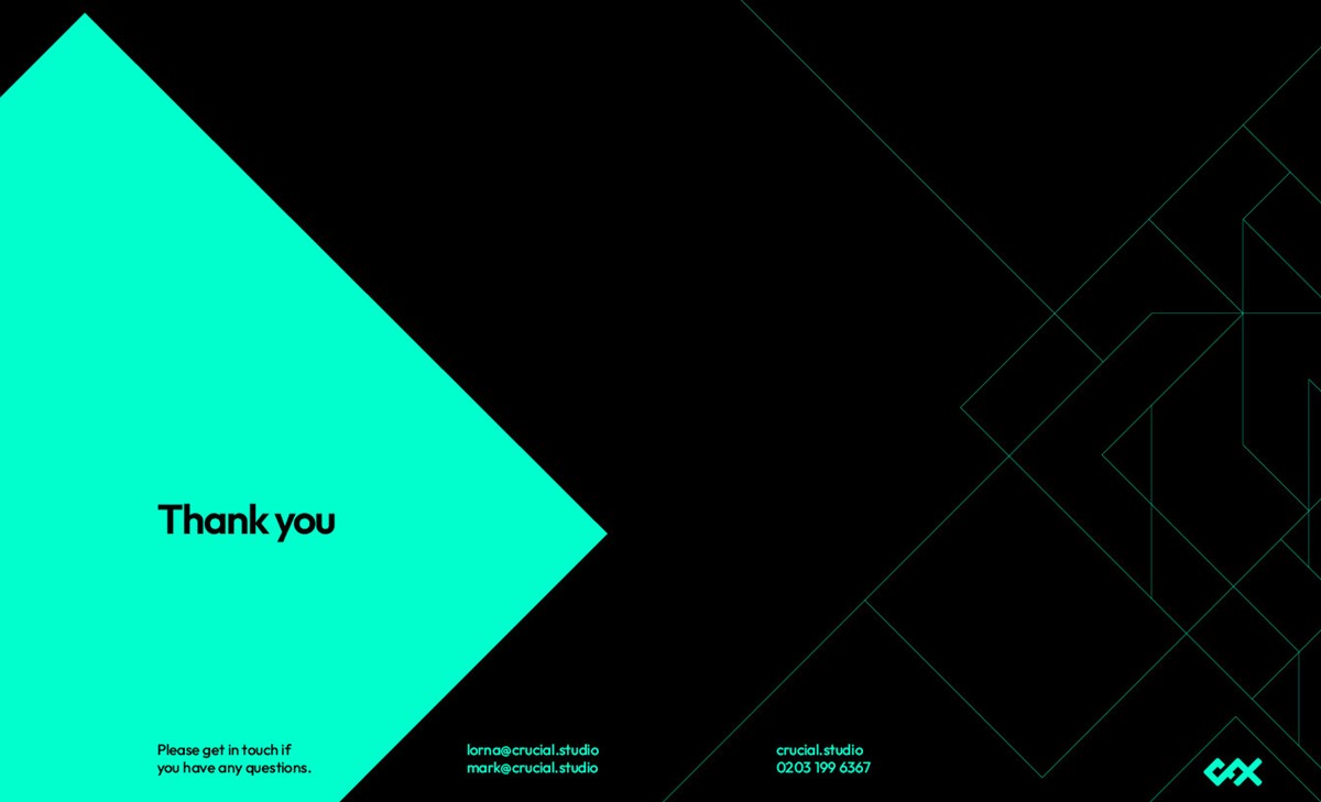
The distinct 45-degree angle from the marque was continued to develop additional graphic language. Keyline grids provided extensive design options for containing, separating and styling content. This proved to be very versatile – from a simple angled line to split a page to highly intricate pattern designs as dramatic wallpapers. However, it also required extensive testing to ensure restraint and creative control was maintained, leading to over 40 template designs for the presentation deck!
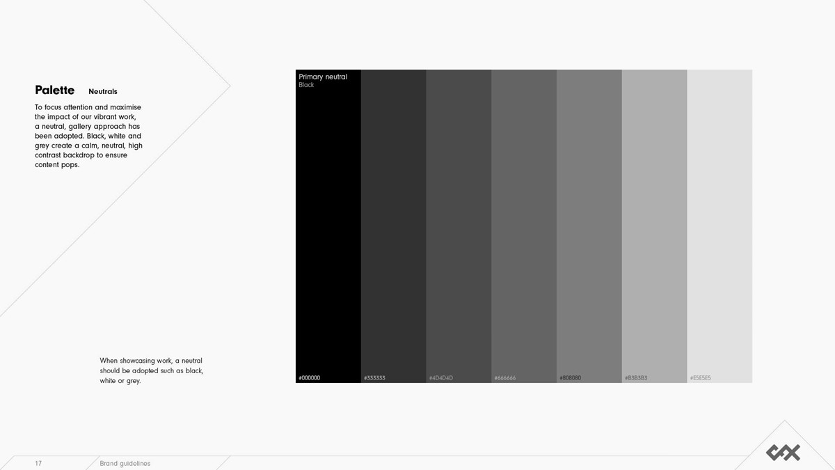
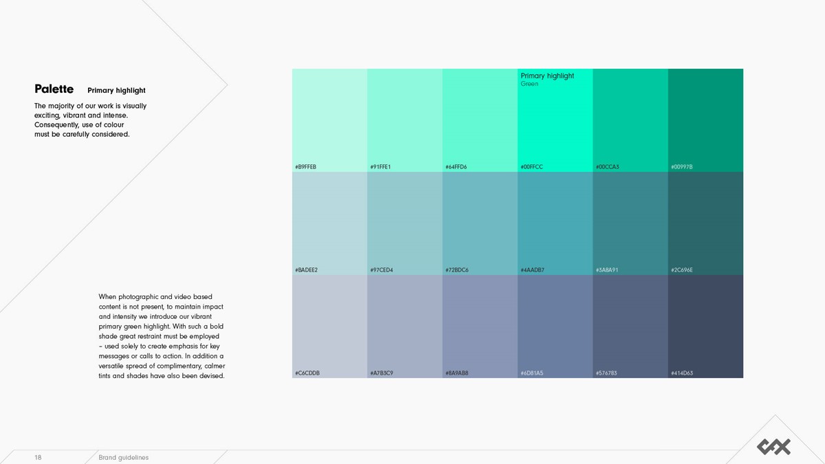
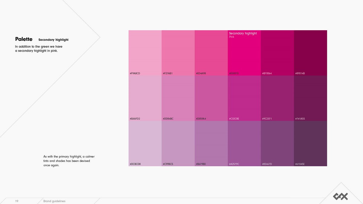
The majority of Crucial's creative work is very bold, bright and energetic. Consequently, most brand-led colours would be lost or clash amongst the content. For the brand palette, to eradicate this concern and maximise visual impact, black was selected as the base colour. For key messaging, a highlight colour would still be required. Consistent with the bold, digital form of their work a neon green and secondary pink were adopted.
For typography, a geometric sans was the logical choice. Uppercase sans for headlines in keeping with the logotype were tested but lacked the softer, human, organic reactions to their work. Consequently, we reverted to sentence case. The typeface Output – originally designed to be as geometric as possible – with wide accessibility and multiple weights provided the perfect, creative solution.
Project services
- Branding
- Brand Strategy
- Bespoke Typography
- Graphic Design
- Marketing
- Animation
Testimonials . Press . Awards
This brand identity project has been awarded for Branding in the Creativepool Annual 2023 awards.