BBFAW Rebrand + annual report
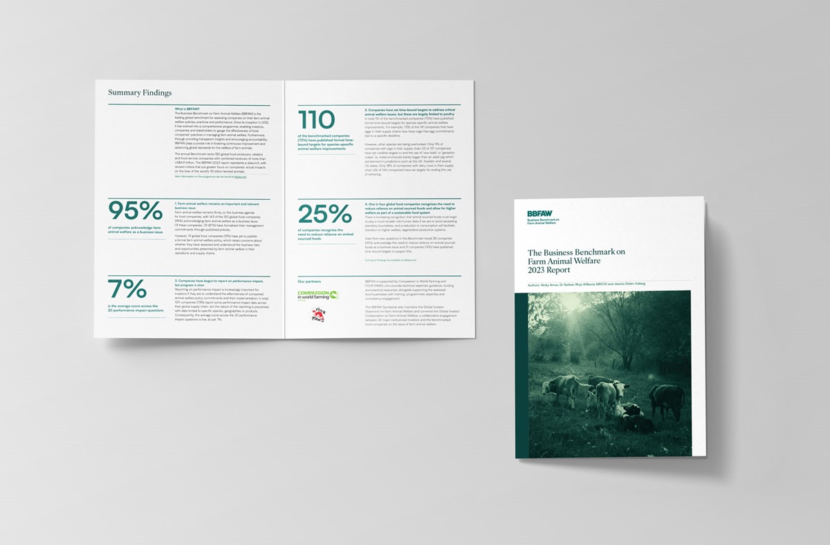
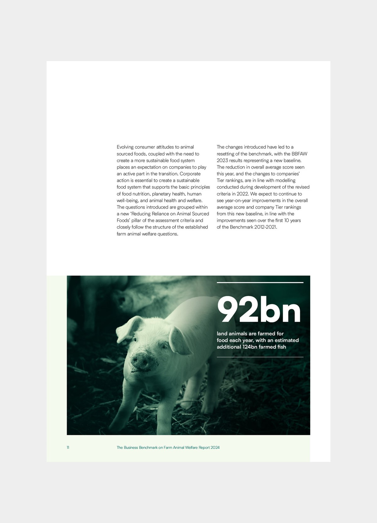
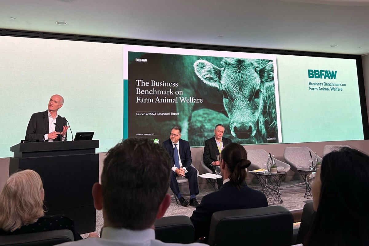
The Business Benchmark on Farm Animal Welfare (BBFAW) is the leading global measure for farm animal welfare management in food companies. Globally 92bn land animals and an estimated 124bn fish are farmed for food every year. Despite these statistics, there is currently no requirement for animal-based food companies to publish details of their welfare standards. Since launching in 2012, in association with its global animal welfare charity partners, Compassion and Four Paws, BBFAW has addressed this with its annual benchmark results. This ensures investors and stakeholders are aware of the corporate practices and performance of the top 150 global companies, with the aim of improving the welfare of animals reared for food.
Although there is a long way to go, standards have improved over the past decade, so BBFAW felt it was time to recalibrate the tier structure of the benchmark accordingly. This provided a perfect opportunity to also rebrand, so Superfried design studio were appointed to develop their brand strategy and design the new benchmark report for 2023.
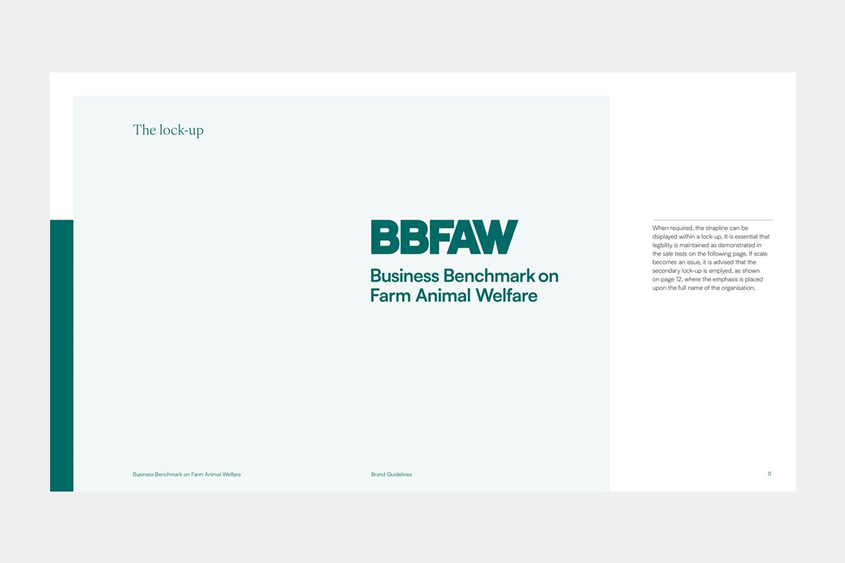
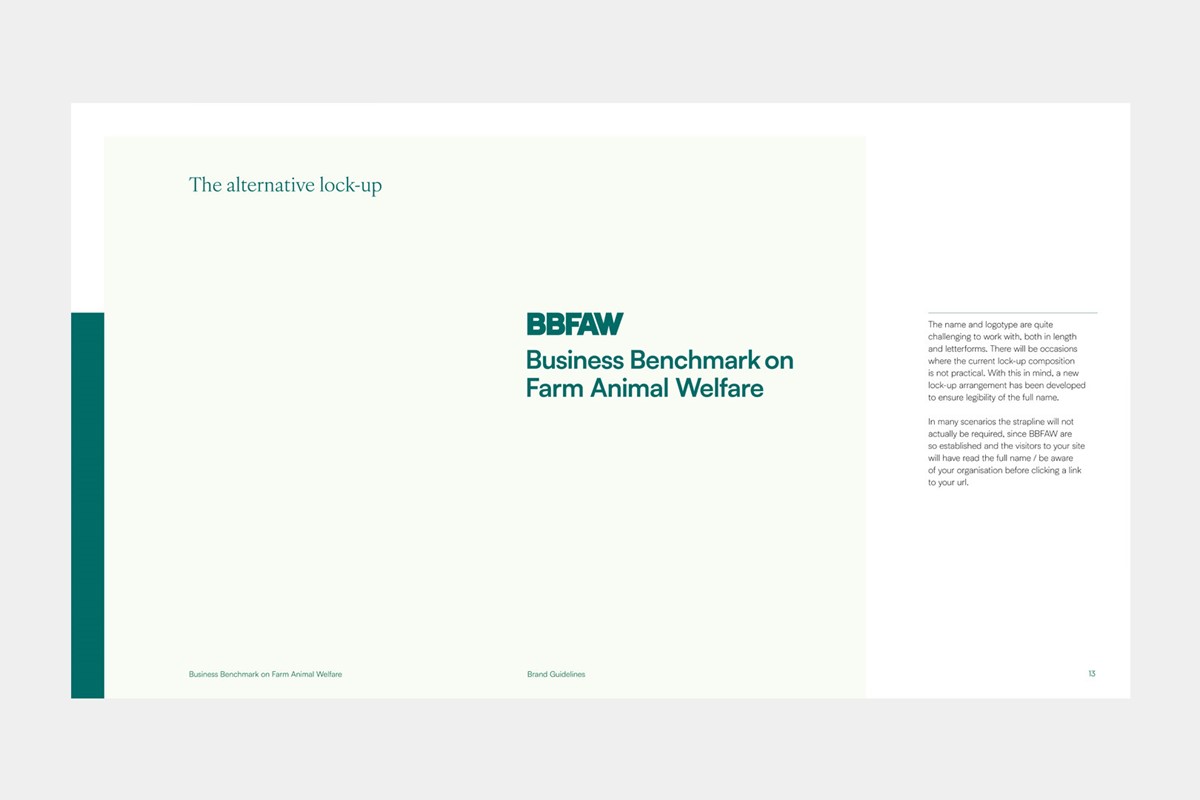
As a respected industry standard, to maintain trust and brand recognition, it was important to retain an essence of the original brand. With such a long name the initialsm would need to be retained. Bespoke lettering was developed, the kerning improved, and the previous 'tick styled' W was removed to create a simplified, robust logotype. Despite the changes, the new wordmark retained the same feel of the original brand. The full name was subsequently applied for use as a lock-up. To cater for use at small scale, a revised lock-up was developed where the logotype was reduced in scale relative to the full name.
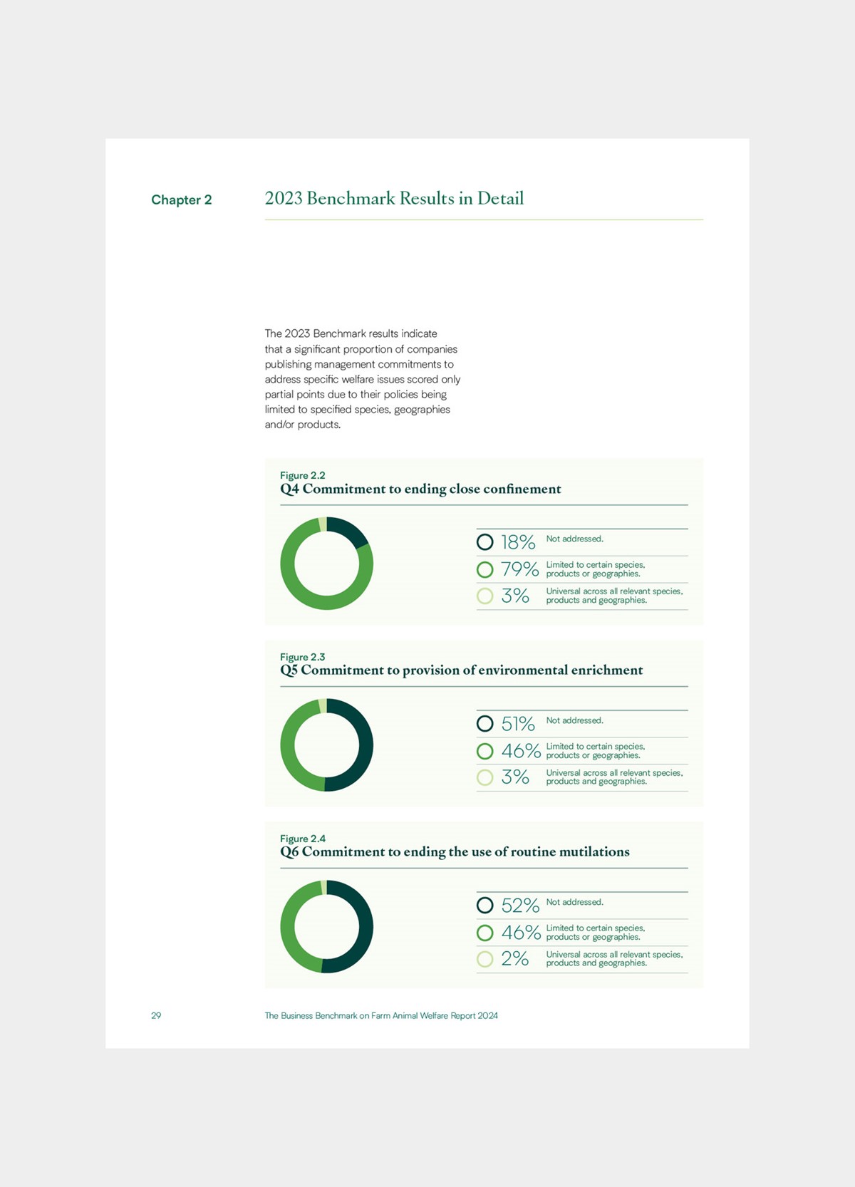
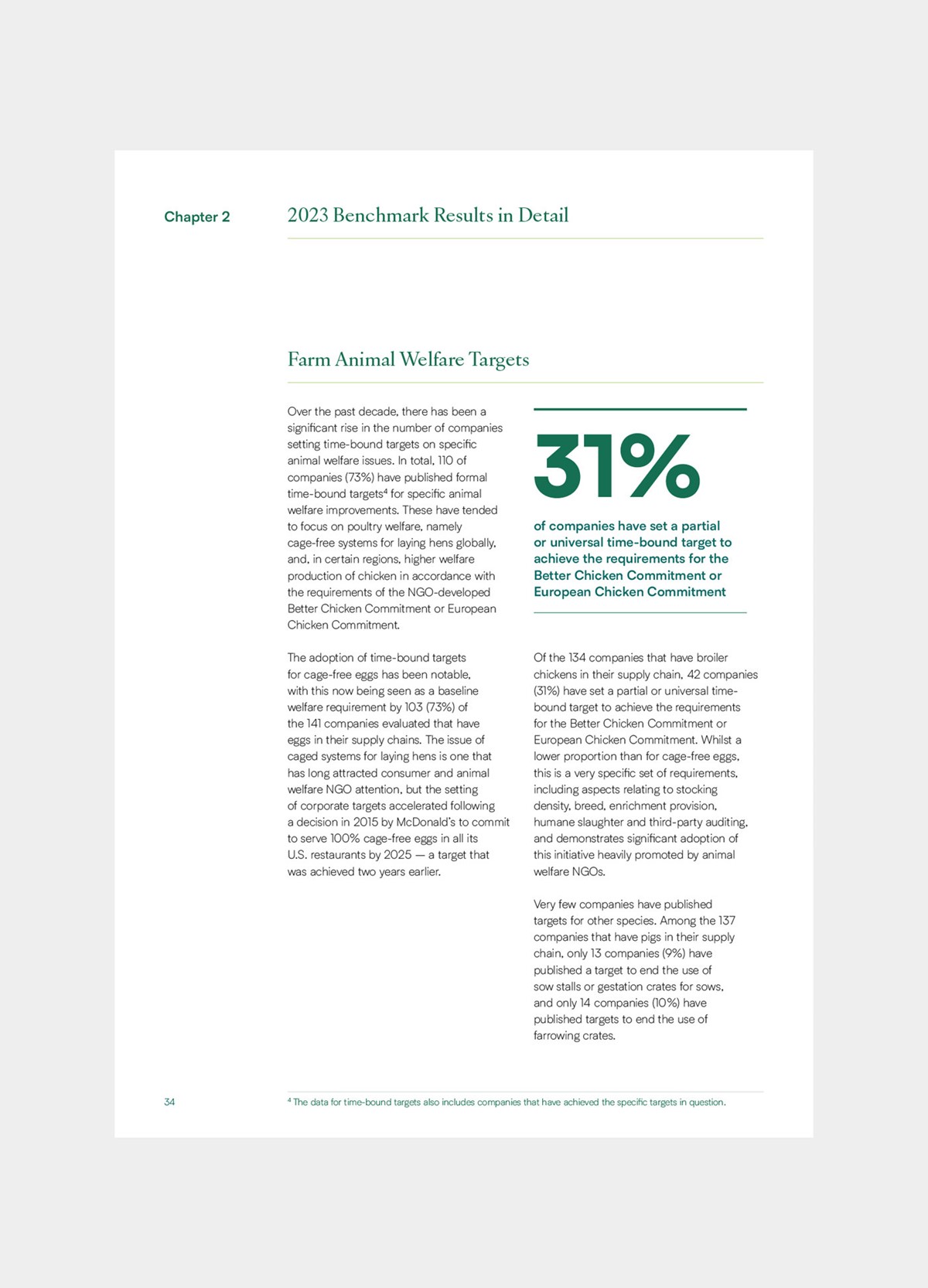
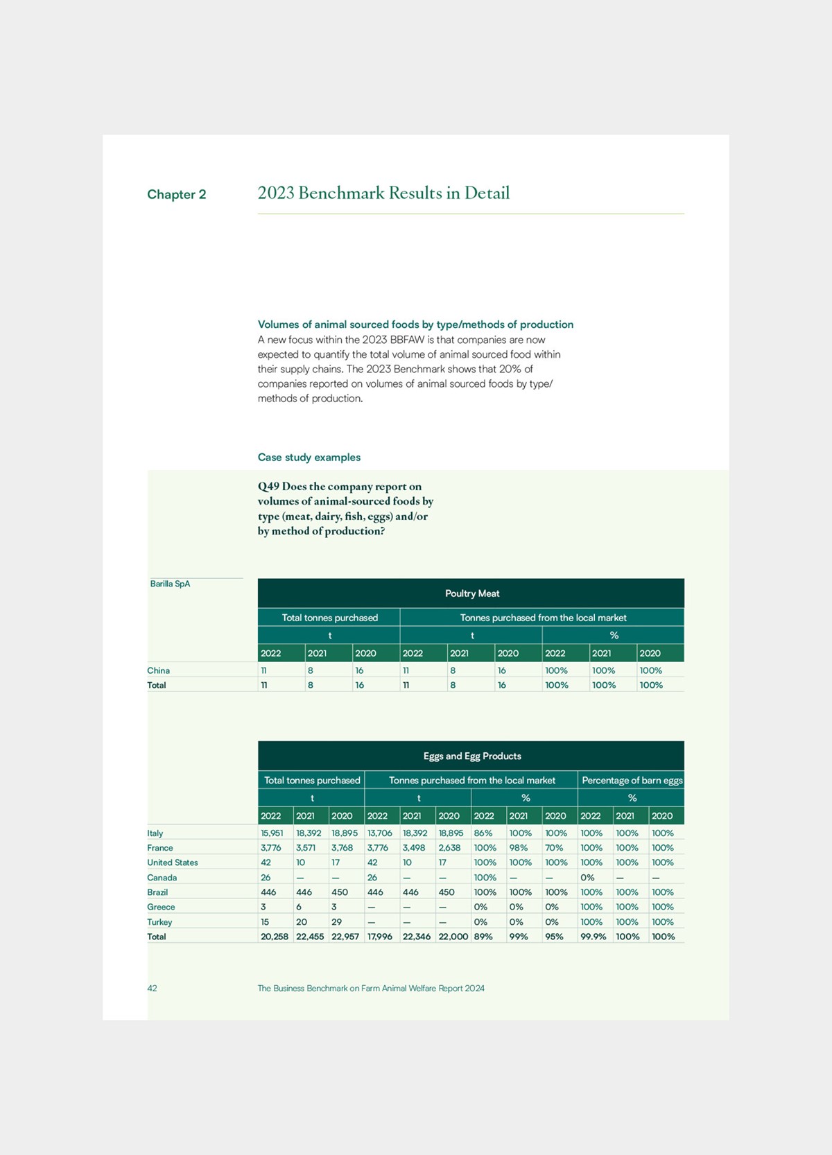
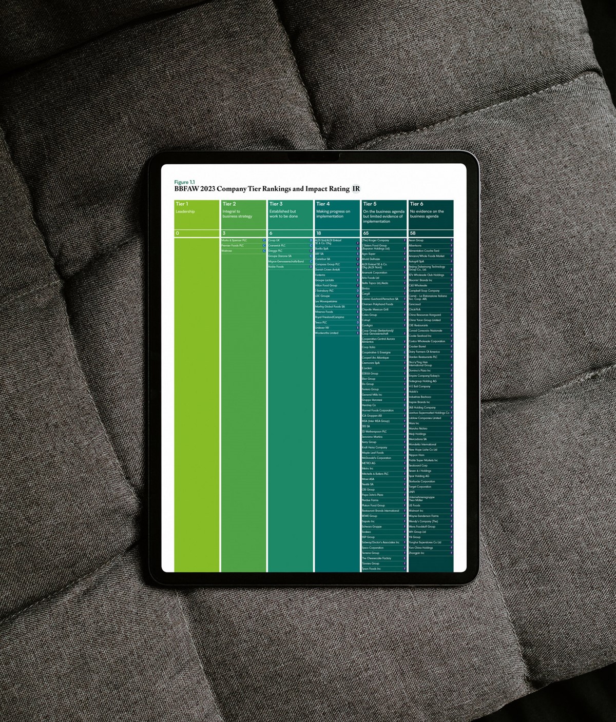
With the brandmark in place, the focus was then directed to the most significant service BBFAW provide – their annual results. Since the data they collate is key, great attention to detail was given to the typography and information design to ensure it was authoritative and as comprehensible as possible. After reviewing previous reports, it was clear there were significant issues with regard to accessibility with the use of colour and type sizes.
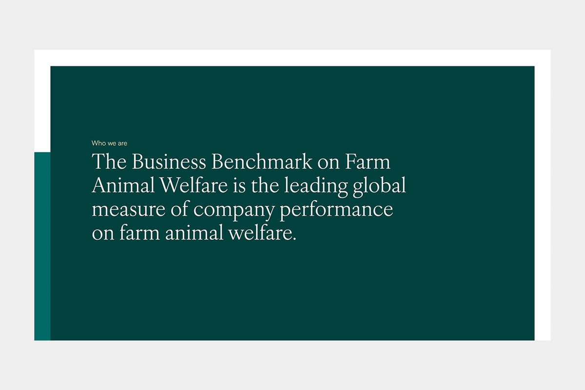
As the leader in their field, I felt this should be reflected in their tone of voice. With this in mind a serif typeface – IvyOra Text – was selected for large headings. This typeface is elegant and versatile with wide variety of weights. It also uses a conventional, modern number set by default. Many serif typefaces revert to traditional, impractical, multi-height numerals – which is consistently frustrating. For body copy and numerical data, a complimentary sans-serif – Satoshi – was optioned to ensure content would be accessible and legible on all devices. Satoshi is clean, modern and unlike many sans typefaces, it is well proportioned. It was being used on a 100+ page report, so it was essential that the X-height and character width was not too excessive which can lead to multiple linebreaks and inefficient use of space. Satoshi also provides an expansive chacatre set. Via opentype settings, the traditional 'a', double deck 'g' and tailed 't' were specified from the Satoshi glyph set to create a more complimentary pairing between the typefaces.
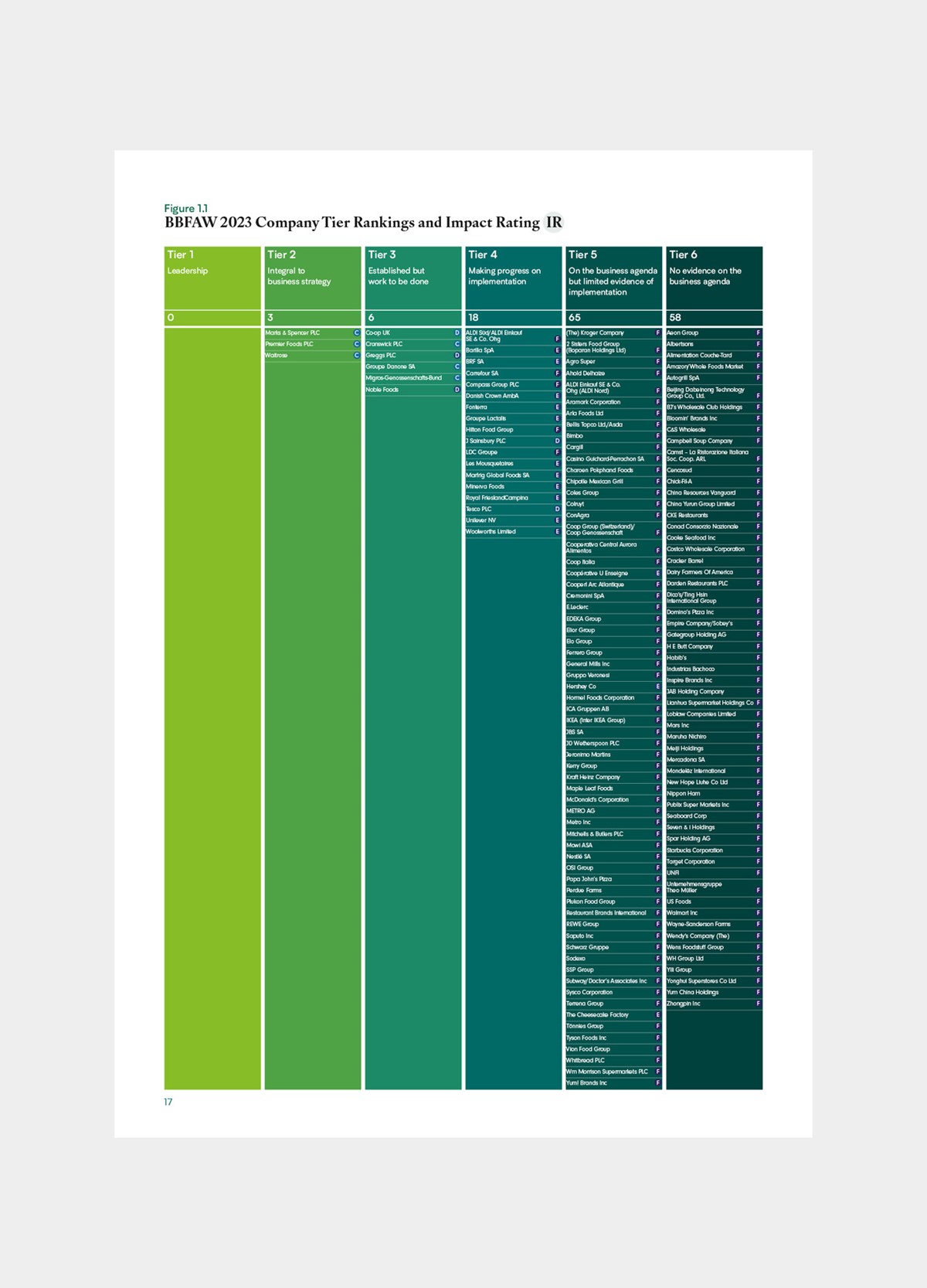
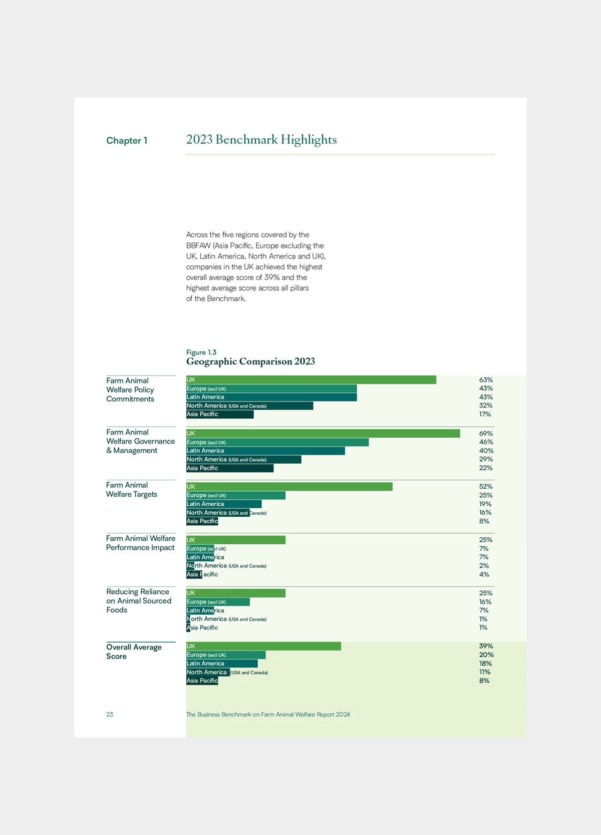
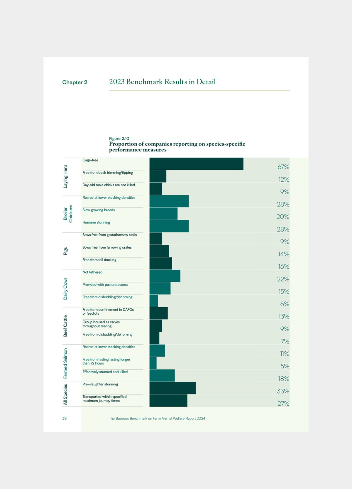
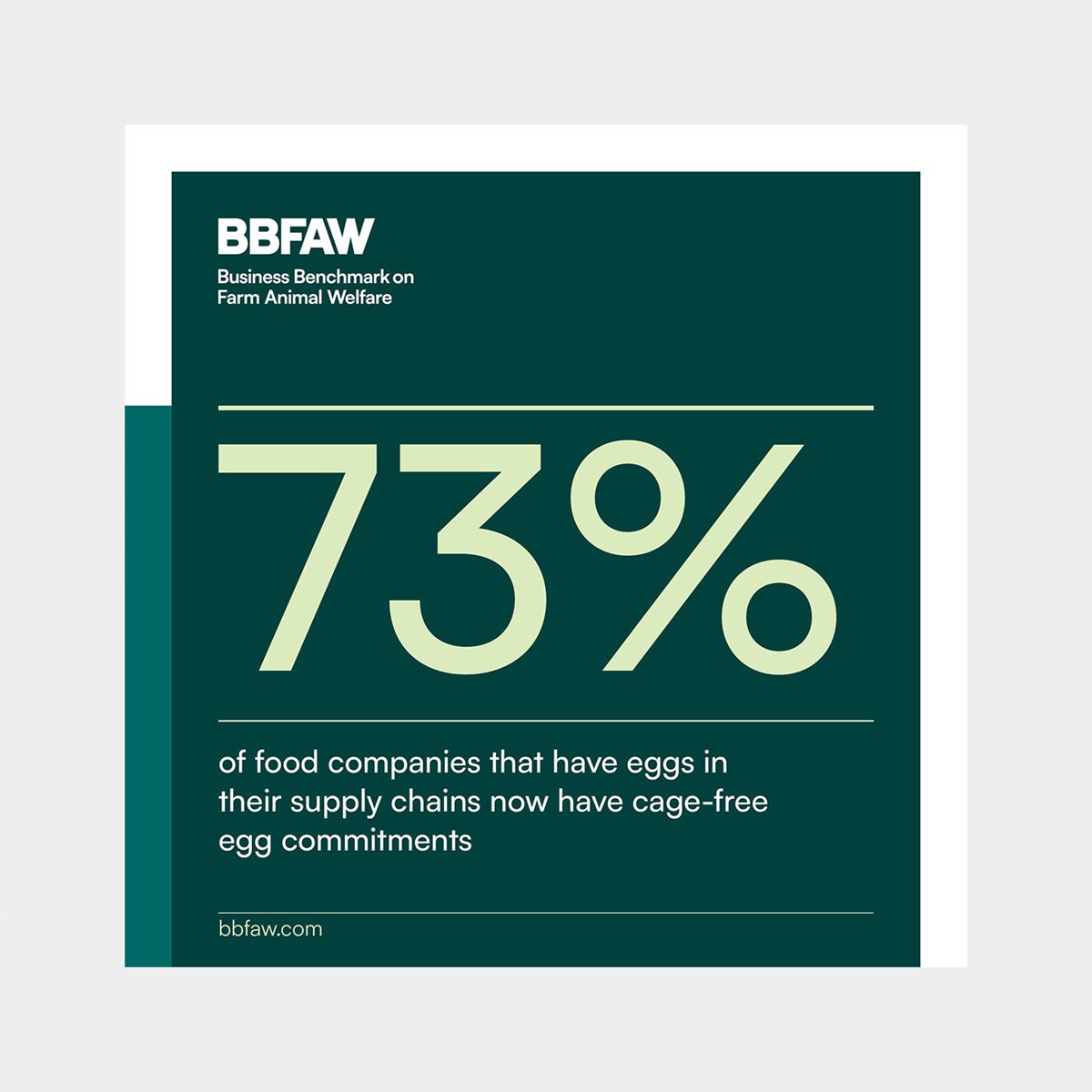
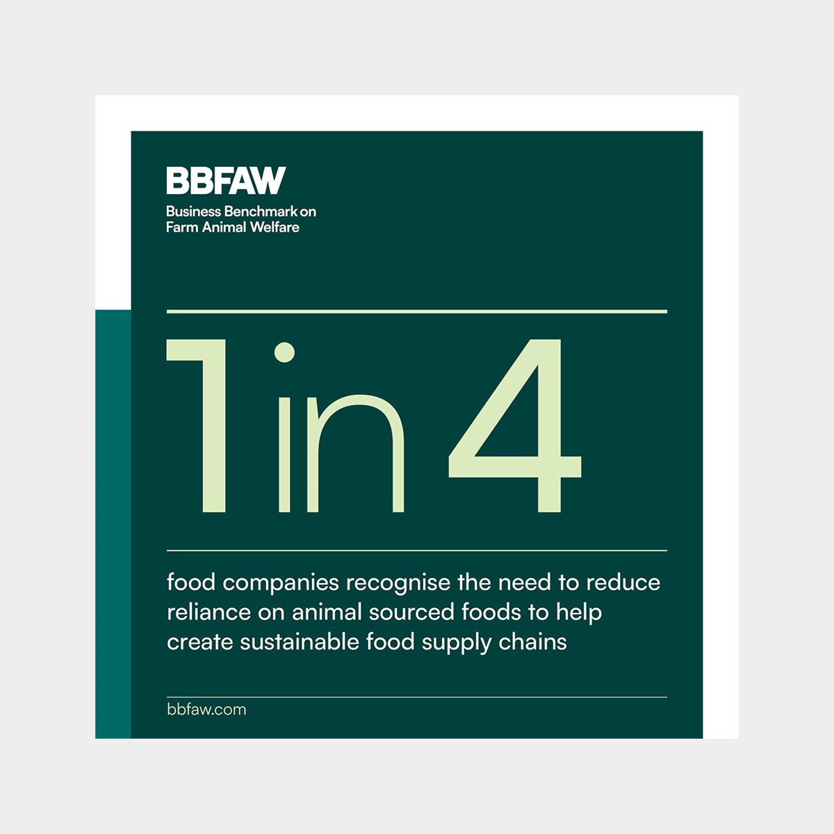
With the typography established, focus was directed towards the actual data. Rather than simply going through the motions, since the figures were the most significant element within their report, I wanted their data to be treated as a brand asset. A distinct, consistent brand style was developed to cover all data formats and charts, whilst ensuring comprehension was never compromised.
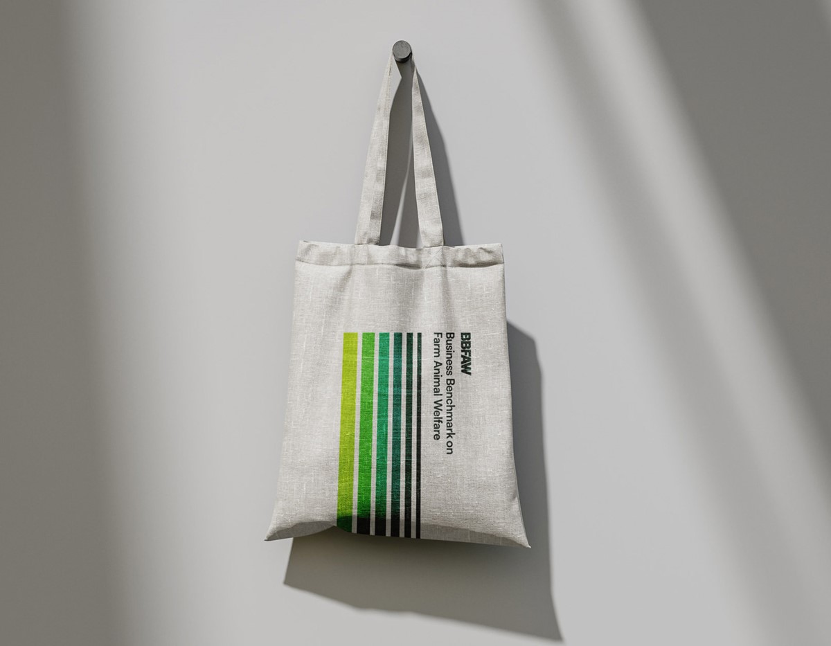
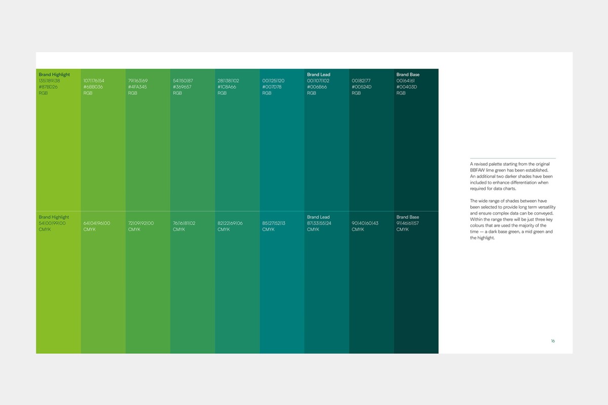
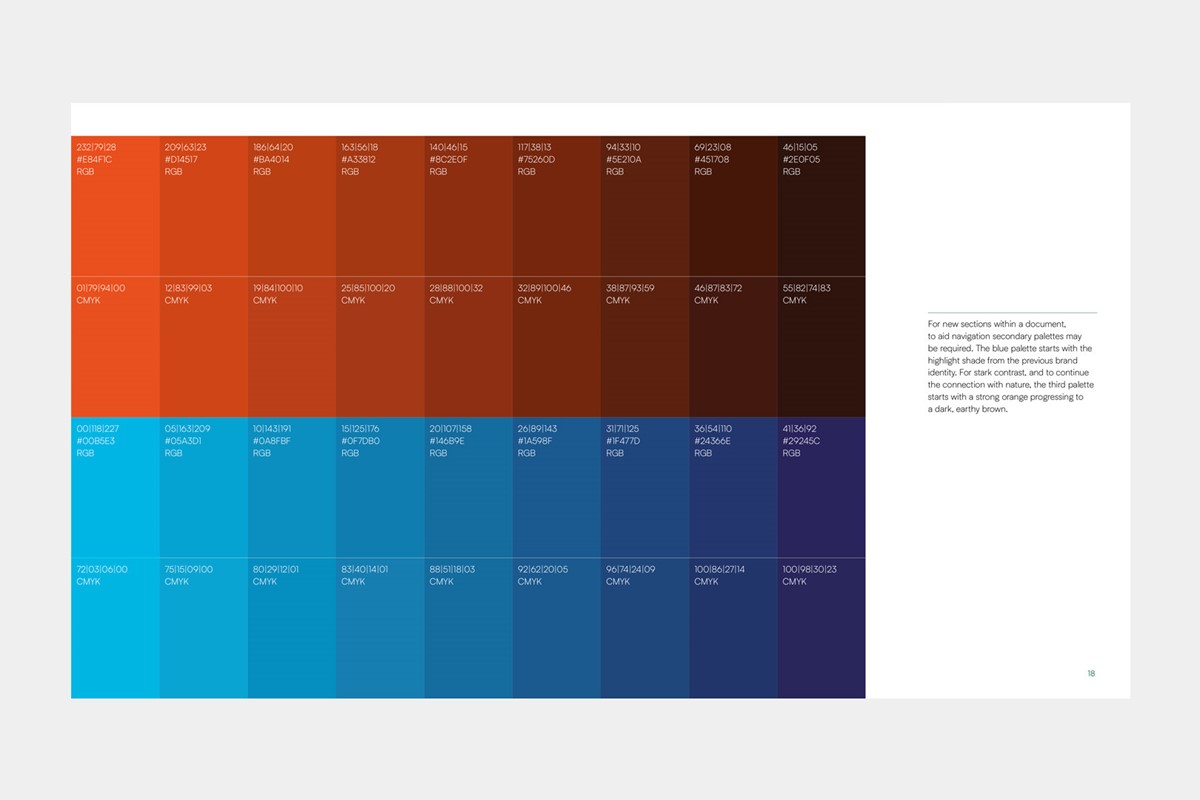
With the typography and information design established, the attention was then directed towards additional graphic language. Looking at the use of colour, to maintain a connection to the previous brand the primary palette of greens retained the previous highlight lime. Additionally, the secondary palette of blue shades, also retained the previous highlight colour. Lastly, a third palette was devised transitioning from a bold orange through to an apt dark, earthy brown. The versatile approach to colour would allow for both conservative and high-impact messaging.
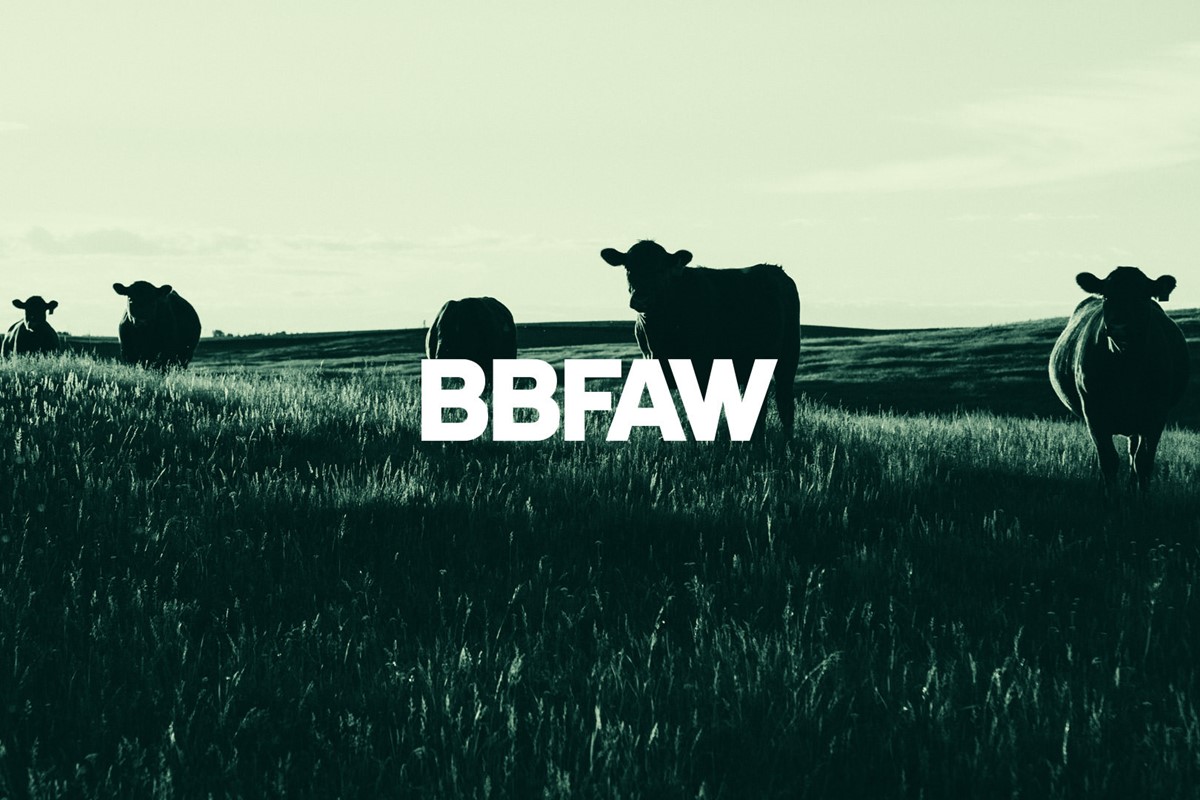
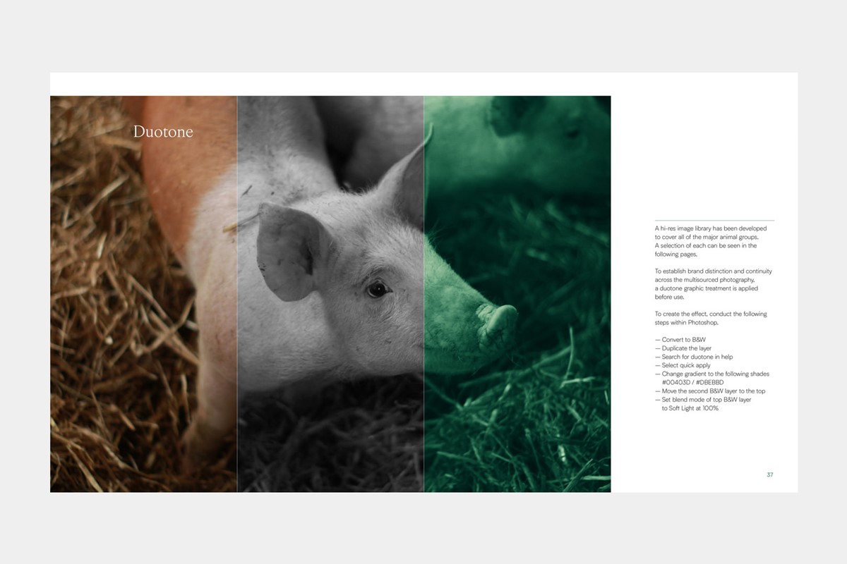
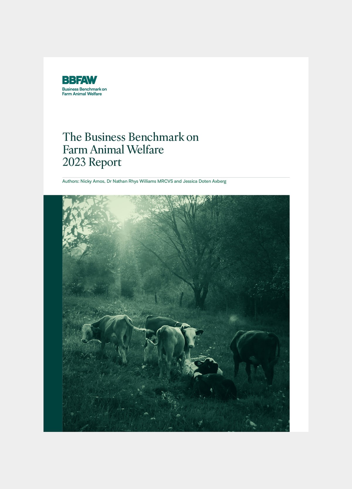
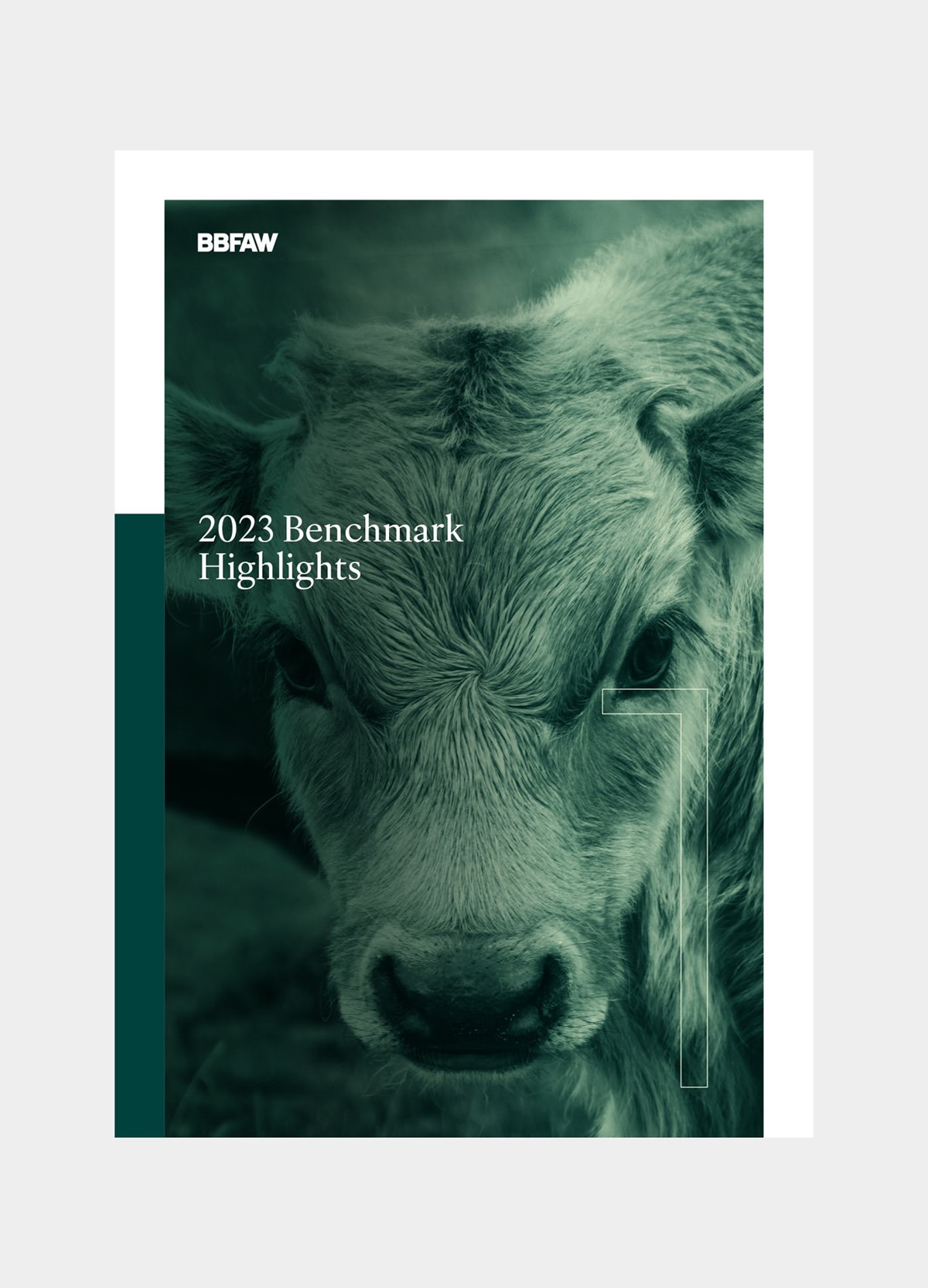
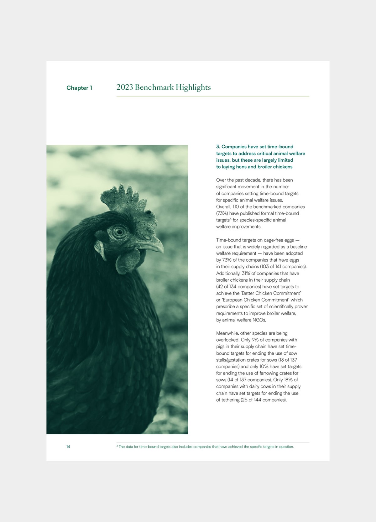
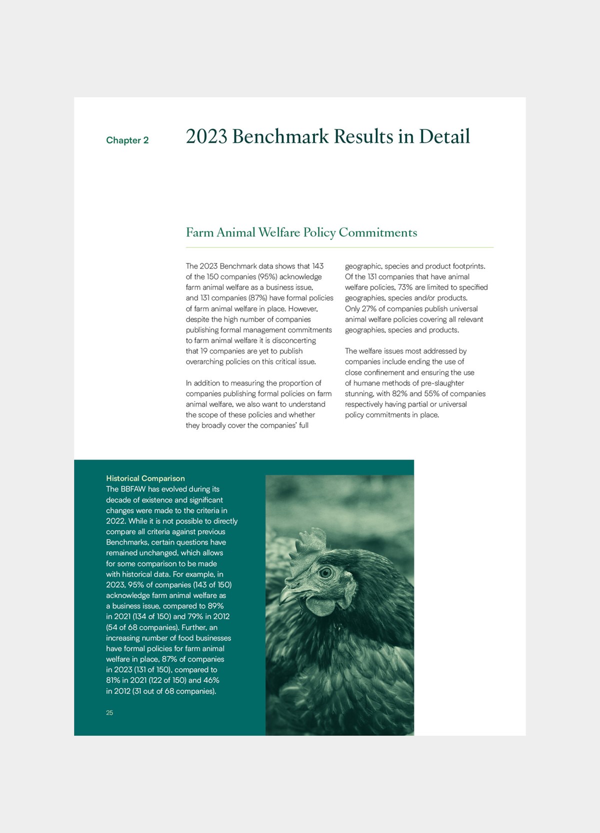
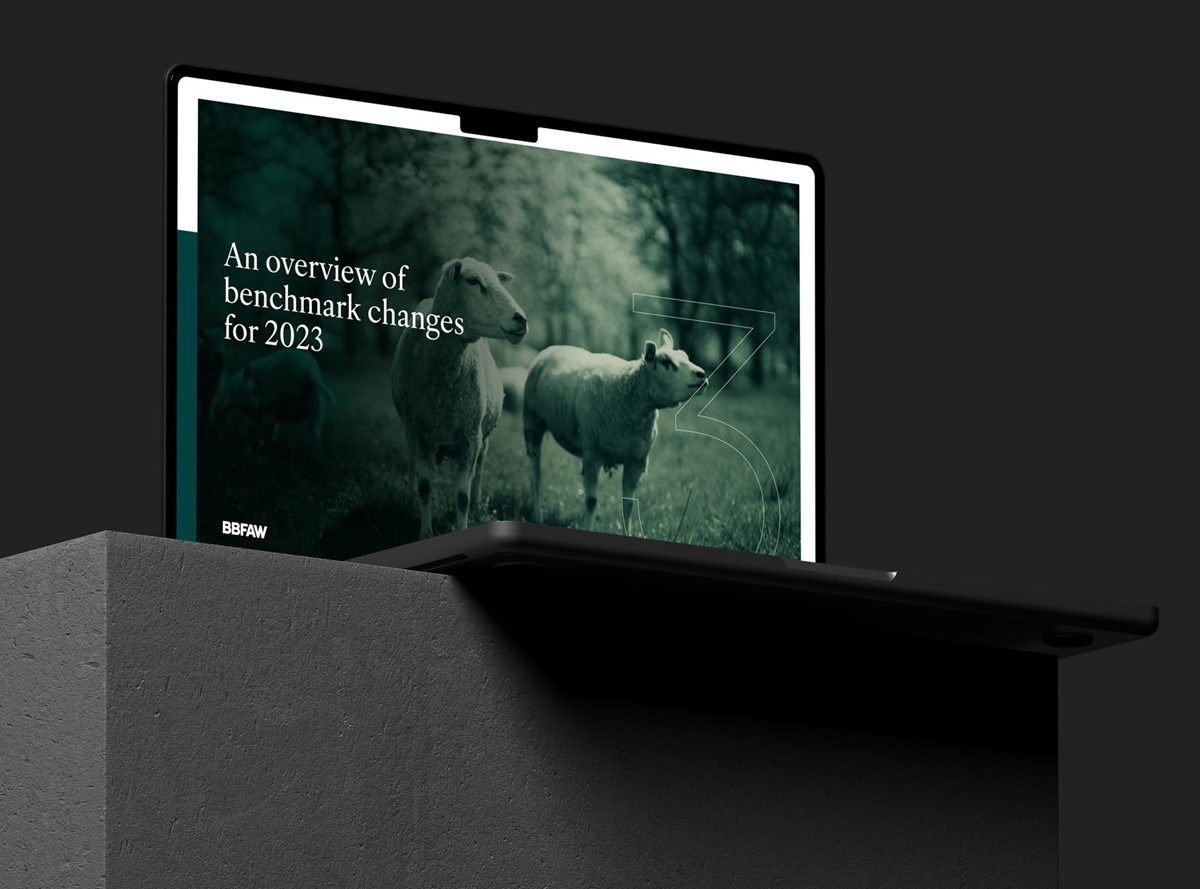
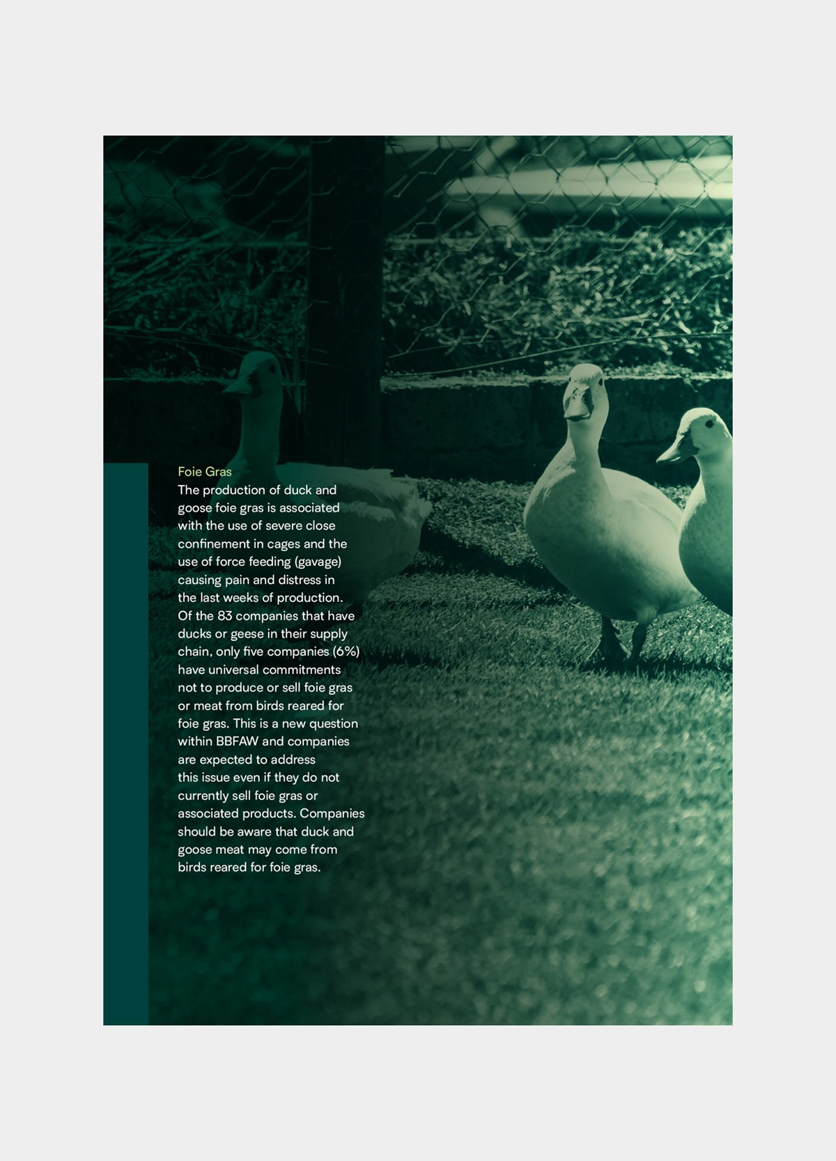
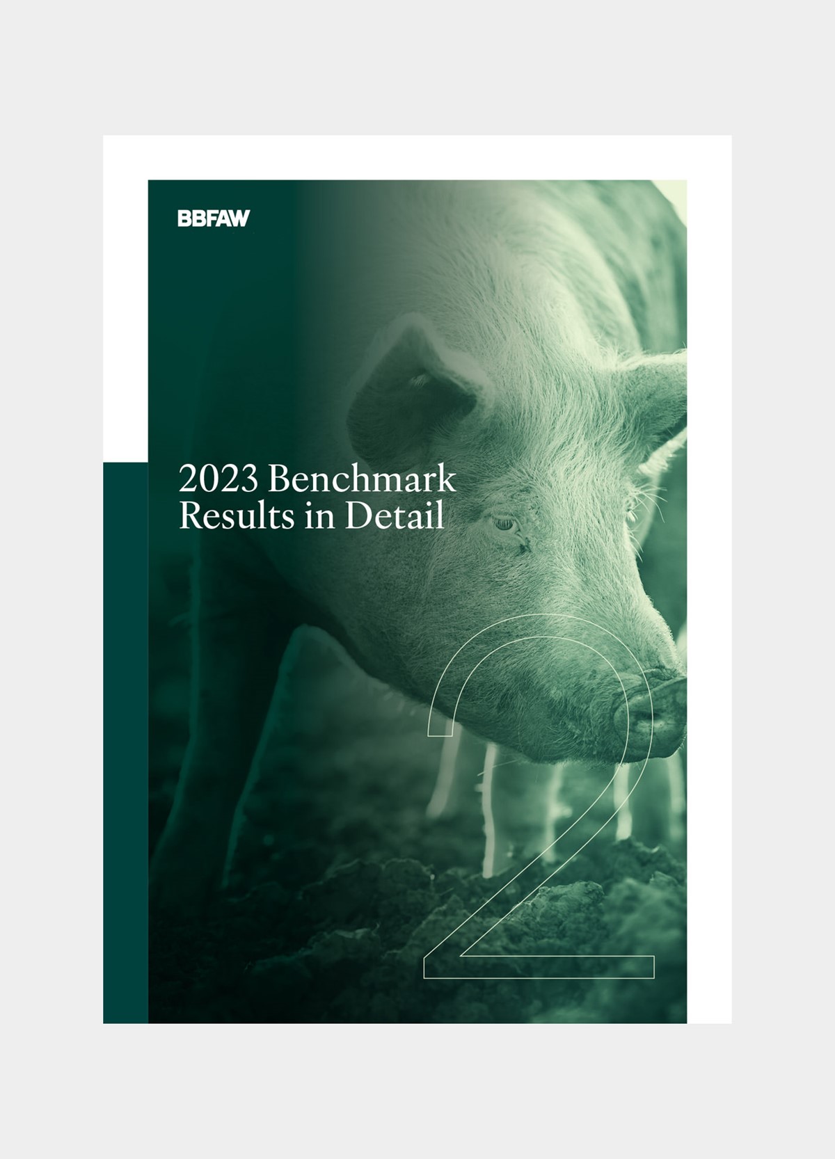
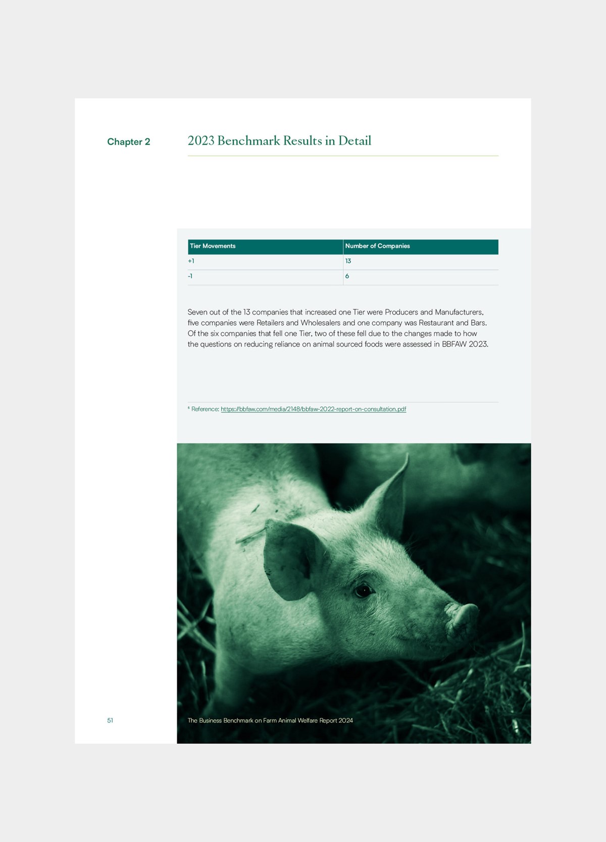
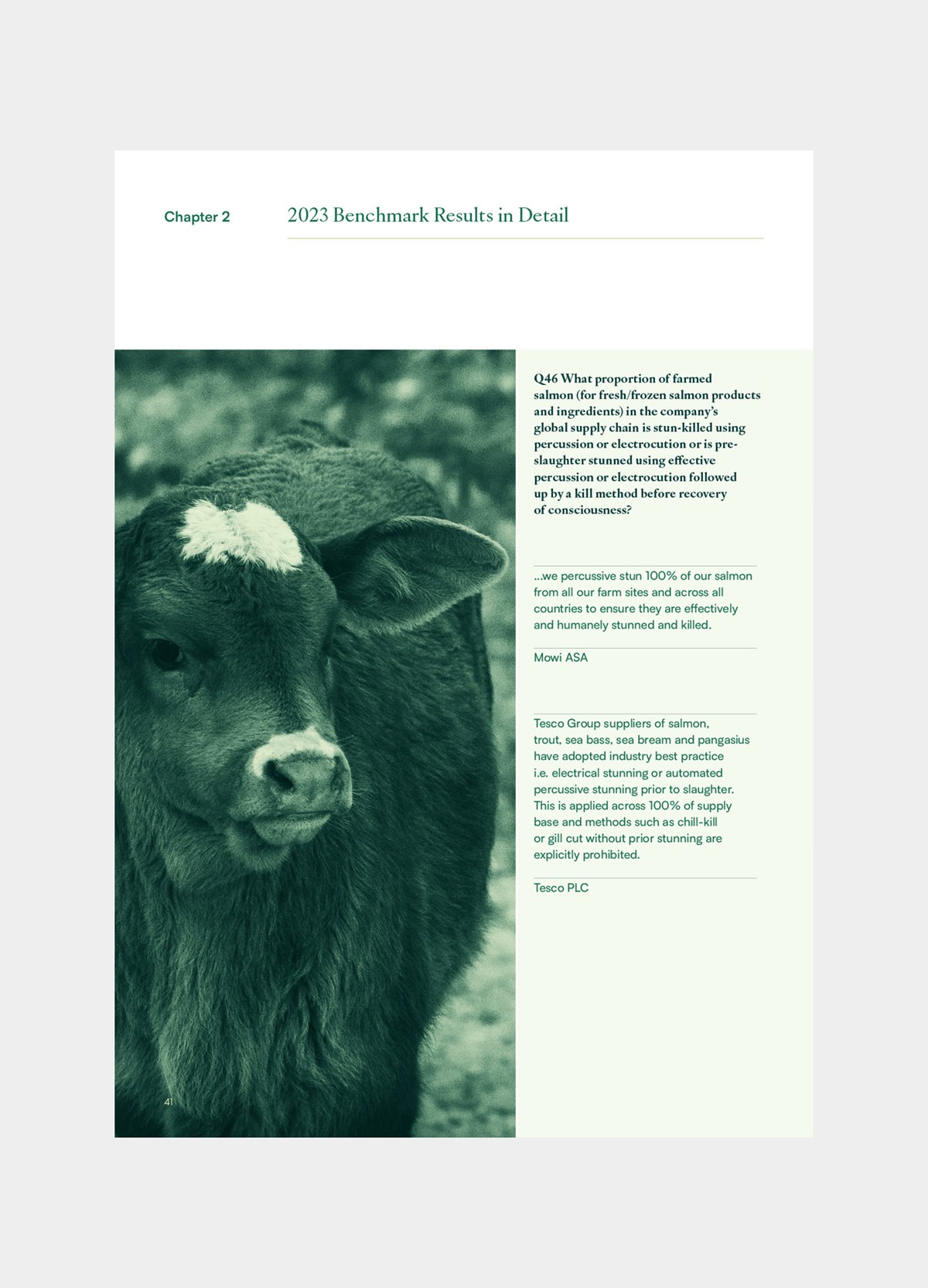
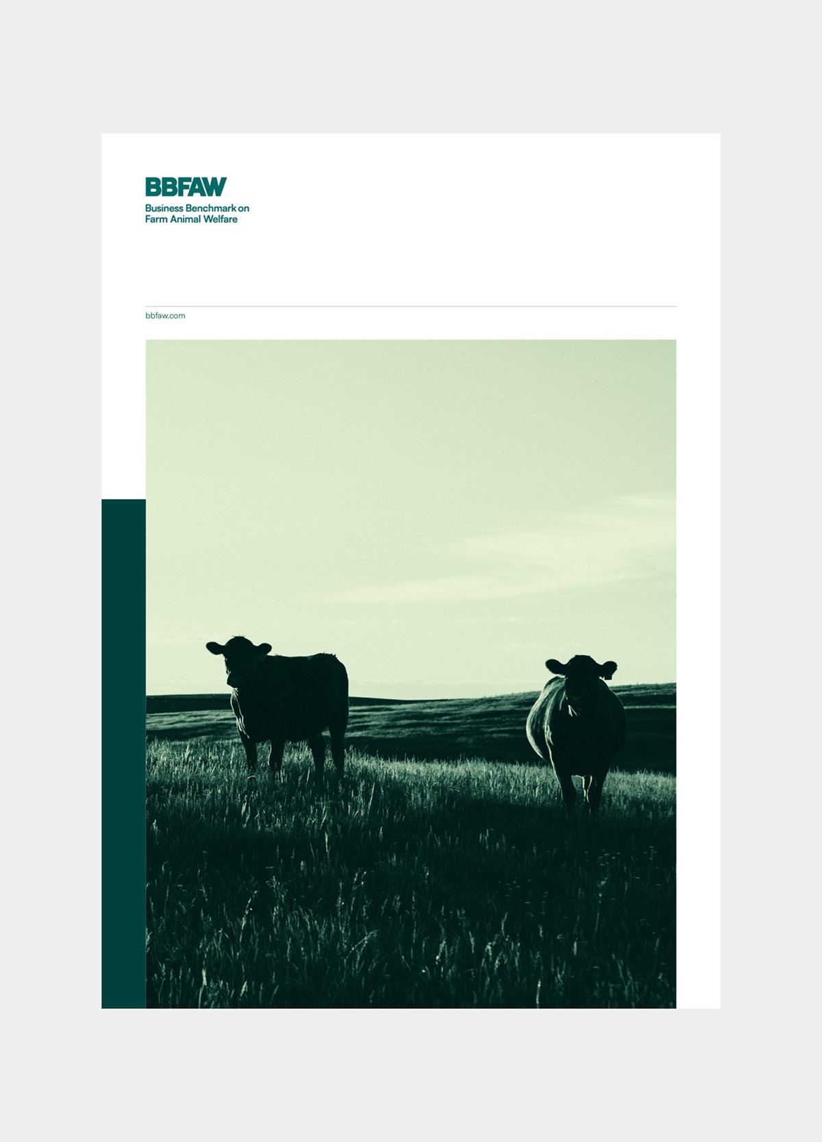
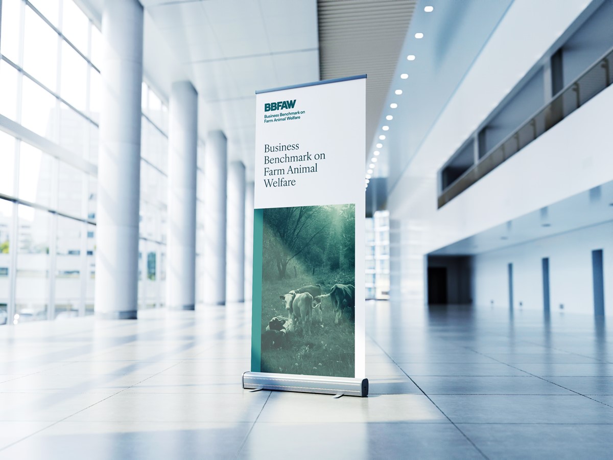
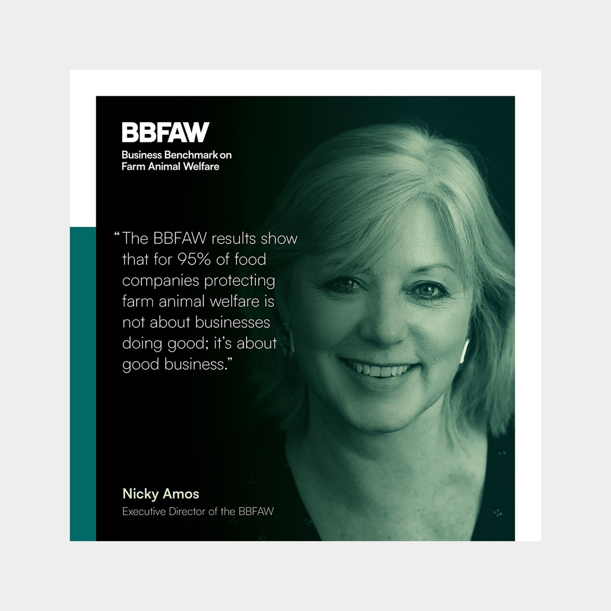
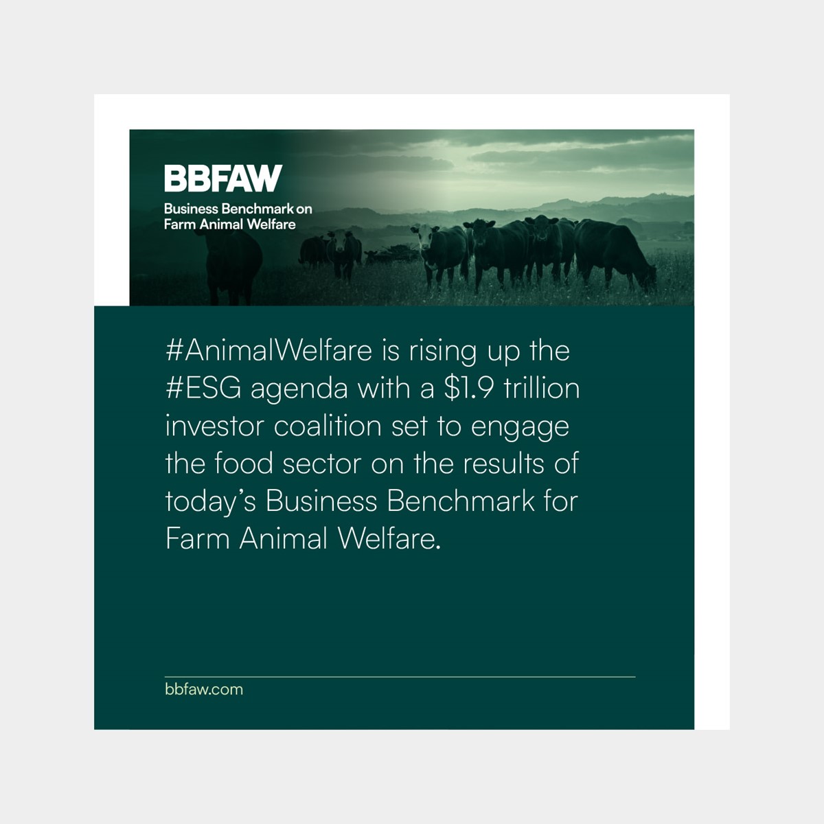
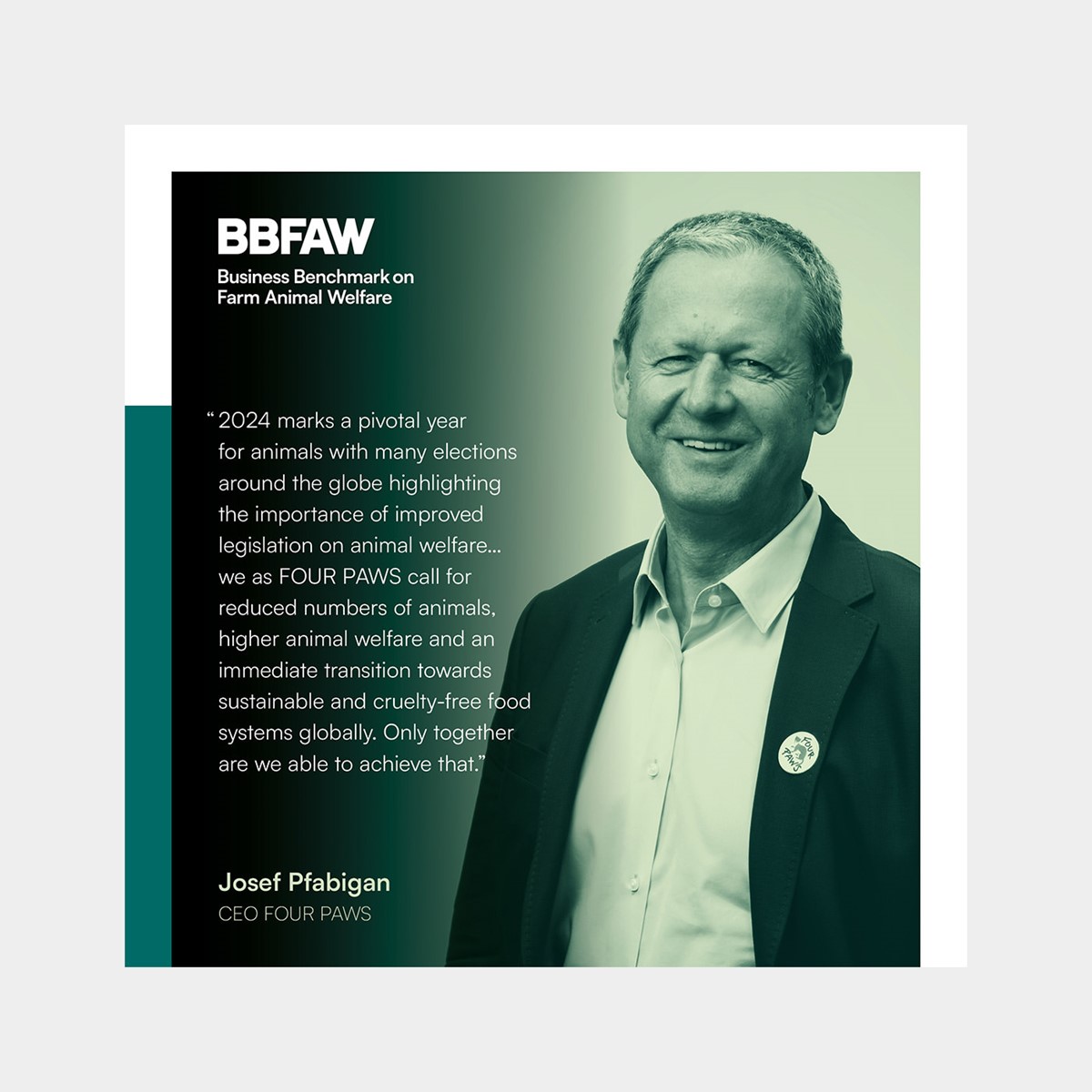
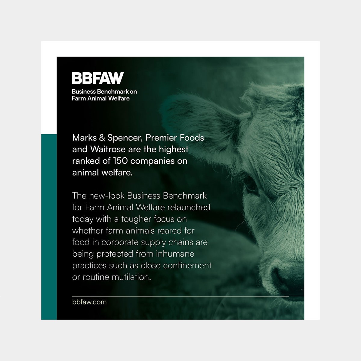
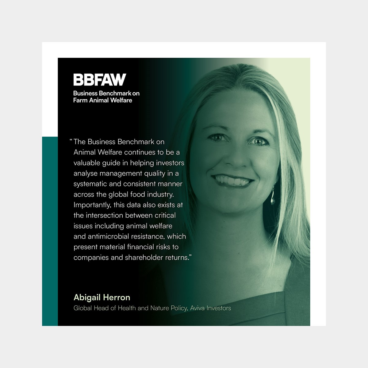
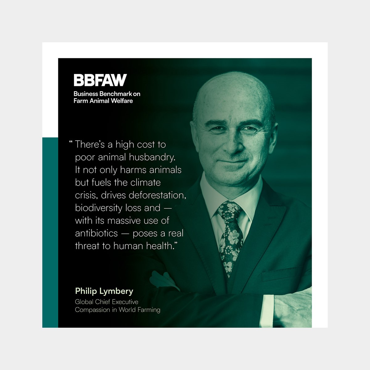
Moving onto photography, examples of specific species and farming practices would mean that imagery would be obtained from an eclectic mix of sources. To create a more consistent, photographic style and enhance brand recognition, the application of a graphic technique would be required. This was achieved via the use of a duotone effect based on the new primary palette.
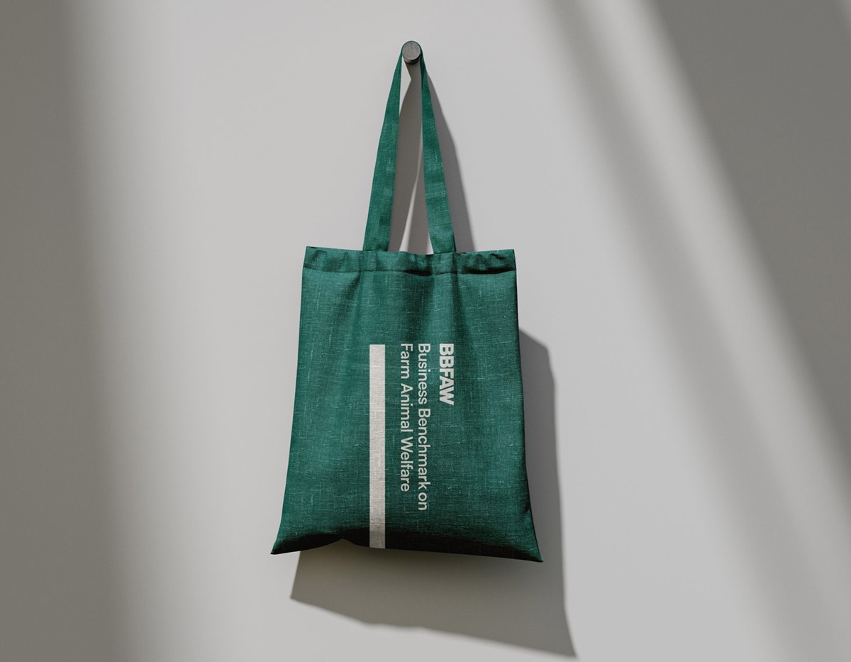
To style and structure the layout of content, additional graphic devices were devised including the use of a bar within the margin and use of subtle tinted panels. With the building blocks in place, brand assets were designed and tested to ensure the brand identity was robust across all mediums.
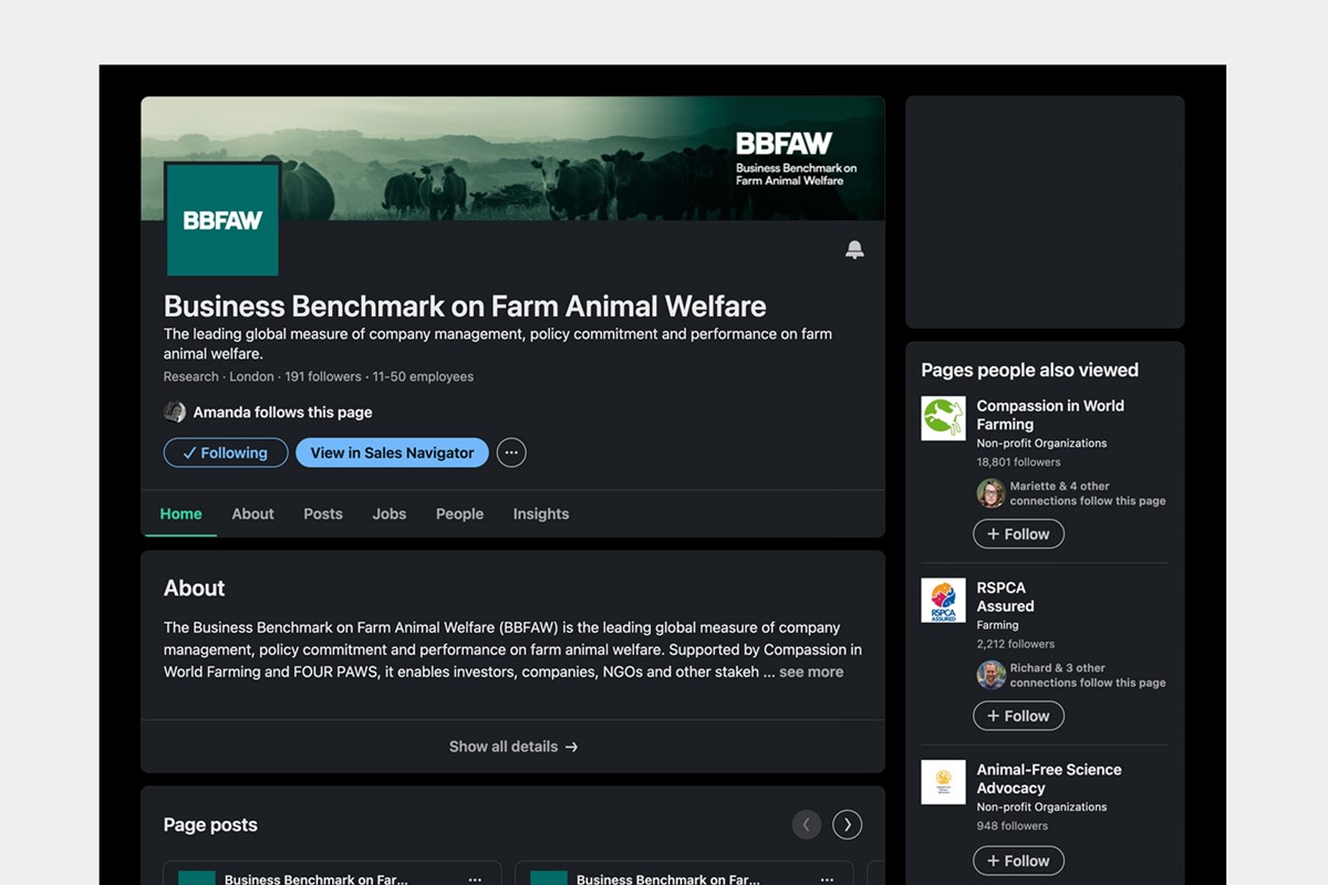
Time was extremely limited, so with the launch event imminent there was insufficient time to redesign and develop a new website. Consequently, the existing site was temporarily retained and re-skinned to reflect the new brand evolution.
Project services
- Branding
- Brand Strategy
- Bespoke Typography
- Graphic Design
- Marketing
- Information design
Credits
Photography credits
–
Brett Jordan
Clara Bastian
Clayton Chase
Dmitry Kalinovsky
Galina Sandalova
Grant Durr
Iga Palacz
Jordan Whitt
Kishyru
Lauren McConachie
Lesha Delgado
Lightpoet
Michel Stockman
Miguel Ángel Díaz Magister
Nadia Supertino
Niklas Ohlrogge
Oliver Sharp
Priscilla Du Preez
Rick Barrett
Slowmotiongli
Sven Brandsma
Zoe Schaeffer