

All We Have is Now Branding a music label
Existing long-term client Dj and producer Will Clarke – Cut a Rug – wanted to set up a new record label. So he contacted graphic design studio Superfried to develop the brand identity.
The name – All We Have is Now – was strong, but open to interpretation. Will requested a rebellious, punk vibe. Numerous design iterations were explored during the research phase, but a clear connection to time and an organic, human attribute became a recurring theme.
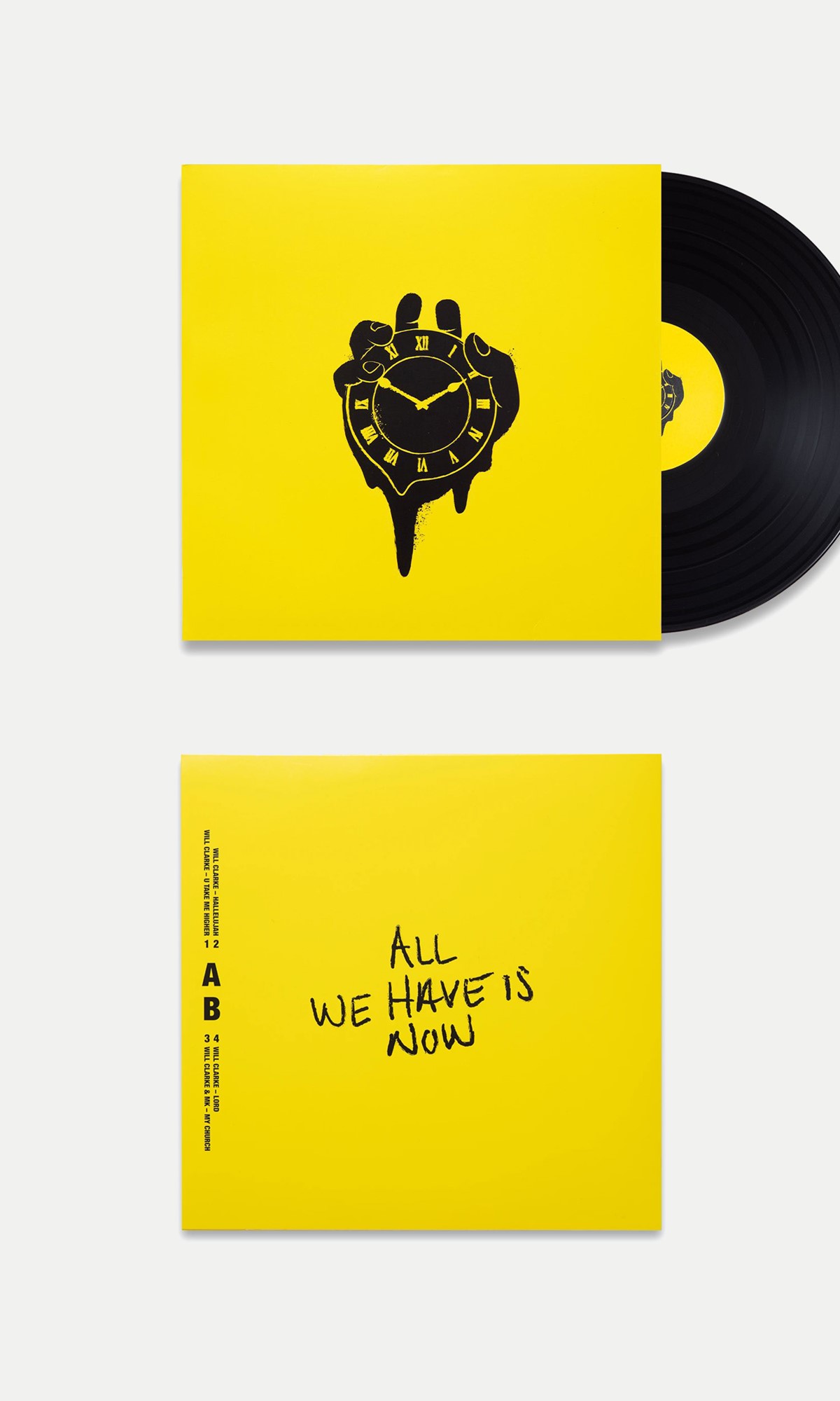
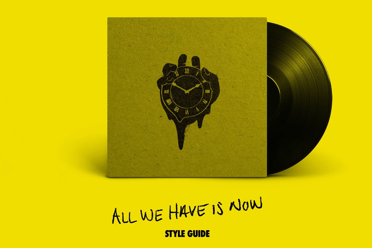
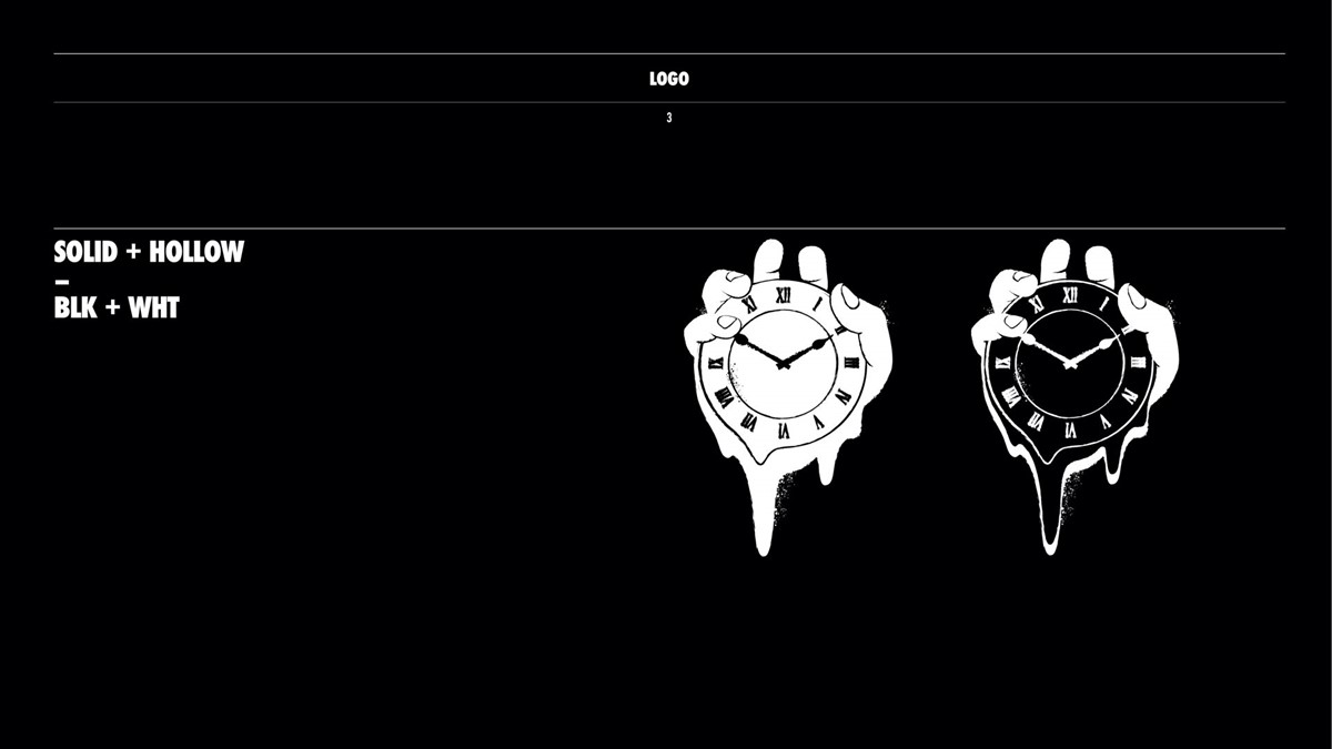
I wanted to establish the significance of now. Dali-based references sent by Will covered this and led to the idea of time slipping away with the classic melting clocks. Now to explore that human element.
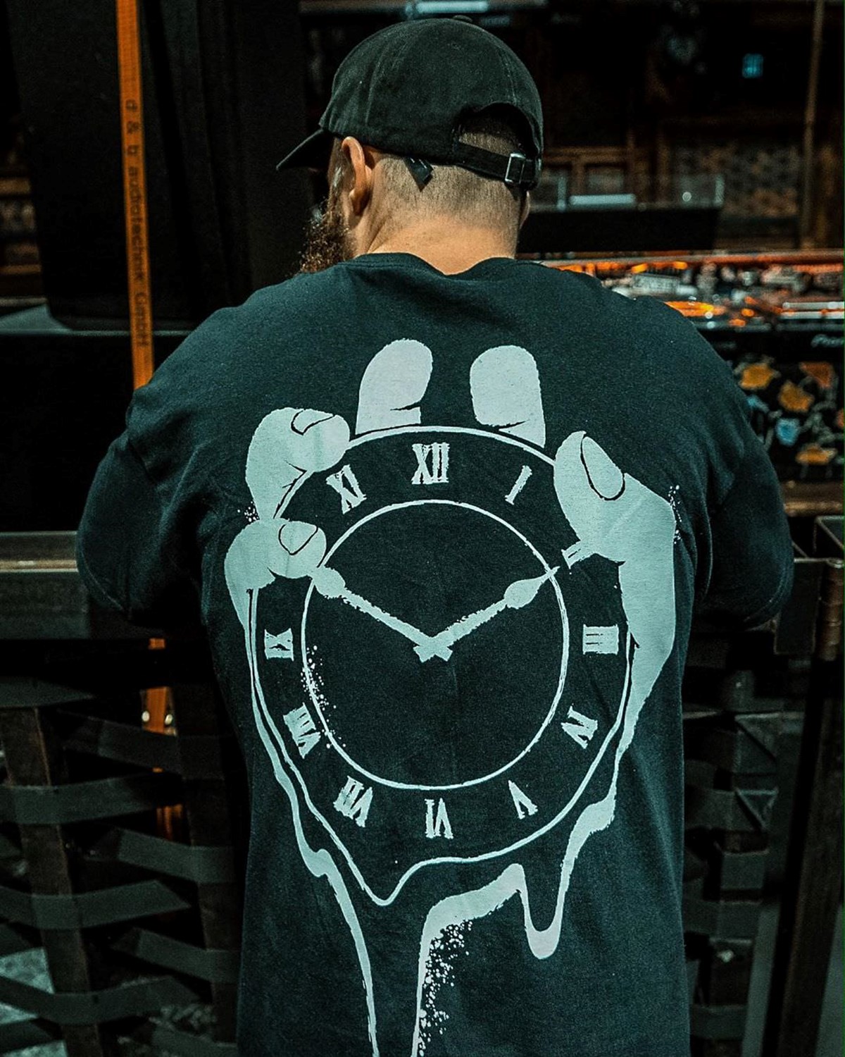
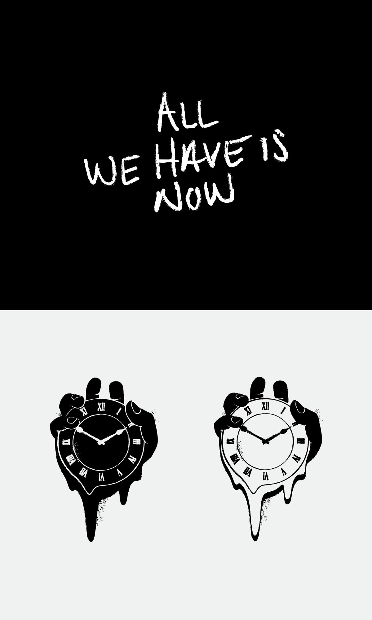
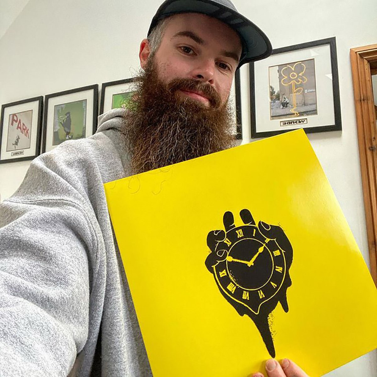
The idea of a human hand grasping the clock before time slipped away conveyed the overall sentiment required. Initial image research was not successful, none of the hand positions were quite right. Therefore, I tried modelling my own hand. A quick mobile shot provided the positional reference required. From here I could develop a distressed illustration style for the grasping hand to complete the graphical representation.
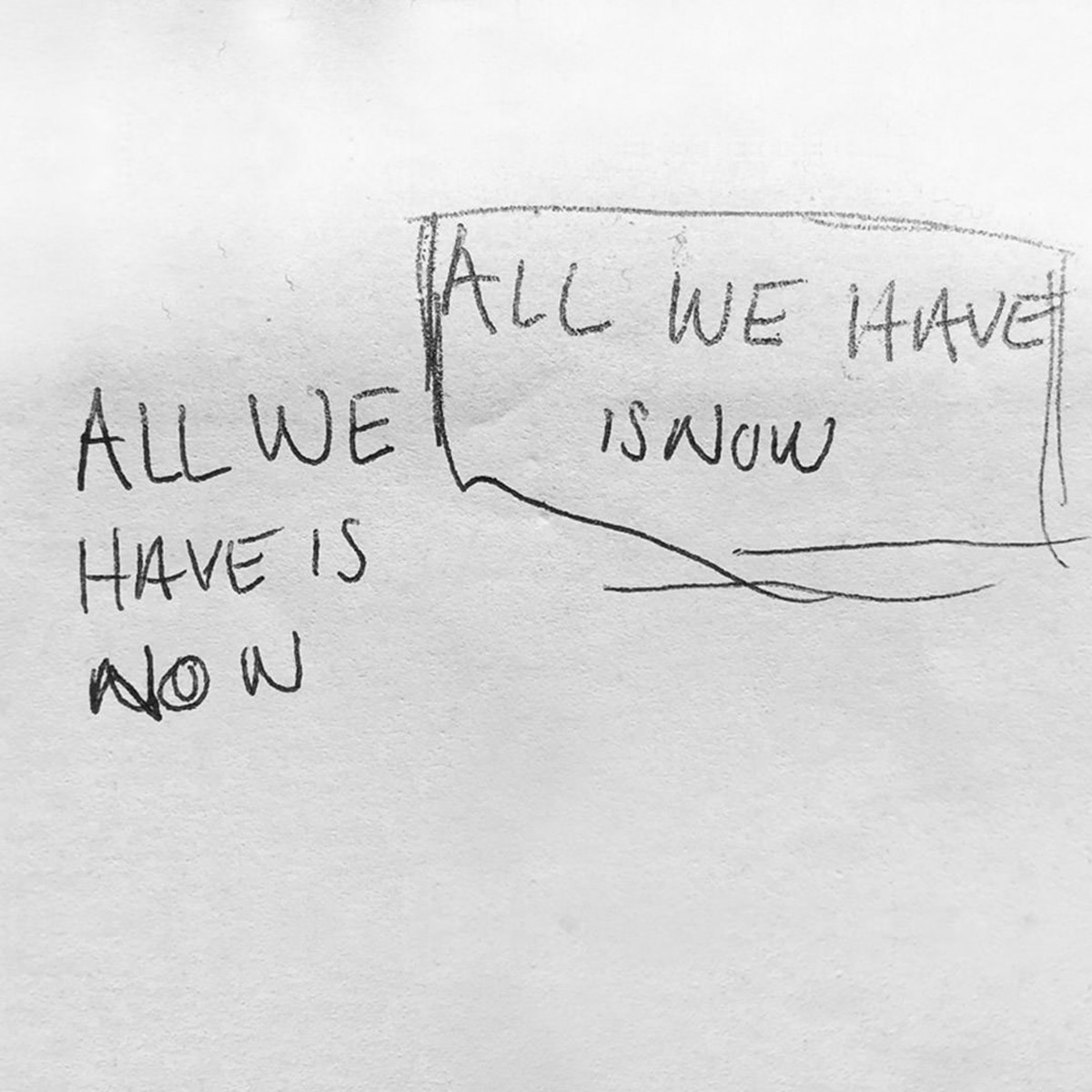
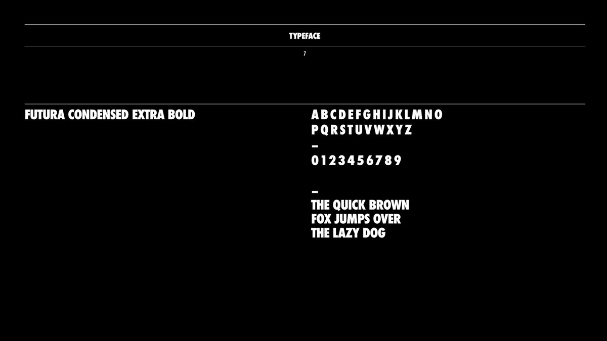
For the typography, we required something equally organic, raw, punk. Distortion to existing typefaces was explored, but they still felt a little too ordered. A new approach and design strategy was required. To create a stronger personal connection with the client the final creative solution was found by developing the typography from Will's own handwriting. This created the perfect balance. The marque and logotype design were subsequently tested and logo lock-up compositions created.
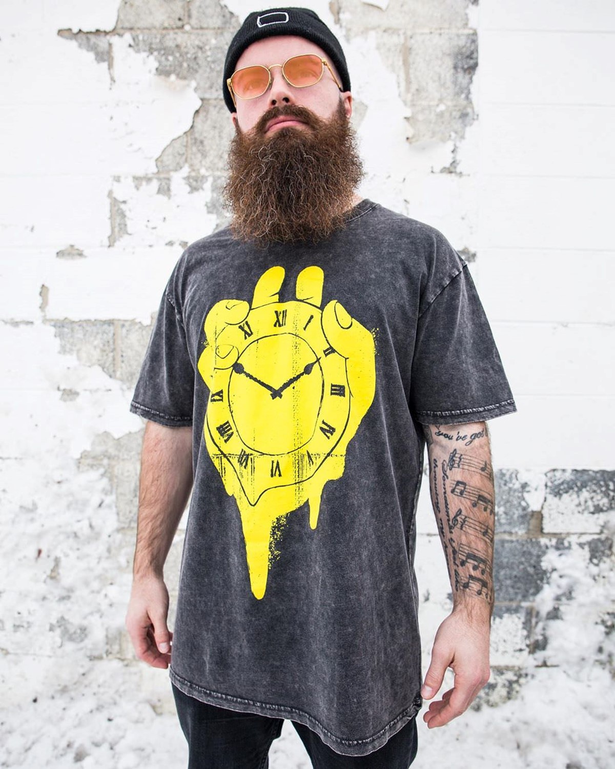
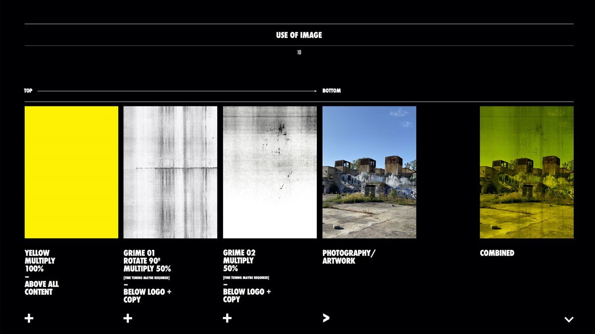
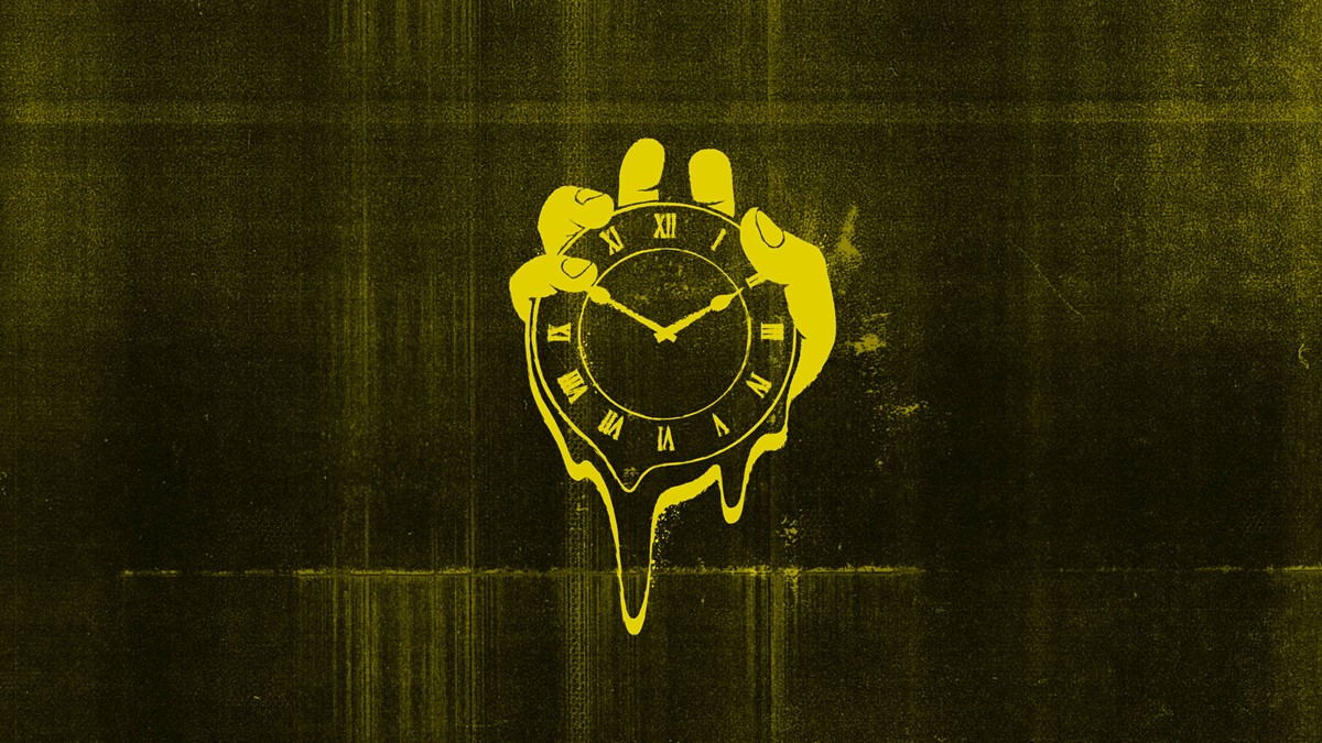
The next phase was to look at the photography, graphic design, and brand application for promotional marketing material. Once again, the options were endless and numerous design iterations were explored. To maintain continuity, a distressed technique was agreed upon. This was achieved via the simple graphic design technique of overlaying the designs with multiple stock shots of photocopied paper.
Like before, the final creative solution for the photography returned to a genuine connection with Will. Shots from Detroit, his new second home and US base, provided the perfect backdrop. These demonstrated endeavours and times past. Locations ready for something new. Something now.
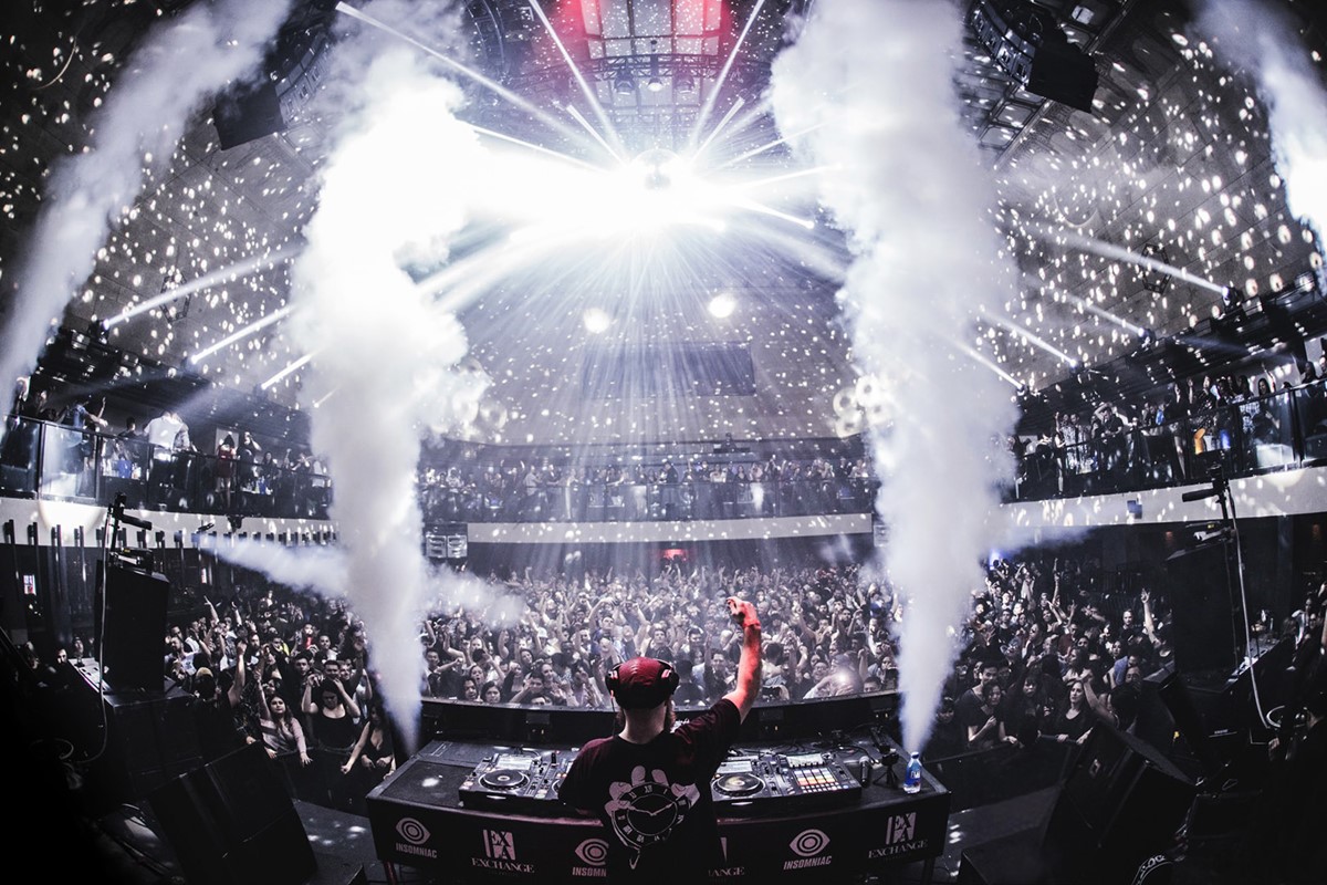
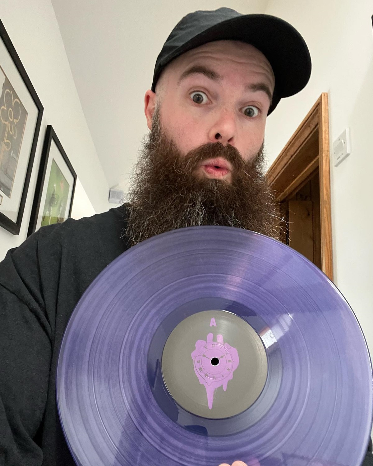
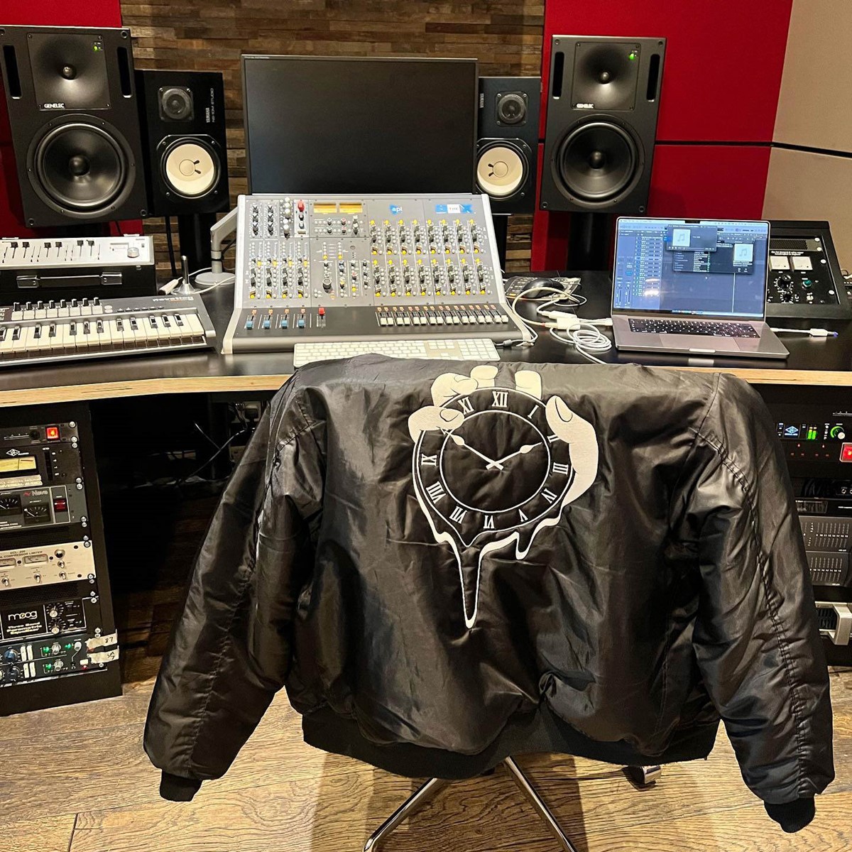
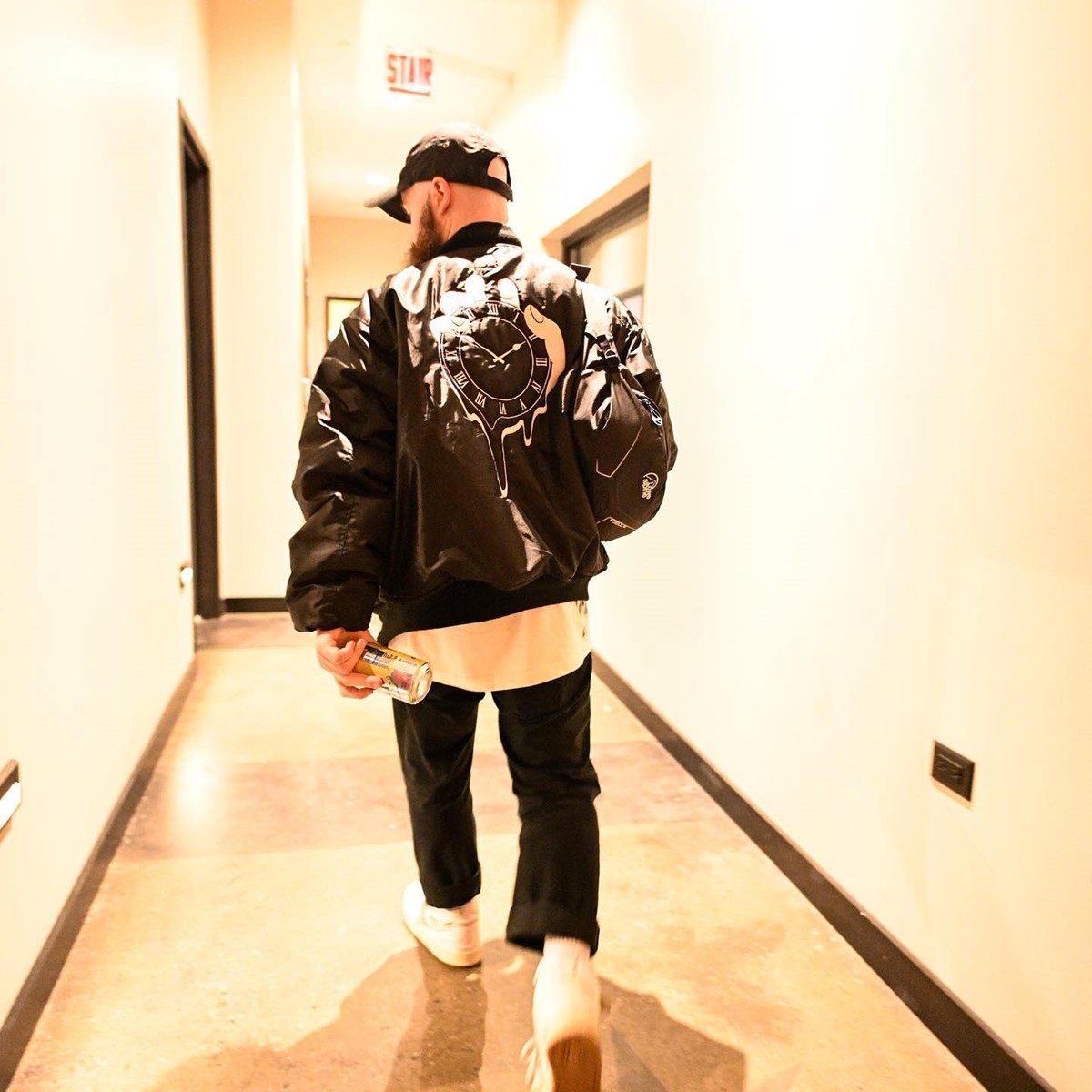
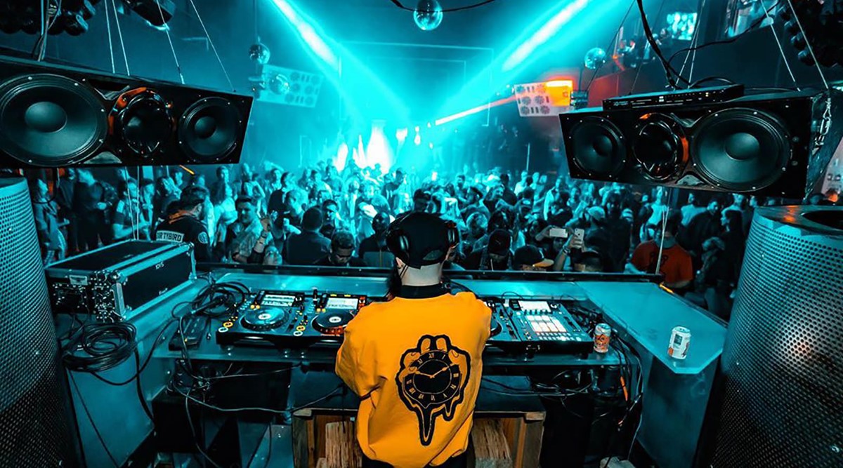
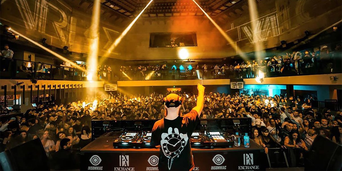
The final design solutions were then applied across all marketing material and media including digital marketing, merchandise, web, and animation. For digital promotions and social media, animated logo idents were designed. These featured variations of the clock melting, running anti-clockwise, too fast, and out of control before being stopped by the grasping hand.
Project services
- Brand Identity
- Illustration
- Animation
- Art Direction
- Branding
- Typography
- Graphic Design
Testimonials . Press . Awards
"Our branding is on-point. I’ve worked with Superfried for years now and after working with many designers this team is still 100% the best."
—
Will Clarke . DJ . Producer
Detroit
—
This branding design project was shortlisted for the branding award in the Creativepool Annual 2020 awards.