


1980 Recordings Branding for electronic music
1980 recordings is an electronic music label featuring an eclectic range of styles and genres. Superfried had already worked with founder and established Dj / Producer, Dan McKie on various design projects – Fish Don't Dance. Dan McKie . Phonik – so naturally he called in graphic design agency Superfried once again. Dan required a complete rebrand to maximise recent high praise by top Djs such as Fatboy Slim and build on their recent growth.
After reviewing the existing brand identity it was clear a sharper, more vibrant look was required. Previously the branding had conveyed the name in written form rather than using the numerical option. This seemed illogical and to be missing a great opportunity. In written form, the name was incredibly long, difficult to read, and did not match their url.
As a graphic designer who experiments with typographic design, especially numerals, this was a perfect opportunity to employ some bespoke typography. For the development of a marque, with the number 80 and retro reference to records in the name, circles were an obvious geometric connection. I wanted to find a way to create a symmetrical logo design using just one consistent shape. To achieve this would require some deviation in scale between the 8 and 0 which felt anything but balanced.
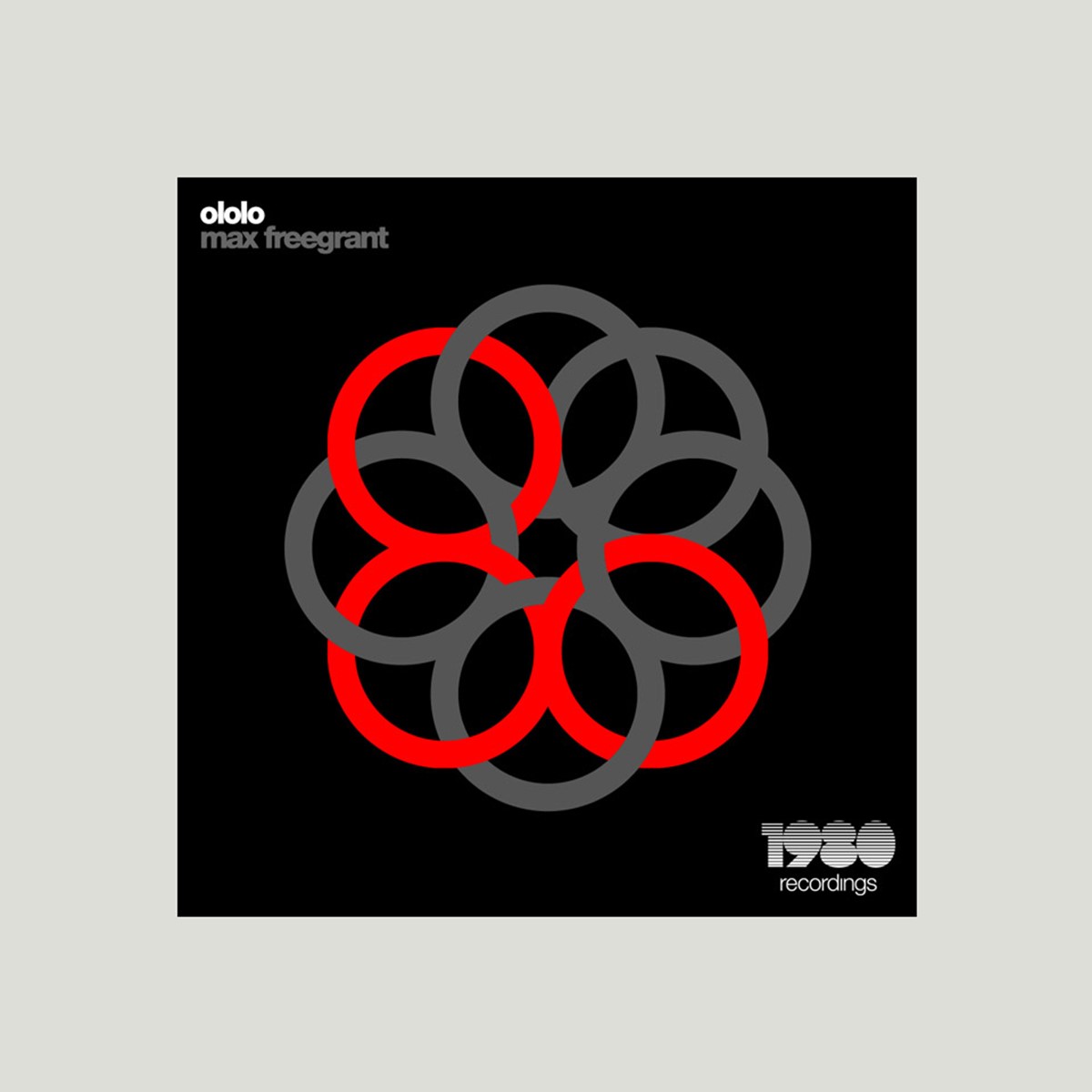
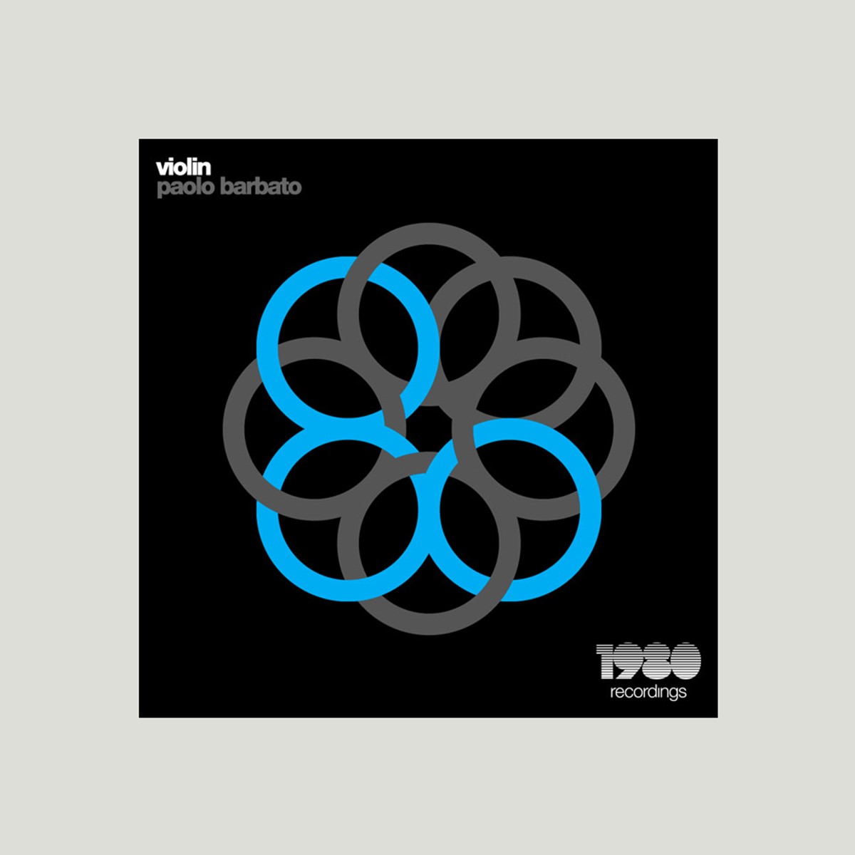
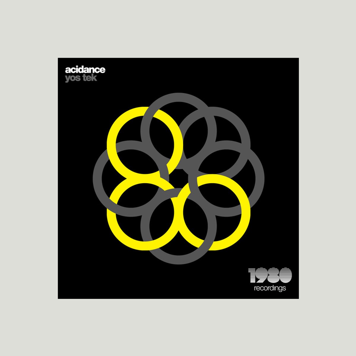
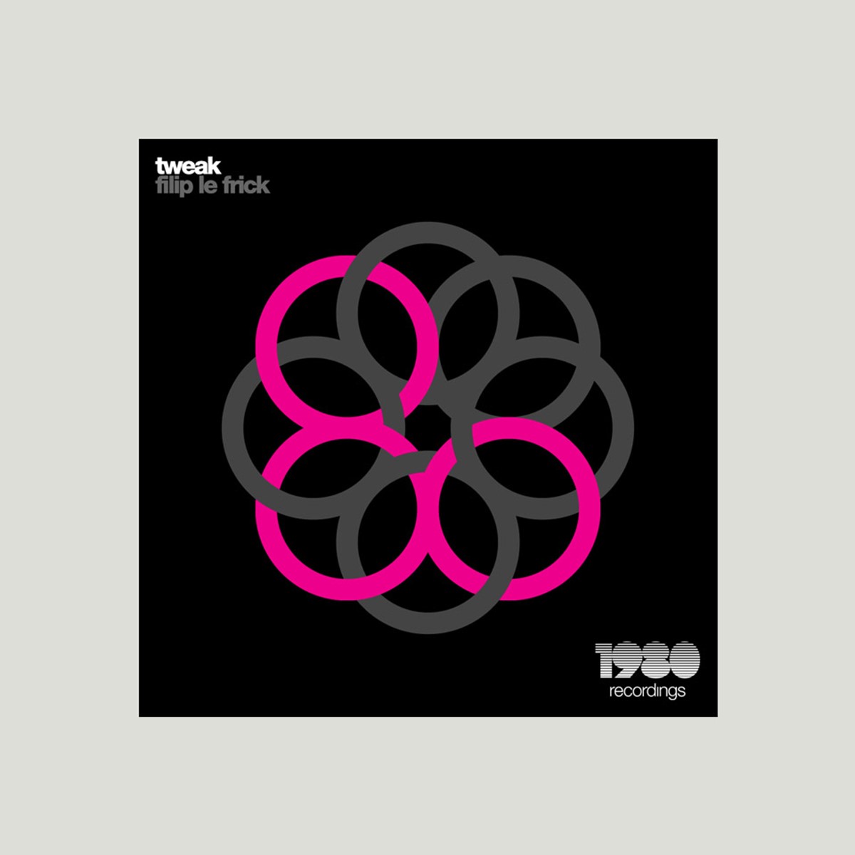
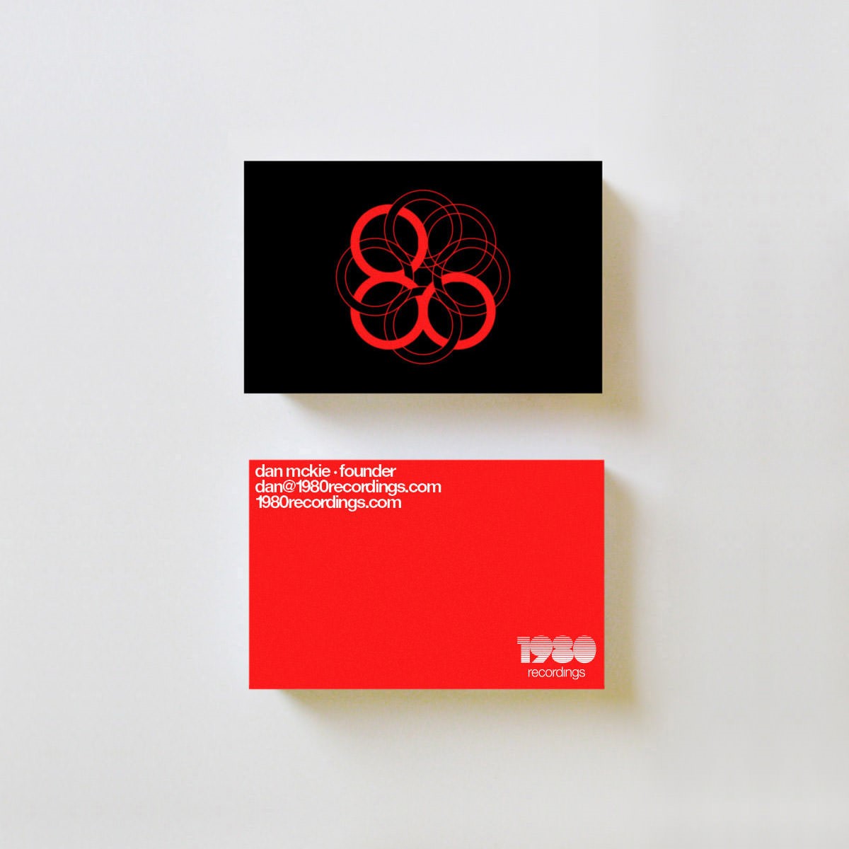
Further research was required. With a name featuring a previous date in time, it was natural to take a trip back to the 80s for inspiration. The creative solution was found upon a nostalgic childhood memory of a classic toy of the time – Spirograph. It was so infuriating to use, but the designs on the box were always so clean! Using the same duplication and rotational approach, a graphical representation of the number 80 could still be created solely from circles. The additional, unused circles filled the negative space to maintain a balanced marque.
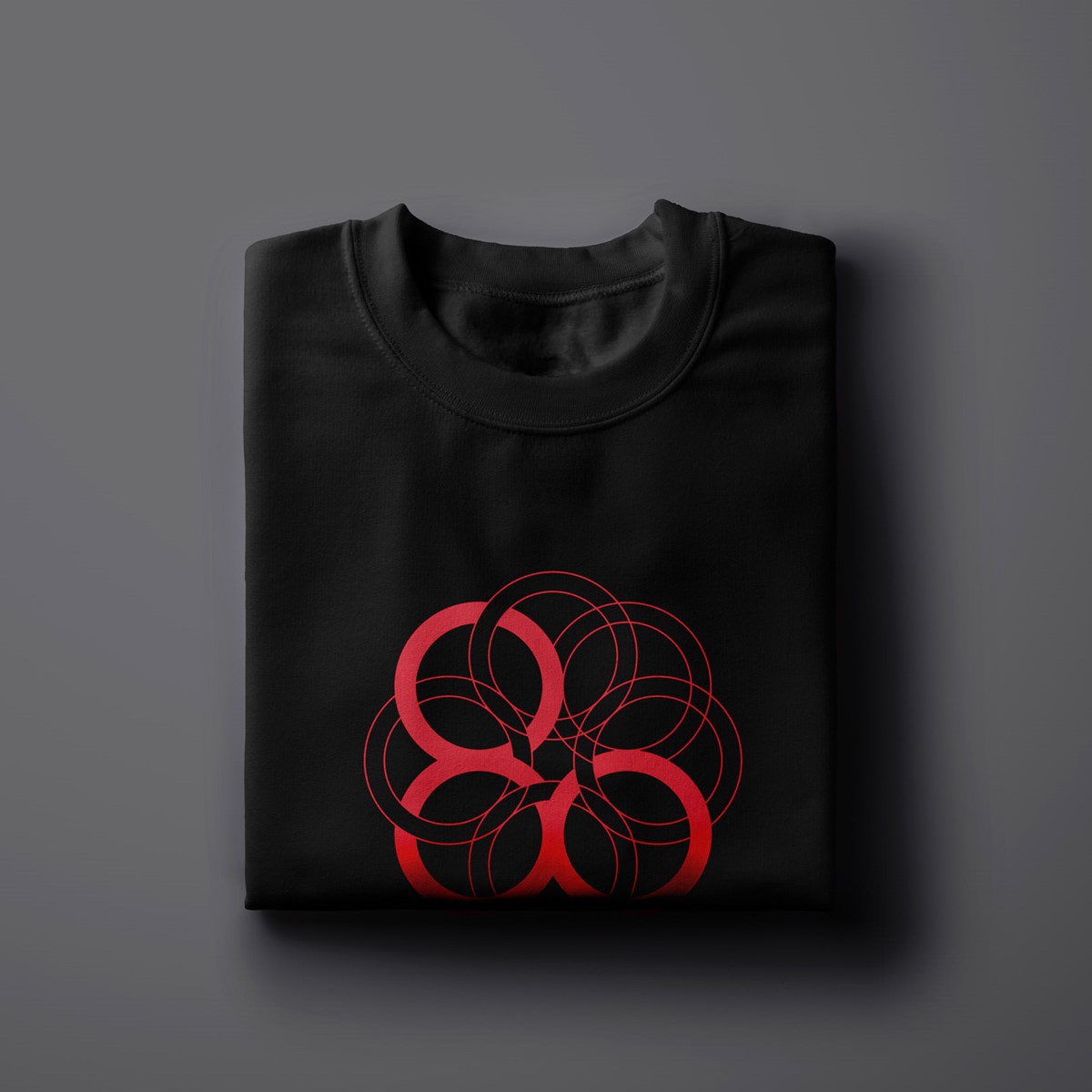
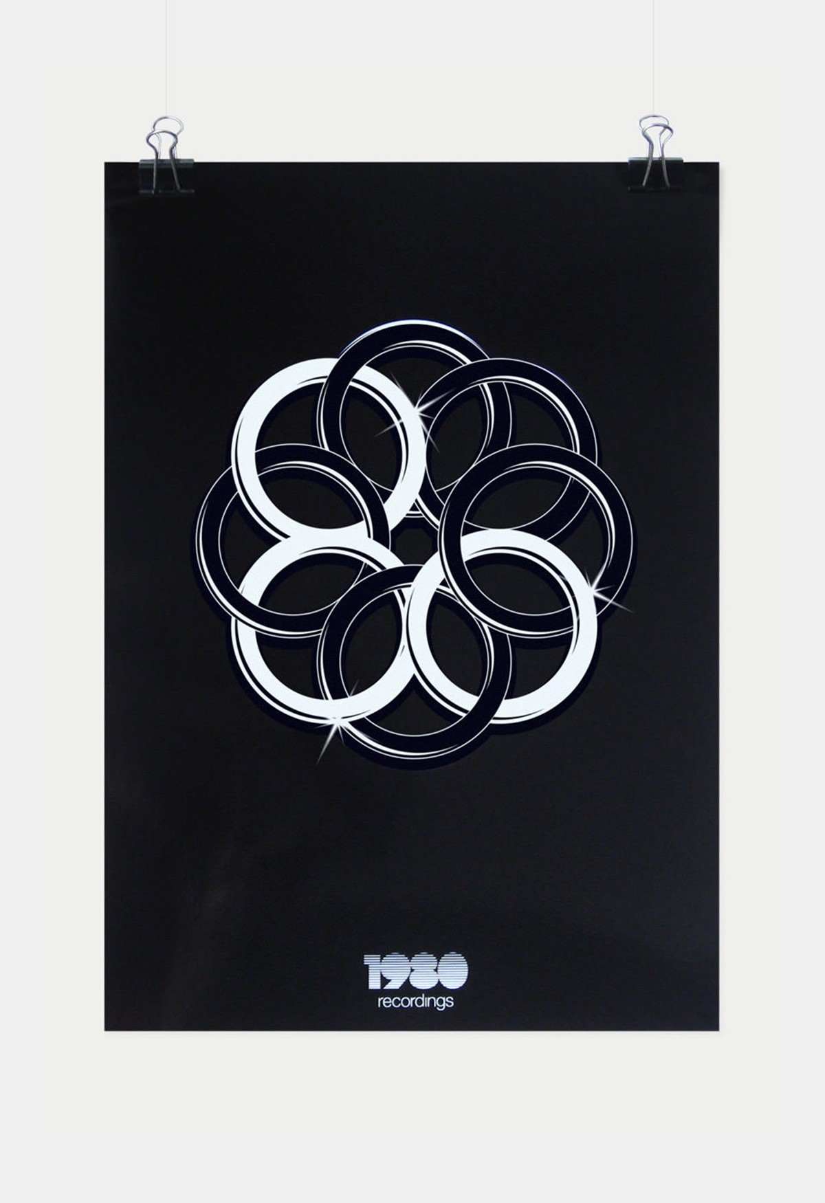
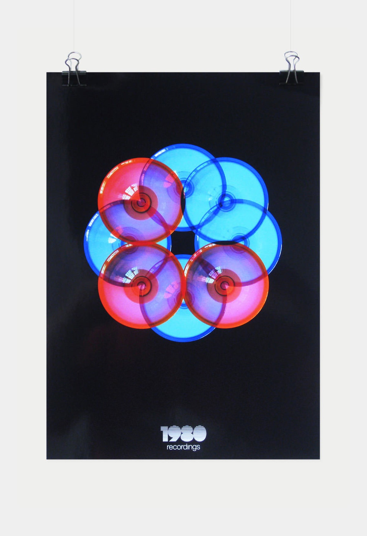
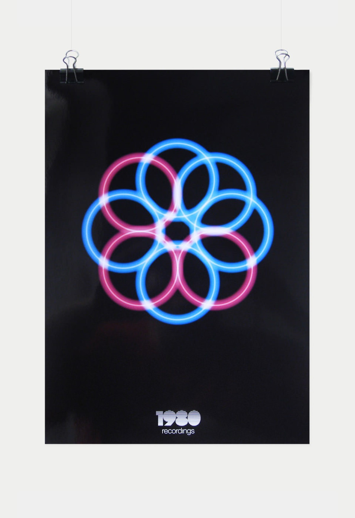
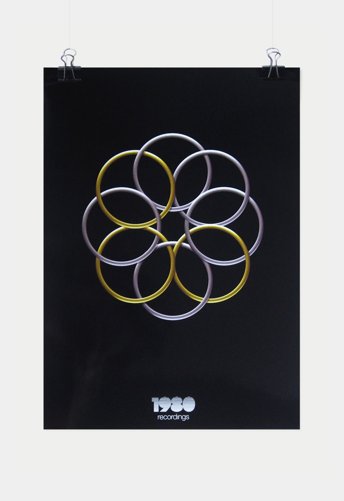
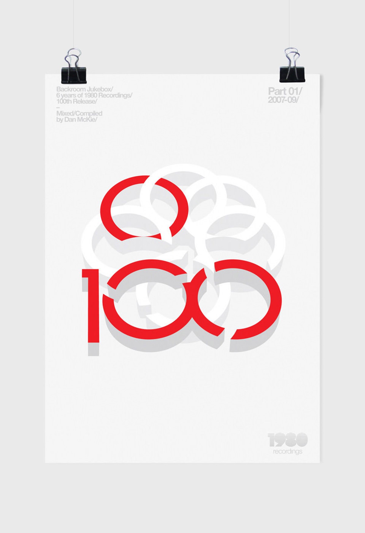
Various design iterations with varying line weights were tested, but it required something more as the unused rings felt surplus and forced. Inspiration from another retro classic – the Olympics – led to the perfect creative solution of interlocking the rings. The logo design had a strong presence. The retro feel connected to the name and most of all, was incredibly versatile for potential variations in illustration style, rendering, or for containing and masking imagery.
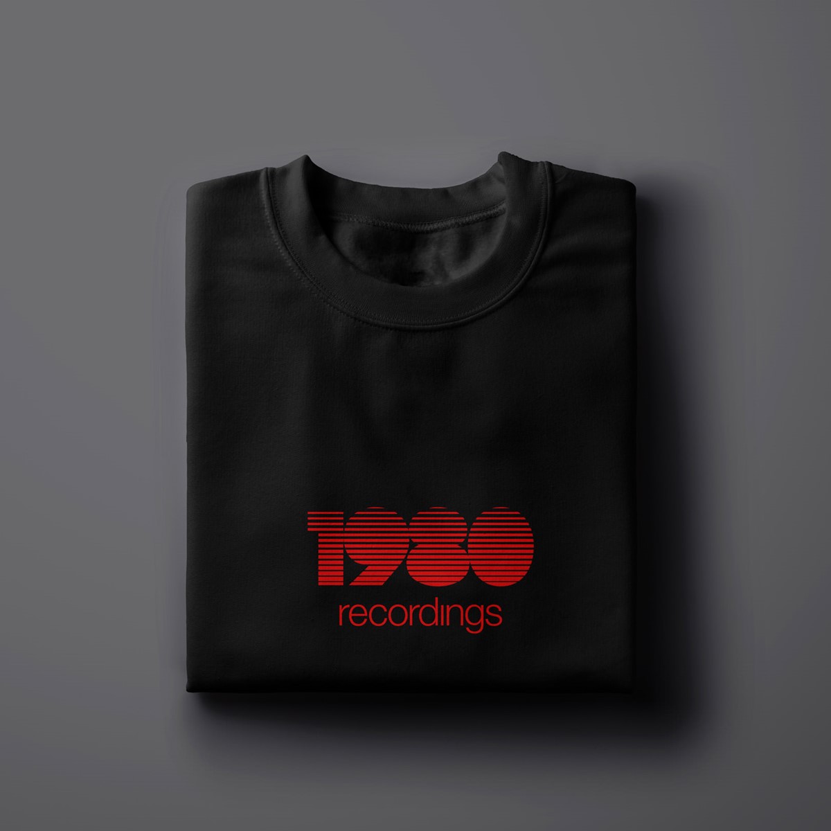
Moving on to the wordmark further nostalgic research came into play. Another trend from the 80's was the retro line fade graphic. This could provide a simple, clean distinct illustration style that would create a nod to the past. A heavyweight typographic design would be required for the lettering to work with multiple incisions. Various typefaces were tested, but none were clicking. So bespoke typography for the numerals was developed, adjusted, and tested until the line fade effect was working at scale.
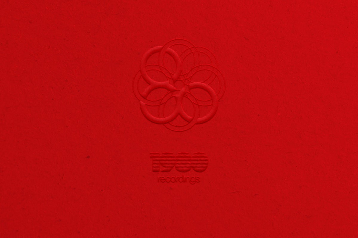
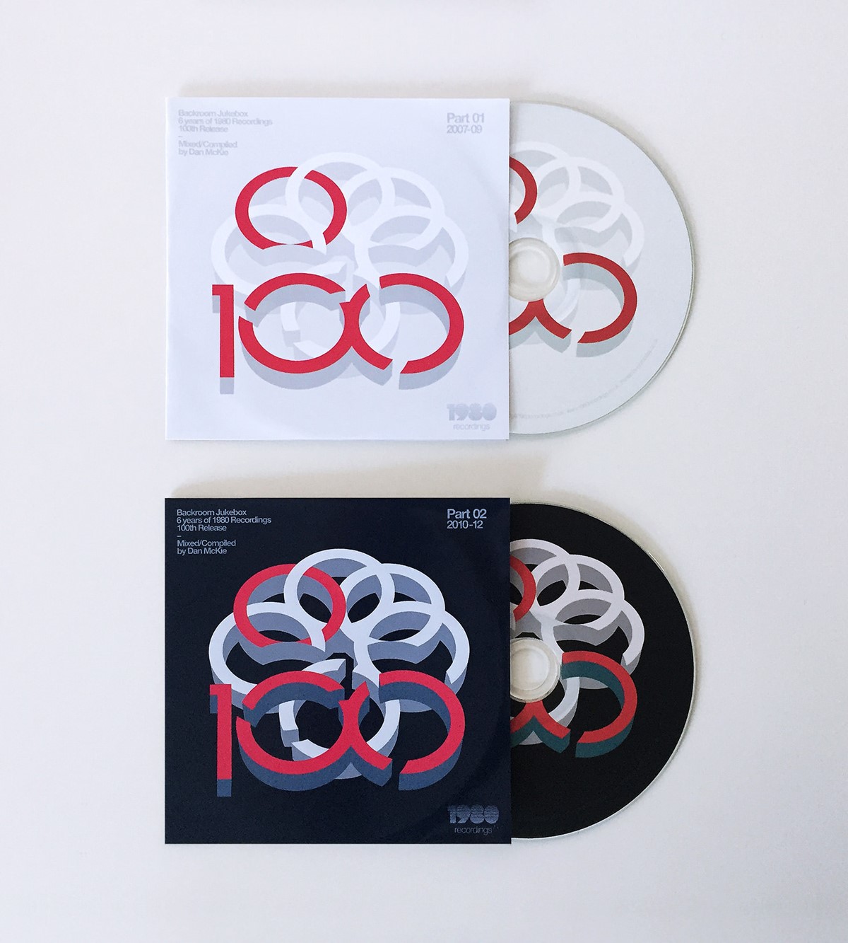
With the logotype design and brandmark in place, it was time for brand application. Based on such simple geometric shapes the brand solution proved to be very versatile with the potential to render the rings in various materials and colour routes without compromising the message. This was particularly important due to their requirement to promote various tours and new releases with a simple, clean bold graphic device. This made the development of template designs efficient. The marque also looked great on branded merchandise with the feel of a clothes brand. The wordmark was also effective in logo lock-ups, or when used in isolation.
Project services
- Brand Identity
- Art Direction
- Bespoke Typography
- Illustration
- Branding
- Typography
Testimonials . Press . Awards
"I own and run 1980 Recordings and with Superfried's help I have managed to totally rebrand my company. I would highly recommend Superfried and will certainly be using them again."
—
Dan McKie . Director . 1980 Recordings
—
This branding project has been featured in two international graphic design publications.