


Superfried website Design + dev of this site
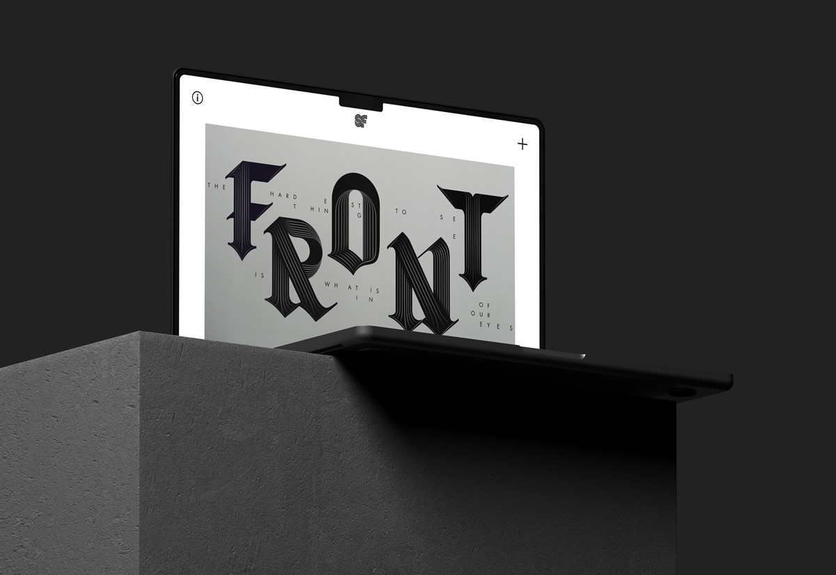
That tricky website redesign for creative agency Superfried was long overdue. For the new webpage layouts it needed to remain simple. With this in mind, particular attention to detail was directed toward the user interface design and enhanced performance via efficiency. The purpose of the site would be to showcase the work which should always remain key, so everything was stripped back to the bare essentials required. To advise on the build of the new site I called on the web development services of our regular collaborators at digital agency HiFi.
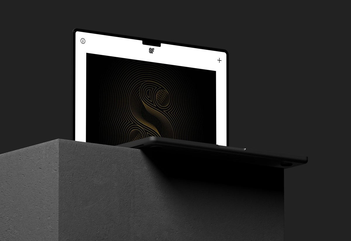
On the homepage the menu has been placed behind an obvious plus sign + button. This ensures the webpage layouts remain uncluttered, enhancing the user interface design and focus user attention on the visual content. This design strategy also allows for additional navigation content without the compromise of limited, screen real estate.
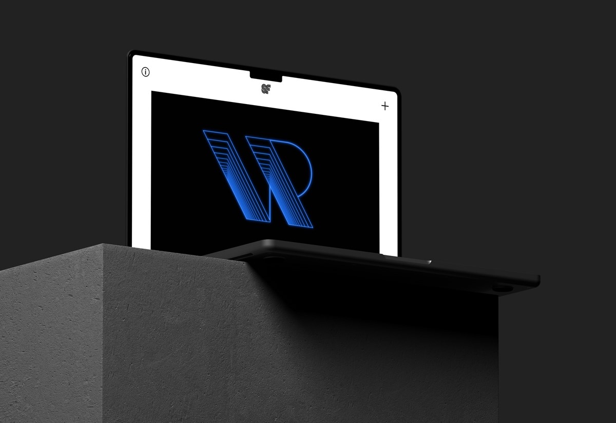
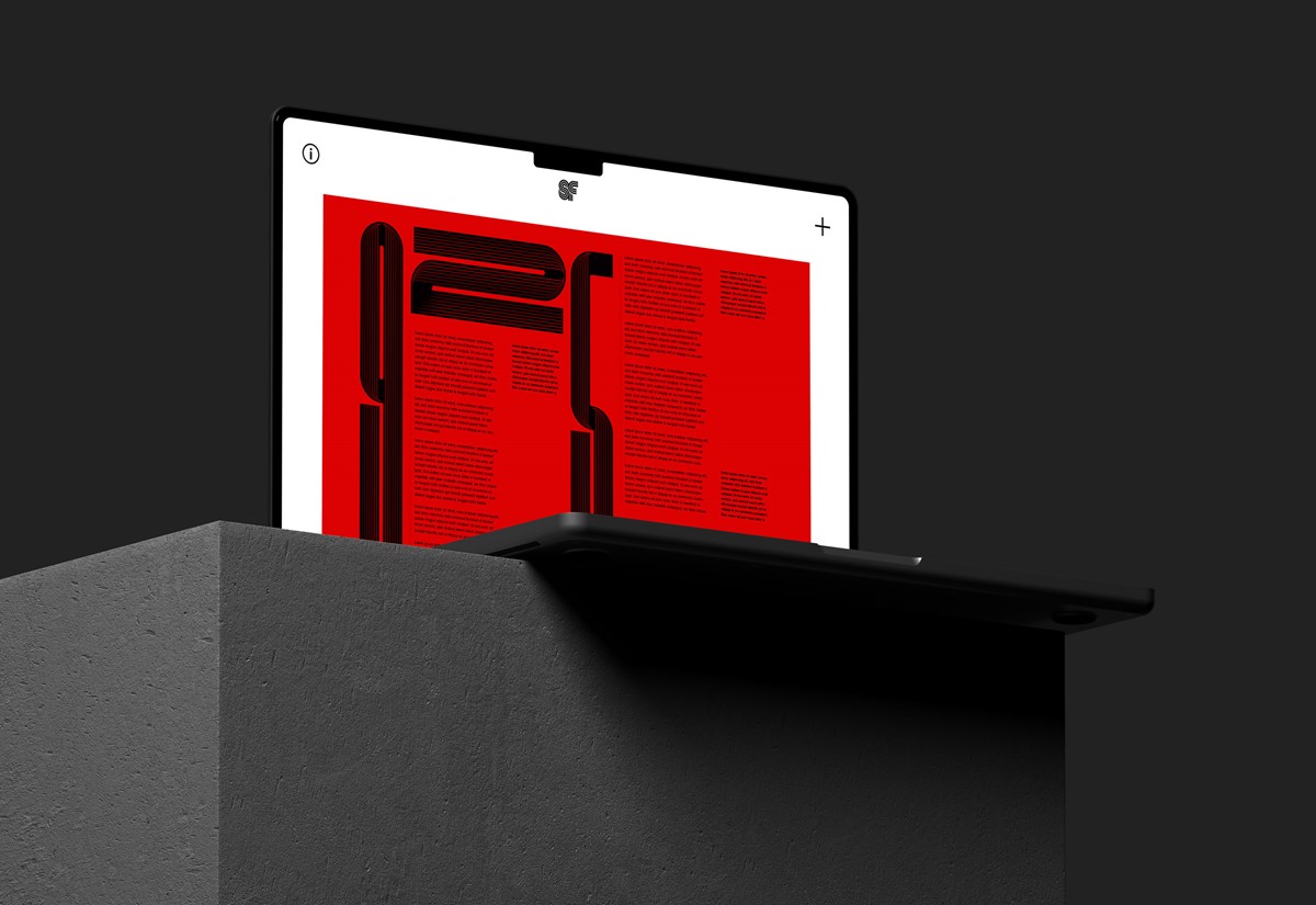
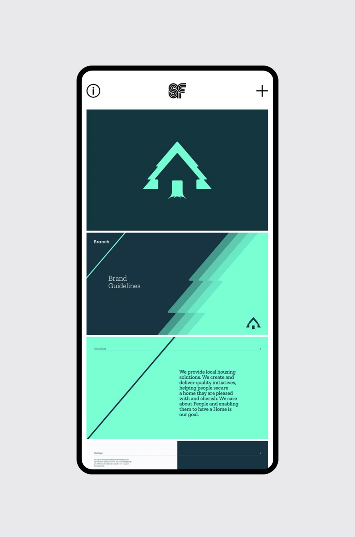
An autoplay, portfolio showreel was an obvious choice to create design impact and immediately convey the eclectic, design output of Superfried. Although video content can be heavy and detrimental to webpage performance, via optimisation using Handbrake, the desktop homepage was still hitting the performance targets. For mobile, as expected, this had a more dramatic effect on webpage performance. To counteract this, for mobile devices autoplay video will be dropped in favour of a lighter image carousel in the next development phase.
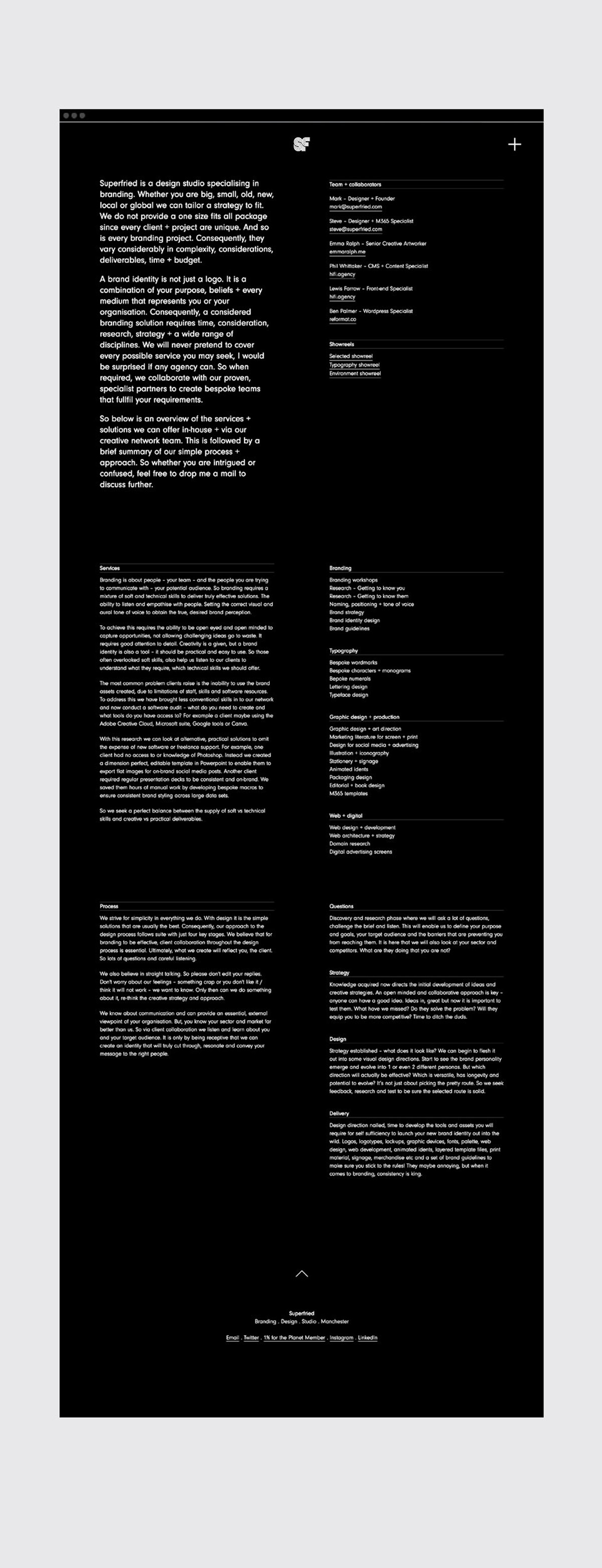
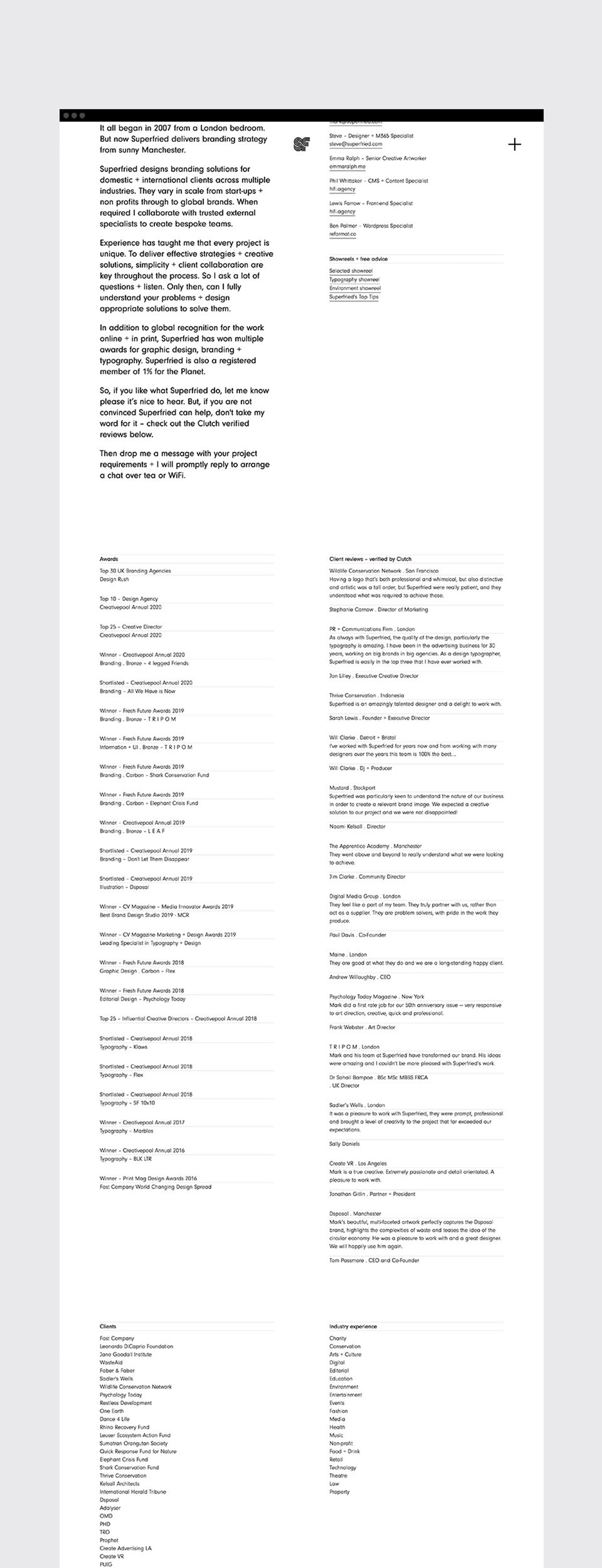
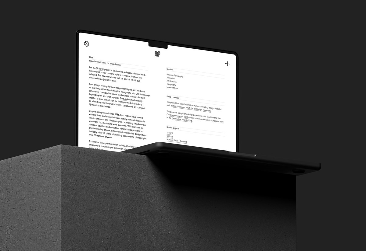
Having analysed user behaviour on portfolio sites, it was clear they are more focused on visual content, with copy often overlooked. Consequently, for case studies, priority was given to the photographic and video content. For the benefit of SEO and those wishing to understand the design strategy behind the creative solutions, there is a simple, universally recognised info icon button to toggle between the written and visual content. This design strategy simplifies updates by eradicating the time required to consider the composition and balance of differing content on webpage layouts. For efficiency and simplicity the same webpage design template was then employed for the profile and services webpage designs.
A key aspect for the website was that it should be fast and efficient. As a folio site, it would be image and video heavy. With this in mind a keen focus was placed on optimisation. Rather than full screen images, a max width was employed. It was also felt that full screen can become over bearing on larger monitors. Images were also cropped close to the actual size required. For compression, in addition to standard web optimisation in photoshop all imagery was run through jpeg mini for further lossless compression of up to 80%. Where as for video content, all files were rendered using two pass encoding. The site was then tested through lighthouse on Google developer tools to locate further opportunities to enhance performance on both mobile and desktop.
Functionality and speed are essential, but as a folio site, this should not be to the detriment of the design. It was here that HiFi proposed a system called Turbo that allowed them to give the site a more 'appy' feel with smooth page transitions whilst also improving speed and performance. Not often that refinement leads to a faster site.
With efficiency still key, since the site did not require a search facility, HiFi proposed adopting a static hosting approach. With a standard website, each time it is visited the database will call in content from the server to render the pages. With static hosting, the pages are pre-built every time they are changed, there is no database call. This means the site is far quicker and more scalable. There are other advantages too. Since there is no database connected, the risk from hacking and loss of data is eradicated. Secondly, since the pages are no longer re-rendered for each visit, the amount of energy consumed to serve the site is greatly reduced leading to a lower carbon footprint.
Hosting is also a potential area of concern with regard to energy consumption. There are now many green options out there. For this initial release of the site, we have hosted with Netlify since they are experts with static sites. Although not a green host as such, Netlify are very focused on sustainability. As we develop the site further we will investigate completely carbon neutral, static site solutions.
Project services
- Website design
- Art Direction
- Information design
- Website dev
Credits
Designed in-house by design studio Superfried®.
–
Developed by HiFi