

Northern Group website Design + dev for property sector
Please note, since completion the website design has been significantly altered and no longer reflects the original calm, confident, and minimal art direction intended.
–
Northern Group is a prominent property developer based in Manchester. As part of their complete rebrand project, design agency Superfried brought in the web development services of digital agency HiFi to develop their new website.
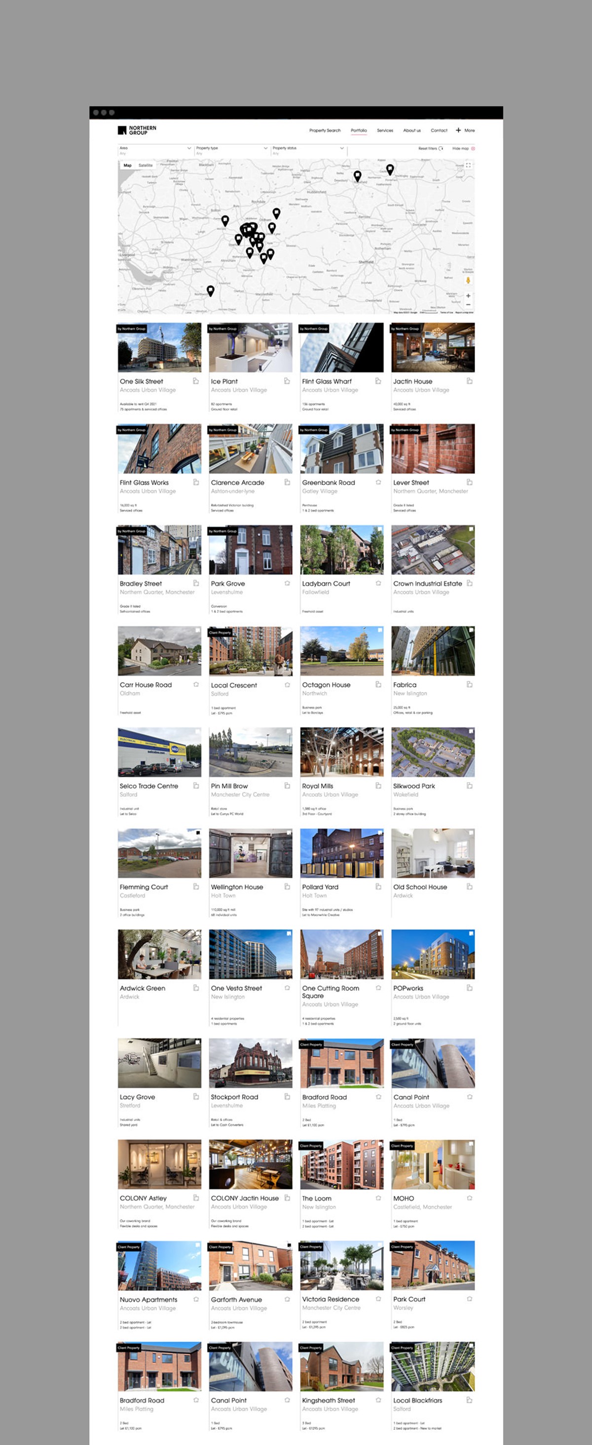
The backend of the site would be technical with the requirement to completely integrate with their existing database software and internal / external screens all controlled through one CMS [Content Management System]. The front-end was also challenging, effectively serving two roles – showcasing the company services whilst also providing a comprehensive and detailed search platform for their property portfolio.
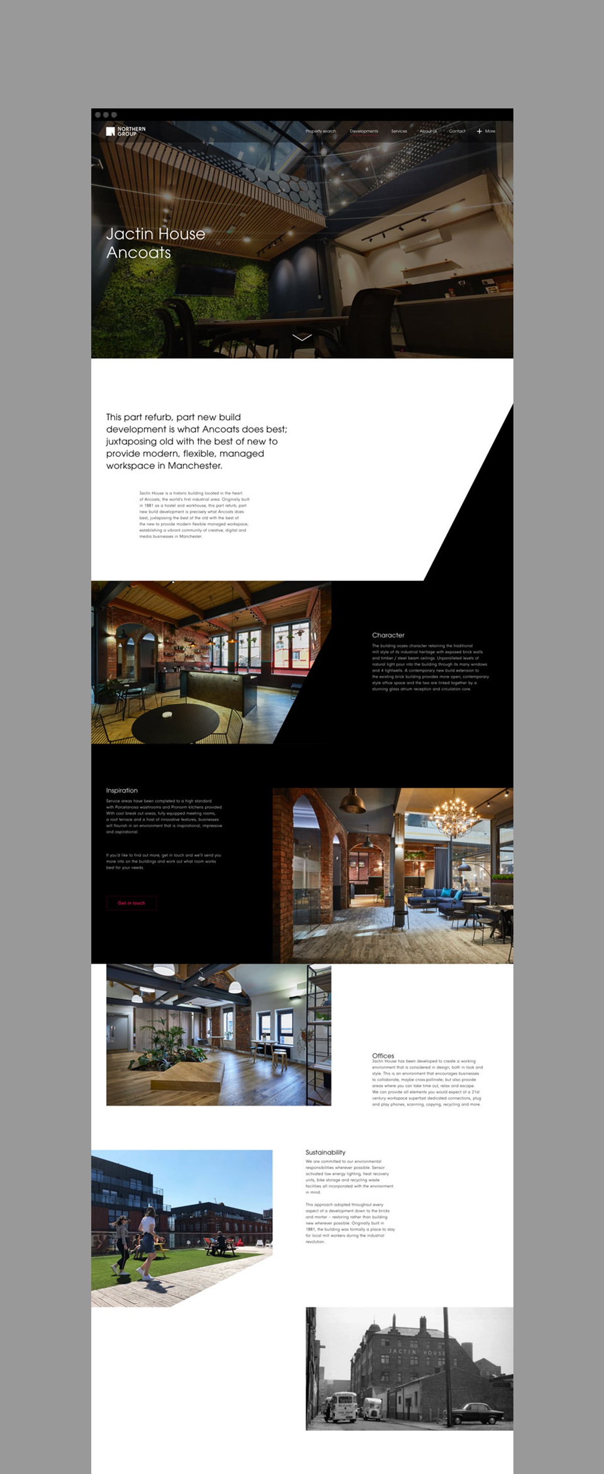
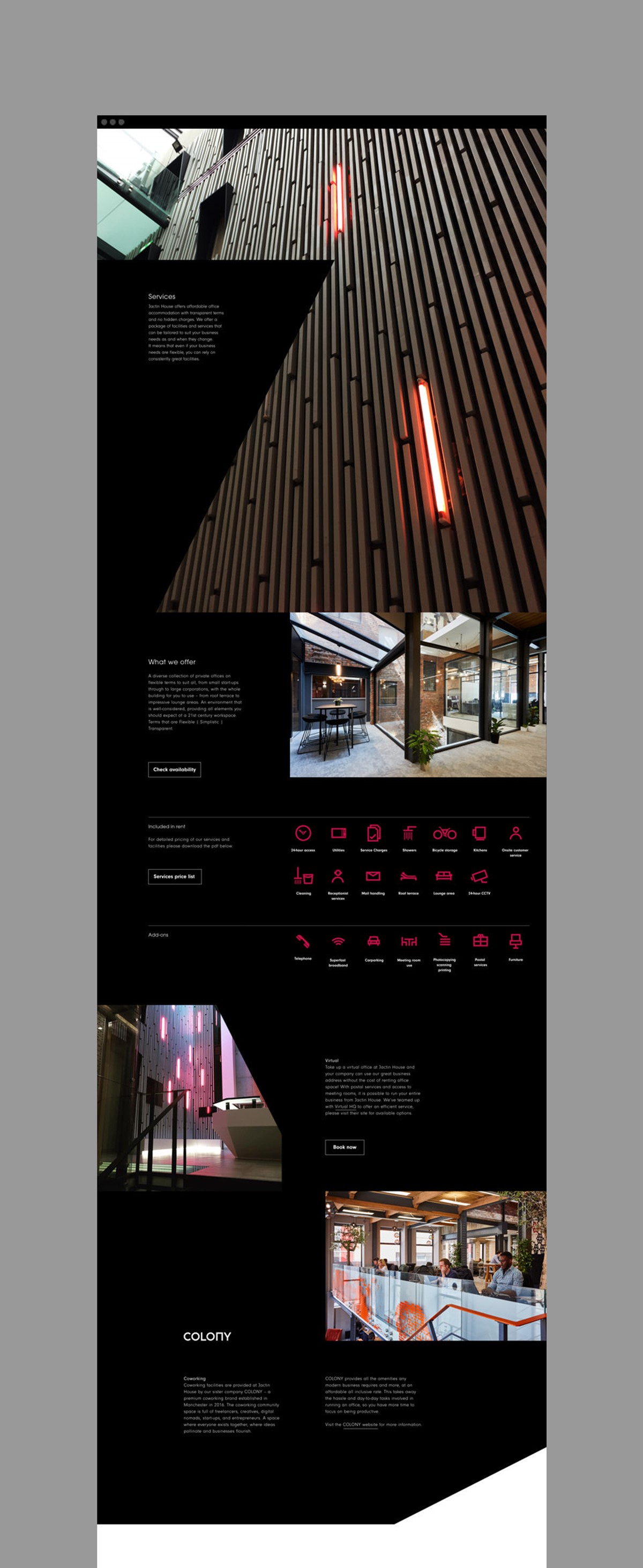
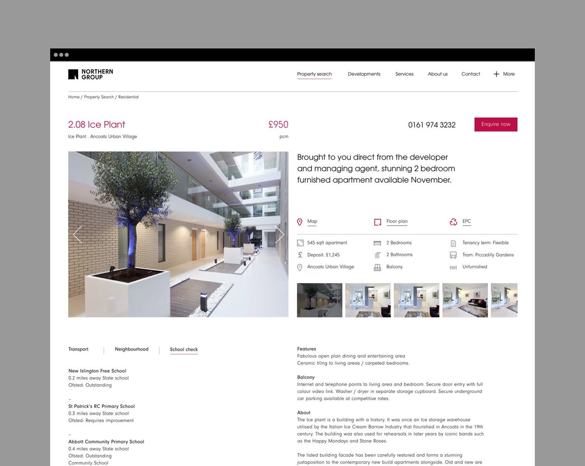
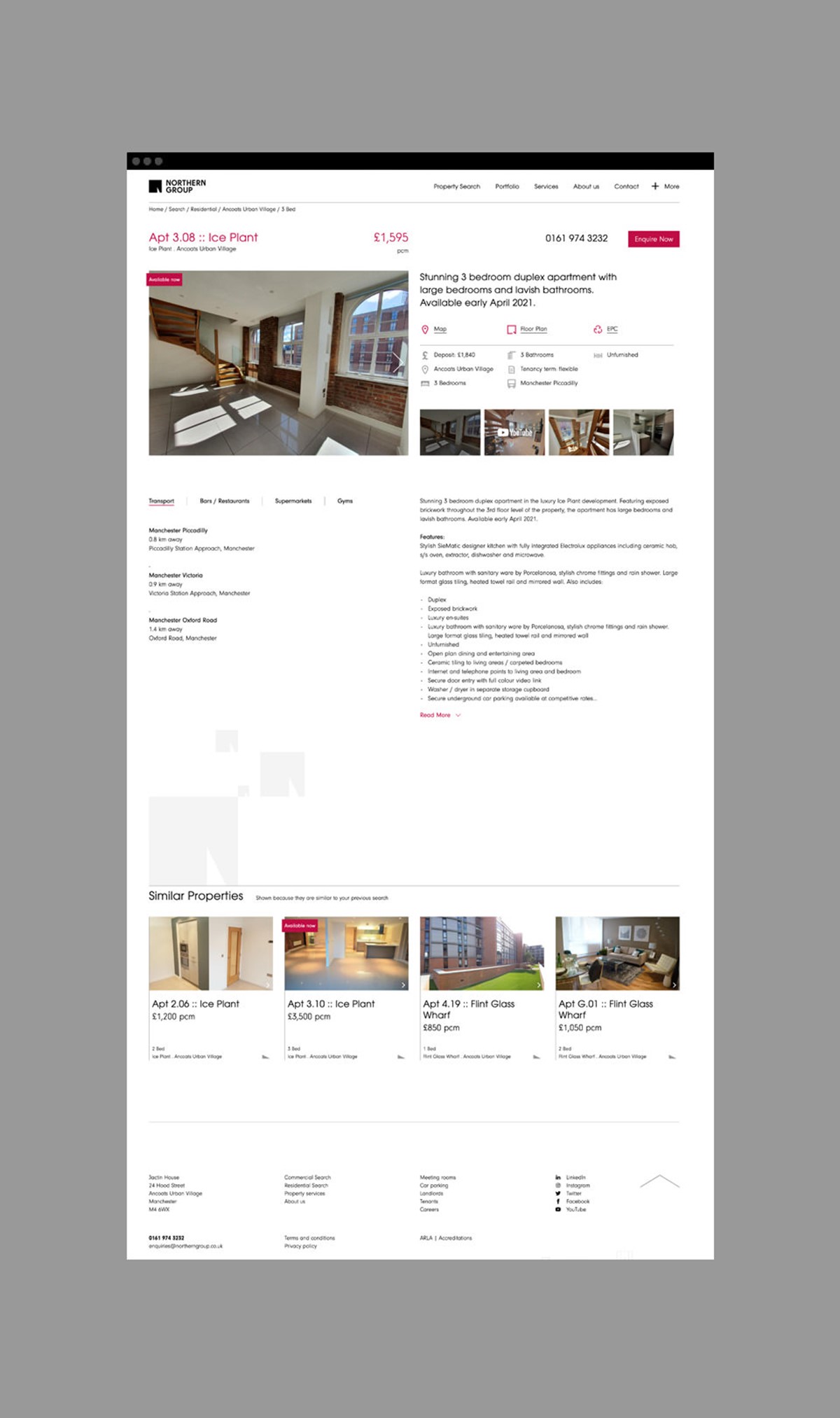
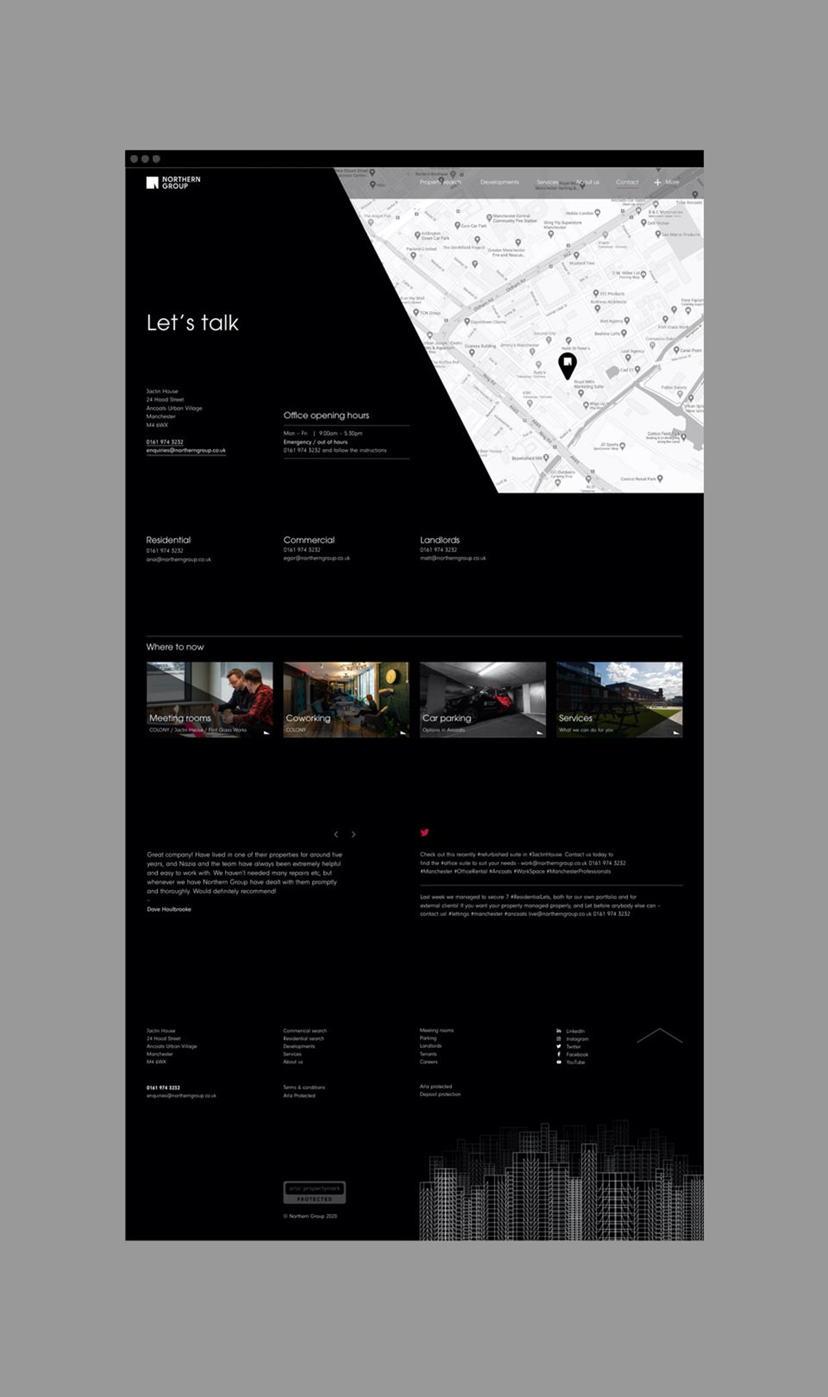
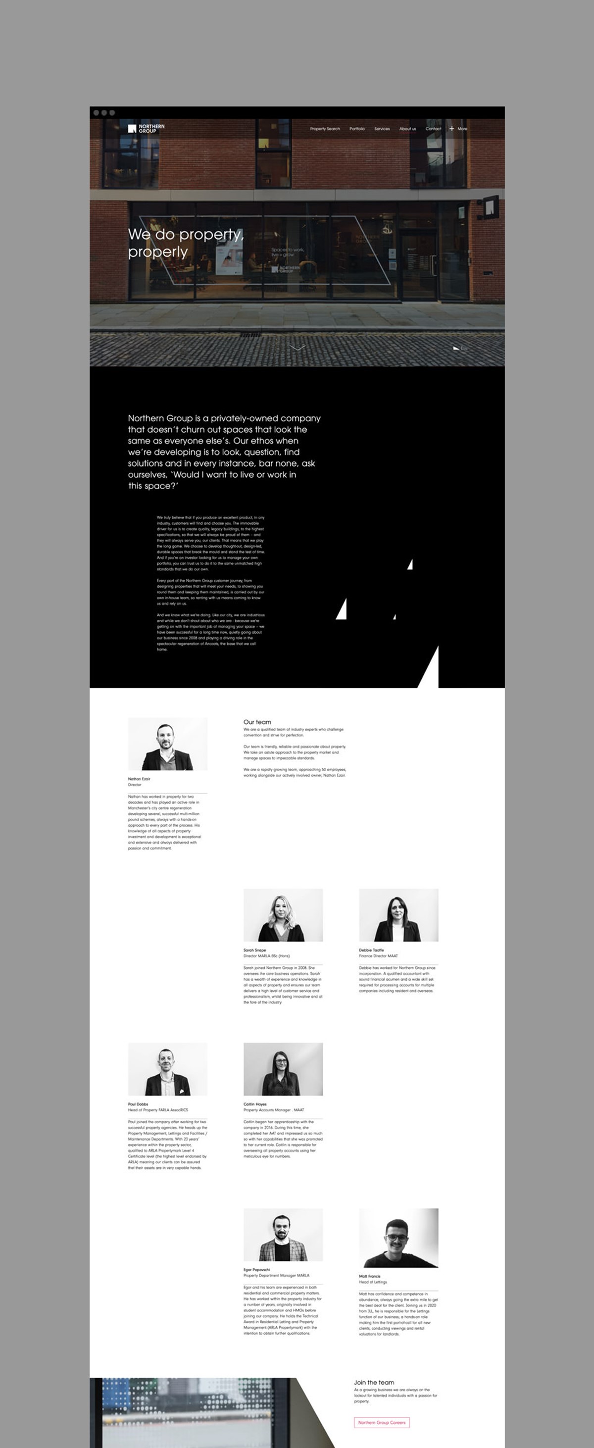
To avoid monotony and aid usability I wanted to create a sense of separation in the design direction between the info, presentation led section, and the property search pages. This was achieved simply via brand colour – services would be placed on a black background where as the information-led search pages would employ a more practical, minimal white page.
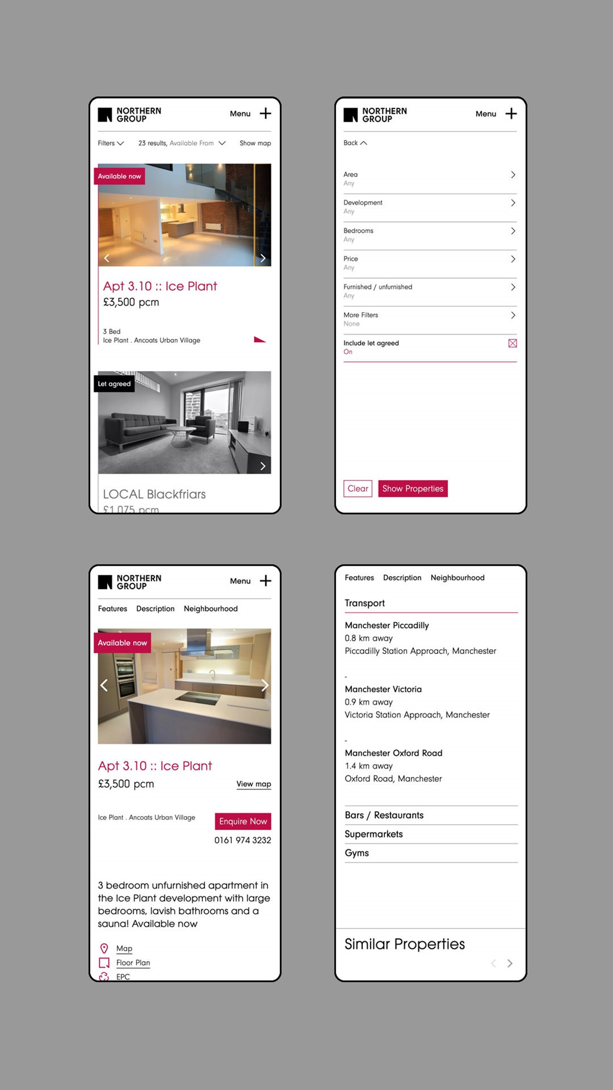
Priority focus and consideration were placed on the user interface design to ensure all search requirements were catered for. To achieve this, great attention to detail was required, so we worked closely with the client whose extensive experience ensured they would understand the market, search behaviour, and requirements of their customers. In addition to this collaboration, extensive research and user testing were conducted to ensure that optimal solutions were adopted. The webpage designs were subsequently refined through several design iterations to present the detailed user interface and information as cleanly as possible. This design process was also adopted for mobile devices to maintain all functionality and prevent the user experience from ever being compromised.
For the company, product-led section, once again clean webpage layouts were employed. Alternating from black to white helped to signpost new sections within content heavy pages. For design impact and distinction, an angled brand led, graphic device was introduced. Although this required extensive, design experimentation and user testing to ensure it worked within the responsive design, the striking results were worth it.
Project services
- Website design
- Website dev
- Art Direction
- Strategy
Credits
–
Website development – Hi-Fi.